A signup page begins an account relationship, so the visitor should understand what they are creating and what information is required. Use Mockitt’s online prototyping workspace to review the form, verification step and recovery states. The goal is a clear, proportionate registration task rather than an emotional first impression alone.
Ask only for information needed at this stage and explain unfamiliar requirements beside the field. Fewer fields are not automatically better if removing a necessary choice makes the next step confusing.
Not every purchase or information task requires an account. Decide whether registration is necessary, optional or part of an invitation before designing the form. Where guest access exists, make that choice understandable rather than concealing it.
Prototype the registration task
Begin with the account purpose, required fields and the next state after submission. A workspace invitation, a retail account and a regulated-service application need different explanations and validation. A prototype helps the team review the sequence; it does not implement authentication or protect stored credentials.
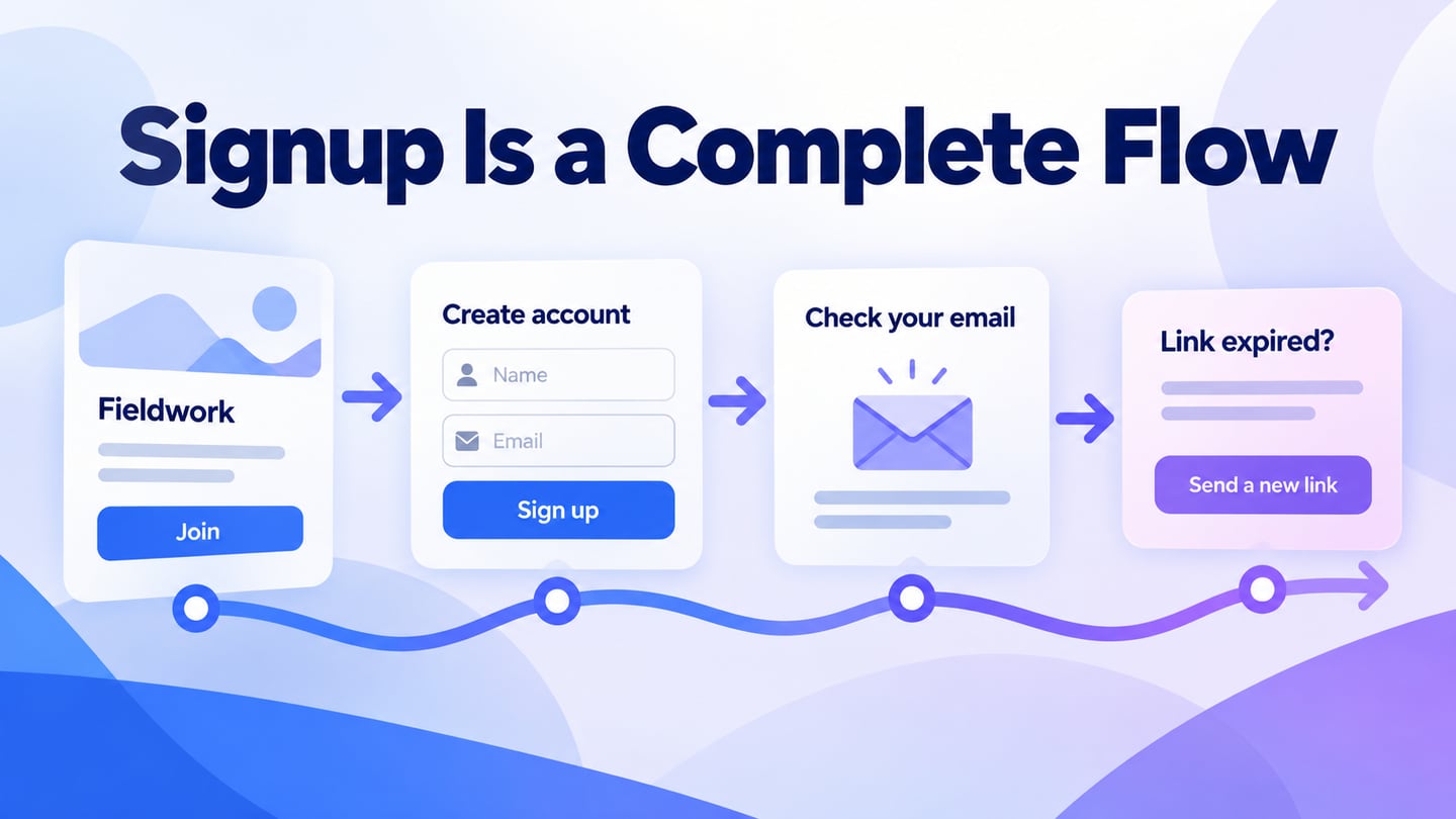
Create screens for the initial form, invalid input, submission in progress, verification required and an expired or unsuccessful verification link.
Review both a wide and a narrow layout. Long email addresses, validation messages and translated labels should not push the primary action outside the form or overlap another field.
Use persistent form labels and explain formatting requirements before the visitor submits. A placeholder disappears during entry and should not be the only name for an input. Mark required and optional information consistently.
Keep the form readable when text is enlarged. Associate an error with the field it concerns and preserve appropriate entered values so correcting one mistake does not require starting over.
Connect the prototype states and ask a reviewer to complete the task using only the information shown. Treat any share or preview mechanism as a way to review the design, not as a production signup system.
Coordinate authentication behavior with the OWASP authentication guidance and the implementation team. Decisions about password handling, account enumeration, verification and session behavior require more than a visual design.
For an illustrative workspace invitation, the form states that Alex is joining the Fieldwork project as a Viewer. It asks for a name and work email, preserves the invited role and explains the email-verification step. After submission, the next screen says where the verification message was sent and offers a way to correct the address.
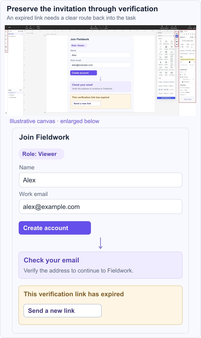
Test an expired verification link. The recovery screen should explain the problem and offer to send a new link without implying that the account is already ready to use. Repeated requests need a clear status; the interface should not invite rapid clicks that produce an uncertain result. The W3C form-notification guidance helps specify how success and error feedback will be presented.
Also test someone who already has an account. Provide a descriptive route to the login form and preserve the invitation context. Do not force the person to create another account because the two flows were designed separately.
Six signup patterns to evaluate
The following signup patterns address different registration tasks. Evaluate the information and decisions each task requires; these concepts are not verified current products or page-building services.
1. A focused mobile account form
A mobile form should present the account purpose, the essential inputs and the next action in a compact, readable order. Compact does not mean removing labels or shrinking tap targets.
Test the on-screen keyboard, autofill and the path from one field to the next. The submit action should remain reachable without covering a required field or its error message.
If more than one language is supported, check the actual translated labels and messages. Do not assume that a form is multilingual merely because its layout can be reused.
2. Financial-service onboarding
An account flow for a financial service may require information or verification beyond a simple email signup. The interface should explain each requirement and avoid promising immediate access before those steps are complete.
Divide a longer process into meaningful stages when that helps the user understand progress. Show what is completed, what remains and which information can be saved for later, if that behavior is actually supported.
Sensitive data collection, verification and regulatory requirements must be defined with the responsible specialists. A prototype can review comprehension and sequence; it cannot establish compliance or guarantee security.
3. Invitation-led registration
An invitation should explain the workspace or group being joined and the role offered. Keep that context visible while the person creates or accesses an account.
Test a link that has expired, was already used or belongs to a different email address. Explain the next step without exposing unnecessary account information. Do not describe an invitation interface as unbreakable or immune to abuse.
4. A keyboard-friendly signup form
The tab order should follow the visible task, with a clear focus indicator and understandable controls. Test moving through the form, opening any help and submitting an error without a pointer.
Use native input purposes and appropriate autocomplete behavior in implementation. A prototype can show the intended sequence, while the implemented page needs its own keyboard and assistive-technology checks.
If the form contains a terms agreement, distinguish agreeing to required terms from optional marketing preferences. Explain the choice without bundling unrelated consent into one vague checkbox.
5. Media-led registration
A media-sharing or storage account should explain what the initial account provides and when a plan or storage decision will be required. Do not imply unlimited storage unless it is a verified current term.
Imagery can explain the product context, but it should not obscure labels, contrast or errors. Avoid placing the only explanation of a restriction inside a promotional image.
Keep any amount, trial condition or limit consistent with the pricing page. A visitor should not discover a materially different commitment after completing the form.
6. Retail account creation
A retail account can support order history or saved preferences, but the page should not claim that registration is necessary for every shopping task. State the actual benefit and keep optional fields proportionate.
After signup, explain what the person can do next and where relevant account preferences can be changed. If verification or another step is required, say so explicitly instead of showing an unconditional success message.
Before release, test invalid and existing email addresses, password feedback where applicable, a slow request, a repeated submit, an expired verification link and return to the original task. Keep entered data and invitation context only as appropriate, and have the implementation team verify the security behavior. A complete signup design includes recovery, not just the ideal first submission.