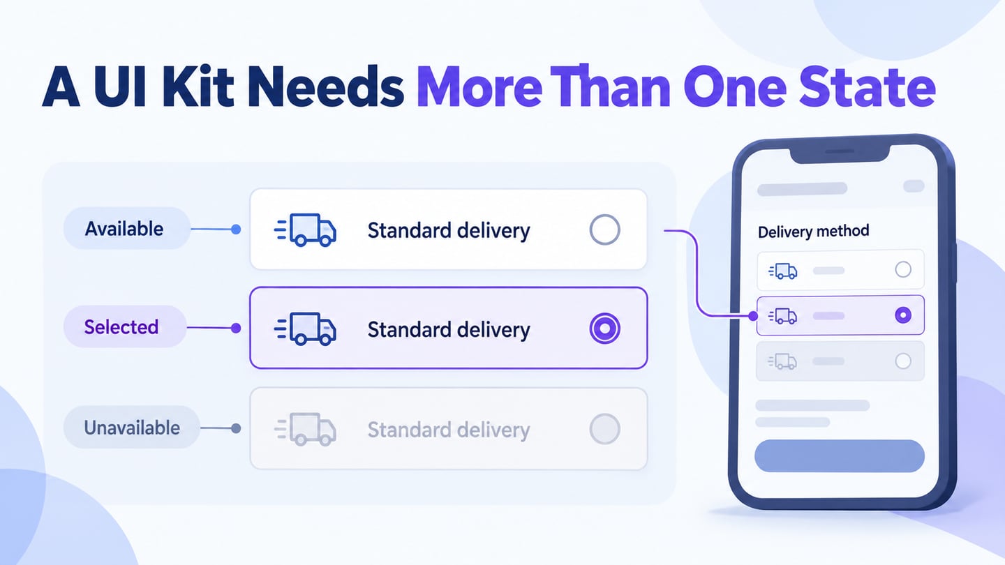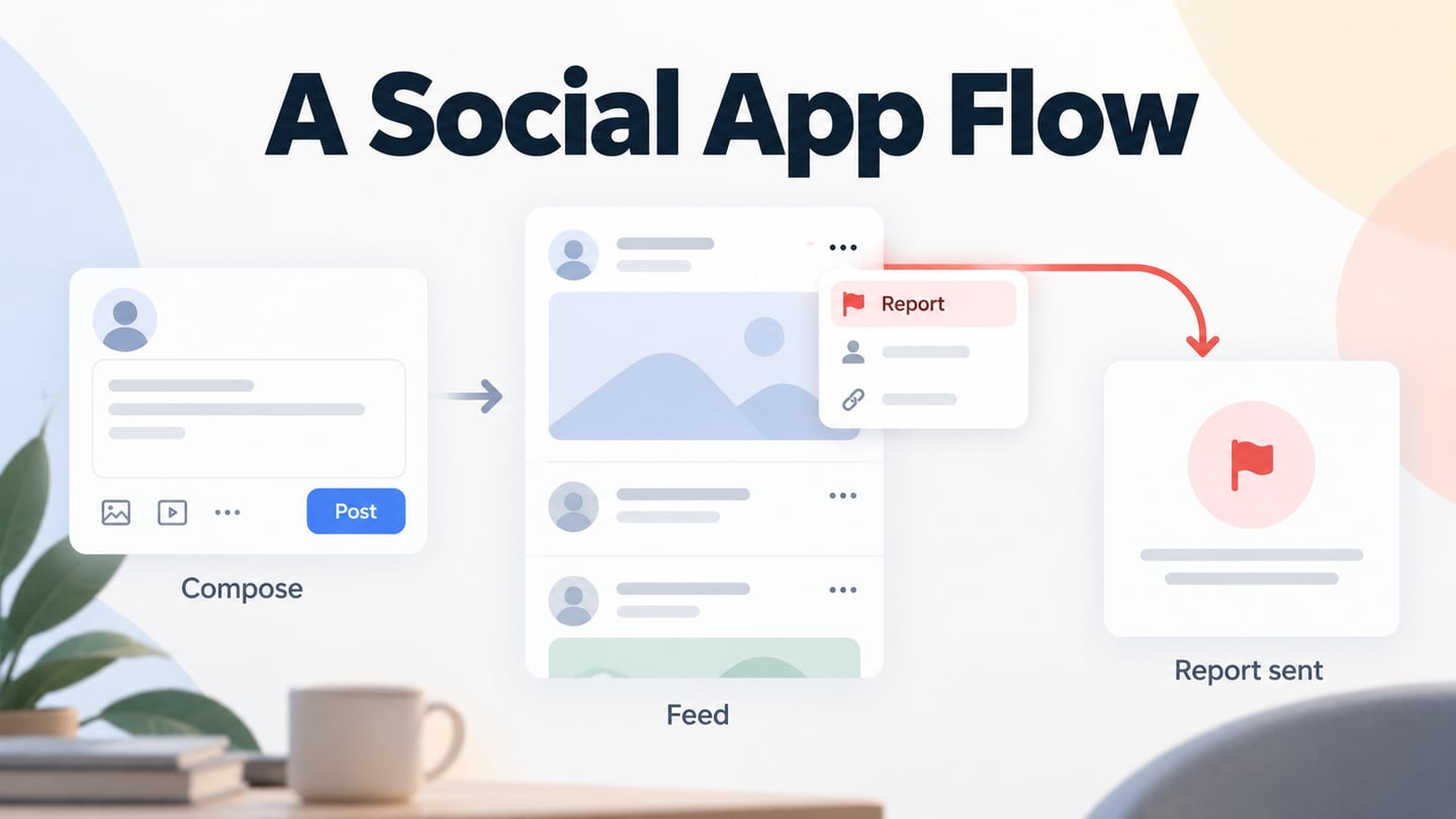
Some mobile apps are easier to understand than others because their controls, hierarchy, and feedback work together. App UI design covers those visible and interactive elements. This guide explains the relationship with UX, compares tool approaches, and shows how to use an app interface design workspace to review a realistic form rather than only a polished default screen.
What is App UI Design?
UI stands for user interface: the controls and information through which a person interacts with an application. In a mobile app, this includes layout, text, buttons, input fields, navigation, and feedback. Touch, voice, keyboard, and assistive technologies may all be relevant depending on the application.
Design the interface for the actual content and input methods in scope. Check how it adapts to smaller screens, longer labels, and larger text. Scaling an entire design down is not always enough; the order and arrangement of elements may need to change.
What is App UX Design?
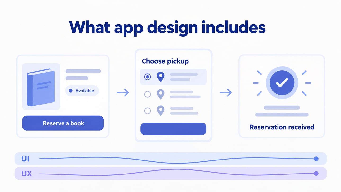
UX, or user experience, considers how the complete experience supports a person’s goal. It includes the task sequence, the information available at each step, and the outcome, as well as the interface’s usability.
A clear UI contributes to UX, but it cannot compensate for an incorrect result, missing service, or confusing policy. Design and review the successful path alongside loading, empty, and failure states.
Revisit the design when user needs or the product change. Compare concrete tasks before and after a revision instead of assuming a new visual style automatically improves the experience.
Five Tool Approaches for Mobile App UI Work
These options serve different purposes. Choose by the artifact and interaction you need to review, and check current plans and platform requirements. Screenshots retained from the original tutorial show earlier interfaces.
1. Mockitt
Mockitt supports screen layout, components, interactive prototypes, and collaborative review. It is useful when a team needs to move from an editable interface to a shared walkthrough of the proposed task.

- Reuse interface components and icons where they clarify the task.
- Adapt a suitable template instead of treating its sample content as a finished design.
- Add screen interactions and states to explain the effect of an action.
- Check the current import, export, and handoff options against the files the team actually needs.
Pros
- Share a preview with appropriate access permissions.
- Review the interface and its interactions in Preview.
- Browser-based editing supports the workflow; account and plan limits still apply.
2. ProtoPie
ProtoPie focuses on detailed interaction prototypes. It can suit a review involving richer behavior or device interactions after the base interface has been designed.
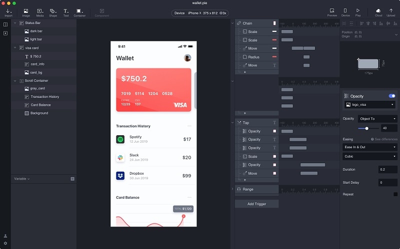
- Use the vendor’s supported authoring and preview setup; do not assume the full editor runs in any browser.
- Official plugins connect with design tools such as Figma and Sketch.
- Check current plan and preview requirements for the behavior you want to demonstrate.
Pros
- Detailed interaction logic can make a prototype more representative of the intended experience.
Cons
- Advanced behavior takes time to configure and maintain; verify current limits rather than relying on an old trial duration.
3. Framer
Framer is oriented toward designing and publishing websites. Consider it for an app’s marketing site or a responsive web experience, rather than assuming it delivers a native iOS or Android application.
- Website layout and responsive presentation are relevant strengths for this use case.
- Use motion where it helps explain a web interaction.
- Confirm the publishing, CMS, and site requirements of the project.
- Keep the website deliverable separate from native-app implementation.
Pros
- Useful when the deliverable is a published website.
- Can support the app’s public-facing landing page.
Cons
- A website builder is not a substitute for native-device behavior testing.
4. Figma
Figma combines interface design and prototyping. Teams can use components and connected frames to review screen flows, including more detailed states and conditional behavior.
- Build and reuse components to keep repeated controls consistent.
- Connect frames and inspect the resulting flow in the prototype viewer.
- Choose the fidelity needed for the review instead of implementing every possible state at once.
Pros
- Interface components and prototype interactions can stay in the same design workflow.
- Shared design work can support review and handoff.
Cons
- Check the plan features and handoff needs of the whole team.
5. UXPin
UXPin supports advanced prototypes and code-backed components. It can fit teams that need to review realistic states or align designs with an existing component library.
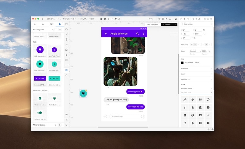
- Reusable component libraries can make repeated interface behavior more consistent.
- Variables and conditional interactions support detailed prototype behavior.
- Evaluate the collaboration and developer workflow with a representative task.
Pros
- Design-system and component workflows are part of the product’s focus.
- Code-backed components can help connect design and implementation discussions.
Cons
- A more involved component setup may be unnecessary for a simple screen-flow review.
- Verify the current plan rather than assuming a fixed free or trial policy.
A Step-by-Step Guide for Making App UI and UX Designs
The following Mockitt workflow covers projects, widgets, links, notes, preview, and sharing. Apply it to one task so each design choice can be reviewed in context.
Step 1: Enter Project Details
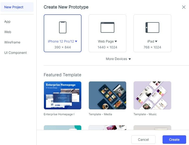
Create a prototype project at a mobile size representative of your audience.
Choose a blank screen or suitable template and replace its sample content with your actual task.
Step 2: Work on the Mobile App UI Design
Start with the controls and information the task requires. Establish a clear title, primary action, and consistent spacing before adding decorative detail.
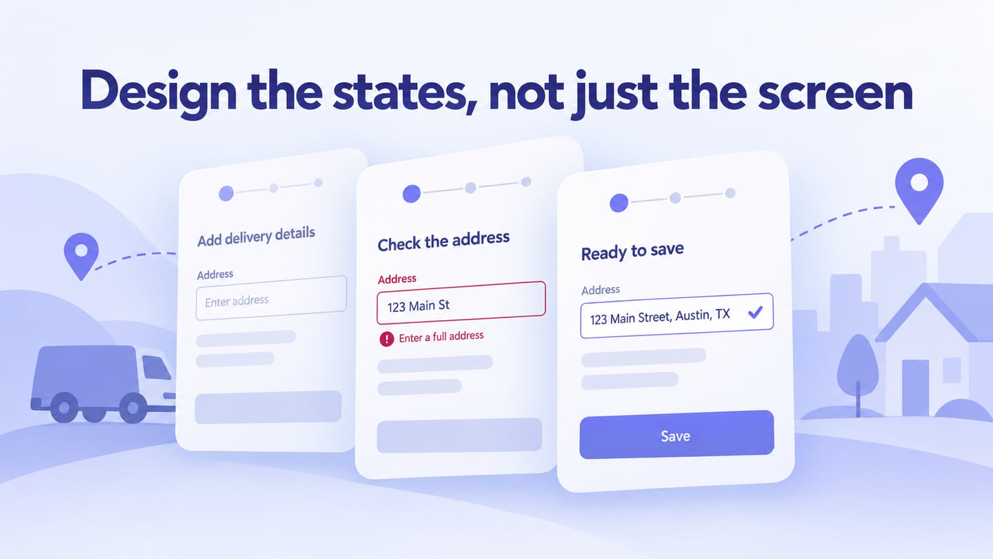
Consider an app that lets a customer add a delivery address. Prepare an empty form, a form with a missing postal code, and a corrected form ready to save. If validation fails, preserve the street and city the person already entered, identify the field needing attention, and explain how to fix it.
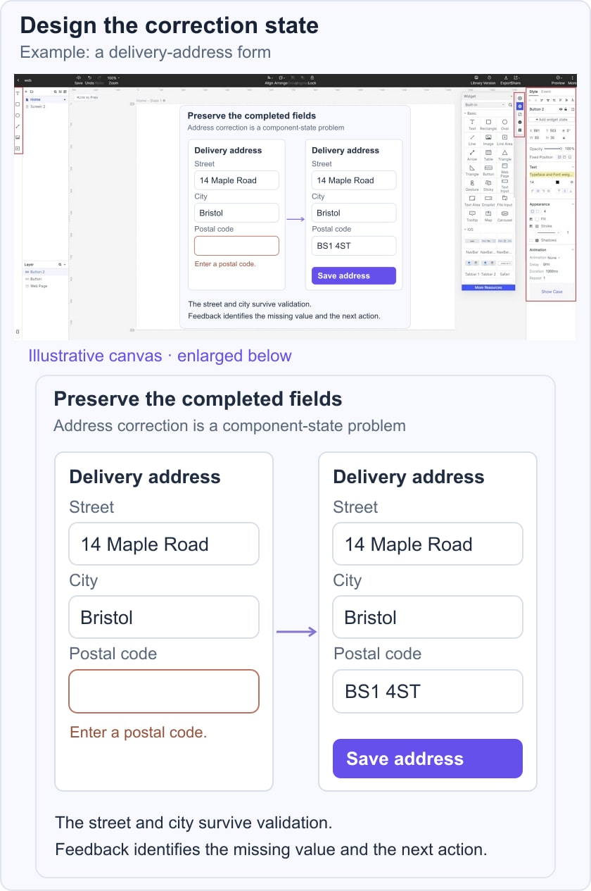
- Add or edit widgets
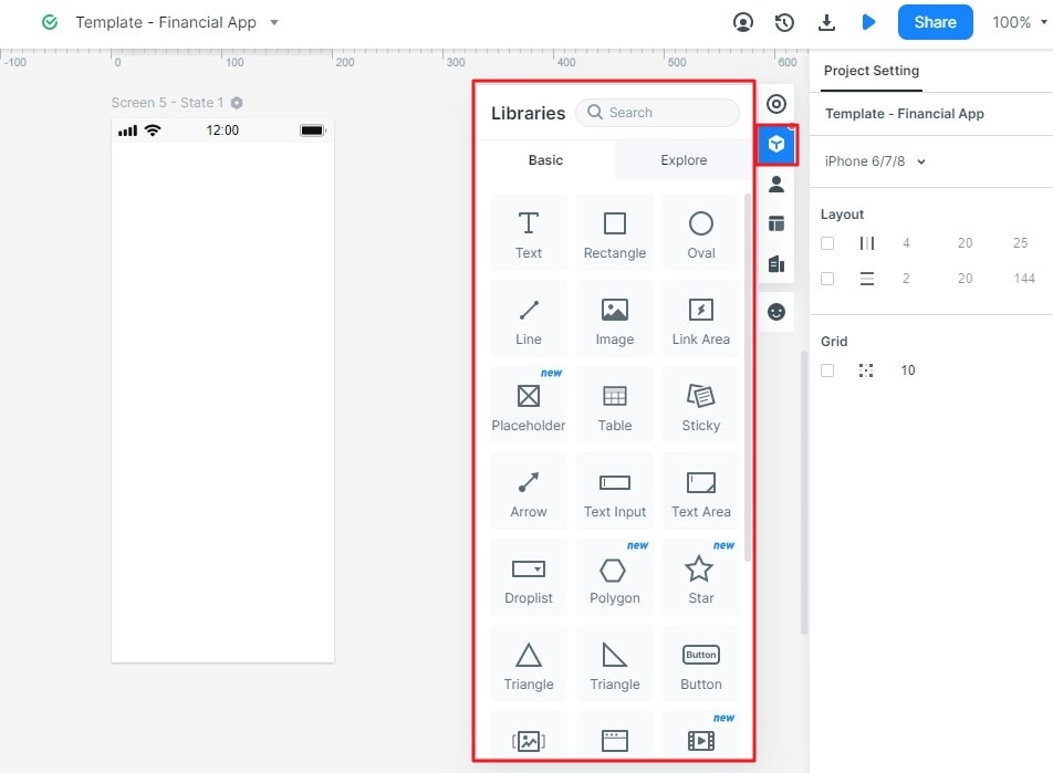
There are all kinds of widgets and icons that you can find on the sidebar of the interface. You can just drag and drop any icon or widget from here to your canvas.
Edit the selected element’s text, size, color, and other properties. Review these values as a consistent set across the form, not as isolated decorations.
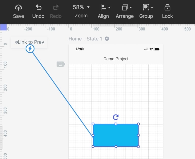
- Link different screens
Connect the save control to an error or confirmation state, then add the correction path. A prototype state can represent the rule for review; it does not implement live address validation.
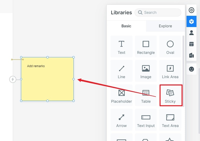
- Add notes to your design
Add notes for reviewers and developers explaining validation, required fields, and behavior that is only simulated. Keep those annotations separate from end-user copy.
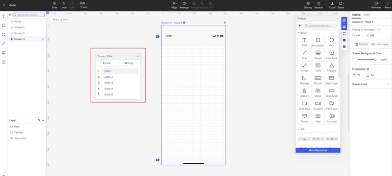
- Insert different dynamic elements
Use states or dynamic elements when they help explain feedback. An error message and preserved input are more important here than an elaborate transition.
Step 3: Preview your App UI Design
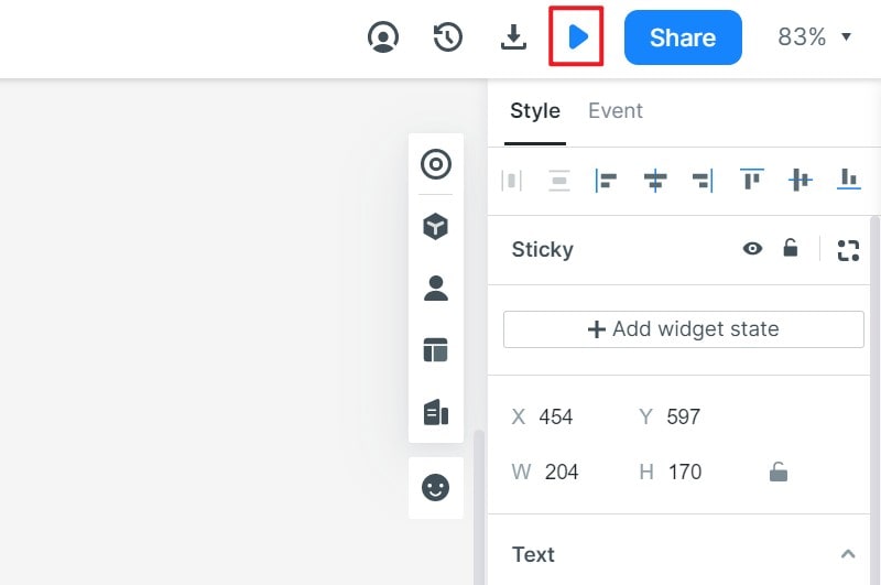
Open Preview and ask someone to save an address with a missing postal code. Observe whether they understand the message and can recover without re-entering the other fields. Consult form design principles for related input and feedback decisions.
Step 4: Export and Share your Project
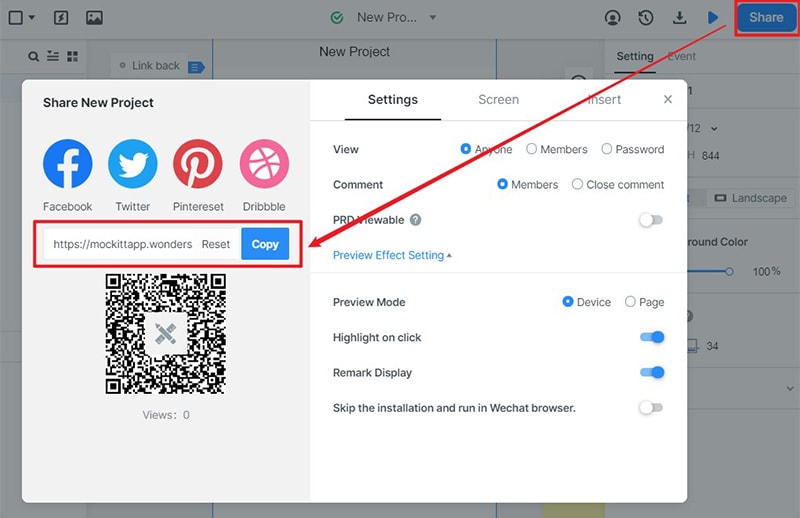
Share the preview with the team and check its access settings. Provide the relevant design files, assets, and notes for implementation; use the current project link rather than one visible in an archived screenshot.
A strong mobile UI makes both the next action and its result understandable. Review component states with realistic content, then refine the layout using the mobile UI design process.