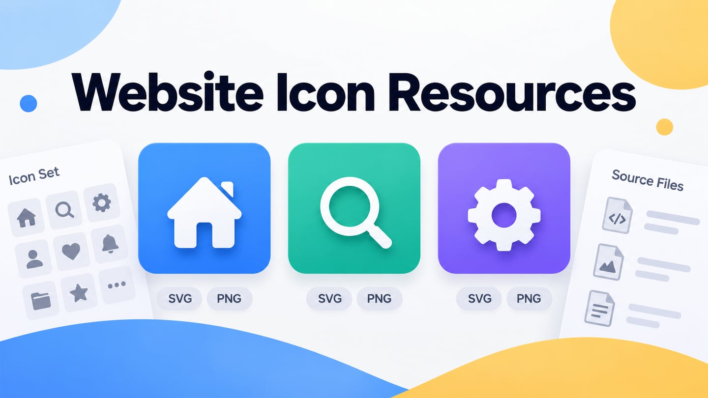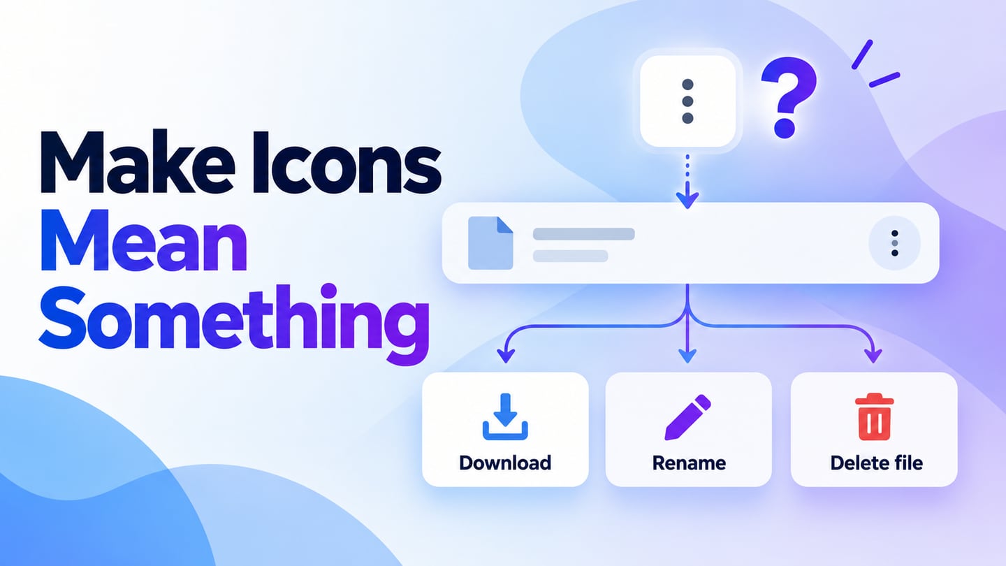
Icons turn a concept into a compact visual cue, but a recognizable shape is not always an understandable action. Ant Design icons can provide a consistent starting point. In a Mockitt interface prototype, review the symbol with its label, surrounding content and state before deciding that it can stand alone.
What is Ant Design?
Ant Design combines design guidance with reusable interface components. Consistent icons help related screens feel coherent, especially in enterprise applications with many repeated controls.
A shared icon set reduces accidental variation, but it does not remove the need to agree on meaning. A tray-and-arrow icon might mean download, import or archive in different products. Select the action first, then choose a symbol that supports it.
Where a shared icon set helps
- Repeated navigation and actions across related screens.
- Consistent stroke, size and visual weight within a control group.
- Design and development handoff using agreed symbol names.
- State changes that preserve the meaning of the original action.
- A documented rule for when visible text is needed.
How designers and developers use Ant Design icons
The Ant Design icon reference provides the implementation names and variants. Keep that reference separate from a design asset: the production icon must still have the right accessible name or decorative treatment. Do not assume that importing an SVG gives an icon-only button a useful name.
Design Principle
The useful principles are accuracy, simplicity, visual rhythm and an appropriate tone. Apply them at the size and context in which people will actually see the icon.
- Accuracy: choose a shape whose meaning matches the action and check its appearance at the intended display size.
- Simplicity: remove detail that does not help recognition, especially at small sizes.
- Rhythm: keep visual weight and alignment consistent across the set.
- Tone: use expressive detail only where it supports the product context.
Design Specifications
The earlier Ant Design icon specification illustrated a 1024-by-1024 construction grid. That is a source-drawing convention, not the size at which an interface icon should be displayed.
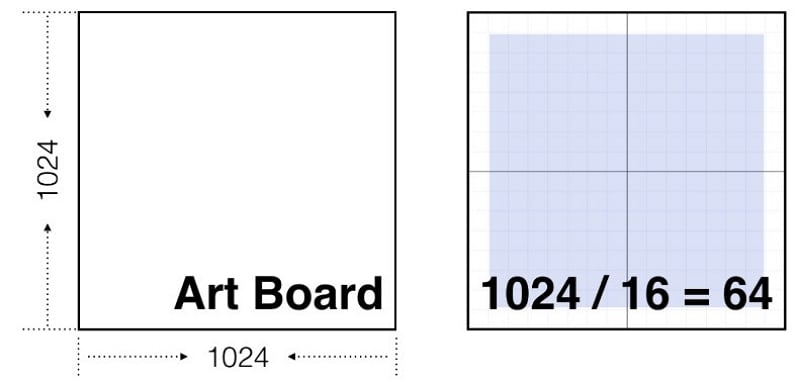
The retained construction diagram shows space around the shape to preserve balance and avoid clipping. Judge the final result at the actual interface size as well; an icon can be mathematically centered but appear optically uneven beside another shape.
Layering
Organize source layers and names so another designer or developer can identify the correct variant. Keep decorative elements distinct from the symbol that communicates the action.
Contours and Templates
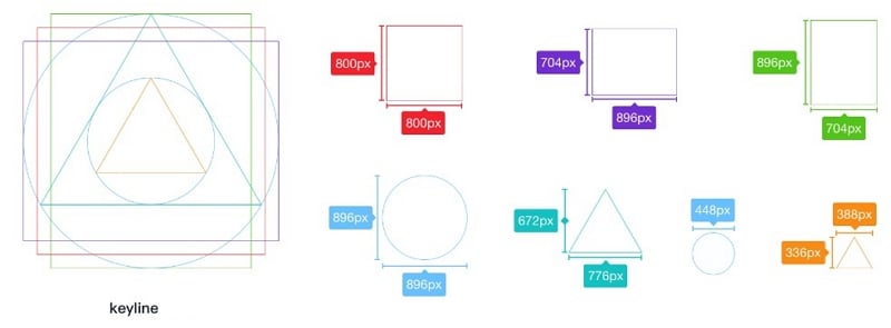
Construction guides help keep related shapes consistent. They do not replace a recognition check: show the icon in its control, use the actual label and inspect how it looks in active, inactive and focused states.
How to prototype icon meaning
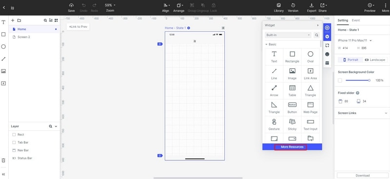
Mockitt can help place the chosen icons into a realistic screen and review the resulting flow. Use an available resource or an appropriately licensed asset, then pair it with the action it represents. Keep decorative icons separate from interactive controls.

What to review in the prototype
- Meaning that matches the surrounding task.
- A preview that reviewers can inspect together.
- Clear default, active and unavailable states.
- Consistent size, alignment, spacing and contrast.
- Enough separation between adjacent controls.
- A coherent set of shapes instead of unrelated icon styles.
- Appropriately licensed assets with descriptive names.
- Visible text where the symbol is ambiguous.
- A documented action for each interactive control.
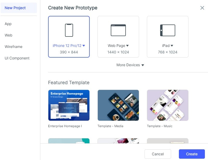
The earlier screenshots show an Ant icon resource workflow. Availability and library names can change, so do not make the design depend on a specific old template. The important outcome is an understandable control with a clear action.
1. Create a file-library screen in Mockitt. Decide which actions are visible in the row and which belong in a secondary menu.
2. Choose a consistent icon style for download, rename and delete. Keep delete visually separate from the ordinary actions because its consequence differs.
3. Add labels to the actions during review. Remove a visible label only when the icon remains understandable in context and the implemented control will retain an accessible name.
In the file-library example, “Download” keeps a visible arrow icon and label, “Rename” sits in the row menu, and “Delete file” opens a confirmation with the filename. A star marks a saved item but does not silently change into a delete action when selected. This keeps the symbol, label and consequence aligned.
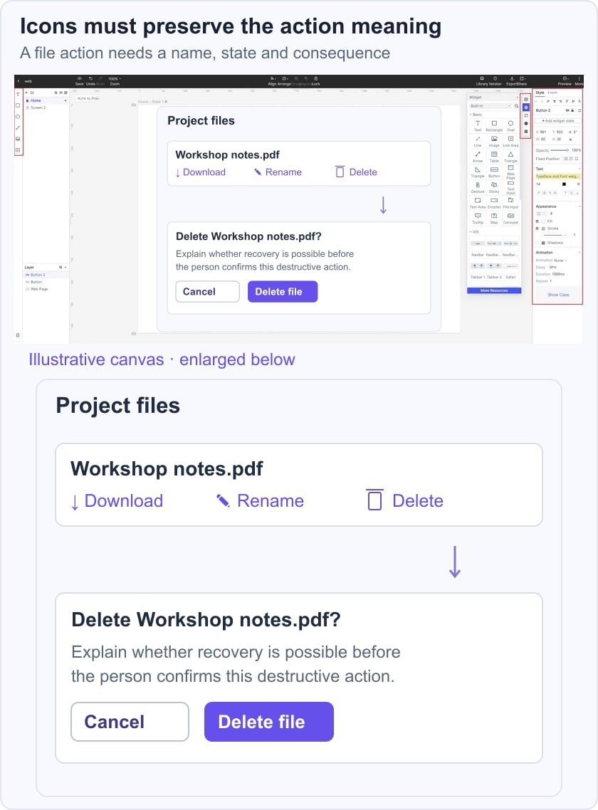
Review the surrounding button behavior and the feedback after an action. An icon is only one part of that complete interaction.
4. Show the same row at its intended density and at a narrower width. Check whether labels truncate, controls collide or the symbol becomes difficult to recognize.
5. Preview the control destinations and annotate keyboard focus expectations. A tooltip may clarify a symbol, but should not be the only place that a necessary action name exists.
6. Keep icon variant names and usage rules with the design handoff. Developers should use the appropriate current package and semantics for the actual implementation.
7. Review unavailable and selected states. A dim icon alone may not explain why an action is unavailable; provide the relevant reason in the surrounding interface.
8. Test the implemented interface with keyboard navigation and assistive technology. A visual preview can reveal ambiguity, but cannot validate the final accessible name or focus behavior.