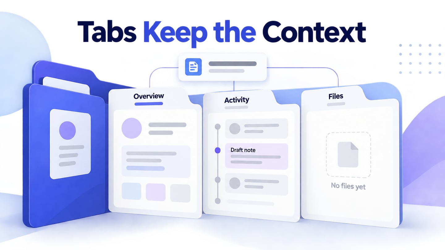
Ant Design tabs switch between related views within the same context. A service record might use Overview, Activity and Files without changing which record the user is viewing. Use Mockitt to prototype tab interactions before implementation so reviewers can check labels, the active panel and what happens to unfinished work.
Ant Design provides a Tabs component in its React library. A design asset represents its appearance; the implemented component and application code determine focus behavior, loading and whether panel content is preserved. Keep those responsibilities visible in the handoff.
Choose tabs when the sections are peers. Use a step-by-step flow for a required sequence, and ordinary navigation links for destinations that should behave as separate pages.
What is Ant design?
Ant Design supplies reusable components and design guidance for interface work. The relevant decision here is how to divide related information so that users can predict what each tab contains.
Tabs need more than a selected color. Specify a clear label, a visible active state, a focus treatment and the content shown after activation. A user should not have to inspect every panel to understand the structure.
There are several features you can get with ant design. Let us have a look at them:
- Consistent interaction patterns for related views within a web application.
- A React Tabs component for implementation, separate from a static UI kit.
- Typed component properties for developers working with the library.
- Documentation that helps a team agree on behavior before coding.
- Internationalization support, with translated labels still requiring width and wrapping checks.
- Theme controls that should preserve the difference between active, inactive and focused tabs.
Use the component’s documentation as a reference, then specify the behavior your particular record or workspace needs.
When should you use tabs?
The Ant Design Tabs documentation provides the implementation reference. In a prototype, the main question is whether the panel labels and content form a coherent set. “Overview,” “Activity” and “Files” are understandable peers for one service record; “Start,” “Confirm” and “Finish” suggest a sequence instead.
Although there are several factors you need to keep in your mind while working on tabs, but here are some of the most important ones:
- Keep tab placement and active-state styling consistent across related screens.
- Use labels drawn from the information users are looking for. Competitor layouts can suggest options, but cannot establish what your users understand.
- Show the active tab with more than a subtle color change. Keep text readable and include a visible keyboard focus state in the implementation requirements.
- Decide how loading works before choosing automatic activation. If each tab triggers a slow request, moving keyboard focus should not repeatedly start disruptive loads.
How to prototype Ant Design tabs
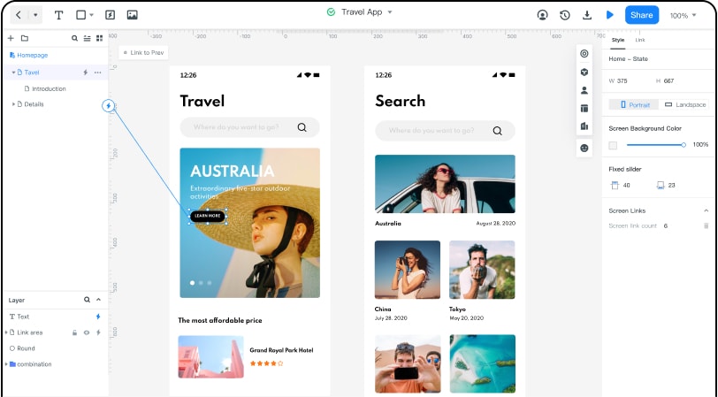
Mockitt can represent the panel layouts and transitions needed for a tabbed view. Build the key screens or states, then review the content change with a teammate. This is a visual and interaction specification, not proof that keyboard navigation has been implemented.
Consider service record SR-104. Overview contains the issue and owner, Activity contains recorded events, and Files contains attachments. When Files is empty, show “No files yet” with an upload action rather than a blank panel. If the user leaves an unfinished note in Activity, define whether that draft stays when they open Overview.
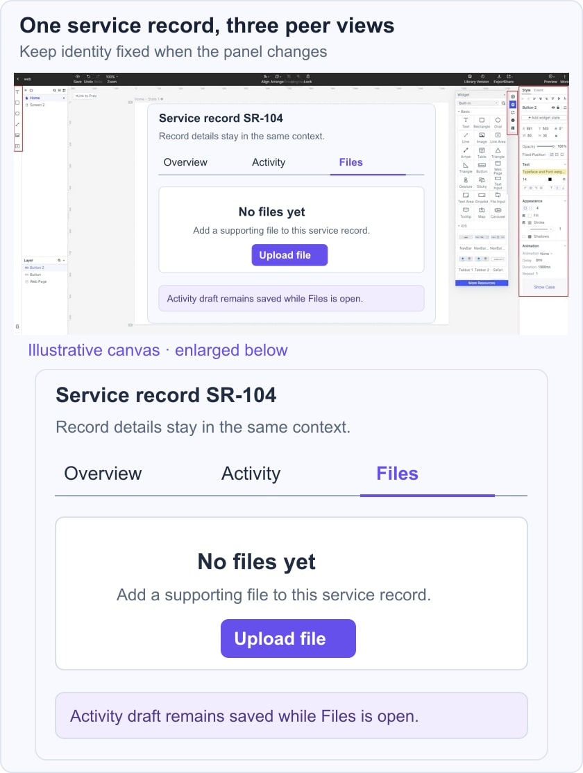
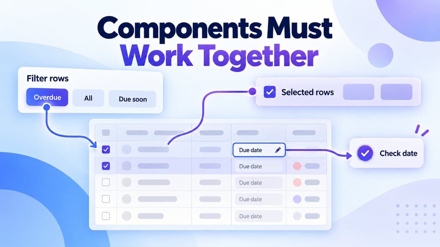
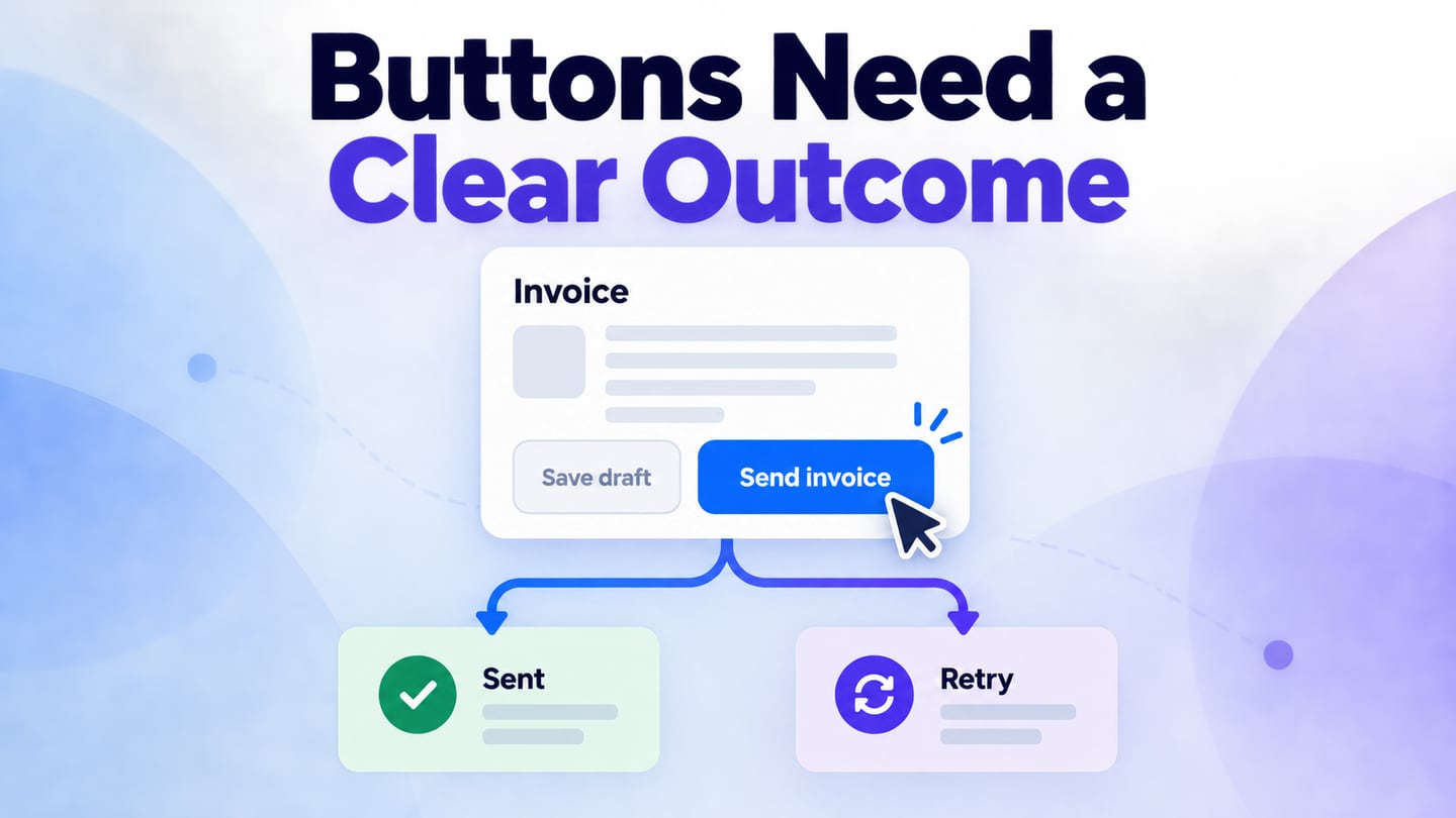
The panels may include a table of records or an action that produces a notification. Those components need their own states; tabs organize access to them without replacing their behavior.
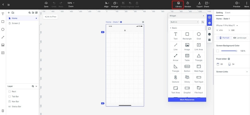
1. Create the service-record screen and the three peer labels. The earlier library screenshots are retained as historical examples; use whichever current assets are available, or draw a simple tab strip with text and a selection indicator.
2. Build each panel with realistic content. Show the same record identifier in every state so the user understands that only the view has changed. Include a populated panel, an empty Files panel and a panel that is still loading.
3. Connect the tab activations, preview the flow and check that the selected label matches the visible content. Record the intended behavior for drafts, scroll position and return navigation. In development, verify that focus and selection are distinct and that each tab is associated with its panel.
The WAI-ARIA tabs pattern describes arrow-key navigation and activation choices. Include that reference in the handoff and test the actual component with a keyboard; a clickable preview alone cannot validate screen-reader or keyboard behavior.
Review the design at a narrow width as well. Long labels should remain understandable, the active tab should remain discoverable, and a person should be able to reach all panels without relying on a hover-only interaction. If the set becomes too large, revisit the information grouping instead of continually adding tabs.