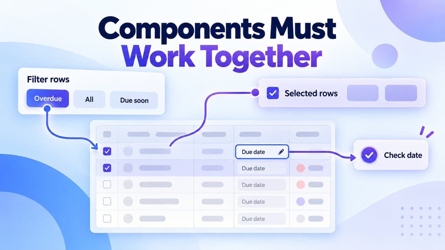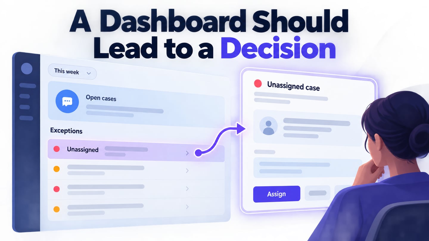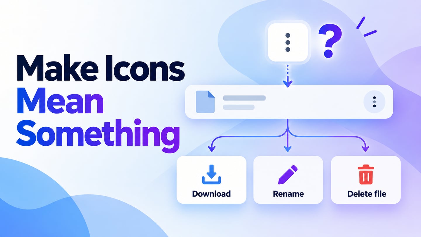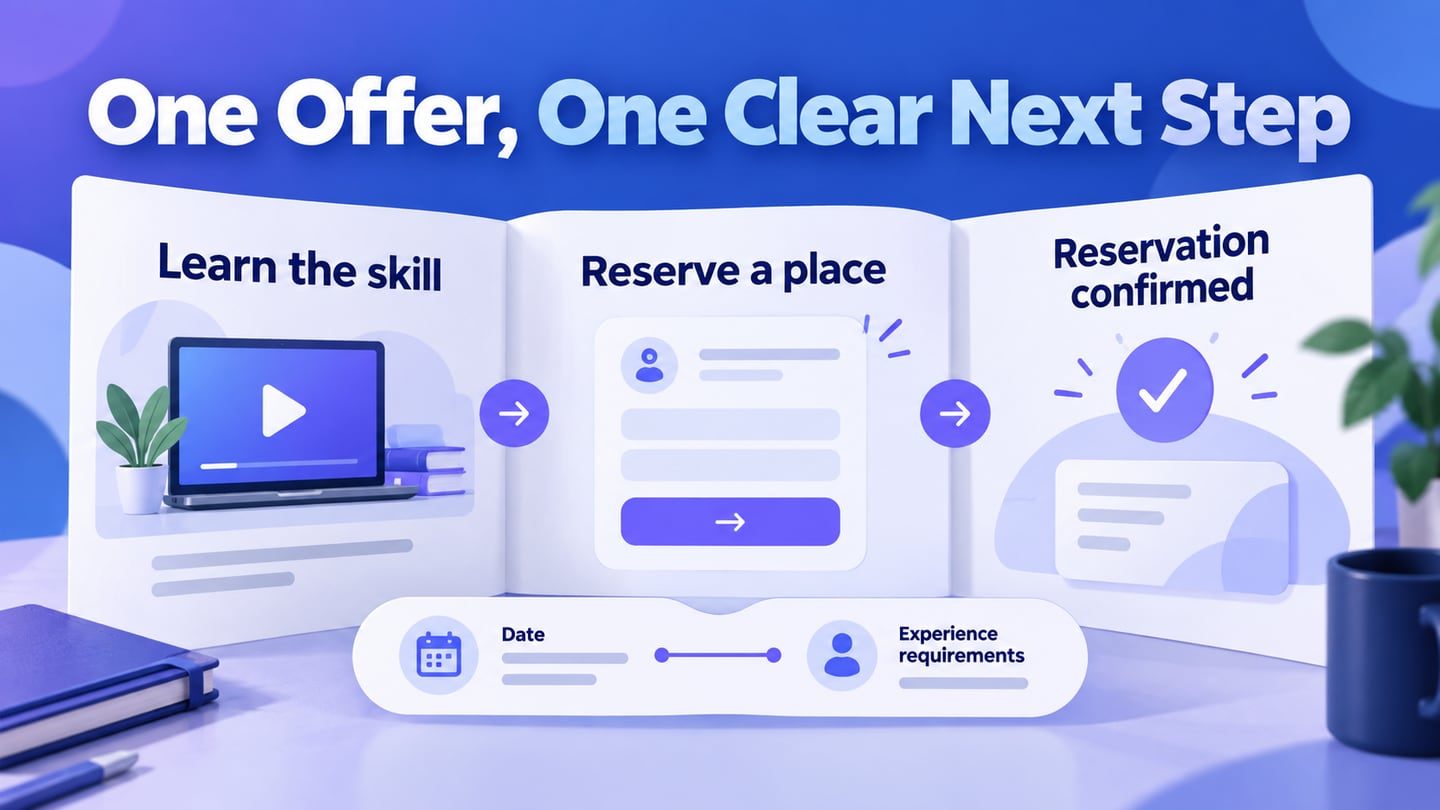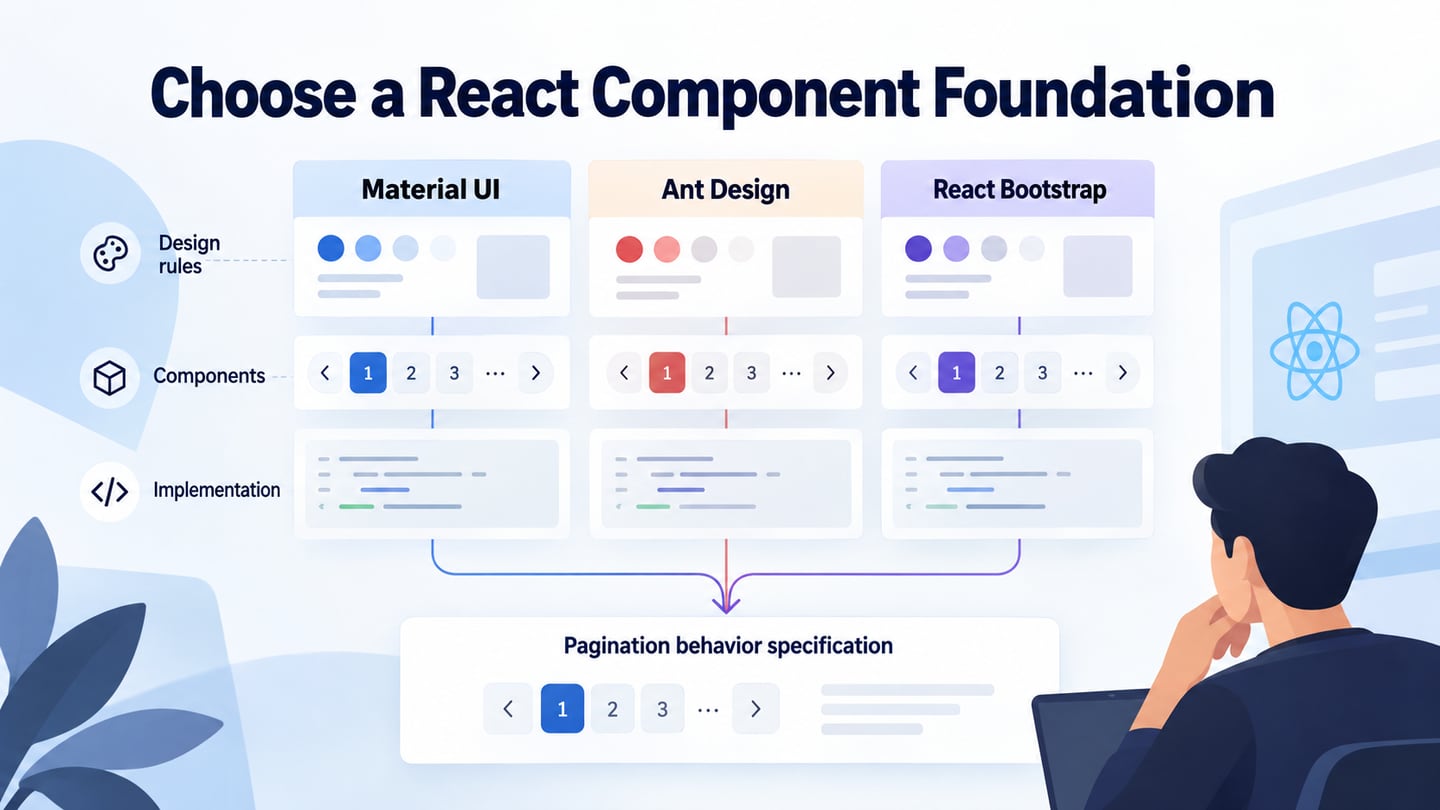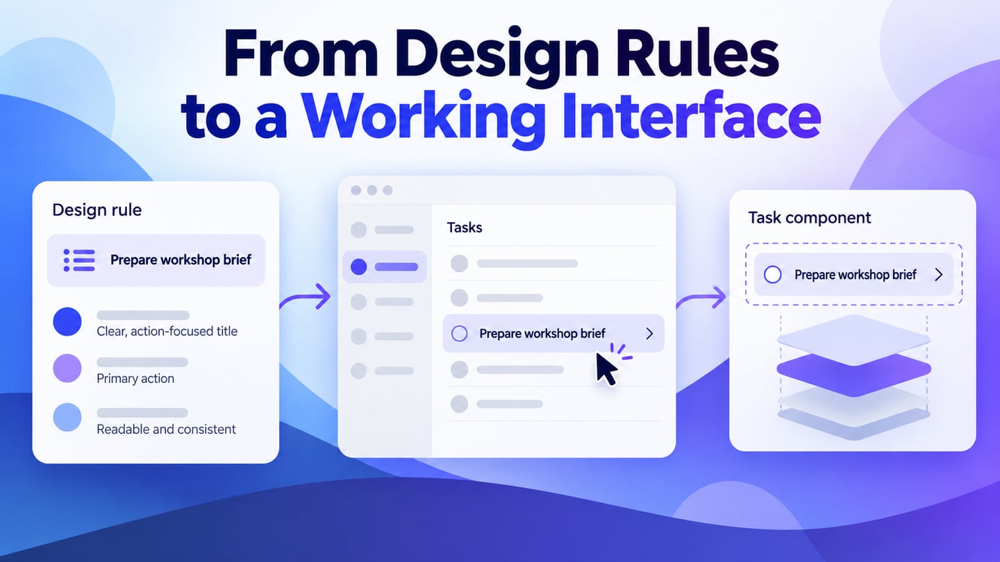
Component libraries help teams reuse familiar interface patterns, but they do not decide the product’s behavior. Ant Design combines a design language with a React UI library. This guide explains where those parts fit and how a prototype can help clarify the interaction before developers connect it to real data.
For a small task-review application, use Mockitt to prototype the task flow and Ant Design documentation to guide implementation. The prototype helps review what people see and do; the React library supplies components in the application. Neither removes the need to specify states, validation and data handling.
What is Ant design
Ant Design for React is a component library supported by design guidance and resources. It is written in TypeScript. Use the current documentation for the version your project has installed; an older tutorial’s build tools and imports may no longer apply.
The React library should not be described as the same package for Angular or Vue. Related ecosystem projects can use the design language, but their installation, APIs and maintenance are separate. Choose the implementation that matches your application and verify its own documentation.
Key Features:
- An enterprise-class user interface designed for web applications.
- A set of quality React components out of the box.
- Written in TypeScript with predictable static types.
- A complete package of design resources and development tools.
- Support for internationalization for dozens of languages.
- Theme customization, with contrast and behavior still needing review.
How to use Ant design?
Consider a task-review screen with an item title, owner, status and a primary “Add task” action. The first design question is what happens when a task is created or completed. Agree on those states before choosing a framework, so the component implementation has a clear job to perform.
Install Ant Design
In an existing React project, check the supported React and runtime versions, then follow the installation instructions for the Ant Design release you intend to use. A package install makes the components available; it does not create a complete application.
The official Vite setup guide is a maintained starting point. Follow one version-consistent setup rather than combining code from different generations.
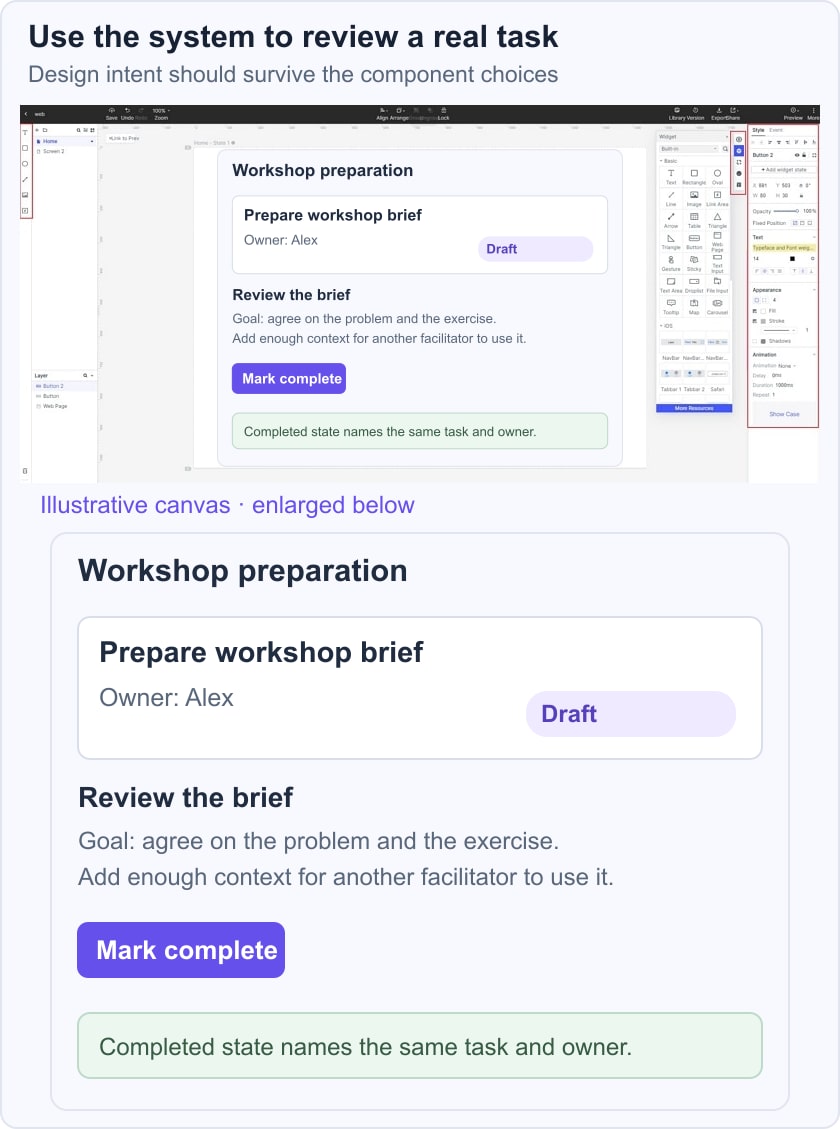
For the task-review example, define four visible states: an empty list with an add action, a form with a missing-title error, a populated list and a completed item. Use the same task title throughout the prototype so reviewers can follow the change. The application will also need to handle saving and retrieval failures; a successful animation does not prove that a record was stored.
The illustrative scene keeps “Prepare workshop brief” as the same record from draft to completion. Its owner and status stay visible, and the completion action changes the state rather than removing the task without explanation. That is the behavior to agree on before connecting a backend.
A minimal component example can demonstrate composition, but it is not a complete task app. The following fragment shows an input and an action; validation, persistence and loading/error states must be added by the application.
Illustrative React component
import { Button, Input, Space } from 'antd';

export default function TaskDraft() {
  return (
    <Space>
      <Input aria-label="Task title" placeholder="Task title" />
      <Button type="primary">Add task</Button>
    </Space>
  );
}
After setting up the application, test the component with actual keyboard input and realistic states. Do not call the interface complete just because it renders. The design and development work meet when labels, validation, focus and saved data behave as intended.
How to use Ant design components?
Ant Design provides components for common interface needs, including data entry, display, navigation and feedback. Select components by the task they support rather than by a fixed component count.
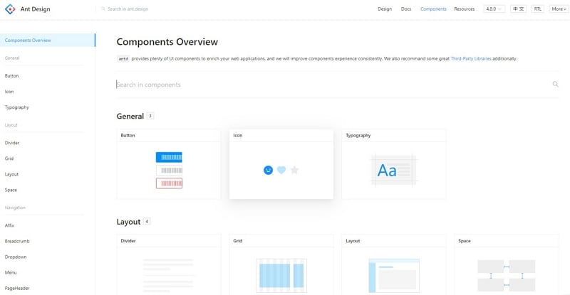
Popularity statistics are not a substitute for suitability. Review the component’s documented API, the version used in your project, accessibility behavior and how the team will maintain customizations.
A reusable design asset can help communicate intended appearance. For example, the button type and state guide explains action priority, while the table workflow guide covers sorting, selection and record context. Check the implementation separately.
Features
The design values are useful when translated into concrete interface decisions:
Natural: make the task and available actions understandable within the user’s context.
Use familiar labels and predictable sequences instead of requiring people to learn an arbitrary workflow.
Certainty: keep the same action and state understandable across related screens. Users should be able to predict what will happen before activating a control.
Meaning: make feedback explain the result of the action. For a completed task, show that the record changed and provide a way to understand or reverse the change if appropriate.
Growth: allow the interface to evolve without making its earlier patterns inconsistent. A new feature should fit the same task and state model.
The main React library and Ant Design Mobile are different parts of the ecosystem. Evaluate the appropriate package and interaction pattern for the devices you support; a desktop component set does not automatically establish a good mobile experience.
How to implement Ant design to your design work?
Mockitt can help the team discuss the task flow before implementation. Build the important screens and link the states so reviewers can see how an input, action and result fit together. Keep the prototype’s purpose clear: it is a design specification, not the production React application.
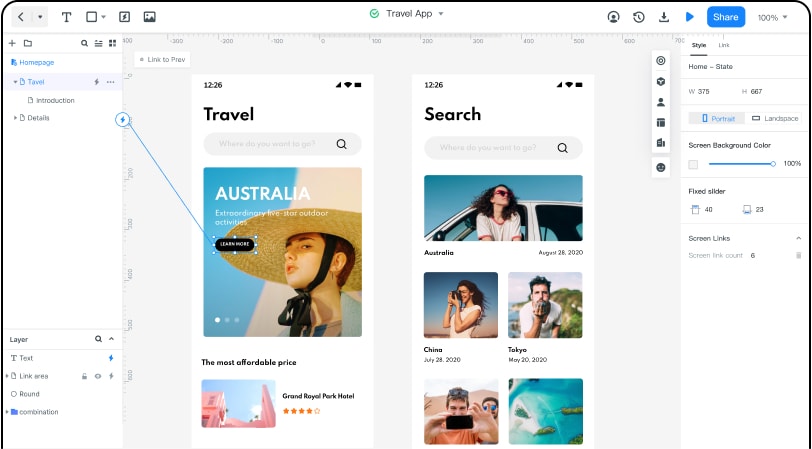
Share the prototype with the people who will review the task behavior, and check the access settings. A browser preview is useful for discussion, but editing and device support should be verified for the workspace in use.
Capture decisions from that review before development: the required fields, the intended result and the failure or recovery states. This prevents a polished screen from hiding an unresolved interaction.
Review the task, not just the screen
Ask a reviewer to add a task, correct an empty title and mark the task complete. Watch for ambiguity in labels or unexpected loss of context. These are design questions that a visual walkthrough can help reveal.
Record what the prototype does not model, such as concurrent edits or server validation. The implementation team needs those boundaries as well as the successful path.
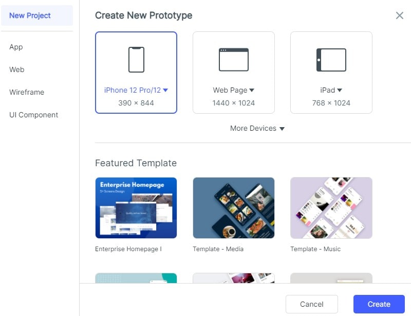
1. Create a task-review project. The retained screenshots illustrate earlier Mockitt interfaces; use the controls and resources available in the current workspace.
2. Select a suitable starting asset or build the list and form with basic elements. Avoid depending on an old template name being present.
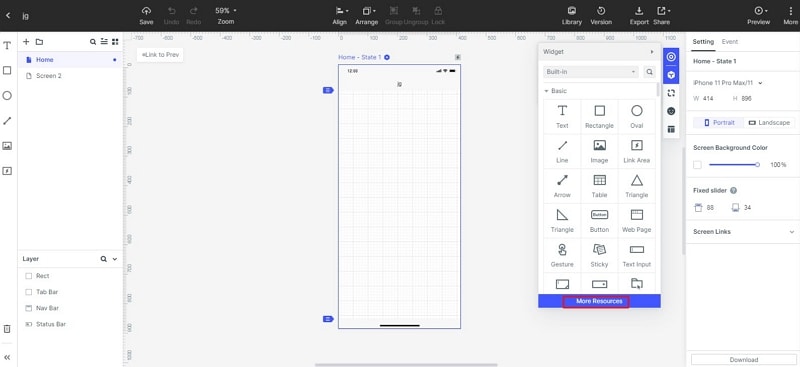
3. Keep repeated task rows and actions consistent. Name the intended component and state in the handoff where that helps developers.
4. Create the empty, invalid, populated and completed states and connect the corresponding actions.
5. Preview the sequence, review its labels and check that the same task remains identifiable throughout.
6. Hand off the agreed behavior with the relevant Ant Design references. Test the implemented application’s keyboard operation, data updates and recovery states before release.