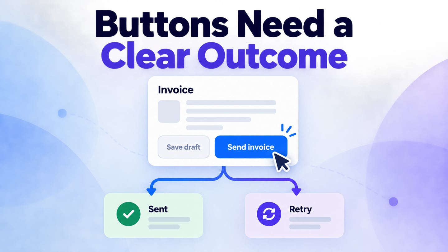
Ant Design buttons communicate which actions are available and which one matters most in a section. Before implementing them, you can use an interactive Mockitt prototype to review labels, action priority and the result of a click. This guide keeps the visual prototype separate from the React component that a developer will implement.
Ant Design includes a React component library as well as design guidance. A button asset can help a designer communicate appearance, but it does not automatically carry the component’s keyboard behavior, form semantics or application logic. Review those requirements explicitly when handing off the design.
What is Ant Design?
Ant Design is a design system with a React UI component library. Its components provide reusable interface building blocks, while the design guidance explains how to combine them into a coherent application.
For buttons, the useful starting point is the action: sending an invoice, canceling an edit or opening a help page. Select the visual treatment after you understand the consequence of that action and the choices beside it.
There are several features you can get with ant design. Let us have a look at them:
- Reusable UI patterns for web applications; a consistent appearance still needs task-specific labels.
- React components for implementation, distinct from static assets used in a design file.
- TypeScript definitions that help developers work with component properties.
- Documentation and design resources to support the handoff between design and development.
- Internationalization support for application interfaces; long translations still need layout testing.
- Theme customization that should preserve contrast, focus visibility and a recognizable action hierarchy.
These capabilities make the library a useful implementation reference. They do not determine the correct behavior for every business task; that decision belongs in the product specification.
What are Ant Design button types?
The official Button documentation describes several visual types and additional states. Treat the type as a signal of priority, not as the business logic itself. A primary button does not automatically submit the correct form or prevent duplicate requests.
- Primary: emphasize the main action in a section. For an invoice review panel, “Send invoice” is the main action; avoid giving every neighboring action the same emphasis.
- Default: use a standard bordered treatment for other available actions, such as saving a draft or canceling an edit.
- Dashed: commonly used for an add-more action, such as adding another item to an invoice.
- Text: use a quieter treatment for secondary actions where the surrounding context already makes the action clear.
- Link: use for navigation when a destination is the intended outcome. The implemented element must have semantics that match its behavior.
There are various properties that you can get with ant design buttons. Let us have a look at them:
- Danger identifies a consequential action, such as deleting a draft. Explain what will be removed and whether the action can be undone; color alone is not sufficient.
- Ghost treatment changes how the button sits on its background. Test the actual background and contrast rather than assuming transparency is always readable.
- Disabled represents an unavailable action. Explain the unmet requirement nearby when users need to know how to make it available.
- Loading indicates work in progress. The application must also handle repeated requests and the eventual success or failure; a spinner alone is not a complete transaction strategy.
How to prototype Ant Design button behavior
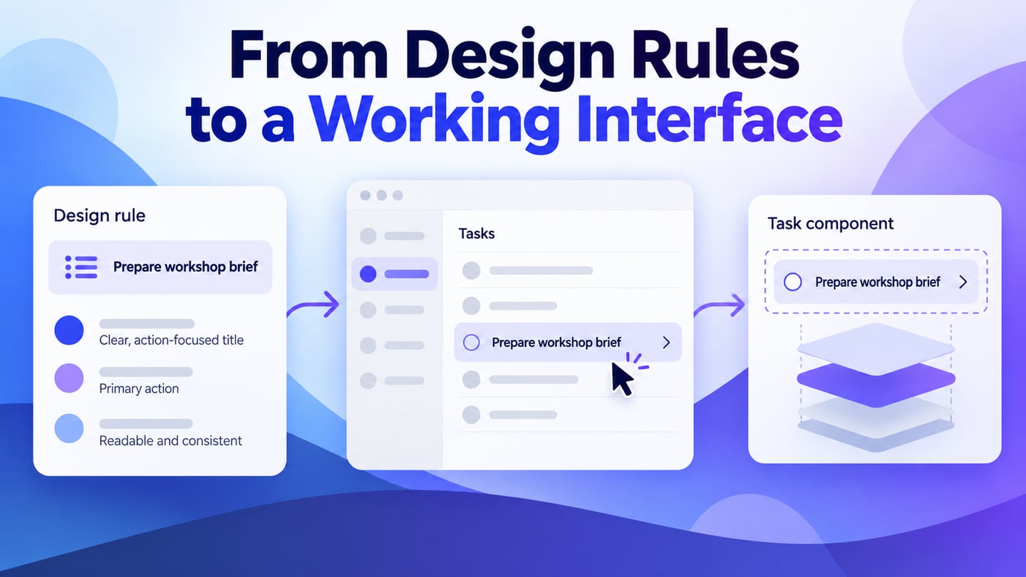
Mockitt can help you assemble the screen and review the sequence before development. Use available button assets or basic shapes and text to represent the chosen hierarchy, then link the important states. The prototype demonstrates the intended interaction; it does not run the Ant Design React library.
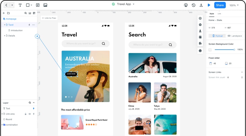
Reuse a component to keep repeated buttons consistent, but inspect its label, size and state in context. A library asset labeled “Save” may need to become “Send invoice” when the action commits something externally. That difference is important even if the visual style stays the same.
Ask reviewers to comment on the consequence and recovery path as well as appearance. Record whether a failure keeps the draft intact, where feedback appears and what the user can do next.
Use an invoice-send example to review the whole action. The draft has a recipient and total, “Send invoice” is primary, and “Save draft” is secondary. After sending, show a progress state, then either a sent confirmation or a recoverable error that retains the draft. Do not show “Sent” before the service has confirmed the outcome.
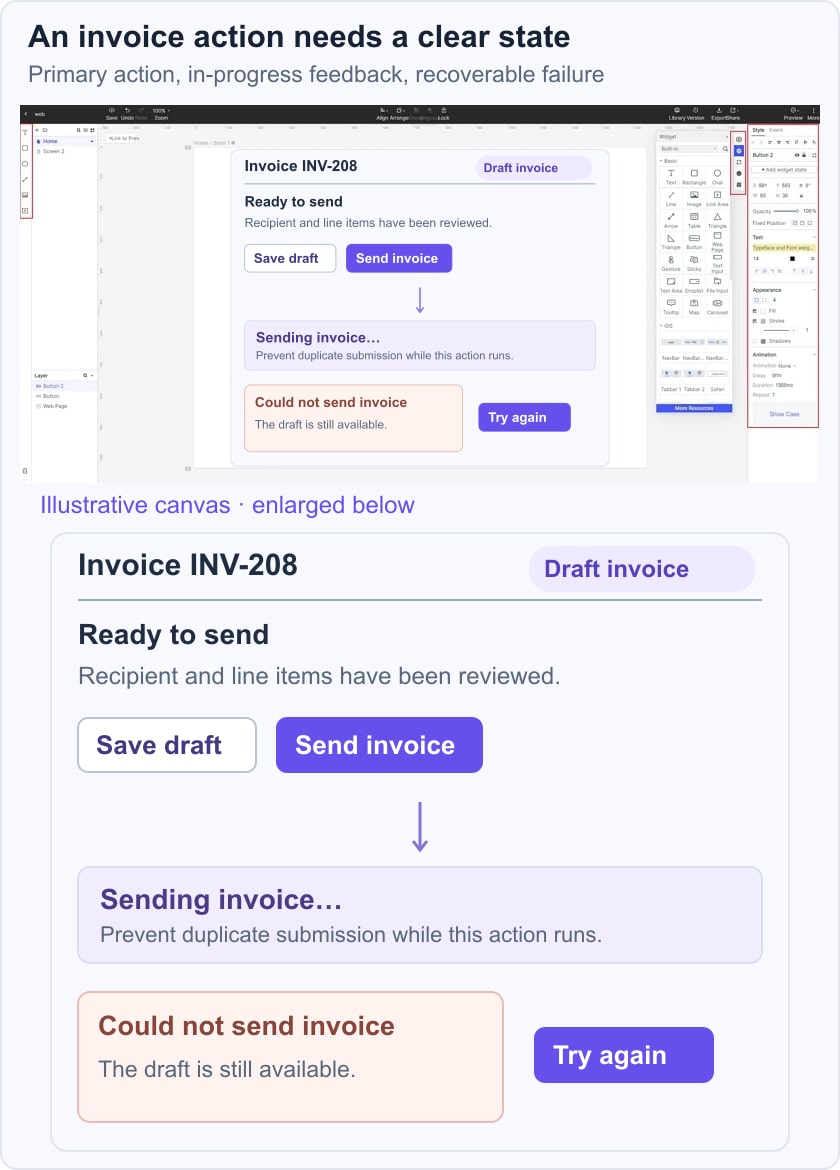
For the follow-up feedback, see notification behavior and dismissal; for broader styling choices, review button labels and interaction states. The example below focuses on the primary/secondary hierarchy and the outcome of the send action.
Step 1. Define the action before choosing an asset
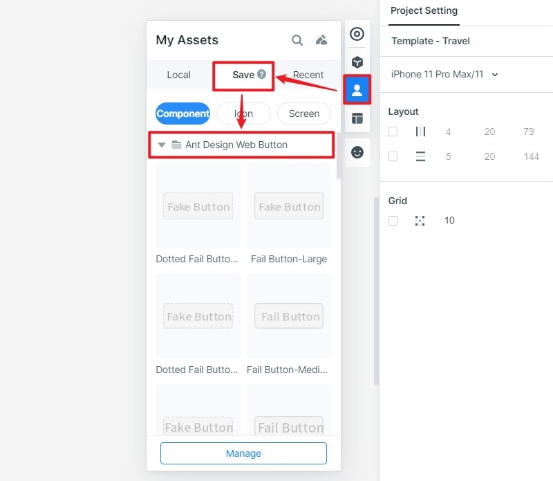
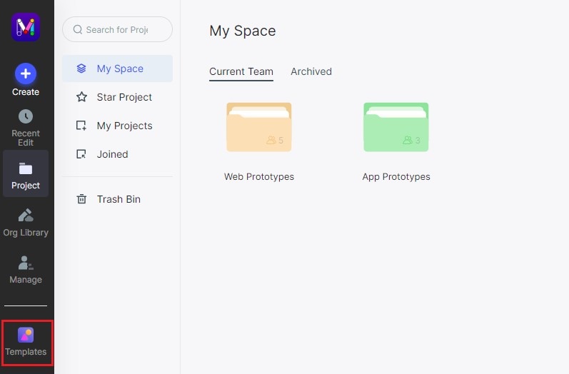
Open a project in Mockitt and write down what each action does. Identify which action changes data or communicates outside the current screen. The earlier screenshots show a Templates workflow; current library names and available resources may differ.
Step 2. Choose or recreate the button variants
If an appropriate Ant Design asset is available in your library, add it to the project and review its states. Otherwise, build a simple visual equivalent with shapes and text. Do not depend on an old template title being available in every workspace.
Step 3. Connect and review the states
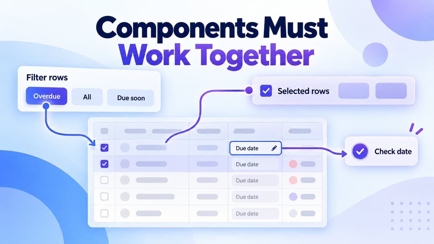
Place the buttons in the invoice review panel and create the sending, sent and failed states. Keep the draft visible when retrying. Preview the flow with a reviewer, then hand off the intended labels and states alongside the implementation reference. Developers should test keyboard activation, focus and submission behavior in the actual application.
The WAI-ARIA button pattern explains keyboard activation and focus behavior. A visual prototype can document those expectations, but it cannot establish that the finished application meets them.