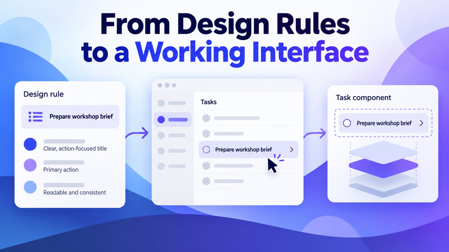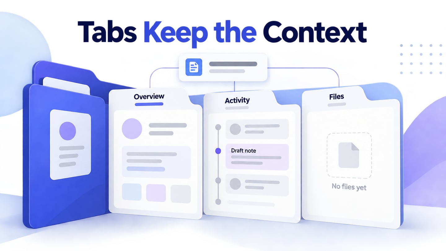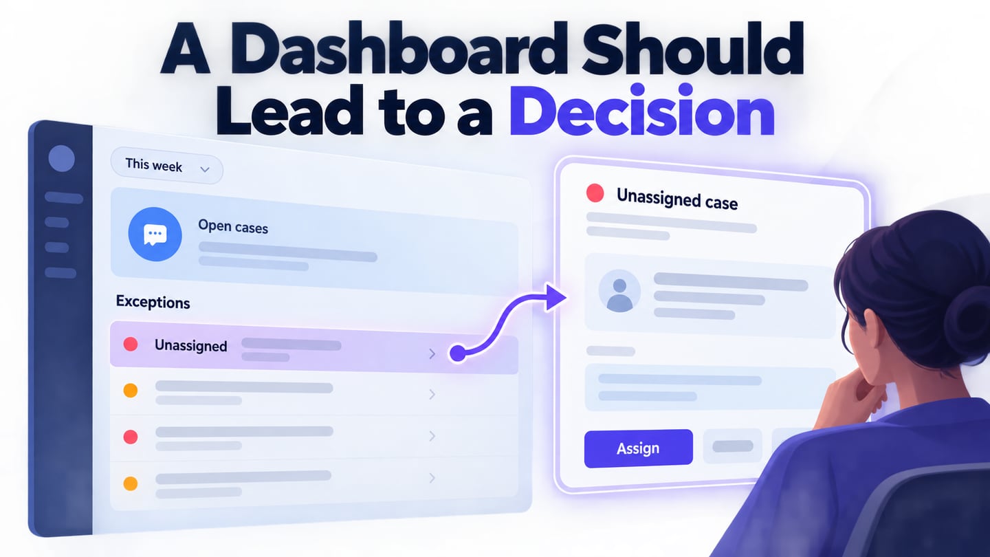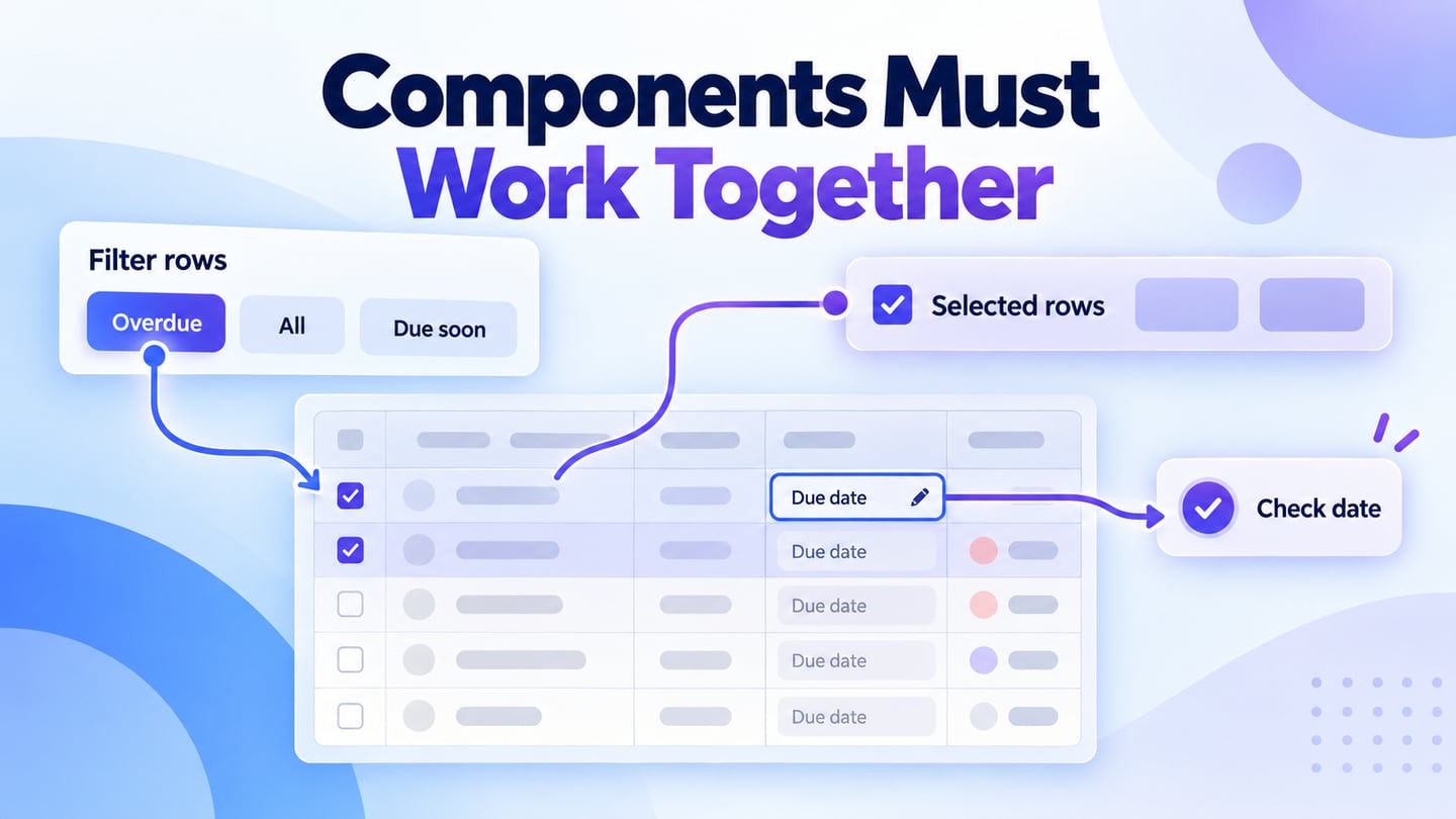
A design system is broader than a UI kit: it includes the principles, reusable patterns and implementation resources that help a team keep interfaces consistent. Ant Design components are useful building blocks, but their behavior still needs to fit the data and task in front of the user.
This guide focuses on a practical component decision: how a table’s filters, selection and editing work together. Use a Mockitt prototype of the record workflow to agree on those interactions before implementing the Ant Design components.
What is Ant design?
Ant Design for React is a TypeScript-based UI library. Check its current compatibility information for your installed version; do not assume that a modern release supports Internet Explorer 9.
Evaluate the library by its documented behavior and maintenance needs, not historical popularity rankings. The more customized a component becomes, the more clearly the team needs to record what differs from its standard behavior.
The documentation helps distinguish component configuration from application responsibilities. Filtering a list, retrieving another page and saving an edited value may require your own data logic even when the component supplies the visible controls.
How to use Ant design components
Tables and forms are useful examples because several interactions meet in one screen. A change in the filter may affect pagination; a selection may apply only to visible rows; an edited value may fail to save. Agree on these relationships instead of specifying each control in isolation.
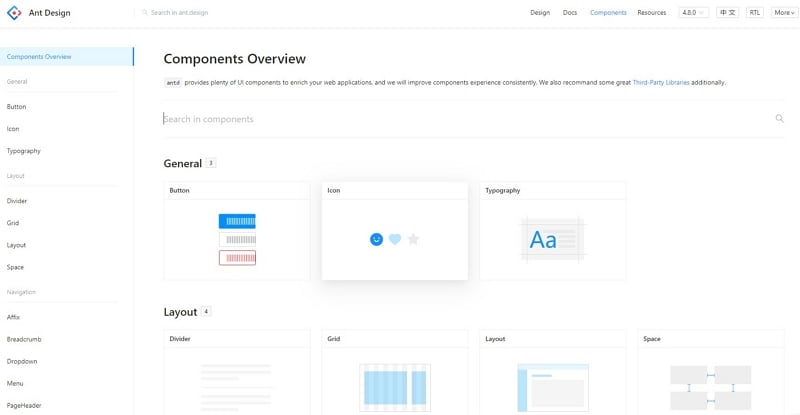
1. Filtering and Sorting
The Ant Design Table documentation covers filtering and sorting options. Define which columns are filterable and whether the operation uses the loaded records or a server query. A search field’s label should make its scope clear; users should not have to guess which values are searched. If filtering needs grouped conditions, review the query builder’s condition groups and result preview before mapping them to a server query.
2. Built-in pagination
Decide whether pagination is local or server-driven. When a filter changes the result set, define what happens to the current page and selection. Loading the next page should not silently change the meaning of a bulk action.
3. Nesting
Expandable rows can reveal supporting details while keeping the main list compact. Specify what belongs in the row, what appears in the expansion and when the user needs a full detail view.
4. Row Selection
Define selection scope explicitly. “Select all on this page” differs from selecting every filtered record. Keep the count and any unavailable action clear, especially after changing filters or pages.
5. Merging Cells
Merge cells only when the relationship becomes clearer. Specify which data determines the span and test missing or reordered records. A visual merge that looks correct in one example can obscure meaning when the data changes.
6. Column and header fixation
Fixed columns and headers can preserve context in a wide or long table. Check horizontal scrolling, overlap and keyboard access at the sizes you support; the prototype should show which identifying column remains visible.
7. Editable cells
Editable cells need a complete state model: the existing value, the editing control, validation, saving and the result. If saving fails, retain the entered value and explain the recovery path rather than silently returning to the old display.
How to Add Ant design components to your design?
Mockitt can help review these relationships with realistic example records. Build a small, representative table instead of a large empty grid; a few carefully chosen records expose more behavior than many identical placeholders.
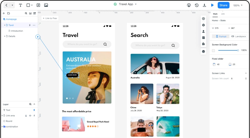
Use the prototype to agree on the record workflow. Reusable elements keep the rows consistent, shared review helps expose ambiguity, and annotations can describe behavior that a visual preview cannot execute.
- Prototyping,
- Collaboration.
- Its library of assets and templates.
1. Create an equipment-loan table with item, borrower, due date and status. The retained screenshots are earlier interface examples, so current asset names and library locations may differ.
For the equipment-loan example, filter to “Overdue,” select two visible records and start a reminder action. Then change the filter. The design must say whether those selections clear or persist; otherwise the user could send a reminder to a record they can no longer see. Show the selected count near the bulk action.
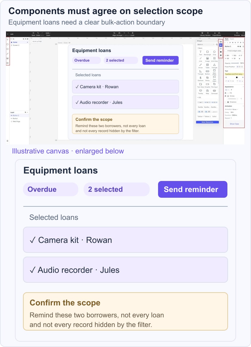
Use the focused table guide for record-level review and the button-state guide for the bulk action’s progress and failure feedback. This keeps the list and action specifications connected.
2. Build the default list, filtered result, empty result and an edit that fails validation. Add the selection count and a way to clear it. Review these states with a teammate before deciding which component options and server operations are required.
3. Hand off the interaction contract: filter scope, sort order, page size, selection persistence, editable fields and validation rules. Mark illustrative data clearly. The React components implement the controls; the application must enforce authorization, validate changes and handle concurrent updates.
During implementation review, use the same example records and repeat the sequence. Compare the result to the agreed behavior, including the empty and error paths. This gives the team a concrete acceptance check rather than a vague instruction to “make the table work.”