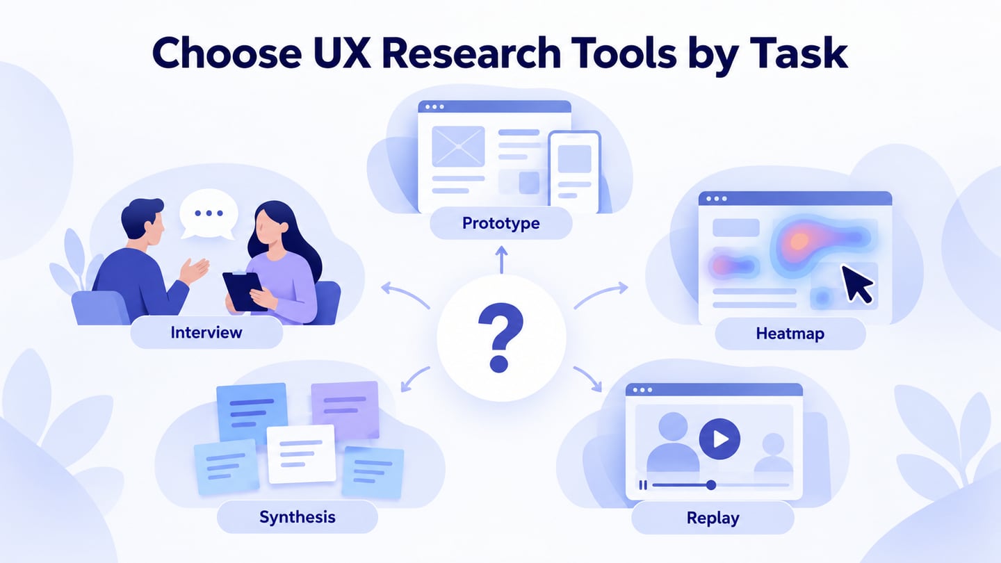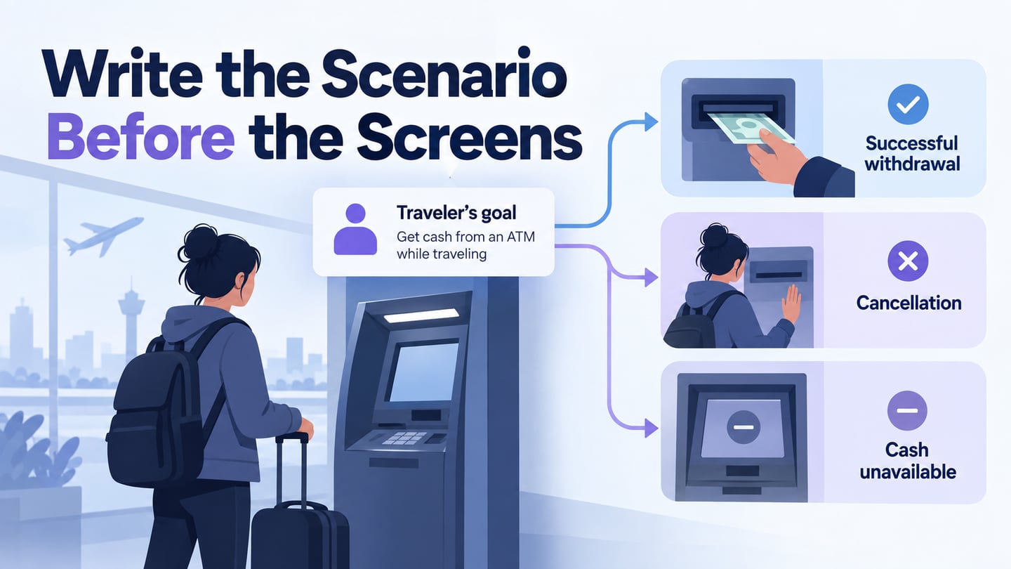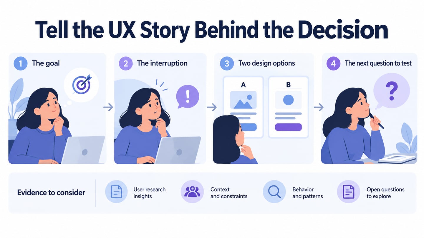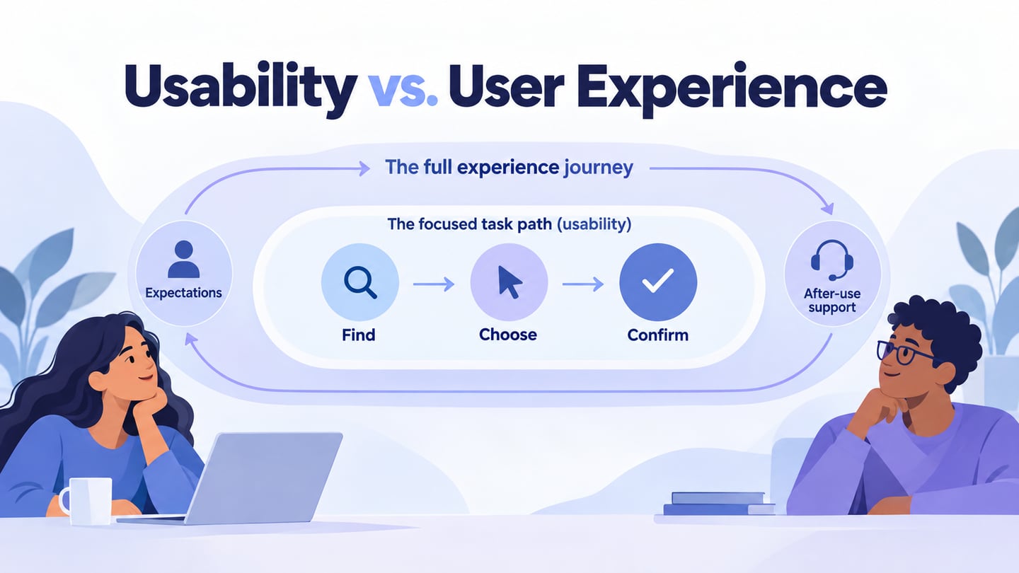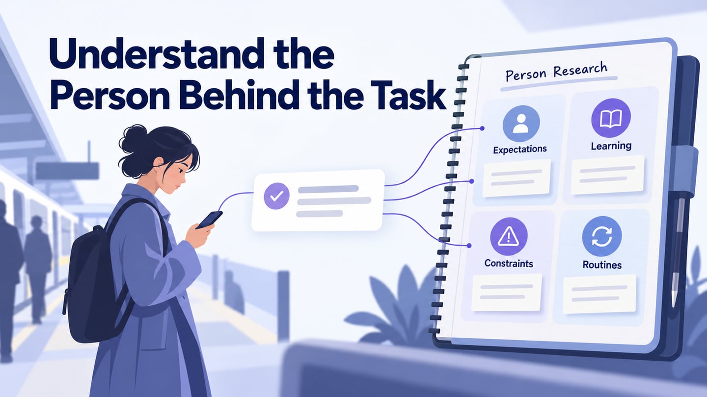
To understand your users, investigate what they are trying to do, what they expect to happen, and what gets in their way. A demographic profile or a team brainstorming session cannot answer those questions alone. Use user research to connect design decisions with observed behavior and people’s explanations. The four lenses in this guide—mental models, learnability, resources, and routines—help you decide what to investigate without pretending that you can know every user perfectly.
Mental models
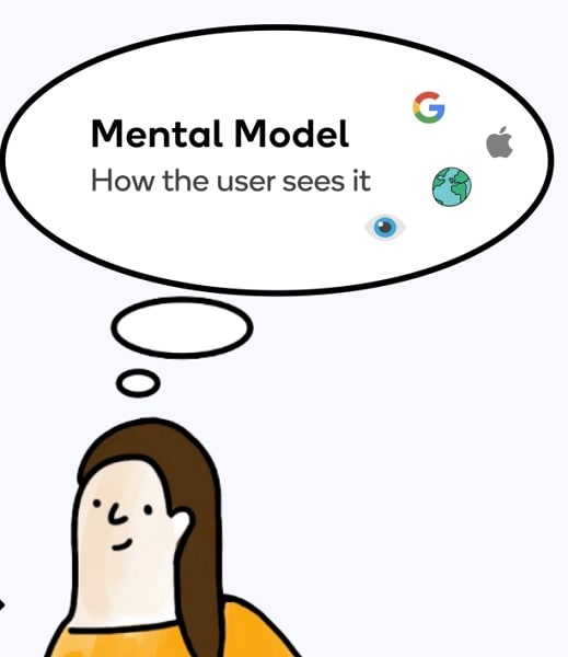
A mental model is a person’s belief about how a system works. It is not a diagram the designer invents in a brainstorming session, and it is not the same as a persona. Someone may believe that saving a form reserves their place, while the service only treats a final confirmation as a reservation. That mismatch matters because the person acts on their expectation, not on your internal process.
Ask people what they expect before they take an action, then compare that expectation with what the interface communicates. Useful prompts include “What do you think happens next?” and “Where would you look for this?” The aim is to uncover the model, not teach the participant your preferred answer. NN/g’s explanation of mental models describes why previous experience shapes these predictions. Record differences between participants instead of replacing them with one convenient assumption.
Keep a short evidence record: the situation, the person’s expectation, what they did, and what remains uncertain. If the participant says “saved means booked,” preserve that wording with its session reference. A possible design response is to distinguish Draft from Confirmed, but that remains a proposal until you check whether the new wording is understood. Do not turn one comment into a claim about everyone.
Learnability
Learnability concerns how people get started and become able to complete tasks. Do not infer it from age, gender, or a supposed fixed learning style. Prior experience with the task, familiarity with similar interfaces, language, disability, and the conditions of use can all matter. Watch a person attempt a realistic first task and note where they stop, seek help, misinterpret a label, or repeat an action.
Test explanations where they are needed. If someone cannot tell whether a shift is reserved, adding a long onboarding tour may not help; a clearer status beside the saved draft may be more relevant. Compare first use with a later attempt if remembering the workflow matters. Define success as completing the intended task with understandable feedback, not simply spending longer on the page or generating more traffic.
Separate a design problem from an unfamiliar domain concept. A volunteer may understand the button but not know what “standby” means for attendance. That requires an explanation of the commitment, not just a larger button. Conversely, a familiar term placed in an unexpected location may be a navigation problem. Write down which explanation your observation supports before choosing a fix.

Resources
Resources include the time, attention, devices, connection, money, and support available while someone uses a service. Investigate the constraints relevant to the task. Can the person stop and return? Do they have a stable connection? Are they relying on one hand, a shared device, or assistance? Ask about a recent real situation and, where appropriate, observe the environment instead of assuming that an ideal desktop session represents everyday use.
Design around a specific constraint. For an interrupted signup, consider saving progress, making the current status explicit, and showing what is still required. For a slow connection, prioritize essential information and clear submission feedback. For a shared device, consider what remains visible after the person finishes. These are different problems; a generic instruction to “make it efficient” cannot choose between them.
Also consider resources the design itself demands. An account requirement may add password recovery to a simple task. A document upload may assume that a phone user has a file ready. Write those dependencies beside the relevant step. This makes it easier to discuss whether they are essential or whether another route is possible, while leaving security and service rules intact.

Routines and Habits
Routines reveal when a task fits into someone’s life and what happens immediately before and after it. Ask about the last time they completed the task: what triggered it, which device they used, whether they were interrupted, and what they did to confirm it was finished. Frequency alone is not enough. A rarely used task may need stronger reminders and clearer labels than one repeated every morning.
Consider a volunteer choosing a weekend shift on a phone during a commute. They save a draft, lose their connection, and return that evening. The design question is whether they can distinguish “my details are saved” from “my place is confirmed.” This illustrative scenario brings together a mental-model mismatch, a first-use question, a connection constraint, and an interrupted routine without claiming that real participants behaved this way.
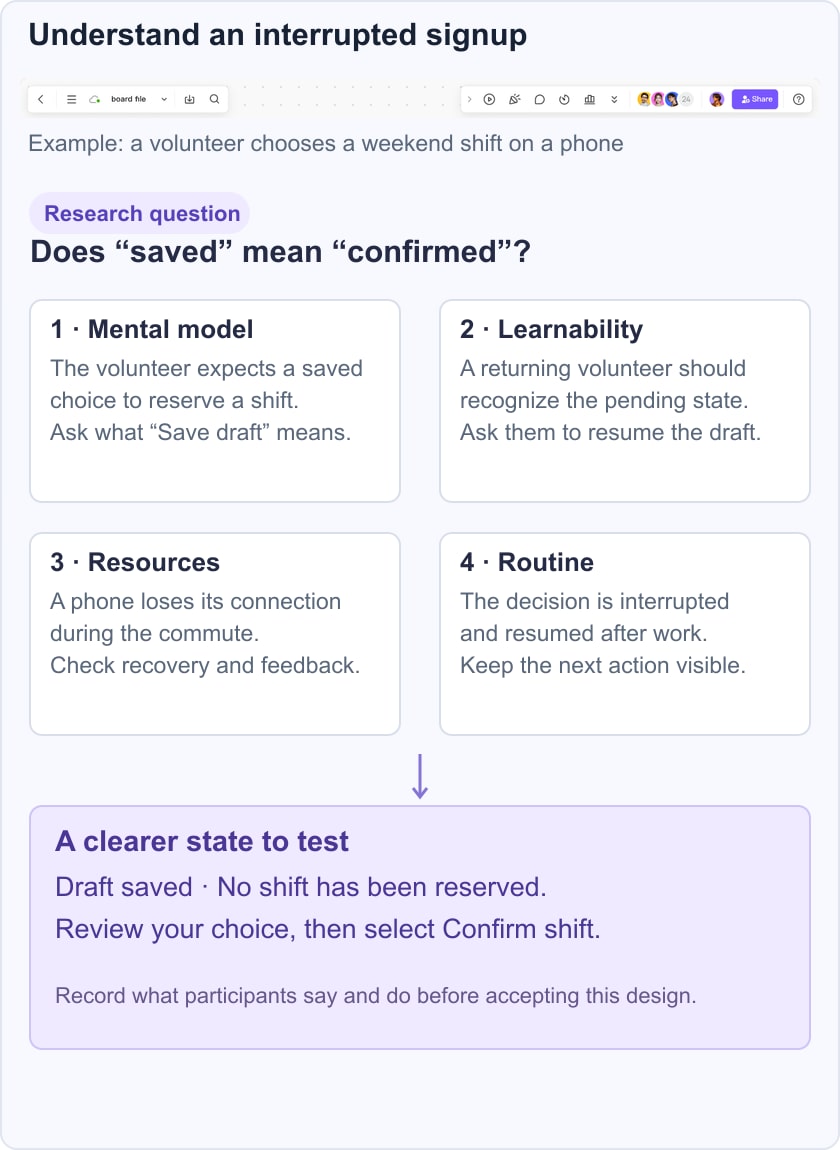
Build the Draft and Confirmed states as a small interactive prototype in Mockitt. Ask a participant to explain their status after returning to it. Avoid saying “find the draft,” because that reveals the concept you are testing. Note whether they can identify the next action and whether the interface preserves enough context to resume. The prototype lets you examine the proposed explanation; it does not test real offline storage or reservation availability.
Use the four lenses to form a focused research plan rather than a large profile of personal details. For each important observation, record the evidence, its limits, the decision it could affect, and the next question. In usability testing, keep behavior and interpretation distinct: “returned to the previous page twice” is an observation; “did not trust the confirmation” needs supporting evidence. Include contrasting cases so that one neat story does not erase another user’s needs.

From understanding to a design decision
Understanding users is an ongoing practice, not a one-time claim that the team has found the perfect audience profile. Start with a task that matters, use these lenses to gather specific evidence, and make a design change that addresses what you found. Then check the change in context. Keep useful observations available to the team, and revisit them when the audience, service rules, or working conditions change.