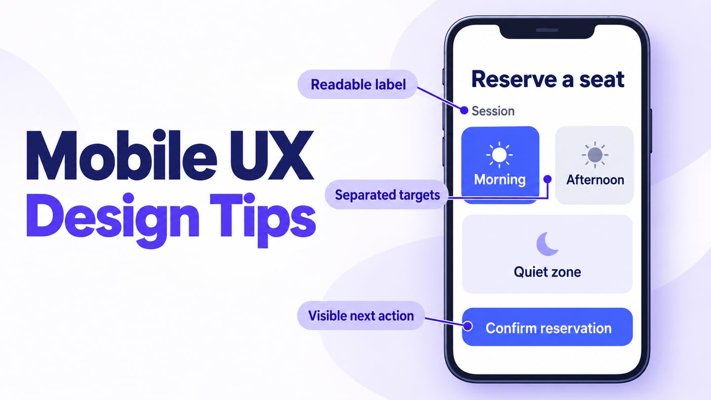
Mobile UI examples can teach useful lessons about hierarchy, imagery, and navigation. They are less useful when a polished screenshot is treated as proof of usability. This collection examines ten concepts: what is visible, what can be borrowed, and what still needs testing.
Use Mockitt’s UI design workspace to explore a pattern with your own content and constraints. Begin with a task such as choosing a product or finding a saved item. A mobile frame and an attractive palette do not establish that someone can complete that task.
The examples are historical design references, not a ranking of current apps. Credit and source links are retained. Do not assume the concepts were released, measured, or made with the tool discussed later in this article.
For each reference, separate the visual idea from the interaction it would require. Long labels, unavailable options, small screens, and larger text often reveal problems that a showcase image does not show.
Ten Mobile UI Design Examples to Study
Read the examples as a practical critique: identify the task, note the visual hierarchy, and name one state you would need before adopting the idea.
The original selection covers shopping, food, plants, onboarding, fitness, learning, and finance. Its variety is useful for comparing patterns rather than copying one style across unrelated products.
1. Rounded Cards and Corners
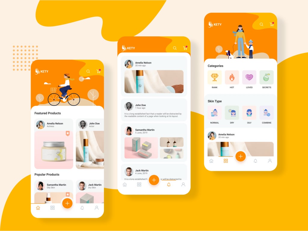
Image Source: Mind Inventory
The first reference uses rounded surfaces to separate product and feed content. Rounded corners are a styling choice, not a capability limited to flagship phones. Their usefulness depends on whether the grouping is clear and the content remains readable.
Borrow the consistent treatment of related cards, then check the actual touch areas and spacing. A soft outline should not obscure where one actionable item ends and another begins.
2. Food App by Marcus Leo
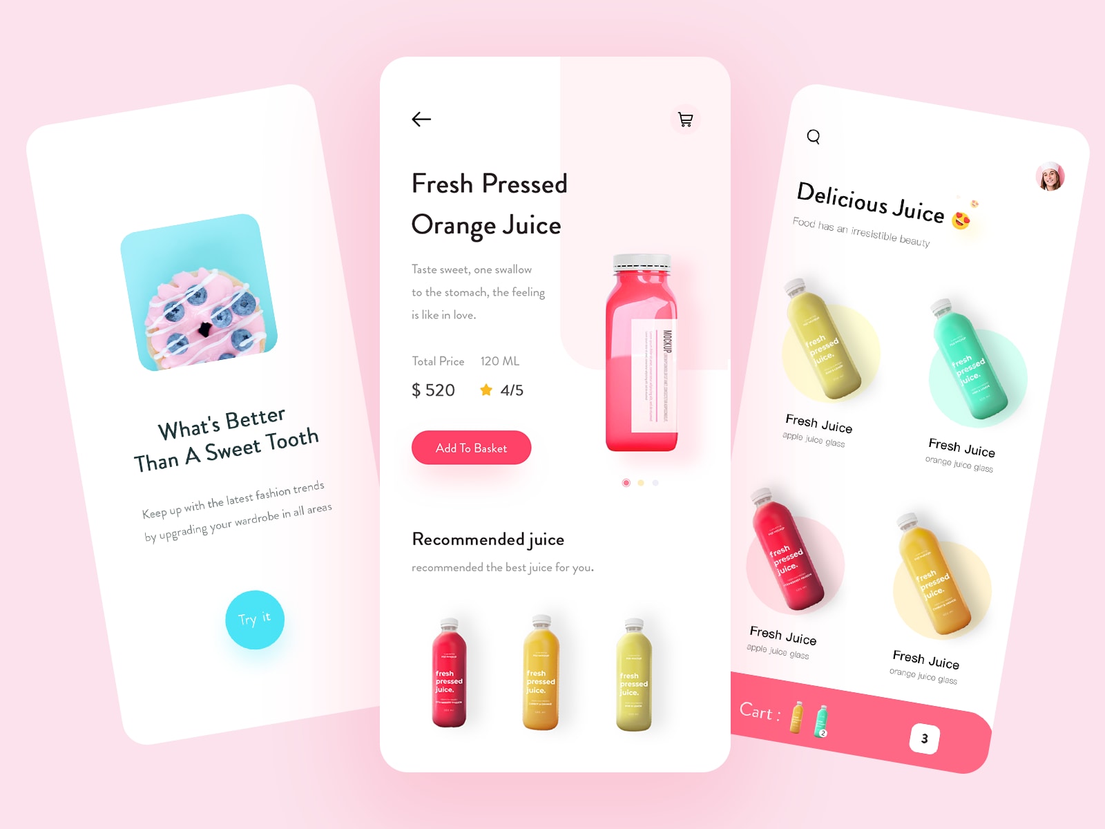
Image Source: Dribbble
Marcus Leo’s food-delivery concept uses product imagery, a focused detail screen, and a visible basket action. The bright accent draws attention toward the choice without requiring every text element to compete.
Before adapting the pattern, add a selected-option state—such as a pending choice in a bottom sheet—and a clear order summary. Check whether a customer can identify the exact item and quantity, not merely recognize an appealing photograph.
3. Plant App Design
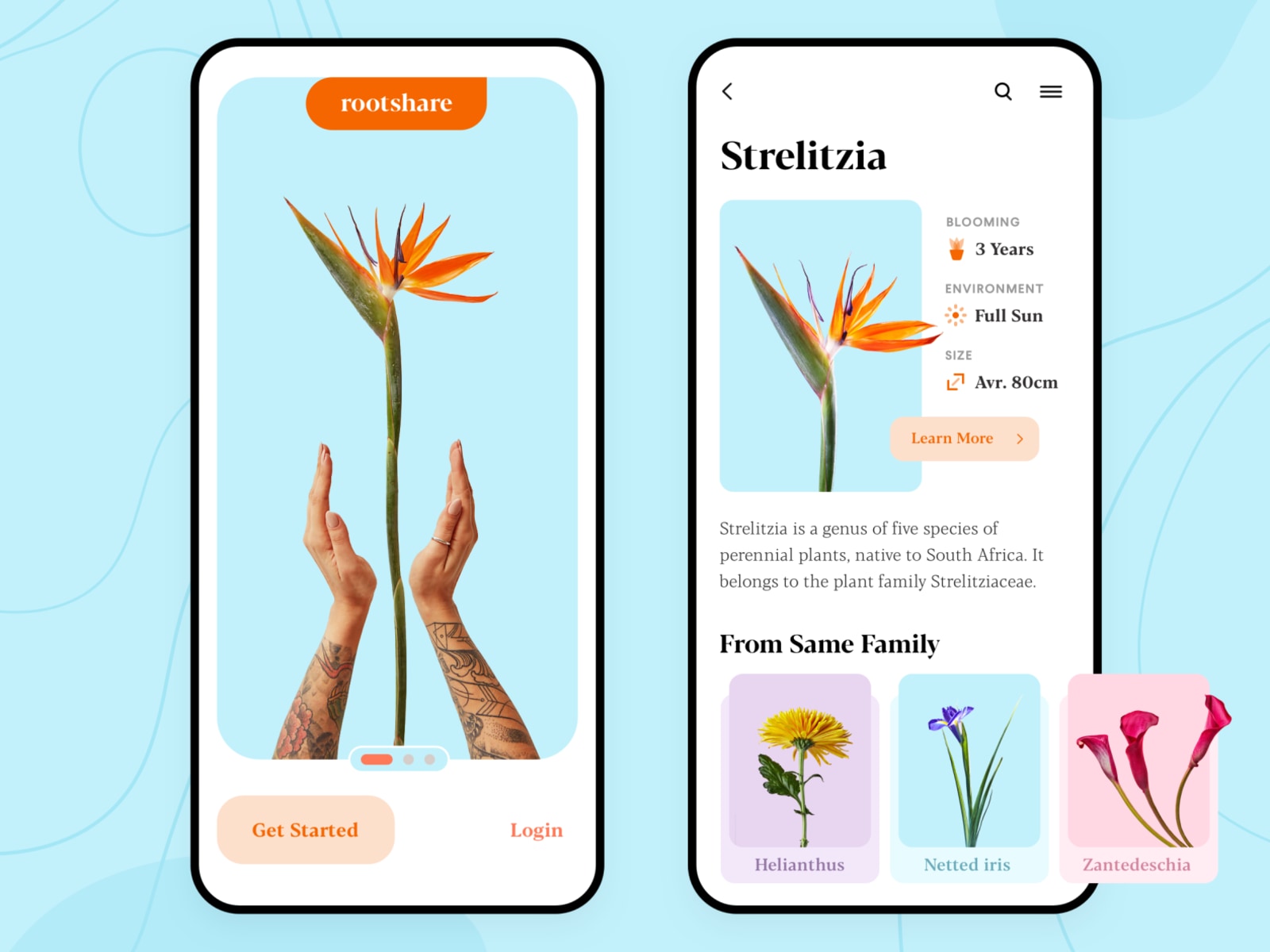
Image Source: Dribble
The plant concept uses a large product image and a separate detail view with care information. It shows how imagery can establish the subject while shorter facts support a decision.
Check whether care labels remain readable and whether the main action is understandable without examining every icon. A sparse layout is not automatically self-explanatory.
4. Food App
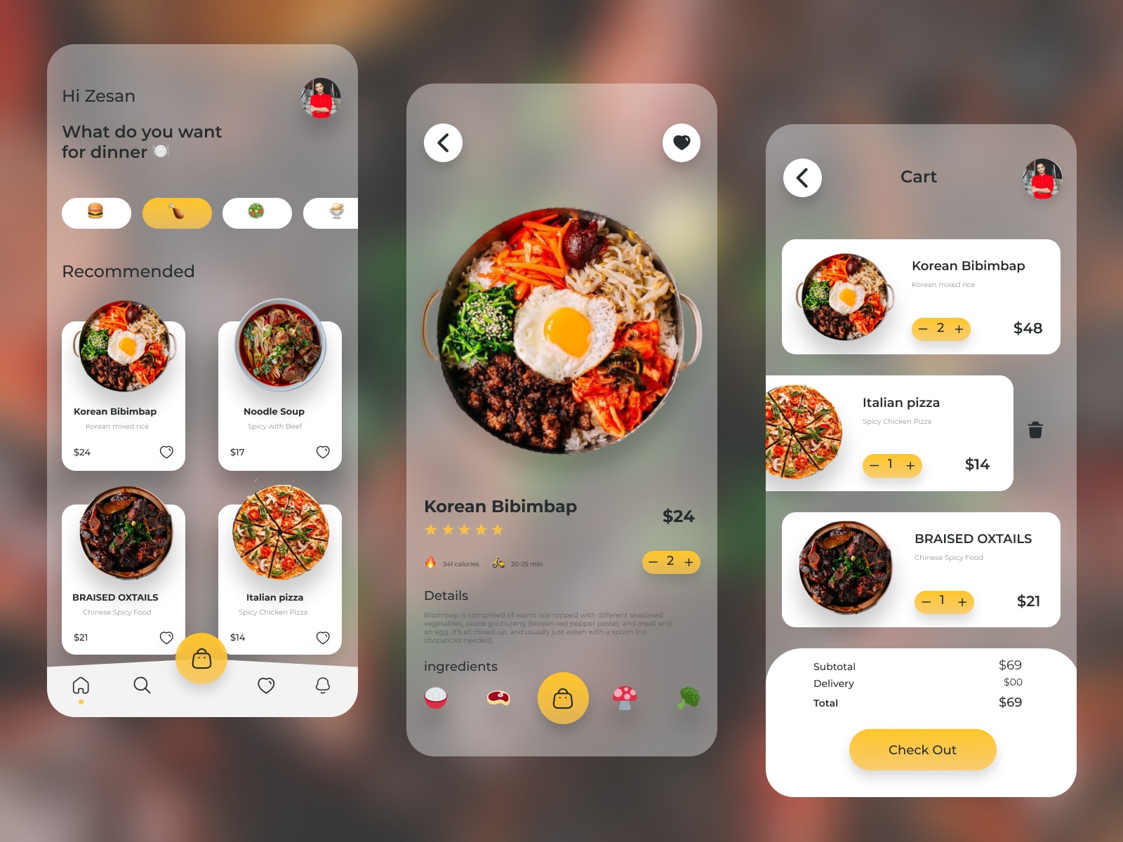
Image Source: Dribble
The food concept attributed in the original article to Zesan combines translucent panels with a product detail and cart view. It offers a reference for layered surfaces, not evidence of future commercial success.
Test text and control boundaries over the actual backgrounds before adopting transparency. The cart also needs usable quantity editing and error states; those should not be hidden by the visual effect.
5. Recipe App
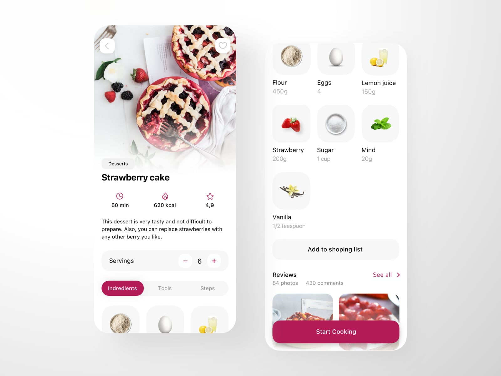
Image Source: Dribble
The recipe concept by Tetiana separates the recipe overview from ingredients and cooking actions. Images help identify the food, while the ingredient list supplies task detail. Check serving adjustments, units, and the step being followed before using a similar pattern.
6. Doctor Appointment App
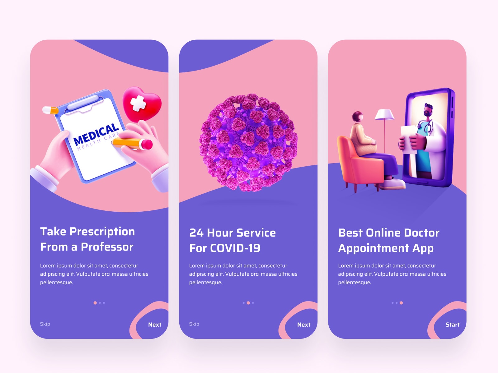
Image Source: Dribble
The doctor-appointment concept by Shafiqul Islam uses illustrations and strong color to explain an onboarding sequence. It is a historical visual concept; medical-service claims shown within it are not verified service promises or recommendations.
For an actual appointment flow, the next screen must make the service, availability, and booking outcome clear. Test whether onboarding can be bypassed appropriately and whether its wording sets accurate expectations.
7. Fitness App
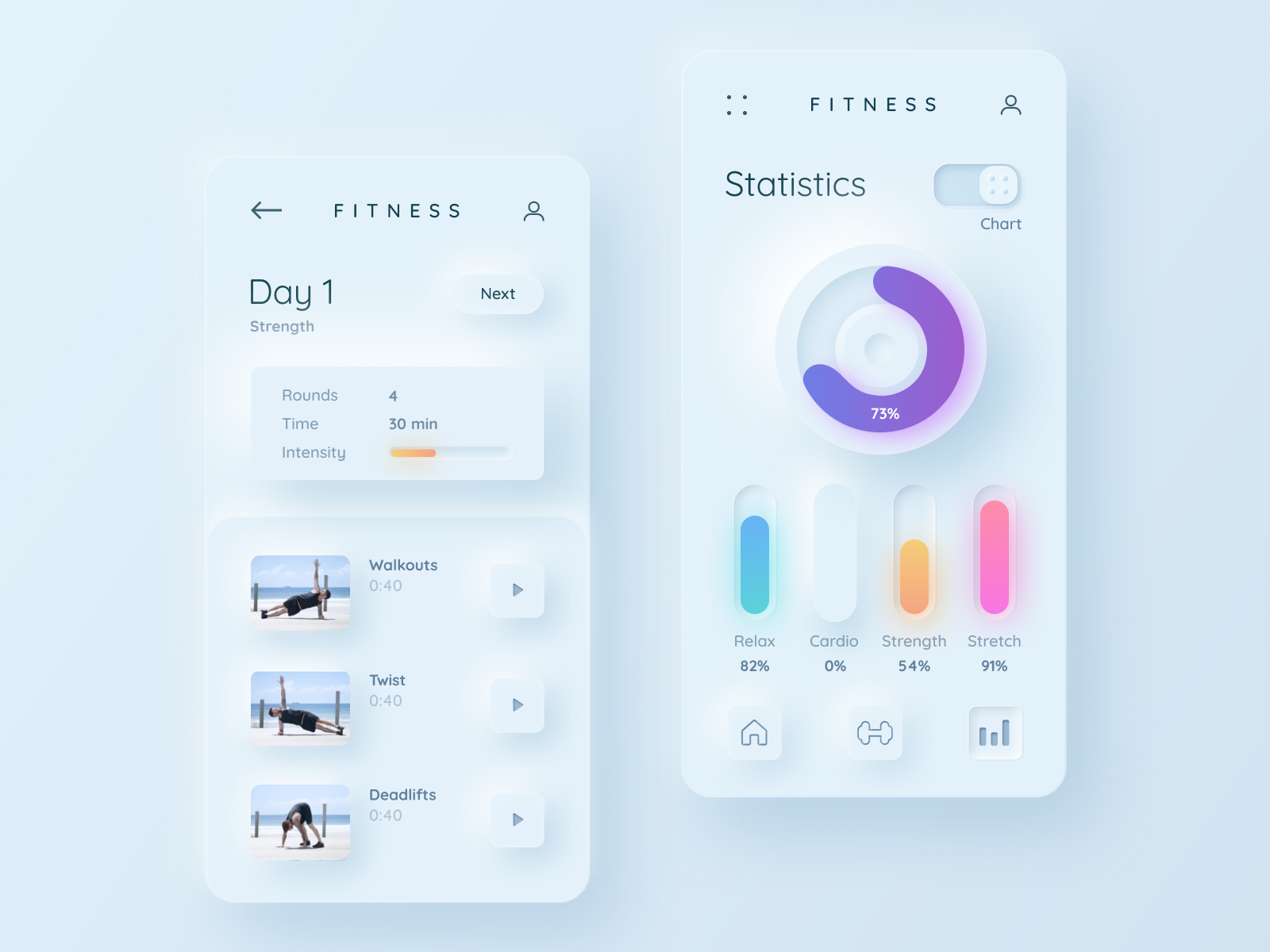
Image Source: Dribble
The fitness concept uses soft shadows, rounded panels, and charts. It is a useful example of neumorphic styling, where surfaces appear raised or recessed.
Inspect the boundaries of controls and the contrast of labels rather than assuming shadows communicate interactivity. Data also needs readable labels and a meaningful definition. Apply text-contrast guidance to the actual color combinations.
8. Coding App
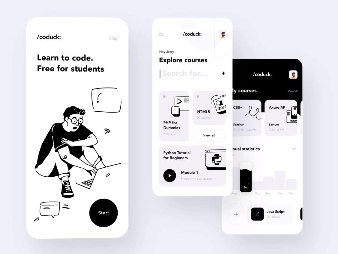
Image Source: Dribble
The coding-learning concept uses a restrained palette and grouped course cards. It demonstrates how typography and spacing can organize content without many competing colors.
Avoid assuming that programmers do not care about appearance or accessibility. Test whether learners can distinguish a new course, a current lesson, and their progress, especially when titles wrap.
9. Financial App Design
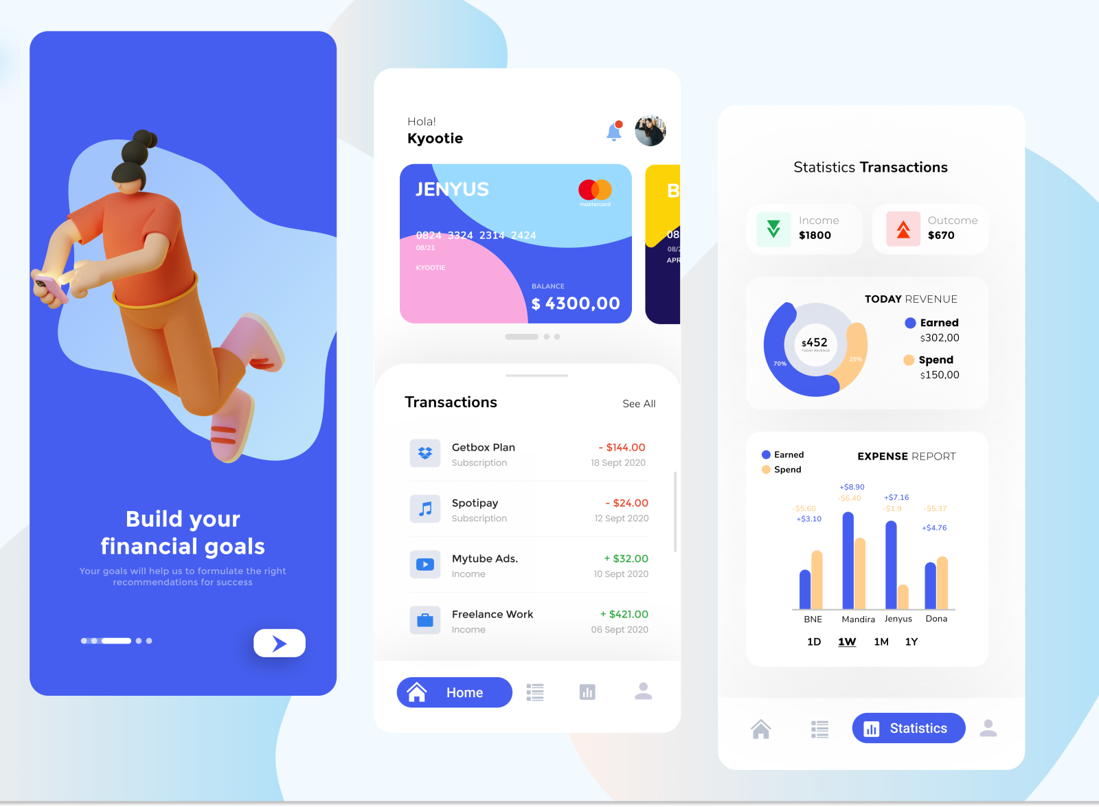
Image Source: Dribble
The financial concept combines a balance view, transaction list, and statistics. Its useful question is how a compact screen connects a summary to its details. Before adapting it, specify currency, time range, pending states, and what a chart measures; attractive sample data is not evidence of financial accuracy.
10. Shopping App
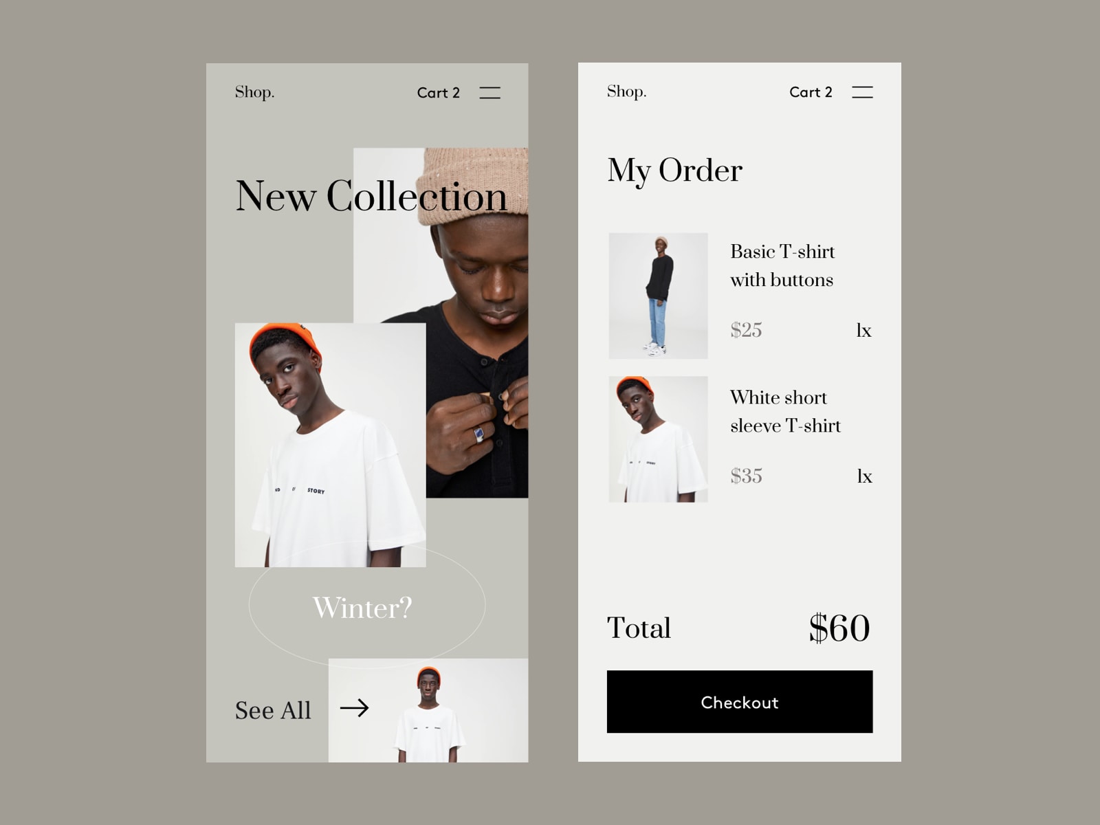
Image Source: Dribble
The shopping concept gives product imagery and an order summary substantial breathing room. Preserve the distinction between browsing and checkout, and check whether quantity, total, and editing actions remain obvious with realistic products. Large empty areas should not push necessary decision details out of reach.
Explore Your Own Mobile Interface in Mockitt
The examples show different visual approaches, but each still needs a complete task. Choose one idea that serves your audience rather than combining every trend into a single screen.
Mockitt can help arrange reusable elements and connect screens for review. Use your own content and write down the behaviour that a static concept cannot demonstrate.
A shared design workspace can keep related layouts and discussions together. It does not eliminate the need for research, platform decisions, or implementation testing.
Keep the following capabilities tied to the work they help you do. Availability and access depend on the workspace and plan, so verify the options in the project you use.
Useful capabilities for this workflow include:
Features of Mockitt
These capabilities support your own design process; the original concept images are not presented as work created in Mockitt.
- Prototype states: connect the screens and exceptions needed to explain the task.
- Design details: communicate component roles, dimensions, and implementation notes. A specification or code aid is not a complete tested app.
- Flow planning: map the route between decisions before adding high-fidelity decoration.
- Preview: inspect the sequence at the intended size and share it with the appropriate access settings.
- Collaboration: collect feedback on the same design context and make the decision history understandable.
Start with one representative task and expand only after its essential decisions are clear.
Turn inspiration into a testable mobile task
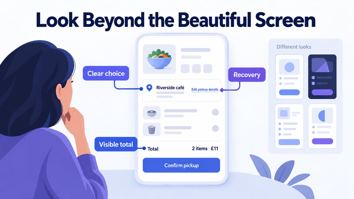
For a fictional café order, show the selected Riverside café, Today 12:30 pickup time, two items, and an £11 total before Confirm pickup. Keep Edit pickup details separate from confirmation. The sample screen borrows clear imagery and spacing without pretending that a visual card has placed a real order.
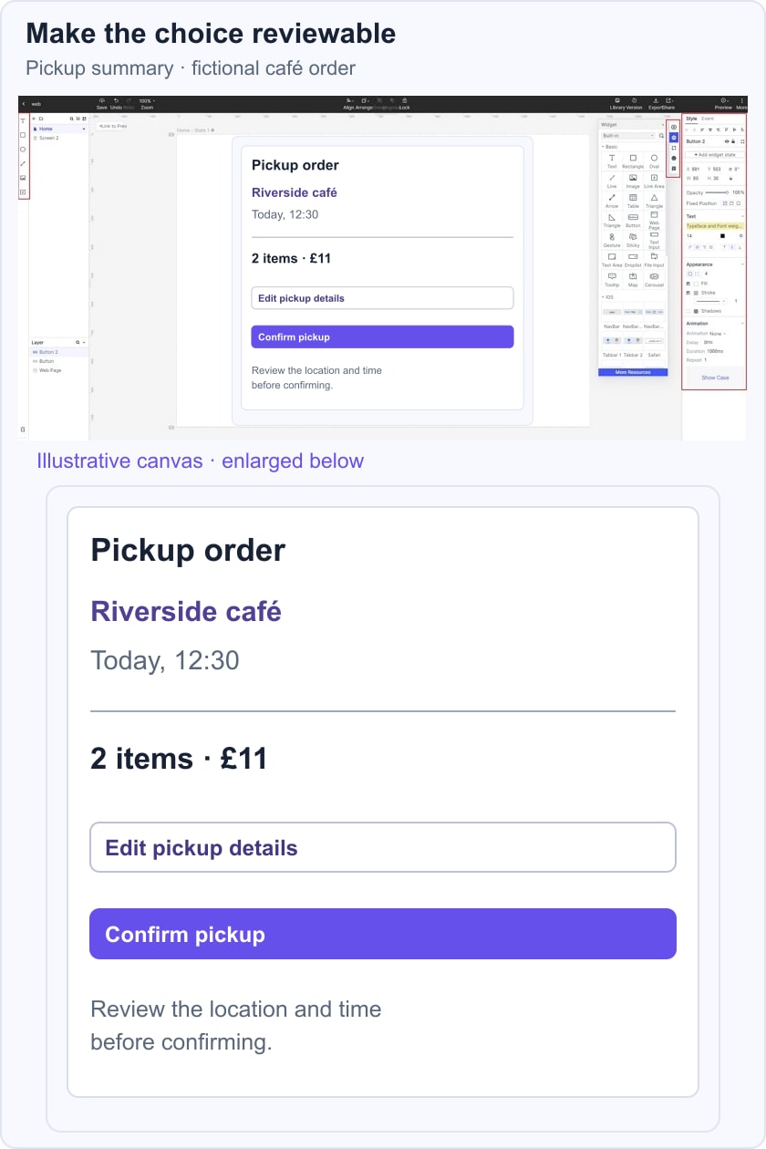
Link the summary and edit state in a mobile ordering prototype. Ask a reviewer where they will collect the order and how to correct a wrong time. Check target size and spacing on the implementation as well as the visual design. If the task fails, adjust the hierarchy or interaction before changing the decorative style.
Use Inspiration as a Starting Point
Keep the parts of a reference that explain the task: a readable hierarchy, an informative image, or a clear route to details. Preserve attribution and avoid presenting another designer’s concept as your own completed product.
Test the missing states with realistic content. The strongest lesson from a gallery is often the question it helps you ask about a design, rather than the surface you can copy.
Use the design and prototype to make those questions reviewable. A useful mobile interface lets people understand their options, act, and recover when the expected path is unavailable.