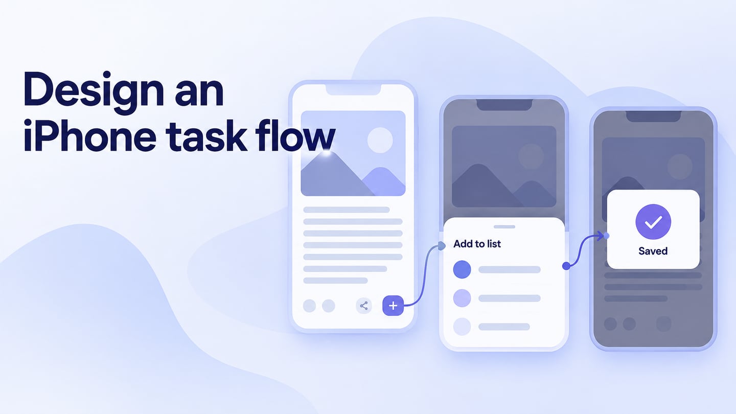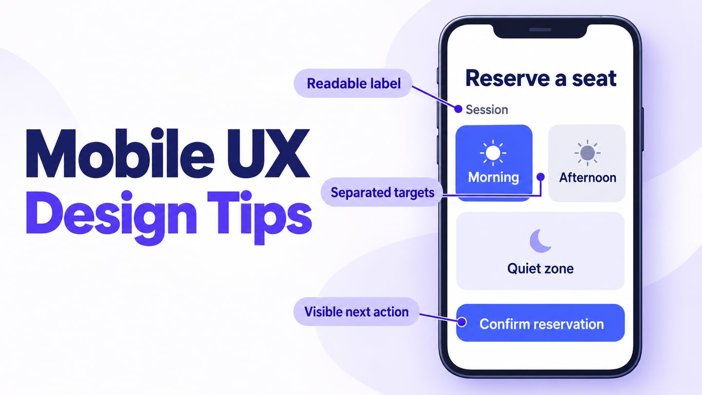
iOS UI design should help people recognize actions, read content, and navigate with the conventions of the platform. Start with the task and audience, then use reusable interface components and layouts to explore the screens. Familiarity is useful, but copying a system appearance without its behaviour can create confusion. Platform guidance is a design resource, not a guarantee that a mockup will become a usable app.
The original five do’s and five don’ts below remain a practical review structure. Apply them to ordinary screens and exceptions such as larger text, denied permissions, an open keyboard, and a loading failure. Assess the design with realistic content before making claims about ratings or customer satisfaction.
Five Things to Do
1. Research the Task and Audience
Research what people need to accomplish, where they use the app, and what they already understand. Ask what problem the app addresses, what information is needed for the next decision, and what existing methods people use. Combine relevant evidence rather than treating one interview or a competitor screenshot as a complete answer. Translate the findings into a concrete task that can be reviewed in the design.
2. Plan Typography for Real Reading
Use a clear type hierarchy and plan for the person’s preferred text size. Apple’s Dynamic Type guidance connects text scaling with layouts that adapt as content grows. Do not treat the old 11-point figure as a universal recommended size. Check long labels, multiline text, buttons, and supporting information at larger sizes. In the native implementation, supported text styles and appropriate scaling need to be configured and tested; enlarging a design-file label does not establish that support.
3) Contrast can make or break your app:
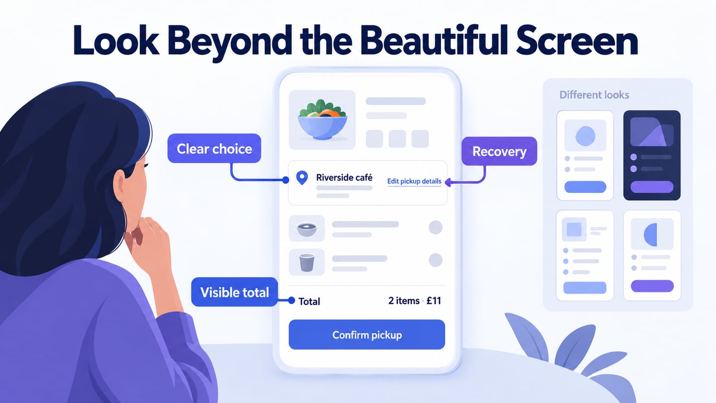
Review text, icons, controls, and backgrounds together. Test the selected, disabled, error, and focus states as well as the default screen. Light and dark appearances may need different color values while retaining the same meaning. A status should not rely only on red or green. Consider the intended lighting and device conditions, and verify contrast in the implementation rather than approving colors solely because they look attractive on one monitor.
4. Use an Adaptable Layout
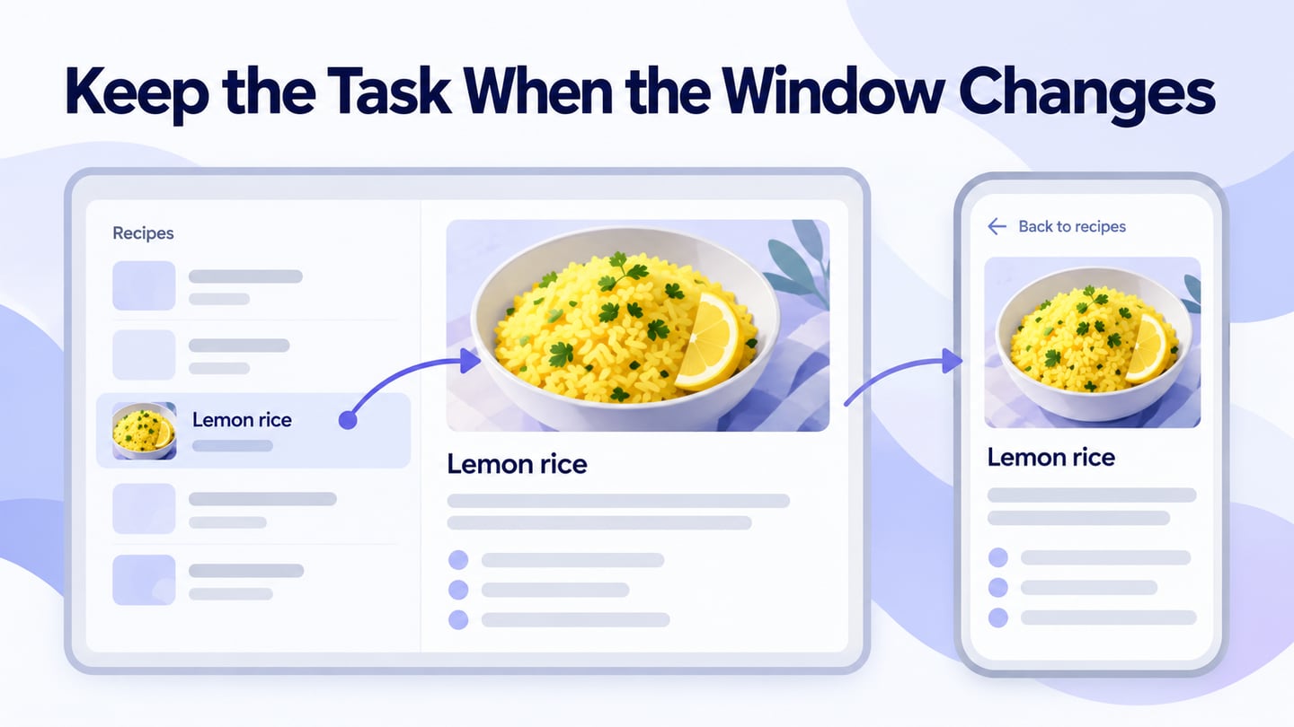
Keep related information and actions grouped, respect system-reserved areas, and allow text to wrap where needed. Review the screen with an open keyboard and at different supported sizes. A vertical content page should not require horizontal scrolling just to read an ordinary paragraph, though a genuinely two-dimensional object may need its own navigation. Preserve the task when the layout changes instead of simply shrinking all elements to fit.
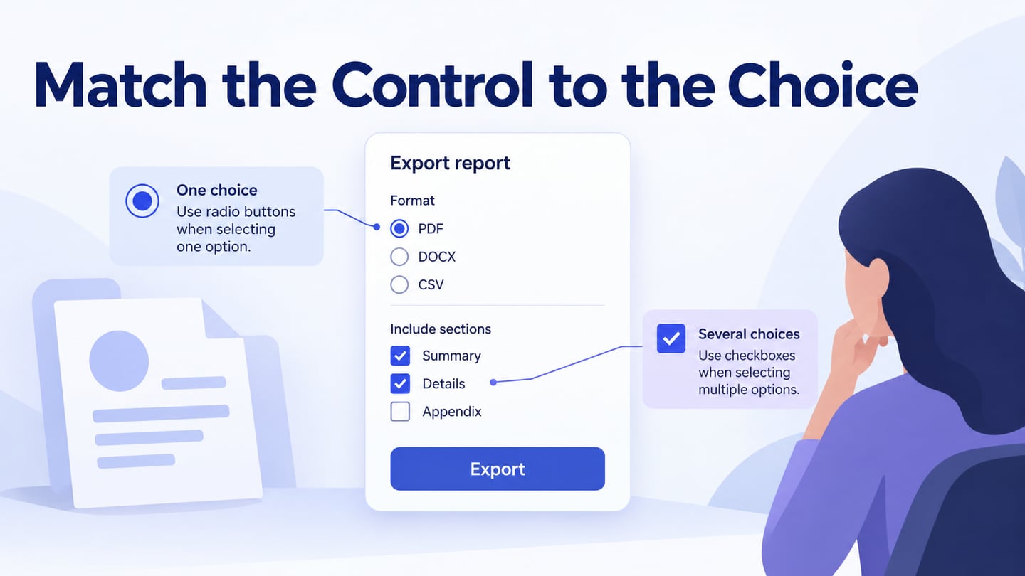
5. Choose Controls by Their Behaviour
Use a switch for an immediate binary setting, a stepper for an appropriate incremental value, and a labeled field for input. Choose the pattern according to the decision rather than its appearance. Gestures can supplement visible controls, but an essential action should not depend on an undiscoverable gesture. Define the result, feedback, and recovery path for each important action.
Five Mistakes to Avoid
1) Ignore your target audience:
Do not substitute assumptions about “typical iPhone users” for knowledge of the actual audience. Context, experience, accessibility needs, and language can change how a screen is understood. Test the task with relevant people and record where the evidence is limited.
2. Unnecessary Jargon
Use familiar, specific words for actions and errors. Technical terms may be appropriate for a specialist audience, but unexplained internal terminology can make a simple task difficult. Pair unfamiliar icons with meaningful labels and ask people what they expect the control to do. Do not assume that an icon is universally understood.
3. Unexplained Waiting
Show useful feedback while content loads and a clear next step if it cannot be retrieved. Preserve information already entered when appropriate. A loading indicator should describe work in progress without inventing a percentage or implying success. Do not add delay to create suspense in an ordinary utility task. Measure the live app’s performance separately from the prototype’s transitions.
4. Ignoring User Feedback
Collect feedback around specific tasks, not just whether someone likes the screen. Observe the choices they make, the information they miss, and how they recover. Prioritize changes according to the problem and its impact, then check the affected task again. A single positive comment does not prove that the interface works for everyone.
5. Asking for Access Without Context
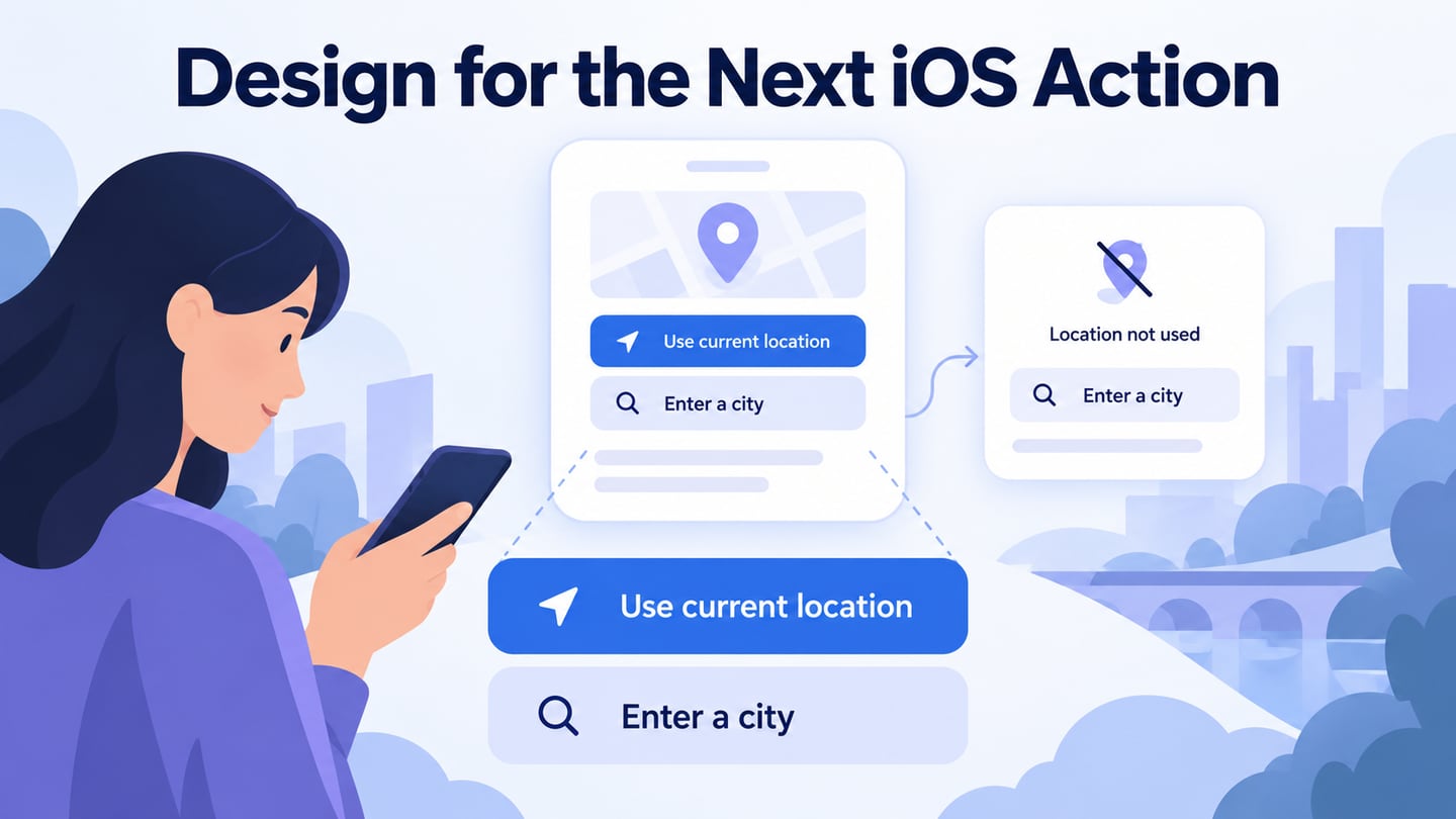
Request access when its purpose is understandable in the task, and explain what happens when the person declines. Avoid front-loading unrelated requests during onboarding. Use the platform’s actual permission mechanisms in implementation rather than creating a misleading imitation. The visual prototype should communicate the intended sequence and alternative route.
Review a permission request in context
For an illustrative library-finder app, let the person choose “Use current location” or “Enter a city.” The first route explains why location is useful before the native request appears. The manual route remains available when location is declined or unavailable, so the core search task does not become a dead end.
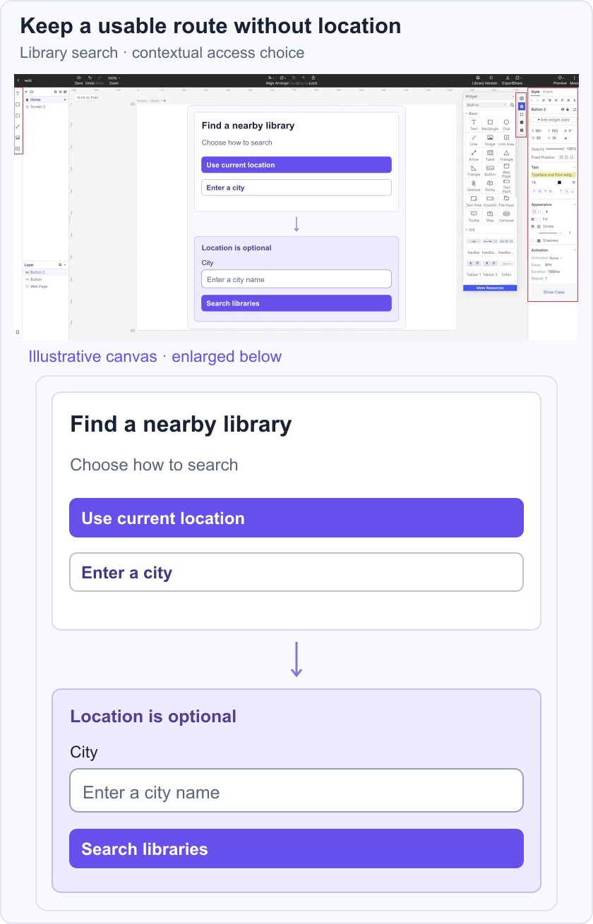
Prototype the choice, city-entry screen, results, and an empty-results state. Ask a reviewer to find a library without sharing location and then repeat the task with larger text. Check that the alternative is visible, the field label remains readable, and the search action stays reachable when the keyboard is open. Actual permission behaviour and accessibility support must be verified in the iOS build.
 Earlier Mockitt guide capture; native iOS behaviour still requires implementation testing.
Mockitt can support a connected prototype of the iOS task for discussion before development. Use the following capabilities according to the question being reviewed. The retained workspace image comes from an earlier guide and is useful orientation; current controls and product limits may differ.
1) Asset Library:
Start from relevant components and icons, then adapt them to the task. Check that any library assets reflect the platform version and licence you intend to use. A template reduces setup work but does not replace design judgment or accessibility review.
2) Design:
Arrange the screens and states needed for the task. Use realistic content, including long names and error messages, instead of only short placeholders. Keep the prototype’s simulated behaviour distinct from the native app’s implementation.
3) Efficient Presentation:
Preview the flow and share it with reviewers. Ask a concrete question, such as whether manual city entry remains discoverable after location is declined. Record observations and decisions with the relevant screen, rather than treating a polished demonstration as proof of usability.
4) Handoff:
Provide developers with the intended states, text behaviour, and unresolved assumptions. Verify current import or export capabilities for your workflow; do not assume that a design tool automatically supplies production-ready native code or the complete accessibility implementation.
5) Cloud:
Use the browser workspace where supported and maintain appropriate access permissions and backups. Cloud access can support collaboration, but it does not by itself guarantee security, recovery, or uninterrupted availability.
6) Collaboration:
Coordinate review among product, design, development, and testing. Assign ownership for unresolved issues such as permission behaviour, Dynamic Type, and keyboard handling. A clear handoff preserves both the intended experience and the implementation checks still required.