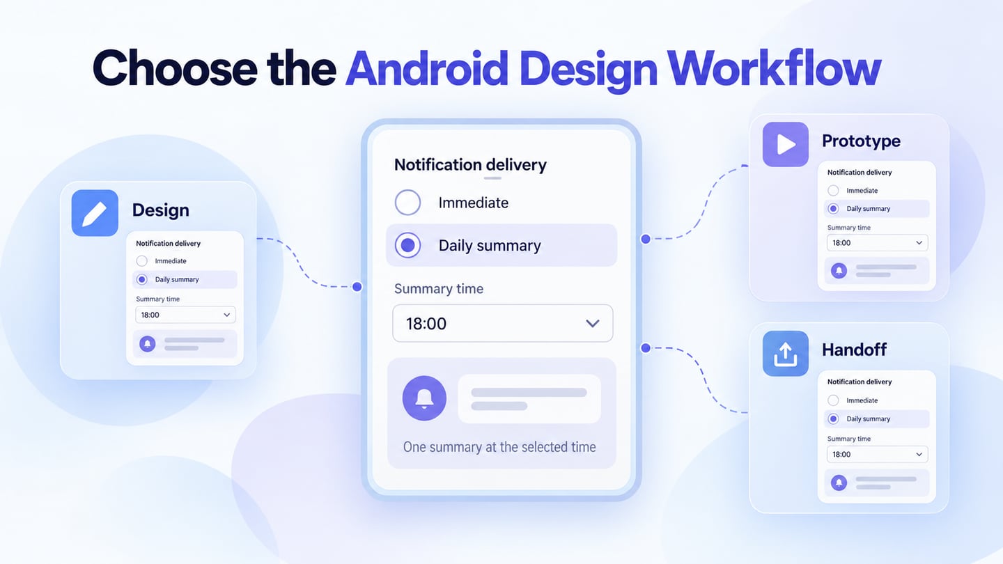
Choose an Android UI design tool according to the work you need to do: create reusable components, compare layouts, prototype interactions, or communicate an approved design to developers. Mockitt’s UI design workspace is one option for that visual design work. A tool that draws an Android-shaped frame does not automatically produce a native Android interface or validate its accessibility.
The six options below serve visual design, interactive prototyping, team collaboration, and developer handoff. Compare the tools using the same small task rather than treating this list as a universal ranking.
Six Tools for Different Android UI Tasks
Before selecting a tool, identify the output you need and the team’s editing environment. Check current plan limits, file access, and import fidelity with a sample project. A feature list alone cannot establish that a tool suits your existing design system.
1. Mockitt
Mockitt supports visual interface design with reusable components and shared review. Use it to arrange Android screens and define states before development. It is suitable when the immediate task is to communicate layout and interaction intent; native controls, data handling, accessibility behaviour, and performance still need implementation and testing.

Key Features:
- Build repeated interface elements from suitable components and icons, adapting them to the task.
- Keep shared styling and component roles consistent; verify imported assets rather than assuming a file is unchanged.
- Share the design or prototype using the access settings appropriate to the review.
- Use comments and design variables where they support coordinated editing and review.
Start with one meaningful screen and its exceptions before extending the pattern across the application.
2. Sketch
Sketch provides design authoring on Mac, with browser-based collaboration and inspection workflows. It can support Android visual design even though the editor runs on a different platform. Check the team’s authoring environment before choosing it; browser access should not be confused with identical editing capabilities on every device.
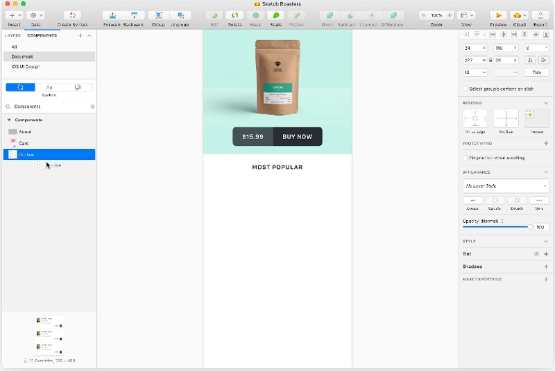
Use reusable elements, layout controls, and shared design resources to communicate the interface. Sketch is a design tool, not a substitute for Android Studio or the native application runtime. The retained editor image is historical orientation rather than a current feature inventory.
Key Features:
- Extend the workflow with supported plugins when there is a clear need, checking maintenance and compatibility.
- Use layout and text styling tools to establish consistent visual rules.
- Prepare wireframes or more detailed interfaces while keeping native behaviour requirements explicit.
3. Pixso
Pixso is an alternative for collaborative UI design, shared components, and prototype work. Its UI design and collaboration page describes reusable libraries and design-delivery capabilities. Consider it when the team needs to keep visual components and review in a shared workspace.
If you bring an existing design file into Pixso, compare the imported fonts, layers, components, and layout against the source. Import support does not mean every project is identical after migration. Test a representative Android component and its variants before transferring an entire library.
Key Features:
- Use shared components and libraries to maintain repeated interface patterns.
- Review collaboration, history, and permissions against the file and plan the team will use.
- Check exported assets and design details before treating them as approved implementation inputs.
4. Paico
Paico provides AI-assisted interface drafts and conversational revisions. It can be useful for exploring an initial Android screen from a task description before refining the structure. Treat the result as a draft: inspect labels, control choices, state behaviour, and platform conventions instead of assuming the generated screen is ready for release.
Key Features:
- Describe the task, audience, important fields, and constraints in the prompt.
- Use revisions to explore layout and wording, while keeping a record of the decision being changed.
- Compare versions against the same requirements rather than choosing only by appearance.
- Continue suitable design work through its supported Pixso workflow, checking the resulting file.
- Review the generated interface and any code output separately; neither establishes native Android correctness or production readiness.
5. Figma
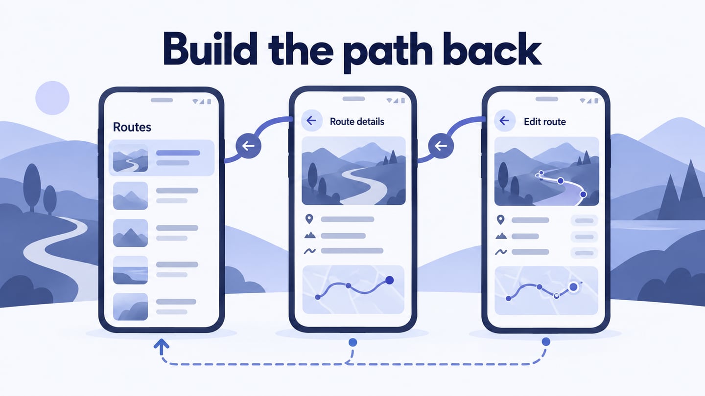
Figma combines visual design and interactive prototyping. Its prototyping tools support interactions, component variants, and more detailed behaviour using variables and conditions. It is useful when the team wants to review reusable visual components and linked states in the same workflow.
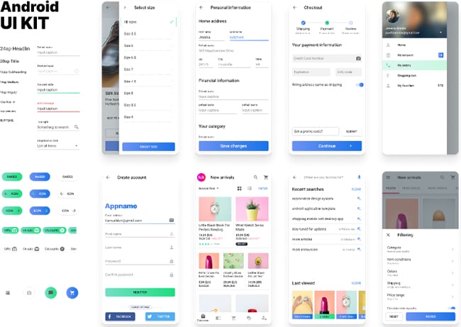
Keep the design-system conventions and review permissions clear. A rich prototype can communicate an Android interaction, but it does not prove that the native implementation has the same focus, semantics, responsiveness, or performance.
Key Features:
- Keep versions and review decisions understandable within the team’s workflow.
- Use components and libraries for repeated patterns rather than manually copying every element.
- Share the relevant design and prototype context with reviewers.
6. Zeplin
Zeplin focuses on design delivery and the connection between approved designs and implementation. It is a different category from a tool used primarily to draw the initial screen. Consider it when the team needs organized screens, specifications, component context, and documentation for handoff.
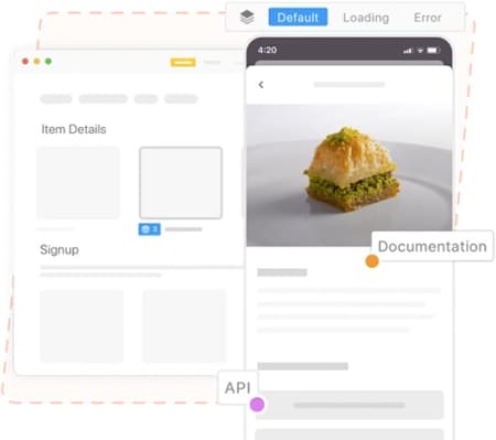
Its design-handoff guidance emphasizes intent and context as well as measurements. Keep the final states and unresolved rules visible; developers need to know what the interface should do, not only its spacing.
Key Features:
- Verify the current integration for the design source used by your team.
- Organize the screens and component information so the approved state is identifiable.
- Treat generated snippets or specifications as implementation assistance, not a complete Android application.
Compare the Tools With One Task
A small comparison project reveals practical constraints more clearly than a broad feature checklist. Use the same content and states in each candidate workflow.
Compare tools with the same Android settings task
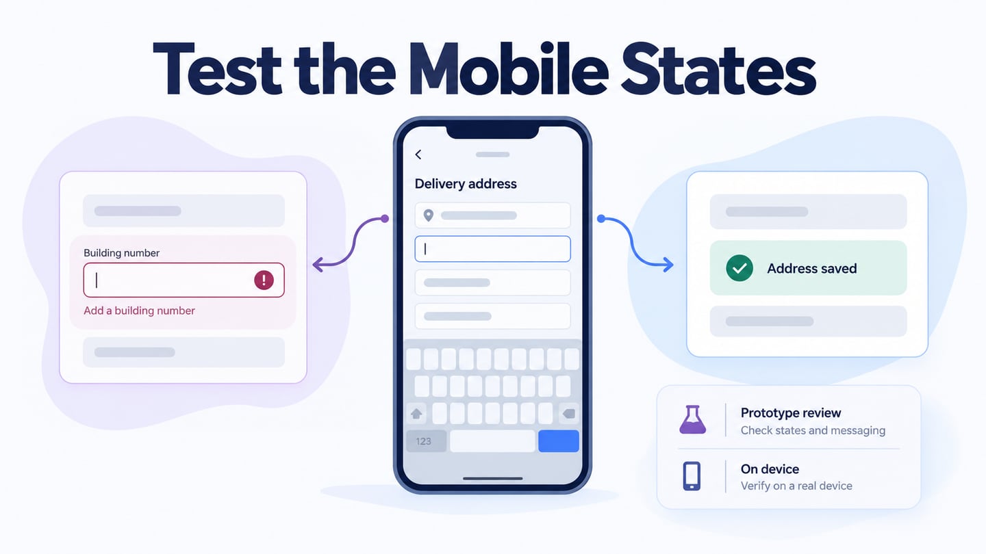
For an illustrative Android notification screen, offer Immediate delivery or a Daily summary. When Daily summary is selected, show a summary-time field and a sentence explaining that one summary will arrive at that time. Keep the selected mode visible when the keyboard or time picker appears.
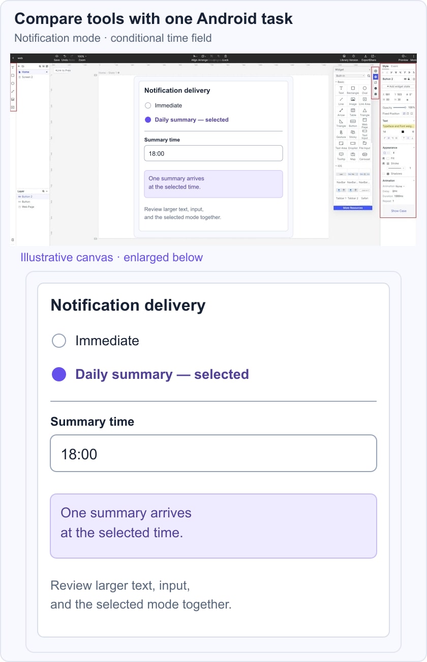
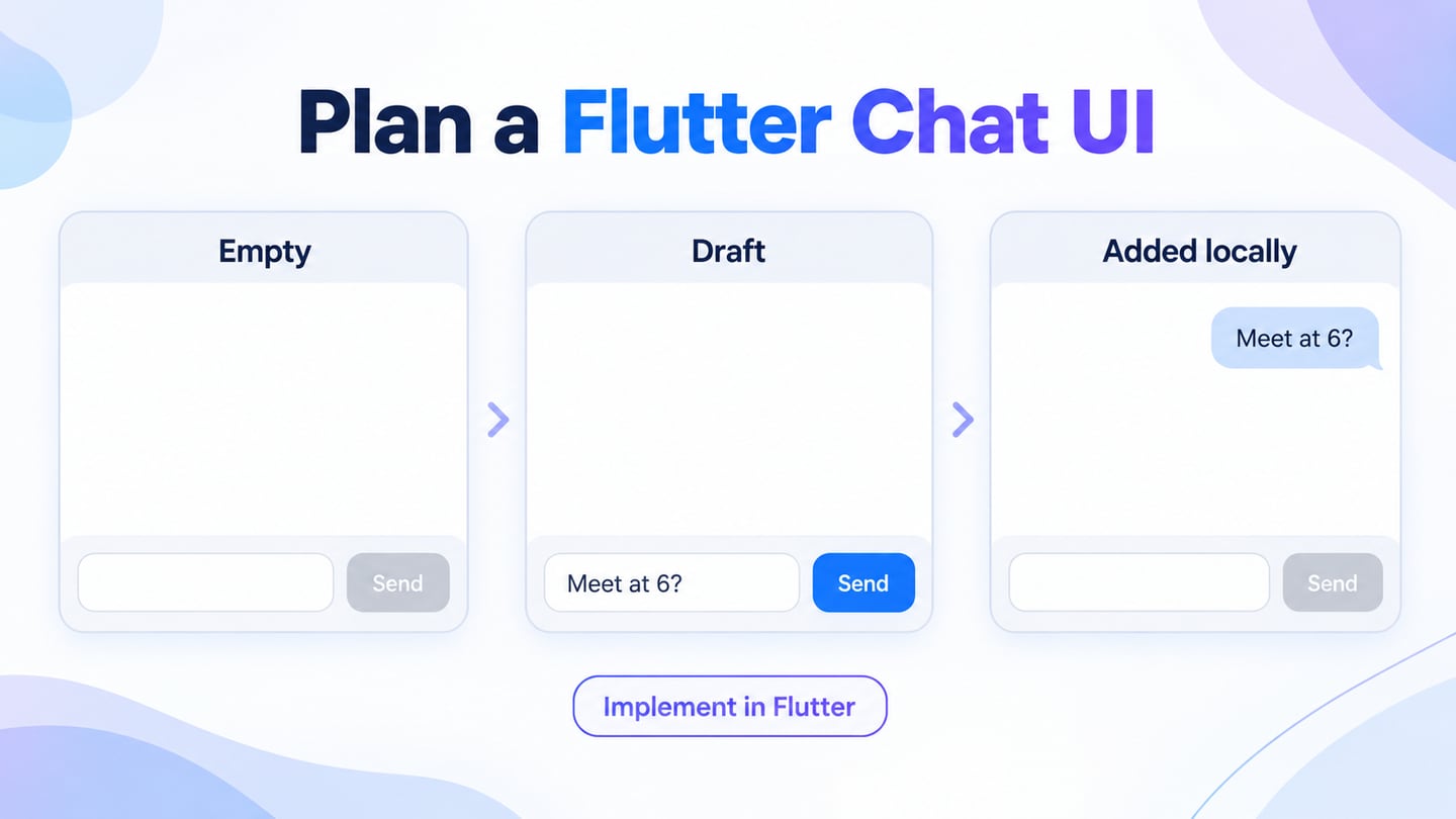
Check how each workflow represents the shared control, conditional field, larger text, and handoff note. Ask a reviewer to explain the selected behaviour. Then connect the states in an Android settings prototype and identify what must be verified in the native build, including state persistence, platform input, and accessibility labels.
Android UI Design Principles to Apply
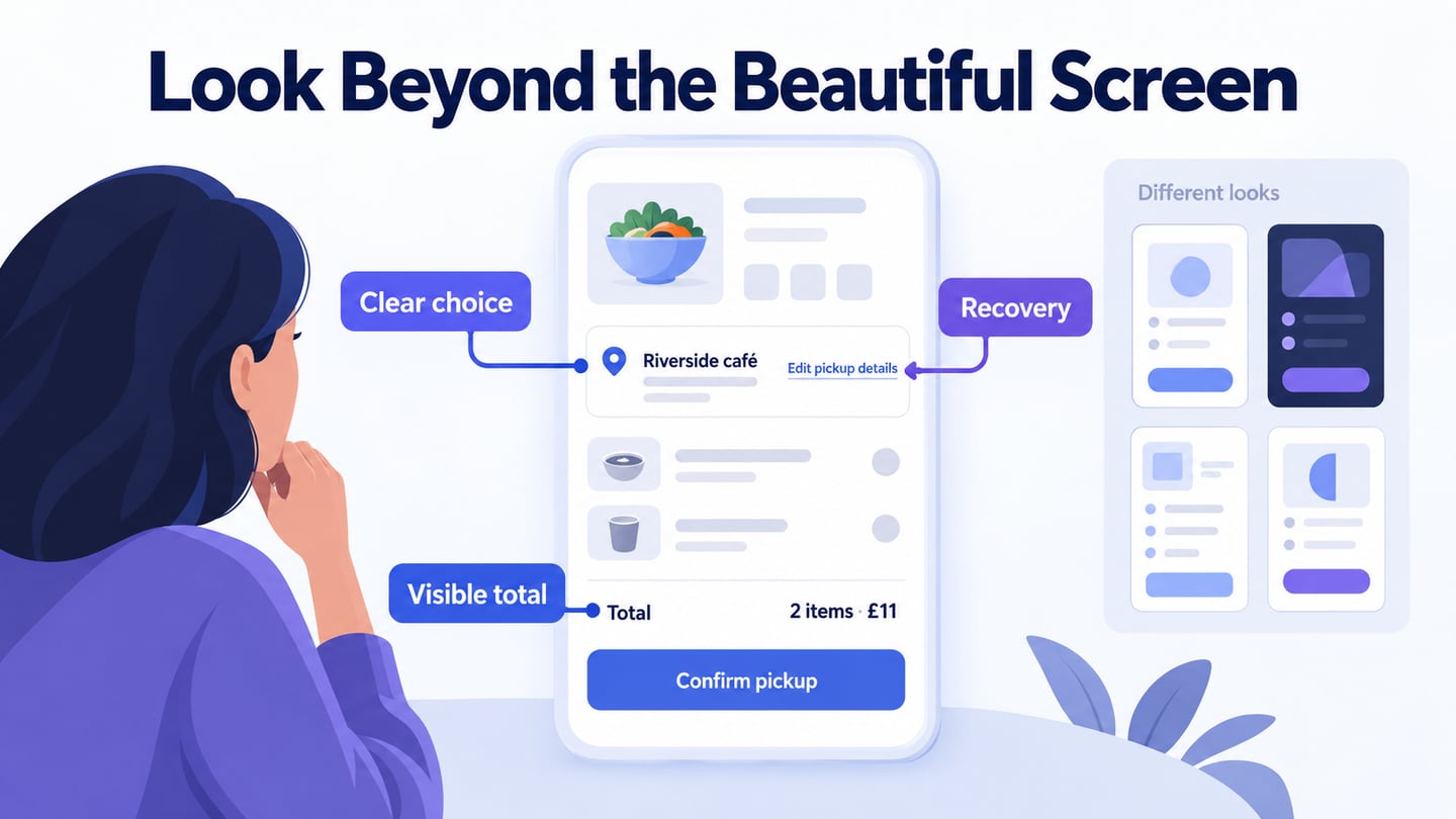
Android UI design organizes content and controls so people can complete the intended task. The Android layout guidance is a useful starting point for space, grouping, insets, and changing screen conditions. Apply the following principles to the default and exception states.
Choose the right UI elements
Choose controls according to their behaviour. A setting, a one-of-many choice, and a submission are different actions. Keep the pattern predictable and document the outcome rather than selecting the control only because it looks familiar.
Ensure the interface is simple
Remove unnecessary elements while retaining the information needed to act. Use clear labels and concise explanations. A sparse screen is not useful if the selected state or consequence remains hidden.
Improve consistency and apply common UI elements
Reuse meaningful patterns across screens and keep their behaviour consistent. Include selected, disabled, error, and loading states in the component discussion; a shared default appearance alone is not a complete pattern.
Use texture and color strategically
Use color and emphasis to support hierarchy, but do not make them the only indication of status or selection. Check the important color pairs and the interface in relevant appearances.
Apply typography
Plan a readable hierarchy with realistic text lengths and user-selected text sizes. Review wrapping, truncation, and space around controls rather than assuming a single fixed font size works everywhere.
Let the system communicate what is happening
Show the result of actions, explain failures, and keep the next step understandable. A pending operation is not success, and a disabled control may need an explanation of what enables it.
Choose defaults deliberately and check the layout when content, available space, or input changes. Native Android behaviour must be verified in the implemented app, beyond the visual prototype.
Conclusion
Choose the tool or combination of tools that supports the team’s actual design, prototype, and handoff tasks. Compare a realistic component and its exceptions, preserve platform requirements, and verify the resulting native implementation. That is more useful than selecting software from a “best” label alone.