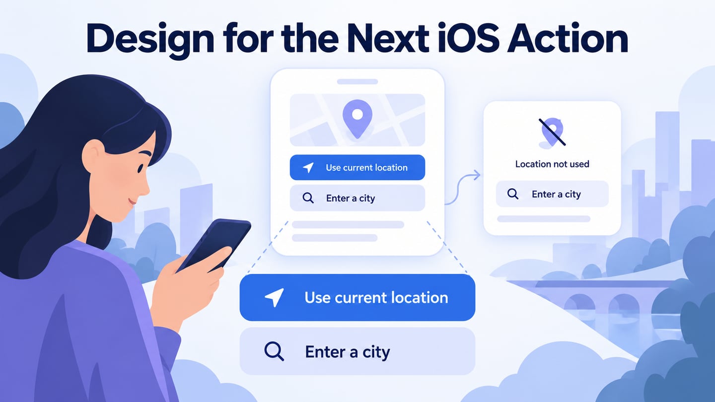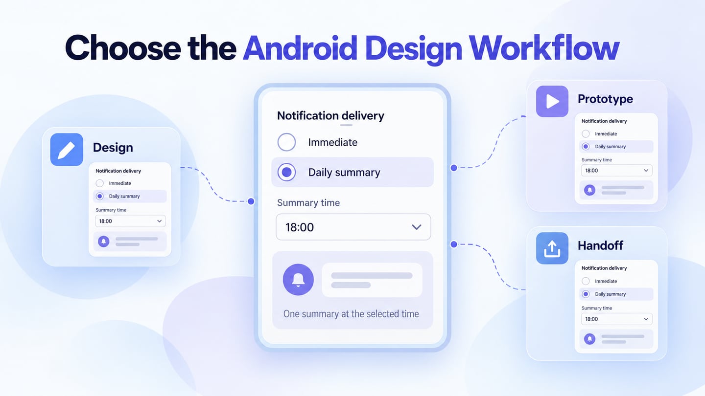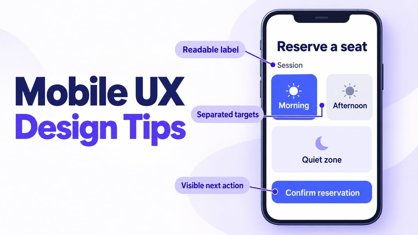

Mobile interfaces have to work within small screens, changing viewing conditions and interruptions. From shopping to getting directions, people may use a phone while moving between other activities. That makes it important to understand the particular task and device context rather than assuming that a desktop layout will work unchanged on every mobile screen.
Mobile UX design considers how people understand and complete a task on a mobile device. Research, readable content, clear controls and recovery from mistakes all contribute. The ten tips below give beginners a practical review sequence. Use a mobile interface prototype to explore the task before committing to implementation, then check the real app or website on representative devices.
10 UX Mobile Design Tips for Beginners
These ten tips cover common mobile design decisions. Apply platform guidance to the product you are building and test the result; no single layout rule fits every task.
Tip#1 – Do Research.
When assigned a project, research the people and context before designing the product or service. Thinking of yourself as the user can suggest questions, but your knowledge and priorities may differ from theirs. User research helps you discover those differences instead of designing only for your own expectations.
Review an existing app to identify questions worth investigating, then observe representative people attempting the relevant task. A high app-store rating is not evidence that a particular feature works for your audience. Ask what people are trying to achieve, what information they have and where they encounter difficulty.
Tip#2 – Practice Minimalism
A mobile screen can become difficult to scan when many unrelated options compete for attention. Practice minimalism by removing unnecessary choices and emphasizing the information needed for the current task. A sparse screen is useful only if people can still find essential actions and context.
Remove redundant buttons and pages while keeping the actions people need. Use consistent styles for similar controls and make primary and secondary actions distinguishable. One clear primary action can help, but do not impose one action per screen when editing, cancelling or going back is necessary.
Tip#3 – Don’t Forget the Readability!
Whether you are designing an app, a web form or a mobile website, readable text matters. Choose a size, contrast and line spacing that suit the content, and check long labels and larger text settings. A heading that fits your design canvas may wrap differently on the actual device.
A font library can help you find suitable typefaces, but choosing a font does not establish readability. Review body text, labels and error messages at the intended size. For web content, WCAG reflow guidance explains how content should adapt when its available space changes.
Tip#4 – Break the Text!
Break long forms and explanations into meaningful sections when that helps people understand the task. A single scrolling page and a multi-step flow each have tradeoffs: one keeps the content together, while the other can focus attention but adds navigation. Choose based on the task rather than assuming that longer pages always increase engagement.
Use clear section headings, keep related fields together and show progress when the task genuinely has several steps. Let people review and correct earlier information without losing their work. Do not split a short, understandable form merely to make the screen look less crowded.
Tip#5 – Design Touch-friendly Buttons!
Small, closely packed controls can be difficult to activate accurately. Review the whole interactive target, not just its visible icon, and leave enough separation between adjacent actions. A mistaken tap should be easy to correct when possible; destructive actions need particular care.
For web interfaces, WCAG 2.2 target-size guidance specifies a minimum of 24 by 24 CSS pixels with defined exceptions, including spacing. This is a minimum requirement, not an ideal size for every mobile task. Native-platform guidance uses its own units and context: do not treat CSS pixels, points, device pixels and millimeters as interchangeable.
Tip#6 – Reduce the Need for Typing
Typing on a small touchscreen can interrupt a task, particularly when someone must repeatedly switch input modes. Ask only for information that is needed. Use appropriate input types and autocomplete where applicable, and make prefilled values visible and editable. Avoid assuming that an inferred value is correct.
Offer choices when the available answers form a clear, manageable set. Keep free-text entry when a fixed list would exclude valid responses. Check the form with the keyboard visible so that labels, error messages and the next action remain understandable.
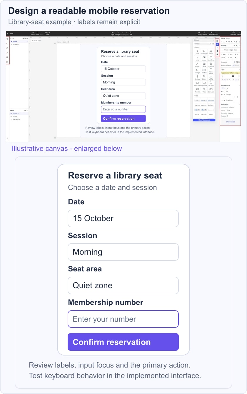
For an illustrative library seat reservation, show the date, Morning session and Quiet zone before Confirm reservation. Keep the selected values visible when a membership-number field receives focus, and provide a clear way to change the session. In a prototype review, ask someone to identify the reservation details and correct the zone; the screen is a design example, not a live booking service.
Tip #7 – Prioritize Features by the Task
A common beginner mistake is to place every feature in the main navigation. This makes it harder to distinguish frequent tasks from occasional settings. Start with the audience’s main objectives, then make less common actions discoverable without giving every feature equal emphasis.
A useful mobile layout follows the task sequence. On a shopping website, people may browse products, inspect details, add an item and review the order before checkout. Make those stages understandable and preserve their choices. Priorities can differ by audience, so verify the sequence rather than assuming everyone starts from the same page.
Tip#8 – Never Clutter the Tab Bars
Tab bars can help people move between a small set of primary destinations, but not every website or form needs one. Use readable labels and a clear selected state. The mobile UI examples offer visual references; evaluate whether a pattern fits your own navigation rather than copying its appearance alone.
Pair icons with concise labels when the icon’s meaning could be unclear. Removing text to save space can make navigation harder to understand. Keep the destinations stable and avoid hiding necessary actions behind an unexplained symbol.
Tip#9 – Take Care of Spaces!
Although mobile screens are smaller than desktop displays, related content still needs clear grouping and separation. Crowding text and controls together makes a page harder to scan and can increase accidental taps. Use spacing to express relationships, not simply to fill or empty the screen.
Give sections enough separation to make their boundaries clear, while keeping a label close to its field. Check readable text sizes and consistent page padding across the layouts you support. There is no universal 15–16 padding value that guarantees touch performance; content, viewport and target geometry all matter.
Tip #10 – Test Early and Recheck the Implementation
After applying these tips, ask representative users to attempt realistic tasks without explaining where to tap. Start while changes are still inexpensive, and repeat the review as the design develops. Observe what they understand, where they hesitate and whether they can recover from mistakes.
Combine observations with feedback and measurements relevant to the task. App-store ranking is not a substitute for observing usability, and a fast prototype is not proof of production performance. Test the implemented app or website on the browsers, devices and input methods your audience uses.
In the end, always remember it’s good to commit mistakes as long as you learn from them.
Conclusion
A mobile app or website needs ongoing evaluation as content, devices and user needs change. Surveys can gather opinions, while observed tasks reveal whether people can use the interface. Preserve what works, address the problems you can demonstrate and verify the result after implementation.