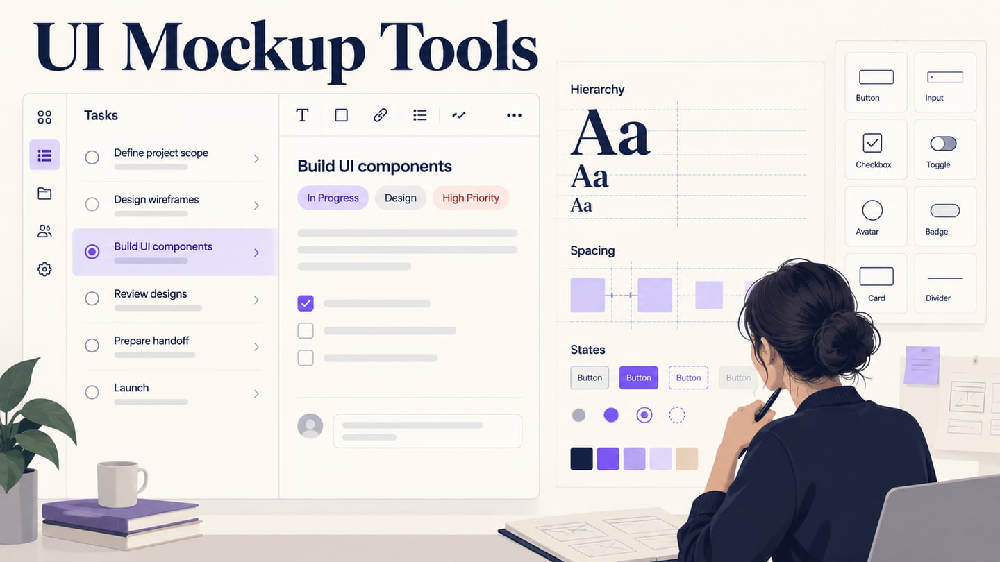
A UI mockup shows how an interface is intended to look: its content, hierarchy, typography and component states. Some tools emphasize rough wireframes; others support detailed visual design and prototype connections. This comparison distinguishes those outputs and uses one project-list screen to evaluate seven candidates.
Choose the output before the tool
For the example, prepare a project list with a toolbar, status labels, project cards and a selected state. A structural sketch can establish placement; a visual mockup can specify appearance; an interactive prototype can demonstrate what a selection does. Do not treat those deliverables as interchangeable.
Tools for UI screen planning and design
1. Mockitt: Editable UI and Prototype Review
Mockitt offers a UI design workspace and a related prototyping workflow. It is relevant when the team wants to continue from editable screen composition into review of the proposed experience.
Build the project-list layout with realistic title lengths and repeated cards. Reuse the status label and selection treatment so the design remains consistent across screens.
Check the intended workspace and plan for the editing, review and export features you need.
Evaluate
Can you change a repeated card’s content without breaking its hierarchy?
Can you use consistent typography and selected-state styling?
Can another team member inspect the intended version and identify the relevant element?
Boundary
A visual mockup does not establish that the selection, filtering or project data works.
Connect the screens only when the next question requires interaction.
2. Moqups
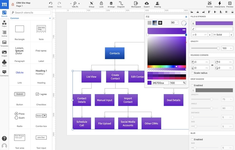
Moqups combines wireframes, diagrams and prototypes in a browser workspace. It can help a team discuss UI structure alongside the route through related screens.
For the project list, use its visual elements to compare toolbar placement, card density and detail-panel organization.
Evaluate the browser editor and recipient access rather than relying on an operating-system label alone.
Evaluate
Whether imported assets preserve the information needed for the mockup.
Whether templates can be adapted without leaving irrelevant sample controls.
Whether repeated cards and labels are easy to keep consistent.
Whether related screens remain organized for review.
Boundary
Confirm current sharing and output options before choosing a plan.
A planning canvas may answer structure questions before the team needs final component-level visual specifications.
3. Balsamiq
Balsamiq focuses on wireframing with a deliberately sketch-like visual language. It belongs in this comparison as a way to settle structure before producing a detailed UI mockup.
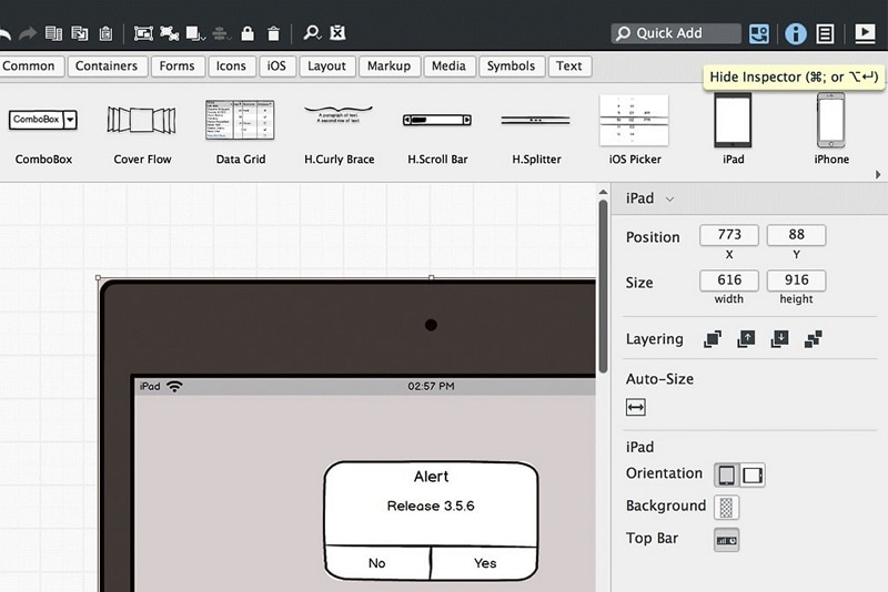
Use its current documented workspace for evaluation and verify any separate desktop requirement.
Evaluate
Whether a reviewer can identify the toolbar, status and primary action in the rough screen.
Whether the team can discuss alternatives without being distracted by final styling.
Whether linked screens are sufficient for the intended structural review.
Boundary
A sketch-style wireframe is not a pixel-level visual specification.
Check current commercial terms; the old project-price table and trial duration should not guide a new purchase.
4. MockFlow
MockFlow provides wireframing and visual planning tools. It can be useful for arranging the project-list structure and documenting decisions before detailed design.
Try the actual browser workflow the team will use.
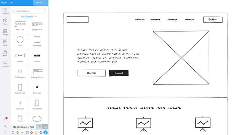
Use a suitable UI component set and replace sample labels with representative content.
Evaluate
How easily the toolbar and card hierarchy can be revised.
Whether the required review and export options are included in the intended plan.
How related screens and annotations stay organized.
Boundary
Do not assume a temporary promotion or old trial is a permanent free entitlement.
If final visual specifications are required, inspect the level of styling and output the project actually needs.
5. Marvel
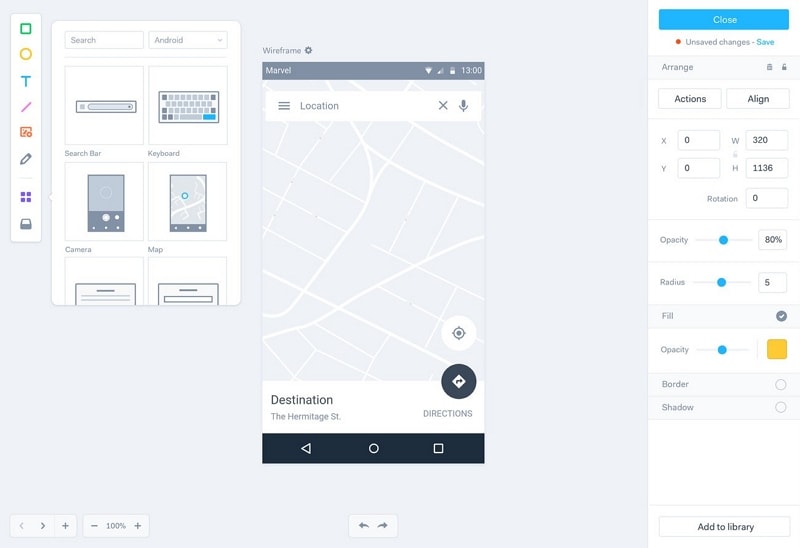
Marvel documents design, prototyping and handoff. It can support a screen-based review where the mockup will be connected to a short route.
Evaluate the authoring and shared-review experience rather than describing it as a native mobile-only tool.
Evaluate
Whether the project card and detail screen remain editable.
Whether a selection can be connected to the intended next state.
Whether feedback identifies the relevant screen and version.
Boundary
Verify current account and collaborator limits.
A handoff view or shared prototype does not prove that the project-management behavior is implemented.
When the task is specifically a public website, use the distinct website mockup tool comparison to evaluate page composition and responsive review.
Additional options for structure and detailed UI
6. Wireframe.cc
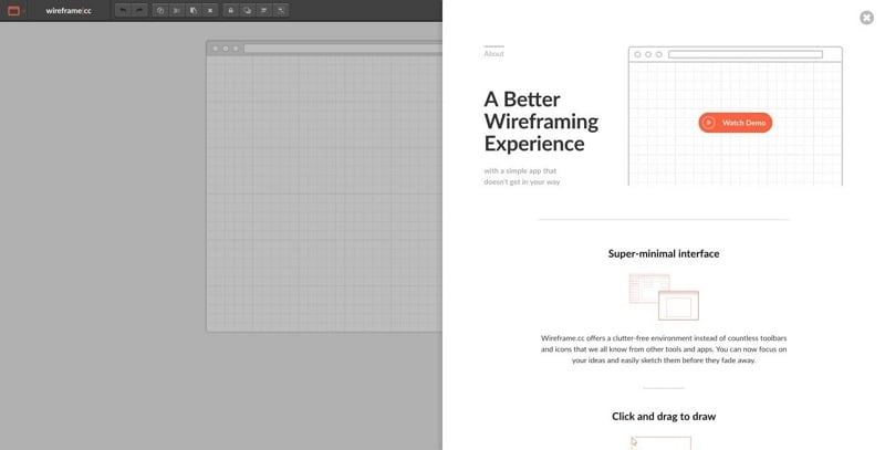
Wireframe.cc keeps the drawing workflow focused on screen structure. Use it to decide where the toolbar, filters and cards belong before committing to detailed visual styling.
Evaluate the clarity of the resulting layout and how the team shares or exports it. Its restrained approach is a tradeoff when the deliverable requires brand typography, detailed component states or a complete design system.
7. Figma
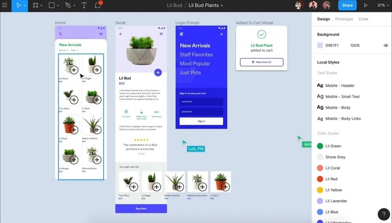
Figma provides collaborative interface design and prototyping. For a visual mockup, evaluate reusable components, text and layout editing, and the review path used by your team. Check current plan and seat rules instead of the obsolete two-editor, three-project claim.
Compare the same project-list screen
Use a shared brief: a project manager needs to distinguish active and archived work, select one project, and locate its details. Include a long project name, an empty-result state and a selected card. Keep the sample content constant across tools.
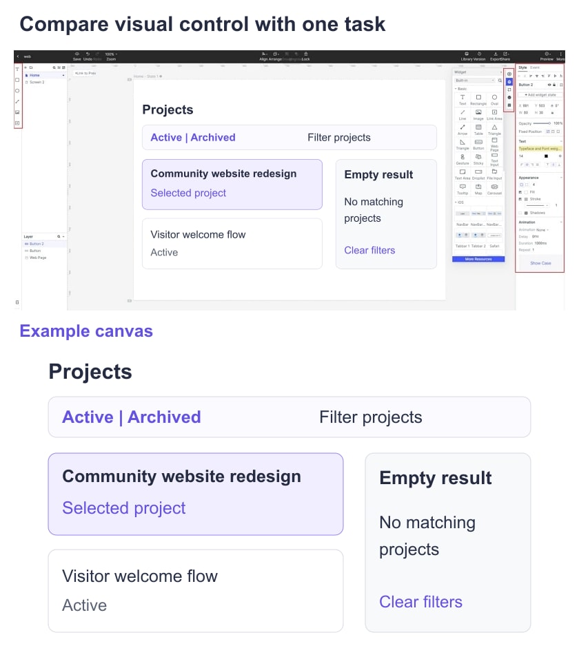
First revise the toolbar label and one repeated card. Then change the selected-state treatment and inspect the full screen at the intended review size. Record whether those changes remain editable and consistent, rather than awarding a tool an unsupported overall score.
Review the result with a teammate
Ask the reviewer to identify the active filter and selected project without explaining the design first. A static mockup can test interpretation of appearance; a clickable version is needed to examine the route after selection.
Use three decision criteria
Required detail: choose a wireframe-first tool for structural decisions or a visual design tool when precise styling and reusable component states are the deliverable.
Usable output: open the shared or exported result through the next teammate’s workflow. Confirm plan requirements before committing the full project.
Maintenance: check whether another designer can change text, spacing and repeated components without rebuilding the screen. Retain the sample file as evidence for the decision.