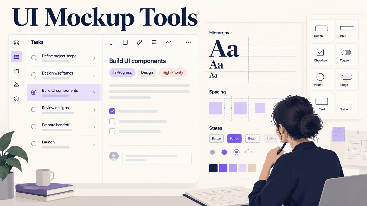
An app mockup lets a team discuss the appearance and information hierarchy of a mobile screen before implementation. An online editor is useful when collaborators need access to the same design, but “online” can mean browser editing, a shared preview, or a companion viewer. This guide compares those differences and shows how to create editable UI mockups in Mockitt around one review task. A mockup describes a proposed interface; it does not produce a working mobile app by itself.
Five Tools to Consider for an App Mockup
The options below serve different needs. Compare where editing happens, how a reviewer accesses the result, and which plan supports the handoff you need. A free tier, a time-limited trial, and a paid workspace are different offers; check current terms before committing project work.
1. Mockitt
Mockitt provides browser-based design and prototyping workflows. It is relevant when you want to build editable screens, connect selected interactions, and share the work with reviewers. Choose it for the design-review task rather than assuming that every feature or export is available without charge.

- Create app or website interface screens in the browser workspace, using a target canvas size appropriate to the review.
- Start from a suitable template or build editable components. Check current import support before depending on a particular source-file format.
- Use the available widgets, icons, shapes, and text to assemble a consistent interface. A large asset library is useful only when the selected elements fit the task.
- Preview the modeled screens and share them using the access controls in your workspace. Verify current export options when a file handoff is required.
- Use shared access and feedback to discuss specific screen decisions with the relevant team members.
Pros
- Browser-based screen design and reviewable prototype paths
- Useful when editable screens and team feedback belong in the same workflow
Cons
- Plan limits and supported exports need to be checked for the intended project
2. Proto.io
Proto.io is a browser-based prototyping environment. Its preview options let reviewers inspect modeled app interactions on the web or a mobile device. A mobile viewer is not the same as a full mobile editing application.
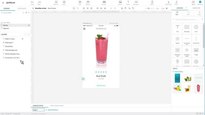
- Build screen-based prototypes using the web editor and its available interface components.
- Check supported design-tool imports and templates against the source assets you actually have.
- Preview prepared interactions to discuss navigation and screen states before implementation.
- Use sharing and comments to collect feedback; a clickable preview alone does not constitute a user-research study.
Pros
- Useful for reviews that depend on mobile interaction behavior
- Screen-based editing and preview options
Cons
- Trial and free-plan restrictions differ; check the current Proto.io plan details rather than assuming unlimited free use
3. Framer
Framer’s current emphasis is designing and publishing responsive websites. Its website-building workflow can suit a mobile web concept, while an app-specific prototype may require different interaction or platform support. Do not choose it solely on the basis of an older desktop-app comparison.
- Use responsive layouts to explore how a web interface changes across viewport widths.
- Review the collaboration features available to the team and plan you intend to use.
- Check the available design-import path and review the imported layout before assuming that components or behavior transfer intact.
Pros
- Relevant when the intended output is a responsive website
- A design-to-published-web workflow rather than only a static presentation
Cons
- A published website is not a native mobile application; verify requirements before choosing it for an app mockup
4. Justinmind
Justinmind provides a downloadable design and prototyping application. It can share work for review, but should not be described as a fully browser-based editor. This distinction matters if your team cannot install desktop software.
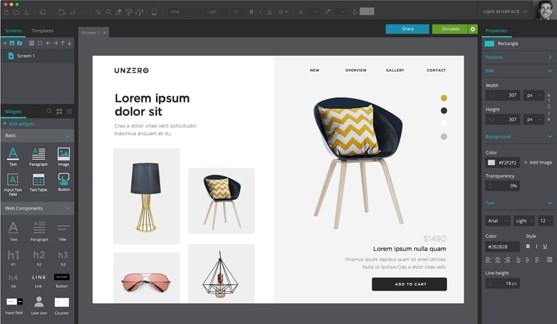
- Use available interface elements and templates to represent screens and interactions.
- Explore data-oriented interface controls where they fit the example, but do not assume that a simulated data grid is connected to a production database.
- Review its layout and interaction capabilities against the device behavior you need to demonstrate.
Pros
- Useful for detailed interface and interaction simulations
- Desktop authoring with review and export options to check against the selected plan
Cons
- A desktop installation is required for authoring; its free edition and premium trial have different capabilities
5. Moqups
Moqups combines browser-based wireframes, mockups, diagrams, and prototypes. It is useful when the team wants to discuss screen structure and surrounding flows in one online space.
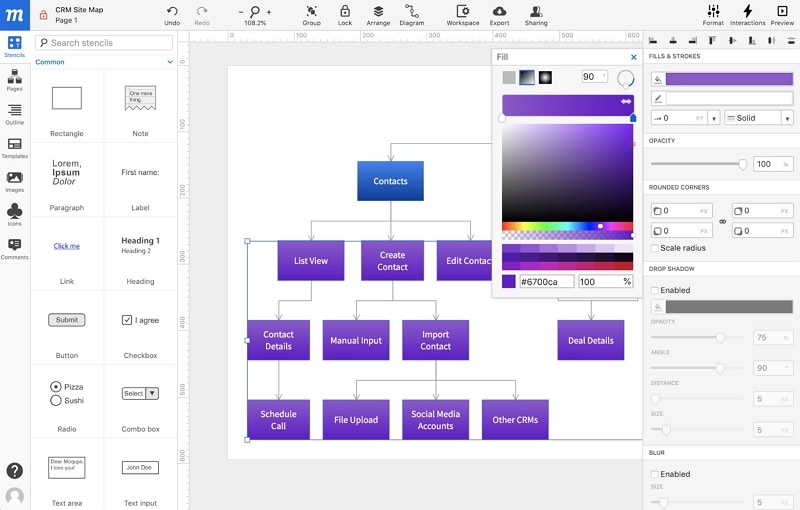
- Use reusable stencils and shapes to build consistent screen layouts.
- Combine the mockup with the relevant flow so reviewers understand how the screens connect.
- Check the export and sharing features needed for handoff against the current plan.
Pros
- Browser editing for both screens and supporting diagrams
- A practical fit for early layout and flow discussions
Cons
- The free plan has project and object limits; consult Moqups pricing instead of relying on limits from an older review
How to Mockup Mobile Apps Online
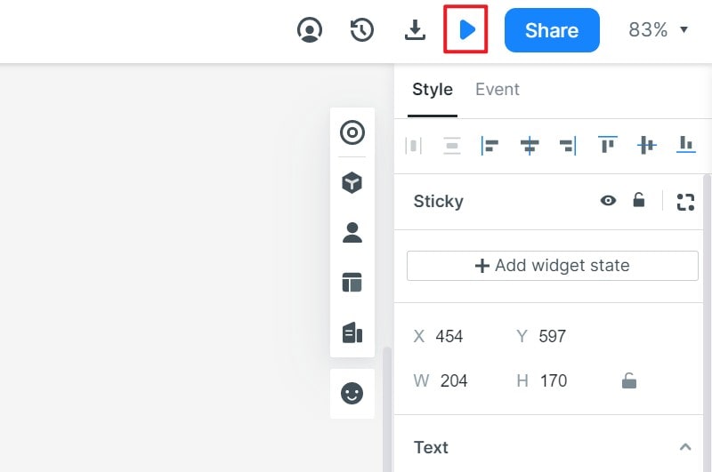
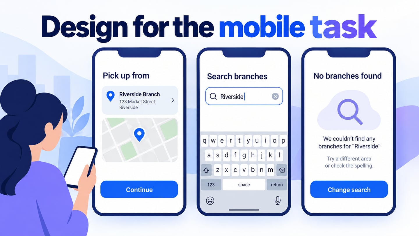
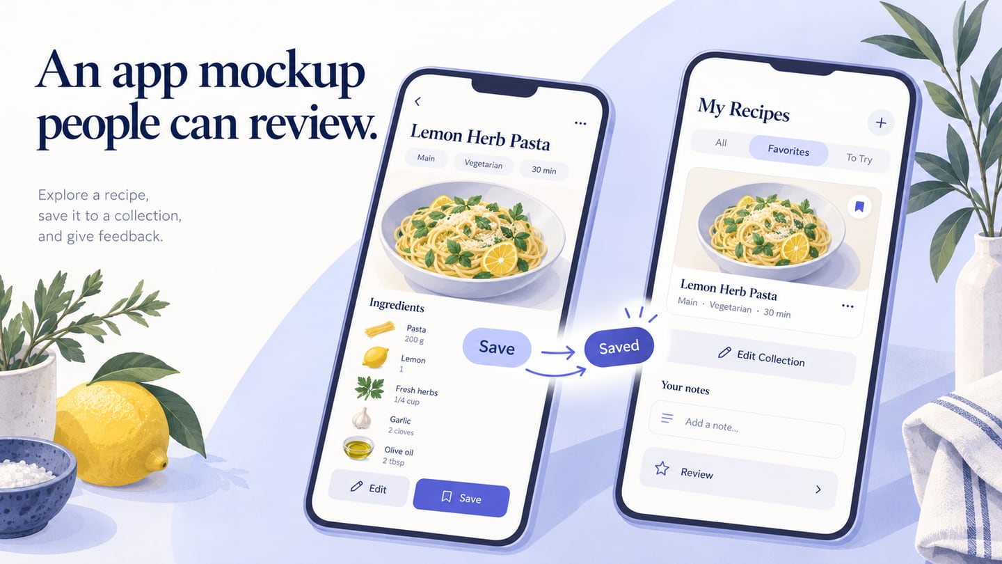
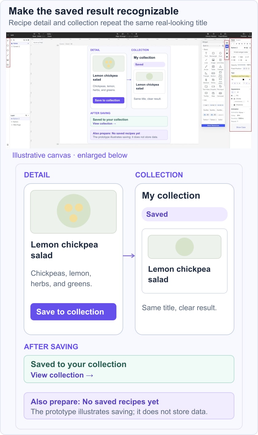
Use the steps below to create an illustrative mobile app mockup in Mockitt: a reader saves a recipe and later finds it in a collection. The example is deliberately small enough to review. The original screenshots are retained as earlier interface references, with a new task-specific scene added to clarify the intended result.
Step 1: Provide Your Project Specifications
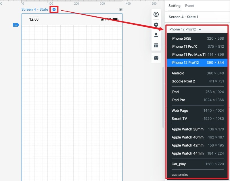
Create a project in the current workspace and choose a mobile-sized canvas for the intended audience. Name it “Recipe collection review.” Start with the recipe detail screen and a collection screen; a preset is a starting size, not a guarantee of responsive behavior.
Keep the important content visible at the target size: the recipe title, basic details, and the Save to collection action. Check text wrapping with a realistic title rather than shortening everything to fit.
Define what the mockup must communicate
For the recipe example, the visual review should answer three questions: where is the save action, how does the interface confirm that it was used, and where can the reader find the saved recipe later? Choose a realistic example title such as “Lemon chickpea salad” and keep it identical in the detail and collection screens.
| Screen or state | Visible content | Review question |
|---|---|---|
| Recipe detail | Title, image placeholder, Save to collection | Is the action easy to find? |
| Saved state | Saved label and View collection | Does the reader understand the result? |
| Collection | The saved recipe with the same title | Can the reader recognize and reopen it? |
This is an illustrative design exercise. A link to a prepared saved state does not store real user data, and the mockup should not imply that a backend or account system has been delivered.
Step 2: Add Widgets, Links, and Other Elements
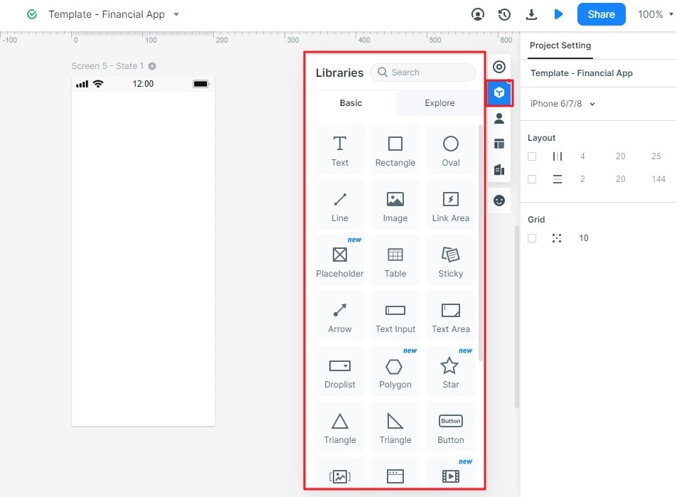
Add the heading, image placeholder, short description, and primary action. Reuse spacing and text styles across the detail and collection screens so the relationship is clear.
Use the properties controls to adjust size and appearance, then review contrast and hierarchy. The primary action should be easy to find without making every control equally prominent.
Add a saved state and an empty collection state. Link Save to collection to the prepared saved result and include a route to view the collection. Notes should explain which behavior is simulated, including persistence, account state, and any network failure that the mockup does not model.
Step 3: Preview and share your project
Preview the task from the recipe detail screen. Ask a reviewer to save the recipe and find it again in the collection. Check that the saved feedback and destination are understandable, then share the review link with suitable permissions.
Choose a tool based on the artifact and review task you need, not a universal ranking. Keep visual decisions editable, use realistic content, and label simulated behavior clearly. If the structure is not settled yet, start with an app wireframe before adding the visual detail of a mockup.