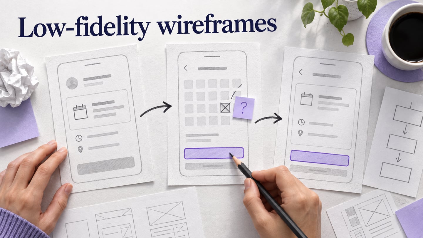
A low-fidelity wireframe is a rough plan for a screen: what information appears, which action matters most, and where the user goes next. Like a building blueprint, it helps a team discuss structure before investing in visual detail. This guide uses an appointment-rescheduling flow to show how to create low-fidelity wireframes, connect the important screens, and decide what feedback is worth acting on.
What is the Low Fidelity Wireframe?
A polished screen can still contain a confusing task. Low-fidelity wireframes make layout and navigation decisions visible while they are relatively inexpensive to change. For the appointment example, the first question is whether a customer can find the existing booking and choose a new time—not which accent color the calendar should use.
You can draw low-fidelity wireframes on paper or build them digitally from text, rectangles and simple controls. A paper wireframe is one form of low-fidelity work; a rough screen in a design tool is another. Use recognizable labels such as “Current appointment” and “Choose another time” so reviewers can understand the task without a finished visual design.
Visual detail and interaction are separate choices. A low-fidelity wireframe can be static or linked into a clickable prototype. A high-fidelity mockup can look finished and still be static. Neither automatically contains the backend features of the eventual product. The NN/g guide to prototype fidelity distinguishes these dimensions.
Start with the screens and information needed to answer the current question. Our example needs the existing appointment, a choice of available times, and a confirmation summary. It also needs a way back when no time is suitable. An online prototyping workspace can keep these screens together and connect them for review; a wireframe is a discussion aid, not proof that the scheduling service works.
These Mockitt features support low-fidelity work when you use them selectively. The retained guide screenshots below show earlier interface versions; control placement may differ in the current workspace.
Multi-Platform Prototyping
Choose a screen size that matches the task you want to review, and adjust it if needed. For the appointment flow, start with a mobile width because the example customer is changing a booking on a phone. A desktop version can follow when you need to review the same task on a larger screen.
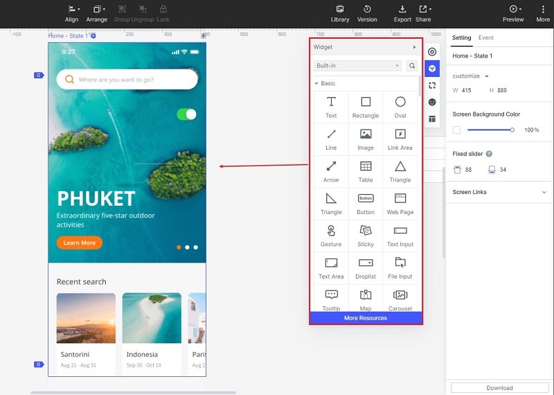
Different Kinds of Icons and Widgets for Designing
Use basic text, rectangles, inputs and buttons before decorative icons. In the time-selection screen, a date label, a short list of time slots and one confirmation action are enough to test the information order. Use an icon only when its meaning is clear without a tooltip.
Drag and Drop Feature
Drag the components onto the canvas, then arrange them in reading order. Keep each button beside the information it acts on. Reuse the same spacing and labels across screens so differences in the flow are intentional rather than accidental.
Links and feedback
Connect the main actions and ask reviewers to attempt the task before explaining it. A comment such as “I expected to keep my original booking until I confirmed the new time” is more useful than a general preference for one layout. Record the screen and decision behind each comment.
Cloud Storage
Keep a shared project for review and agree who can view, comment or edit it. Available collaboration and file allowances depend on the selected Mockitt plan. Test the reviewer’s access before a session and avoid placing real customer appointment data in the example.
How to Create Low Fidelity Wireframe?
The five steps below keep the original project → components → links → notes → preview workflow. Use synthetic appointment details: an existing booking on Tuesday at 10:00, two alternative times, and a confirmation screen. These are demonstration details for a design exercise, not a record of a real booking.
Prepare the appointment flow
Step 1: Create the screens you need
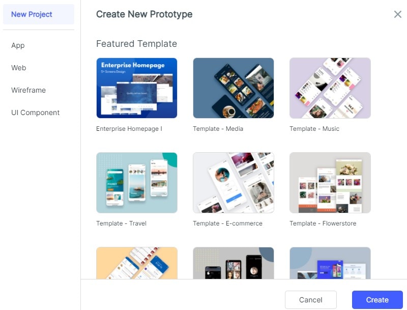
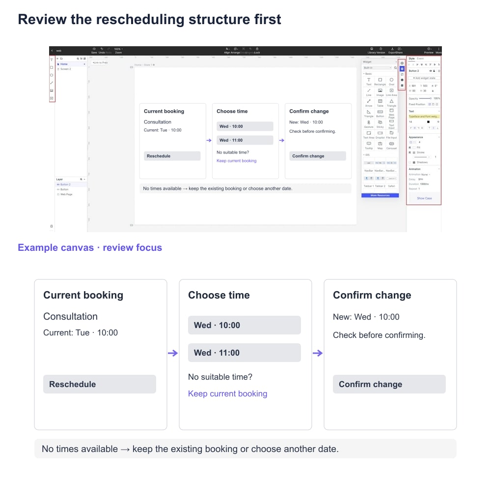
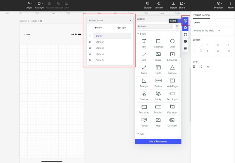
Create a prototype project in Mockitt and choose a suitable mobile canvas. A blank project is useful here because it avoids importing unrelated visual detail; a template is also acceptable if its structure matches the task. Name the screens “Current booking,” “Choose time” and “Confirm change.” Add a fourth state, “No times available,” before you begin decorating any screen.
Step 2: Build a clear information hierarchy
Add the appointment name, current date and time, and a “Reschedule” button to the first screen. On the next screen, put the date selector above the available times and keep the selected time visible near “Review change.” Use gray blocks for images and plain text for labels. Leave realistic space for longer appointment names, and do not use color alone to show the chosen slot.
Step 3: Link the task and its escape route
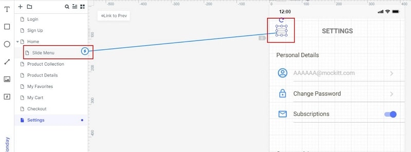
Link “Reschedule” to the time-selection screen and “Review change” to the confirmation screen. Add “Back” or “Keep current booking” so a reviewer can leave without confirming. Model “No times available” as a separate screen or state with a way to choose another date. Only connect the actions needed for this task; unrelated navigation can remain outside the review.
Step 4: Annotate the decisions behind the screens
Add notes beside the relevant controls: “Original booking stays active until confirmation,” “Available times are sample data,” and “If the slot is taken, return to time selection.” These notes explain rules the picture cannot show. Keep them outside the user-facing layout, or hide them while someone attempts the task.
A simple state change is enough when it communicates the decision. For example, mark the chosen time before allowing the reviewer to continue. Add animation only if timing or movement is part of the question being tested; visual polish does not by itself make the eventual application better.
Step 5: Preview, share and record what happens
Preview the flow from “Current booking,” then open the review link at a realistic phone size. Give a reviewer the task “Move this appointment to another available time” without naming the button to press. Note whether they find the action, notice the selected slot and understand when the change is confirmed. After the walkthrough, revise the screen responsible for any hesitation and repeat that part of the task.
When Should You Use Low Fidelity Wireframe?
Use low-fidelity wireframes when the team is still choosing screen structure, navigation, content priority or a task sequence. They are useful for comparing two ways to choose an appointment time before investing in a detailed calendar component. They also give product, design and development colleagues a shared place to identify missing information.
Move to more detail when the unanswered question depends on actual content length, visual hierarchy, touch targets or interaction behavior that the rough version cannot represent. If reviewers still disagree about whether confirmation happens before or after the booking changes, solve that flow question first. A more polished drawing will not resolve an unclear rule.
Difference between Low Fidelity and High Fidelity Wireframes
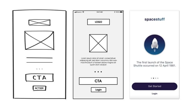
Artwork by Tsvetelina Lazarova
Choose fidelity according to the question. A low-fidelity wireframe is suited to comparing structure and the order of actions; a detailed visual mockup helps evaluate typography, color, spacing and content fit. An interactive prototype can be built at either visual level. In the appointment example, first establish the selection and confirmation sequence, then refine the calendar and selected-slot states. Keep the original sketches so the team can trace why the layout changed.