A website footer should help visitors finish a task: find support, contact the organization, review a policy or move to another useful section. Before coding it, test those paths in Mockitt’s online prototyping workspace. HTML provides the structure and CSS controls the layout; neither automatically makes a footer useful.
Start with an inventory of the information that genuinely belongs at the bottom of the page. Group related links under clear labels and separate essential service information from optional newsletter or social links.
A page-level footer is usually a shared region after the main content. The W3C page-region guidance explains how meaningful regions support navigation. A footer should not unexpectedly appear, move focus or conceal the content someone is reading.
Plan and review the footer before writing code
You can use a prototype to review content, spacing and destinations without first building the live website. Keep the prototype’s purpose clear: it demonstrates the proposed experience, while the implemented site still needs semantic HTML, keyboard behavior and real destinations.
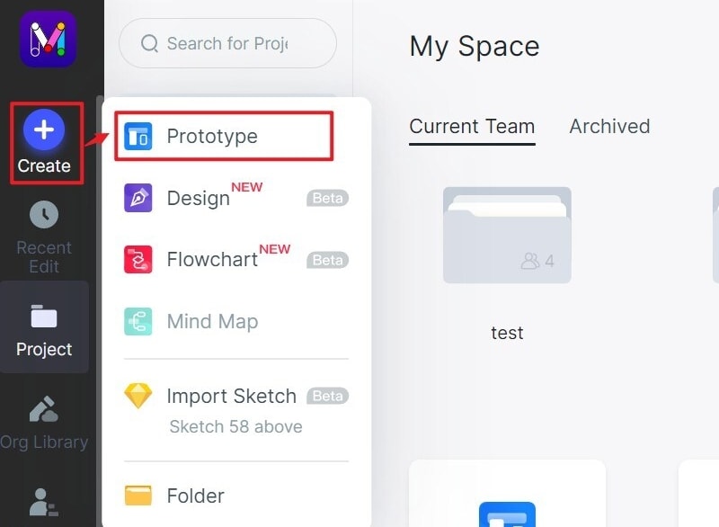
Step 1. Create a Project
Create a prototype and choose a desktop screen size appropriate to the website. Add a second, narrower screen for the mobile arrangement. A second view makes a responsive intention explicit; a screenshot of a wide footer does not demonstrate mobile behavior.
Step 2. Design the Footer
List the footer’s tasks before drawing columns. A small studio might need Services, Work, Contact and Privacy. A store might additionally need Delivery, Returns and Order support. Do not include every navigation item simply because there is room.
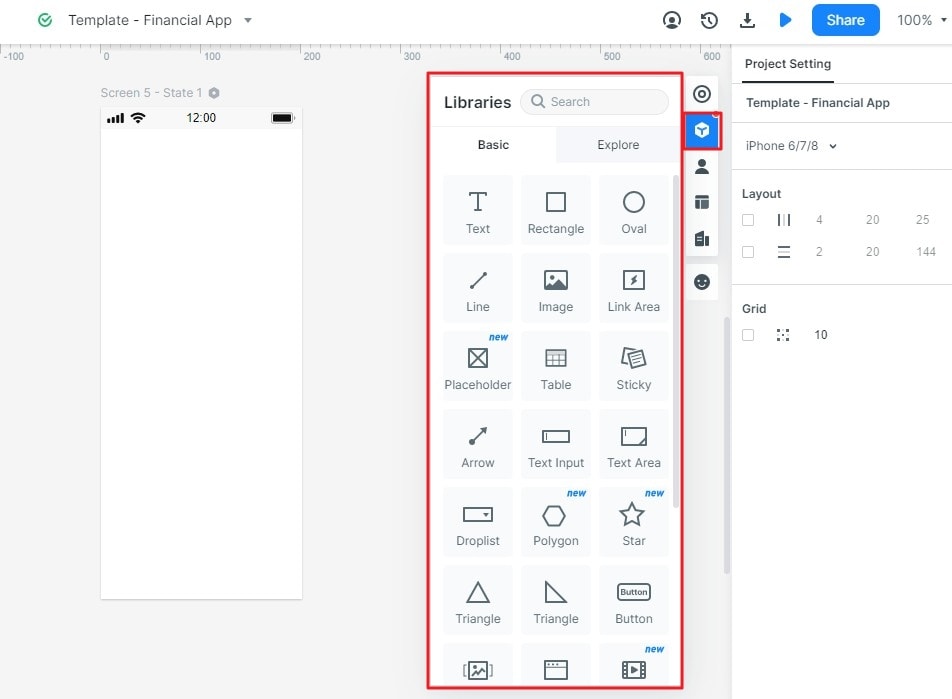
Place the text and controls on the canvas, use consistent spacing and link the destinations needed for the review. The retained screenshots show an earlier Mockitt interface; use them to understand the workflow rather than as an exact guide to the current toolbar.
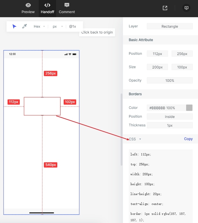
Inspect visual properties for handoff
The historical Handoff screenshot shows a selected element and its style properties. Such information can help communicate spacing and colors. It does not replace accessible document structure, responsive rules or testing of the finished website.
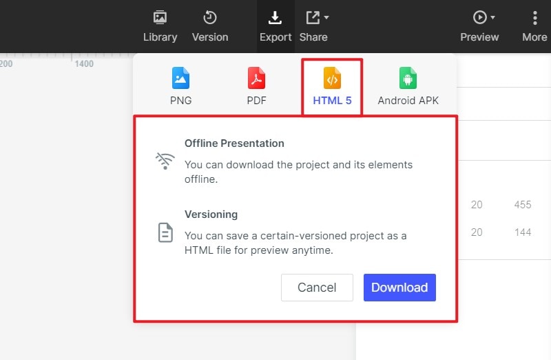
Keep prototype export separate from production HTML
The earlier HTML5 ZIP dialog below is a prototype-presentation export. Do not assume that downloading it creates a production-ready footer component. Check the export options available in the current workspace and agree with the developer which source files and interaction notes they need.
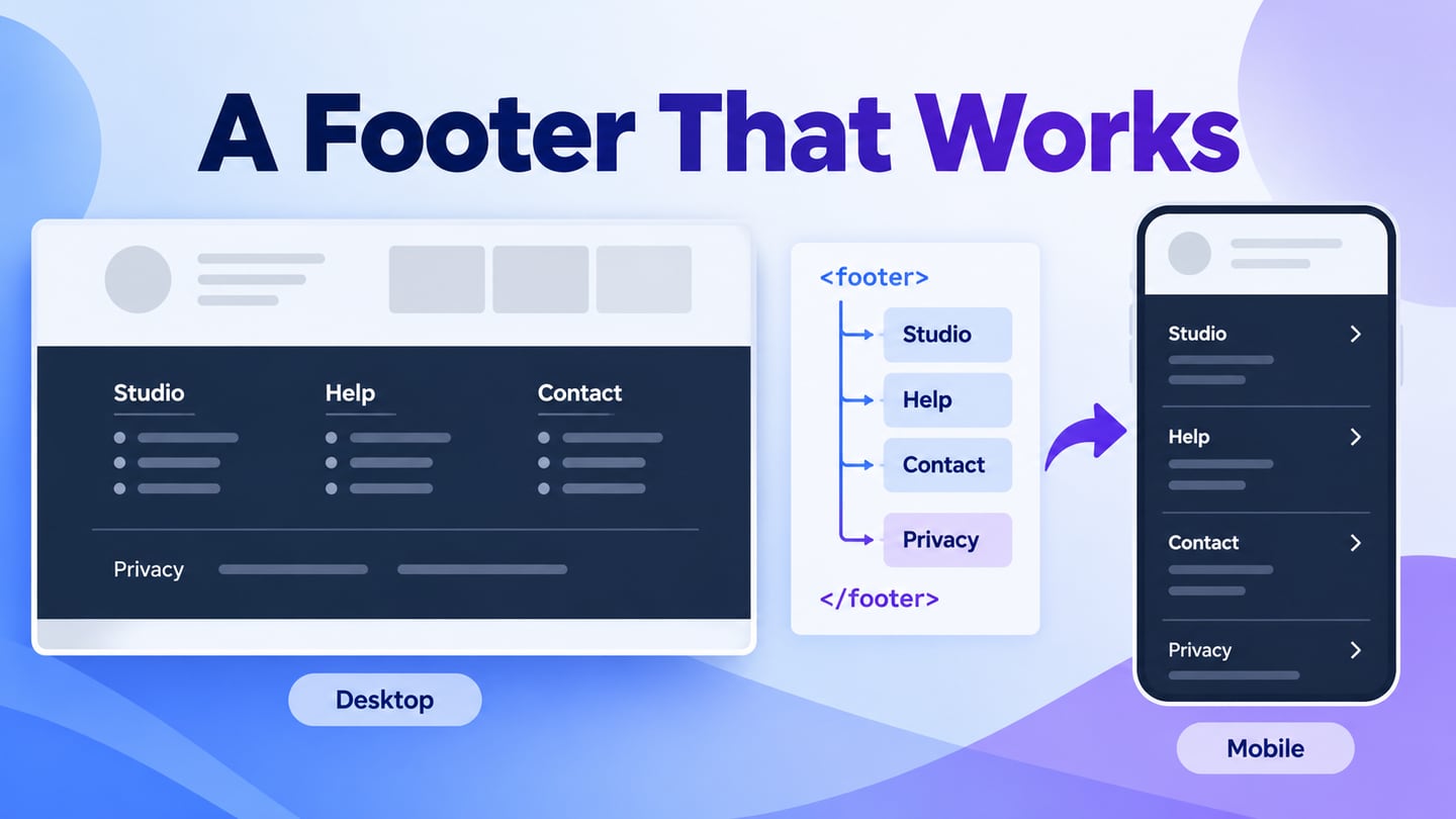
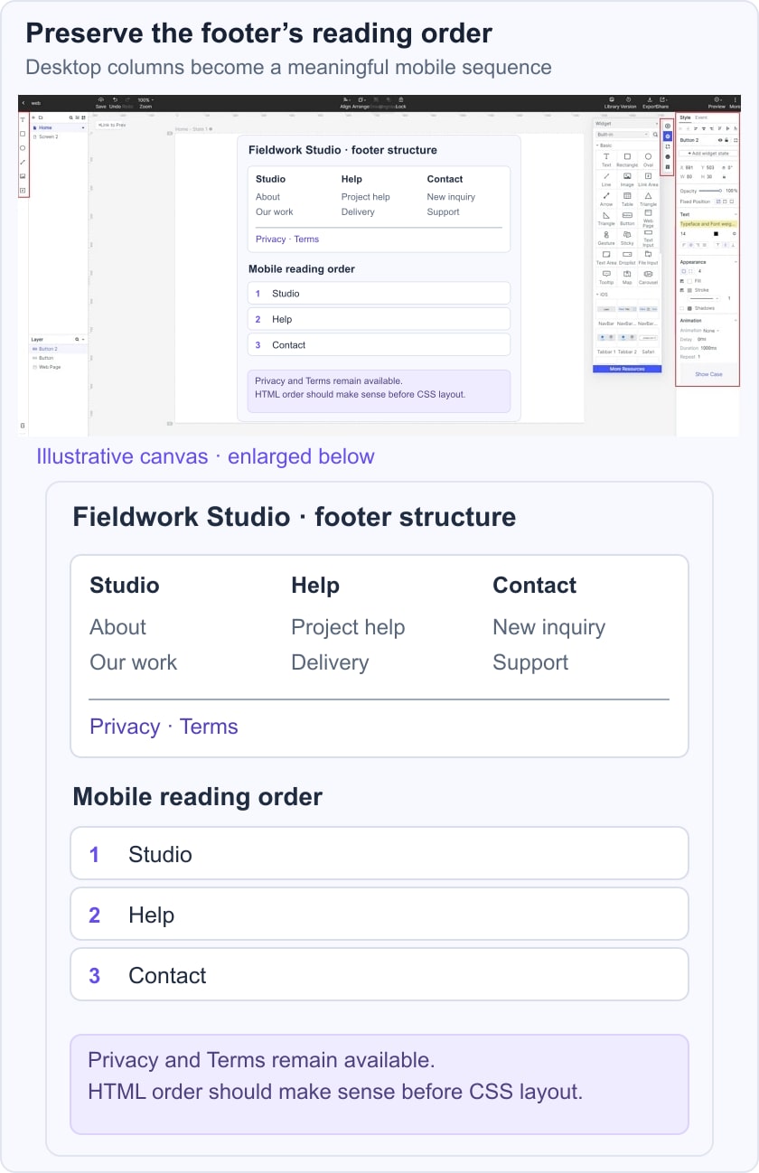
For an illustrative Fieldwork Studio website, group the footer into Studio, Help and Contact. Keep Privacy and Terms in a separate bottom row. On a narrow screen, stack the groups in the same reading order; the Contact address should remain easy to find without opening a promotional panel.
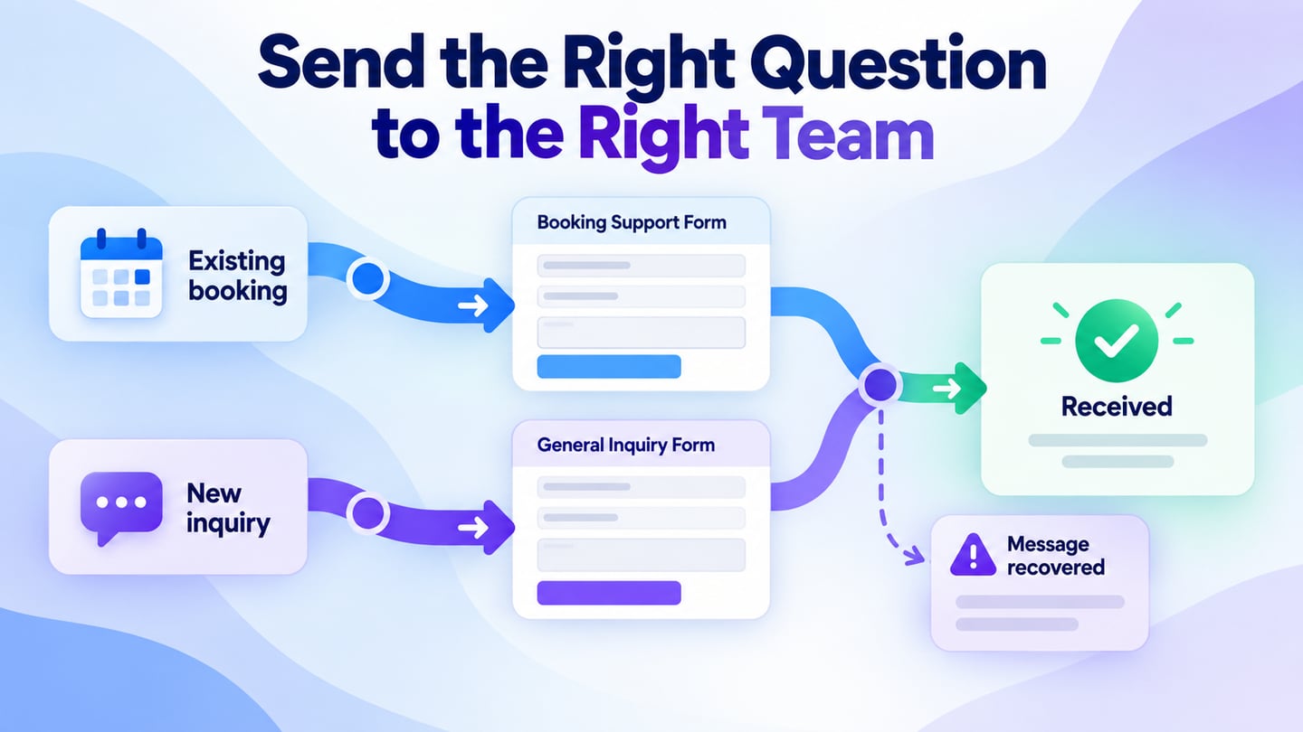
Use one review task: “Find how to ask about an existing project.” If a reviewer repeatedly chooses the newsletter form, the hierarchy is misleading. Move the service contact above optional subscriptions and test again before the layout becomes a reusable component.
Share the prototype with reviewers and ask them to use actual labels rather than explaining what each link means. Record destination errors, ambiguous groups and text that becomes too small on the mobile view.
A small implementation can preserve this structure without a large framework. The example below is a starting point, not a complete site footer: replace its destinations with real pages and test it in the surrounding document.
<footer class="site-footer">
  <nav aria-label="Footer" class="footer-groups">
    <section aria-labelledby="studio-links">
      <h2 id="studio-links">Studio</h2>
      <ul><li><a href="/work/">Our work</a></li></ul>
    </section>
    <section aria-labelledby="help-links">
      <h2 id="help-links">Help</h2>
      <ul><li><a href="/contact/">Project support</a></li></ul>
    </section>
  </nav>
  <a href="/privacy/">Privacy</a>
</footer>

.footer-groups {
  display: grid;
  grid-template-columns: repeat(auto-fit, minmax(min(100%, 12rem), 1fr));
  gap: 2rem;
}
.site-footer a:focus-visible {
  outline: 3px solid currentColor;
  outline-offset: 4px;
}
Keep the heading levels appropriate to your document. Verify the order when CSS is disabled, keyboard focus visibility, long link labels and wrapping at narrow widths. A sticky footer, if used, must not cover the last lines of the main content.
Eight footer references: what to learn and what to test
1. Valaire: keep a compact footer legible
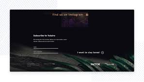
The retained small historical capture uses a dark area for a concise set of footer content. The useful idea is restraint: select a few meaningful actions instead of repeating the entire page.
Do not infer automated personalization or audience preferences from a still image. At the final screen size, check that small labels remain readable and that a compact appearance has not produced cramped targets.
2. Furrion: distinguish navigation from subscription
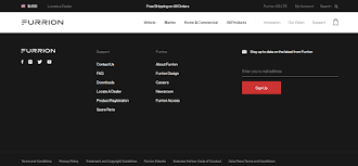
The historical Furrion footer groups links beside a newsletter area on a dark background. The layout makes two different activities visible: finding information and opting into updates.
When adapting this pattern, make the subscription field’s purpose clear and provide a real result after submission. Translate labels deliberately if the site supports multiple languages; a footer screenshot is not evidence of automatic localization.
3. The New York Times: organize a large link inventory
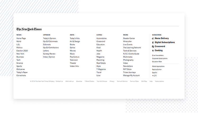
The original capture shows many links divided into labeled columns. This is useful when a publication has a broad content structure, but the number of links creates a stronger need for clear grouping and reading order.
A large footer does not guarantee better search rankings. Review whether the labels help readers find an actual section, then use the mobile footer checks to avoid compressing every desktop column into tiny text.
4. Guerlain: separate help, social and legal information
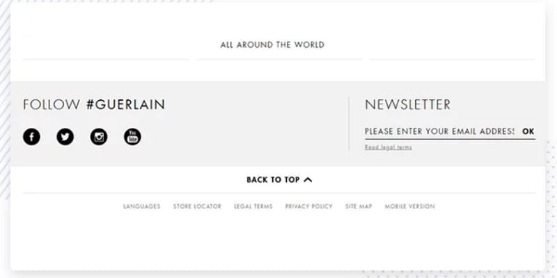
In the retained historical Guerlain image, service information, social links and legal controls occupy distinguishable areas. Their separation is more useful to copy than a particular color or logo placement.
Keep essential help and legal links available even when optional marketing content is absent. A visual layout cannot establish encryption, payment security or compliance, so those claims must come from the actual implementation and policy.
If a store finder or chat feature belongs in your own footer, label its destination explicitly and test its behavior. Do not add a control merely because a similar brand might have one.
5. A catalog-request pattern: ask only for useful information
A catalog-request footer needs a clear explanation of what the visitor will receive, which details are required, and what happens after submitting the request.
Ask whether the request genuinely needs a name, country or email address. Explain what will be sent and distinguish a one-time catalog request from an ongoing subscription.
Test the complete outcome: validation, submission, confirmation and recovery after a network problem. The footer should not lose entered information simply because another group expands.
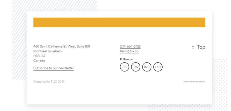
6. TUX: make contact details actionable
The historical TUX capture puts address, phone, email and social information in a simple arrangement. It illustrates a contact-led footer rather than a dense directory.
On a live site, use appropriate phone and email links and make their labels understandable. If several offices are listed, keep each address associated with its own contact details.
A back-to-top control is optional. If provided, make its destination and keyboard behavior predictable; it is a convenience, not a substitute for the page’s navigation.
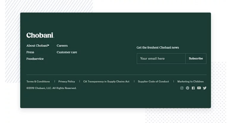
7. Chobani: use a contrasting footer without losing continuity
The retained green Chobani footer visually separates the end of the page while maintaining a clear hierarchy of link groups and subscription information.
A contrasting background can mark the boundary, but text and controls still need sufficient contrast. Do not rely on color alone to distinguish legal links, primary actions or disabled states.
Check the layout when a link label wraps and when a form reports an error. The footer should expand naturally rather than clipping its final row.
8. Henning Larsen: group organizational information
The historical Henning Larsen image shows office-related information, contact routes and organizational links. The current official site identifies the practice with architecture, landscape, urbanism and interiors; the former description of it as a singing studio was incorrect.
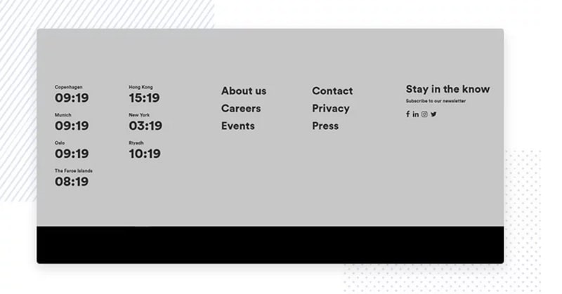
The lesson is to make the organization understandable: separate general inquiries, careers, press and office information when those are genuinely different tasks.
Before handoff, compare the footer’s labels with the website header navigation. Different wording for the same destination can make a consistent layout feel inconsistent.
A useful footer has clear content, working destinations and a layout that survives real text. The website footer planning guide helps decide which groups deserve a place before more styling is added.