A serif is a small finishing stroke at the end of a larger letter stroke. Serif fonts include familiar examples such as Garamond, Times New Roman and Bodoni; sans-serif fonts lack those finishing strokes. This guide explains four serif categories and shows how to compare them in logos, headings and body text. Use Mockitt’s interface design workspace to try a pairing with your actual content.
So, what is a serif?
A serif is part of the letterform, not a separate decoration added to a finished word. The term is commonly associated with the Dutch word “schreef,” meaning a stroke or line. Historical explanations connect serifs with inscription and writing practices, but the practical design question is how the finishing strokes affect the chosen typeface’s appearance.
In digital typography, the serif is one of several features to inspect. Stroke contrast, proportions, x-height, spacing and available weights also influence how a typeface works in a layout. A serif alone does not establish readability or a brand personality.
Serif Fonts - 4 Categories You Should Know
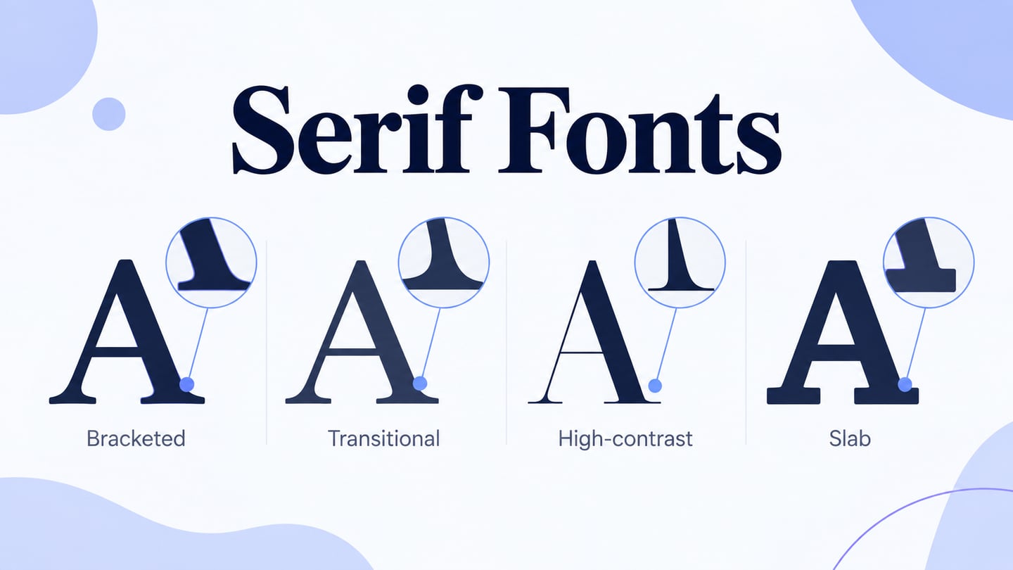
Serif and sans-serif are useful broad categories, but they do not cover every style of type. Within serif typefaces, the following four groups are common teaching categories. Some contemporary designs combine features, so the labels are a starting point rather than rigid rules.
Old Style Serif Fonts
Old-style serifs often show a relationship to calligraphic writing, with moderate stroke contrast, angled stress and bracketed joins between serifs and main strokes. Inspect an actual font specimen: the details can differ substantially between families and revivals.
Garamond is a familiar old-style example. Baskerville is usually discussed as transitional rather than old-style; placing it in the next category makes the differences easier to understand.
Transitional Serif Fonts
Transitional serifs bridge features associated with old-style and modern designs. They often use more pronounced stroke contrast and a more upright stress than old-style faces. Baskerville is a common example.
Times New Roman is another widely recognized transitional reference. Classifications of later screen and display families can be more nuanced, so use the category to compare forms rather than treating it as a guarantee of how a font will perform.
Didone
Didone or modern serifs typically use strong thick-to-thin contrast, vertical stress and fine serifs. These features can be expressive in large headings, but very thin strokes need careful inspection at small screen sizes.
Two popular didone or neoclassical font types are the Didot and Bodoni families of serif fonts.
Slab Serifs
Slab serifs have substantial, block-like finishing strokes. Some have little stroke contrast, while others vary more. They can be useful for emphatic headings, but the category is not limited to posters or to a uniformly heavy appearance.
Slab serif fonts include Egyptian Slate, Rockwell, Serifa, and so on.
When are Serif Fonts used by Designers?
Now that we've answered the question, "what is a serif font?" and have explored the various types of serif typefaces, let's look at the purpose of using serif fonts from a designer's perspective.
Company and Brand Logos
A sans-serif typeface lacks these finishing strokes. The retained AOL specimen illustrates a sans-serif wordmark; it does not establish that all contemporary brands should use that style. Choose by the wordmark’s forms and uses rather than an assumed trend.
Source: LogoTyp.us
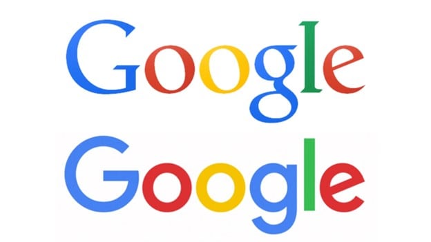
The retained Google comparison shows the change from a serif wordmark to a geometric sans-serif identity. It is a historical example of a type decision, not evidence that one category has become universally preferable.
Source: Canva
Google’s own account of its identity redesign discusses a system that works across varied products and screen sizes. That is stronger evidence than inferring motives such as “the brand no longer needed authority” from the logo alone.
The Wikipedia specimen uses serif letterforms. Study the specific proportions and spacing instead of assuming that any serif automatically communicates the same meaning.
Source: LogoTyp.us
Rolex is another recognizable serif wordmark in the historical examples. Its lettering can be discussed as a visual form without inventing a causal explanation for the company’s choice. The same principle applies to all the logo specimens below.
Neither category is inherently more professional. A logo must work at its intended sizes, remain recognizable in the required formats and fit the identity system around it.
Print Media
Many newspapers and books use serif text faces, but print media includes both serif and sans-serif typography. Garamond and Times belong to different serif traditions; the fact that both appear in print does not make them the same category.
Long-form reading depends on more than serifs: measure, line height, size, contrast and the quality of the font matter. Test the reading conditions instead of relying on an unsupported claim that a serif establishes authority by itself.
Font Combinations
Pairing a serif heading with sans-serif body copy can create a clear difference between levels. You can also create hierarchy within one family using size and weight. Keep the number of roles manageable and check that the two faces do not compete in every line.
For a museum article card, try a serif title such as “Objects with a story” above a short sans-serif summary. Keep navigation and date labels quiet. Compare a wide card with a narrow mobile version: a delicate title that looks attractive when large may lose clarity when squeezed into several short lines.
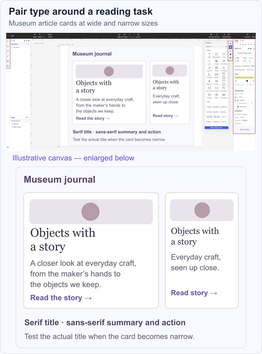
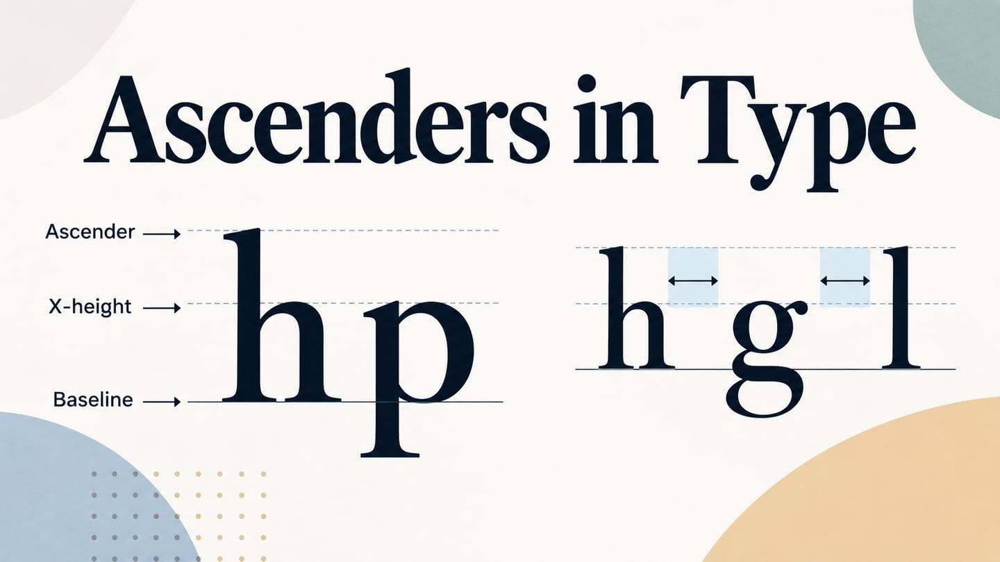
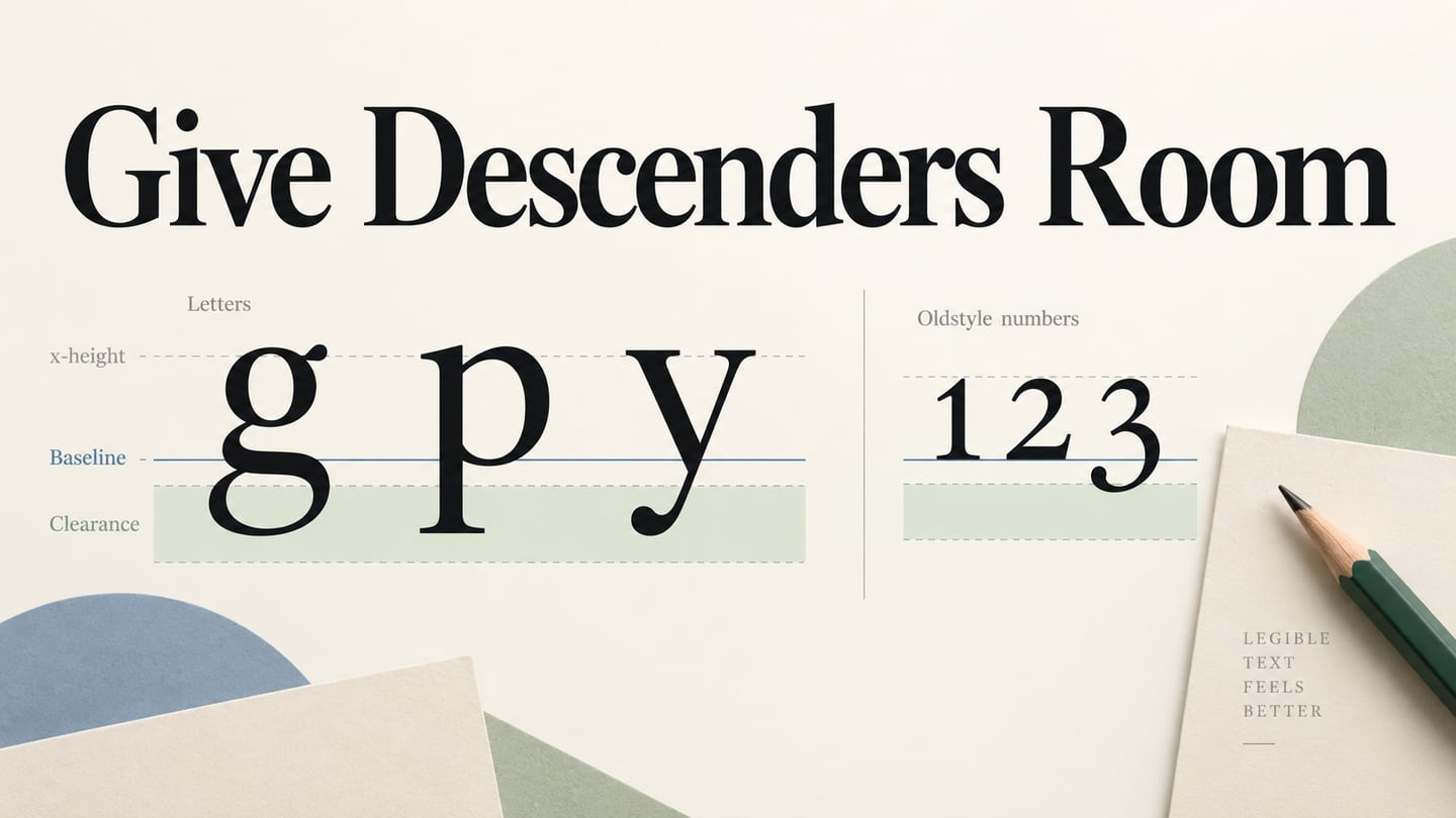
Use the actual text in the review, including numerals, punctuation and a long title. Check the default weight before adding bold, and increase line height if ascenders and descenders crowd neighboring lines. If the heading overwhelms the summary, reduce the contrast between type roles rather than changing several fonts at once.
Serif Font Examples in Real-world Designs
The preserved logo specimens show several uses of serif forms, from high-contrast luxury lettering to softer contemporary wordmarks. They are historical visual references rather than current brand specifications.
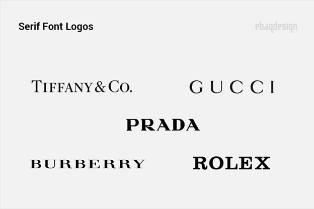
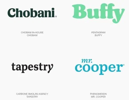
Look for differences as well as similarities: thick or thin serifs, rounded or sharp details, narrow or wide proportions and the spacing of the whole word. Those observations are more precise than assigning every example the same “elegant” personality.
Serif Fonts for Up and Coming Designers
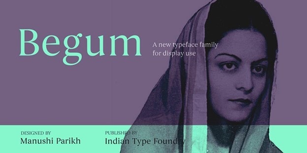
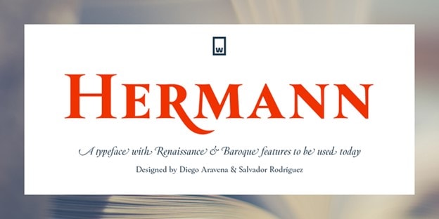
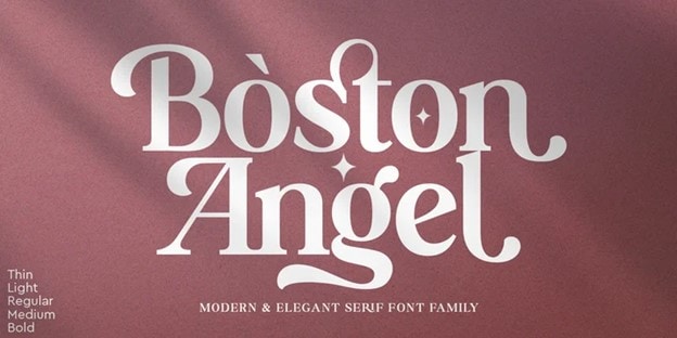
The following preserved type specimens give you several forms to compare, including Bookmania, Begum, Didot-style lettering, Hermann and Boston Angel. They are examples of visual direction, not a statement that every font shown is free or licensed for your project. Check the foundry’s current license before using a face in an app, website or logo.

Linotype Didot
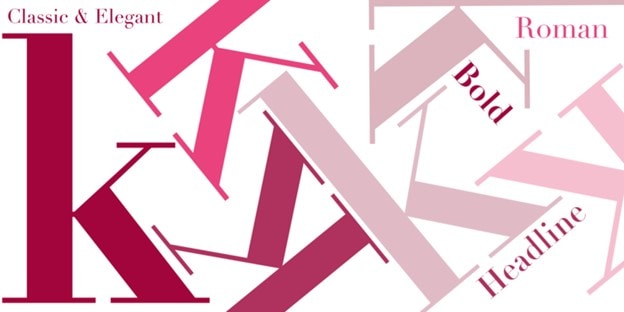
Choose a serif because its forms suit the content and reading conditions. Test real copy, awkward letter pairs, numbers and smaller labels before applying it everywhere. For horizontal spacing, consult the kerning guide; for vertical alignment, use typographic baselines.