The Basics of Kerning
Kerning adjusts the spacing between a particular pair of glyphs. The gap between “A” and “V” may need different treatment from the gap between two vertical letters. When reviewing a heading in Mockitt’s UI design workspace, inspect the actual letter shapes at their intended size rather than assuming that equal geometric gaps will look balanced.
Kerning is different from tracking, which adjusts spacing across a range of text, and from side bearings, which contribute to a glyph’s default spacing. A well-made font can provide useful automatic kerning. Manual adjustment is an option for a particular problem, not the only route to a balanced result.
How to Work with Kerning in Typography
Although kerning has roots in physical typesetting, it is also part of digital typography. Fonts can include spacing data, and text-rendering software decides how to apply it. Before changing a headline, distinguish the controls below so you do not use a global spacing adjustment to solve one awkward pair.
Values
A negative kerning adjustment moves a pair closer; a positive adjustment moves it farther apart. The unit depends on the tool and font system. In the retained FontForge example, the “T” and “o” pair is being inspected in a metrics view; the number shown belongs to that font example, not a universal recommendation for every “To.”
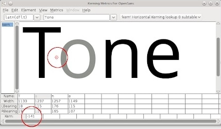
Source: Design with FontForge
Start from the font’s intended spacing and adjust only where the pair looks uneven in context. A numeric value that works for one typeface, weight or optical size may be inappropriate for another.
A side bearing is the space between a glyph’s outline and its advance boundary. The two neighboring side bearings contribute to the default gap; a kerning adjustment can then change that pair’s placement. The sum of side bearings is not itself the kerning value. FontForge’s spacing guide illustrates this distinction.
How can we keep track of so many combinations? That brings us to Kerning Tables.
Tables
A font may store pair adjustments in a kerning table or in OpenType positioning data. The values belong to that font; they are not a universal table of ideal distances for every typeface. A designer usually relies on this data rather than manually setting every possible pair.
OpenType’s Glyph Positioning table (GPOS) can describe positioning adjustments for individual glyphs, pairs and contexts. Class-based rules can apply to groups with similar behavior. They help a font represent spacing consistently, but do not make different fonts share identical geometry.
Types
Kerning can be automatic or manual, and there are further sub-classifications for the former.
Automatic Metric Kerning
Metrics kerning uses spacing pairs supplied with the font. It is a sensible starting point when the font contains suitable data; review the resulting words at their actual size rather than assuming the setting alone guarantees a good fit.
Automatic Optical Kerning
Optical kerning, where a tool offers it, estimates spacing from glyph shapes. It can be useful when supplied metrics do not suit a particular composition, but it is not inherently more accurate or limited to serif typefaces. Compare the result before choosing it.
Manual Kerning
Some typography applications let you adjust a pair manually. Use that option for a specific headline or logo after checking the font’s automatic behavior. Do not assume every UI design editor offers pair-level kerning: a general letter-spacing field may change an entire selection instead.
Contextual Kerning
Contextual positioning can consider surrounding glyphs when applying an adjustment. It is not necessarily limited to sets of three letters, nor is it a guarantee of a better result. The available behavior depends on the font’s rules and the software rendering the text.
How to Use Kerning to Spruce Up your Typography
Spacing can change how a word is read. The retained sign example illustrates the risk of an unintended visual break inside a word. It is a typography example, not a controlled measurement of reading performance.

Source: Bored Panda
Inspect whole words as well as individual gaps. A locally tidy pair can still create an unintended separation elsewhere in the line.
Use the following checks for display text and prominent labels. Body text needs attention too, but manually adjusting hundreds of pairs is rarely a practical substitute for choosing a suitable font and rendering setup.
Use the Right Font Size
Review the final font, weight and size together. Large display text makes some uneven gaps easier to notice, while small labels introduce different rendering constraints. The sign image separates “THERAPIST” into two apparent words; the lesson is to inspect meaning as well as shape. Recheck a heading when it is reduced for a compact card instead of assuming the large version scales perfectly.
Look at the Words the Wrong Side Up
Turning a specimen upside down can make the shapes easier to inspect without immediately reading the word. Use it as an optional visual exercise, then return to normal reading direction. The final test is whether the text reads naturally in its actual layout.
Kern Frequently-used Character Combinations First
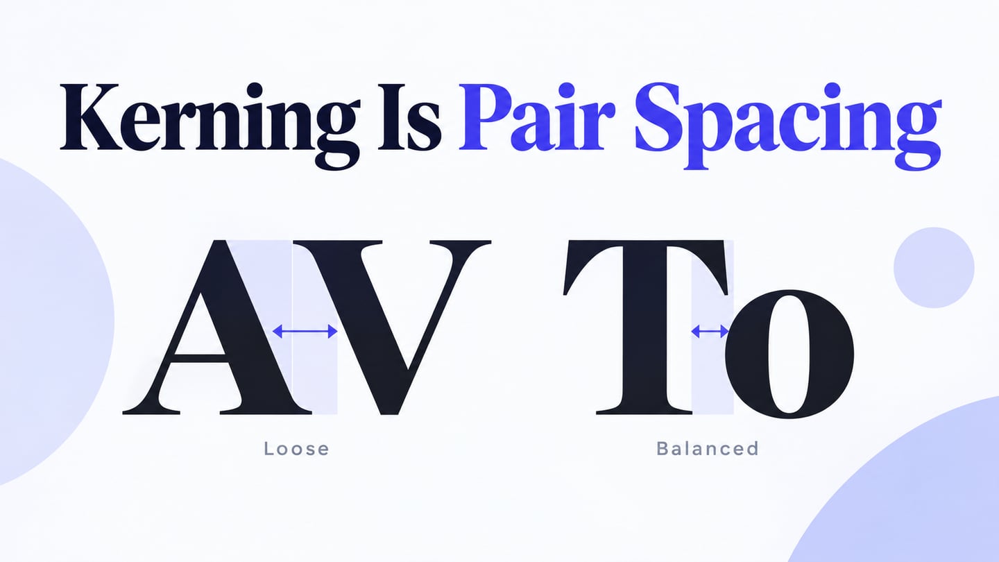
Pairs involving diagonals and overhangs, such as “AV,” “WA” and “To,” are useful places to inspect first. Review the specific words in your design, not only a stock alphabet specimen. Punctuation, numbers and mixed-case labels may reveal a different issue from an all-capitals headline.
For an “Avenue Tours” landing page, compare the heading at its main hero size and again inside a compact trip card. Look at the “Av” and “To” relationships, then read the whole phrase. If one pair looks awkward, first check the selected typeface and its rendering; do not tighten every letter just to close that one gap.
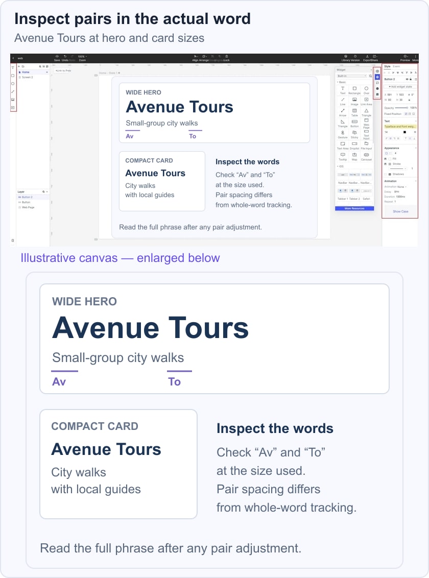
The example below is a designed specimen inside a preserved Mockitt guide interface. It demonstrates where to inspect spacing, not a claim that the editor includes a particular kerning control. For web implementation, CSS font-kerning controls whether font kerning information is used; it is separate from letter-spacing.
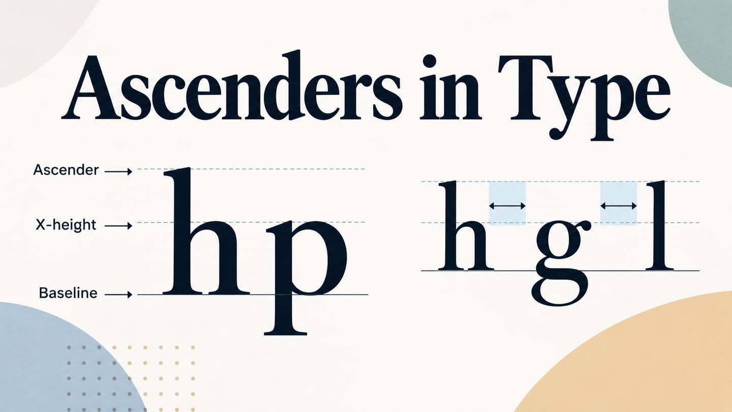
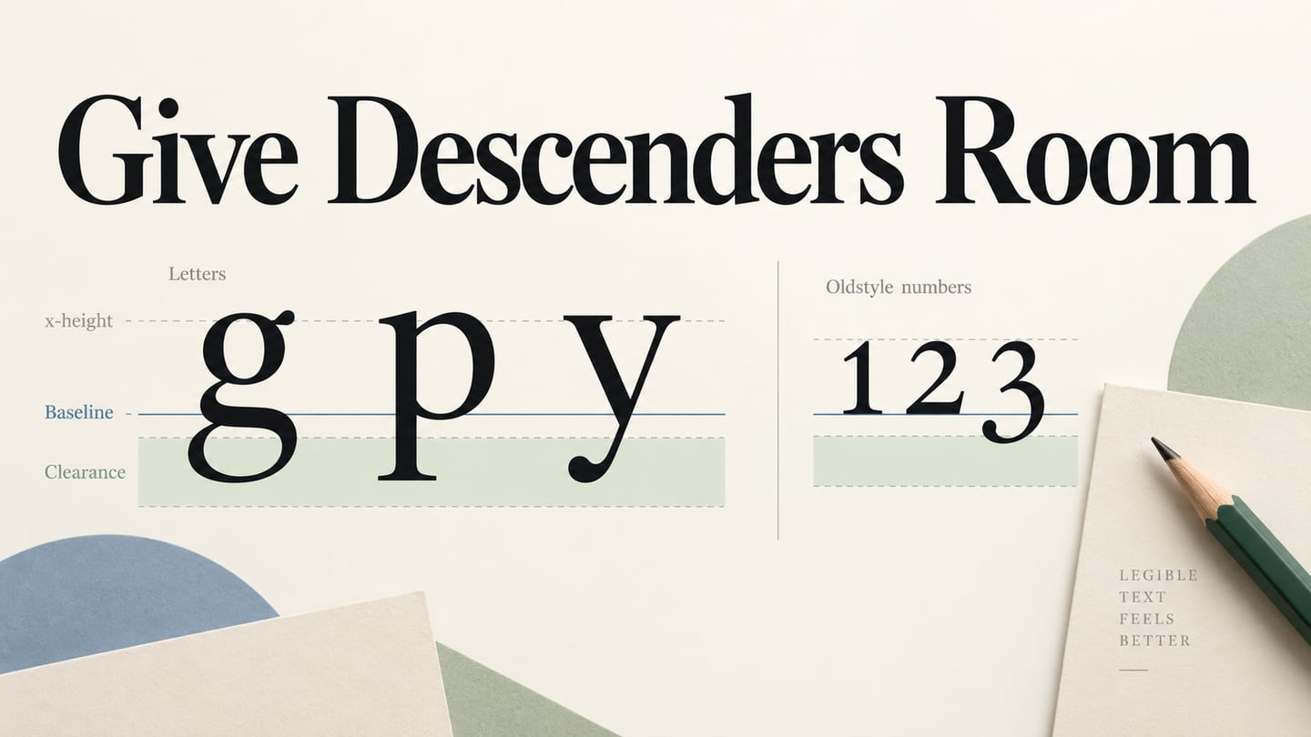
When spacing still looks uneven, change one factor at a time: font family, weight, size or the relevant spacing setting. Compare the same words before accepting the change. For vertical alignment, use the baseline guide; for the anatomy of a serif, see the serif-font overview.
Encapsulating your Knowledge
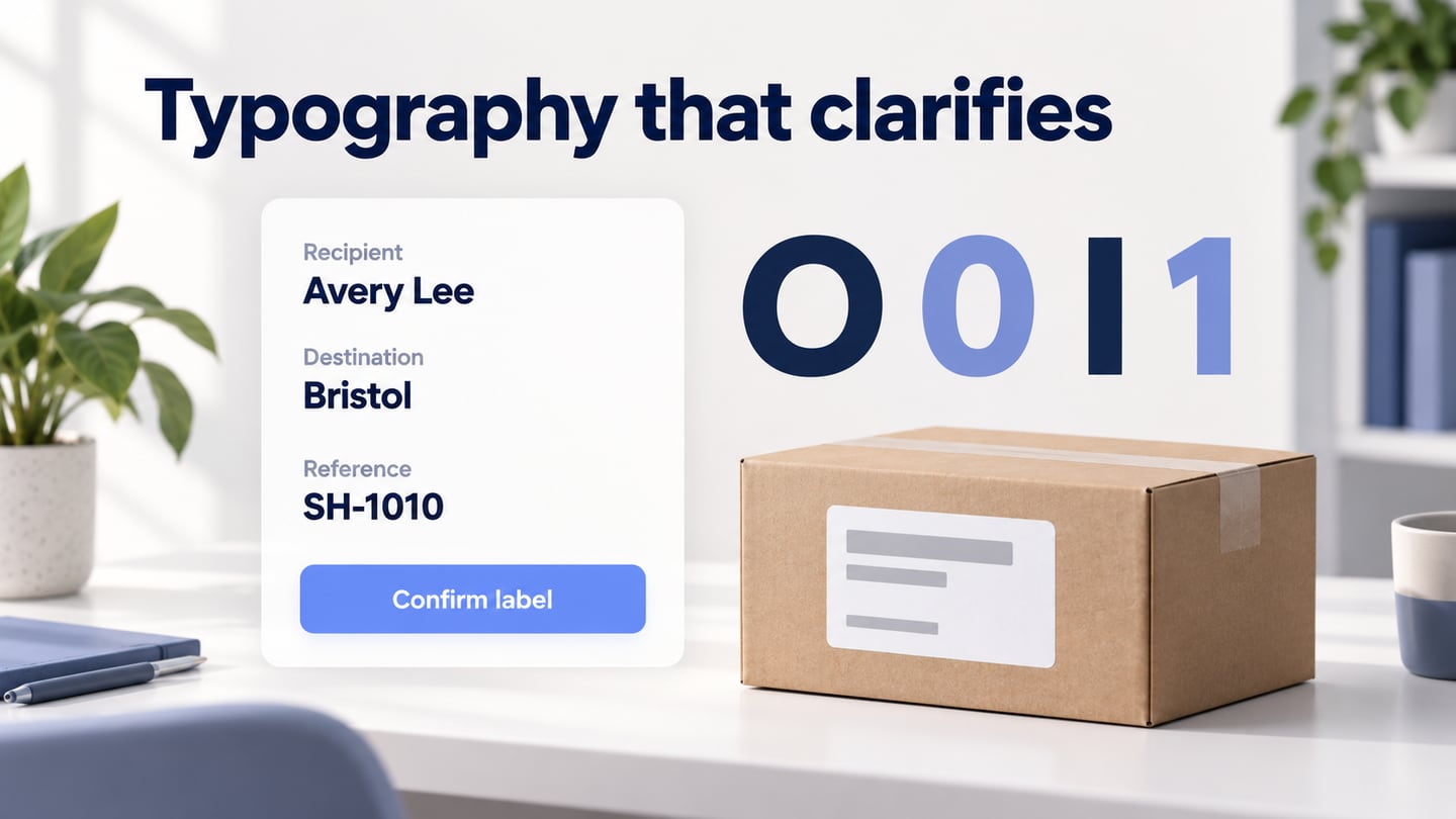
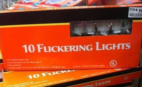
Kerning combines defined font metrics with visual judgment. The final package example shows why close letters can be misread; it does not mean automatic spacing should always be overridden. Keep the font’s rhythm, fix the demonstrated problem and inspect the complete phrase again.
Source: Pinterest