A text baseline is the imaginary line on which most letters sit; descenders such as the tail of p extend below it. In typography, it helps align words and numbers of different sizes. A baseline grid repeats that reference across lines. In Mockitt’s UI design workspace, use the pricing-row and form examples below to review text alignment.
What is a Baseline: The Basics
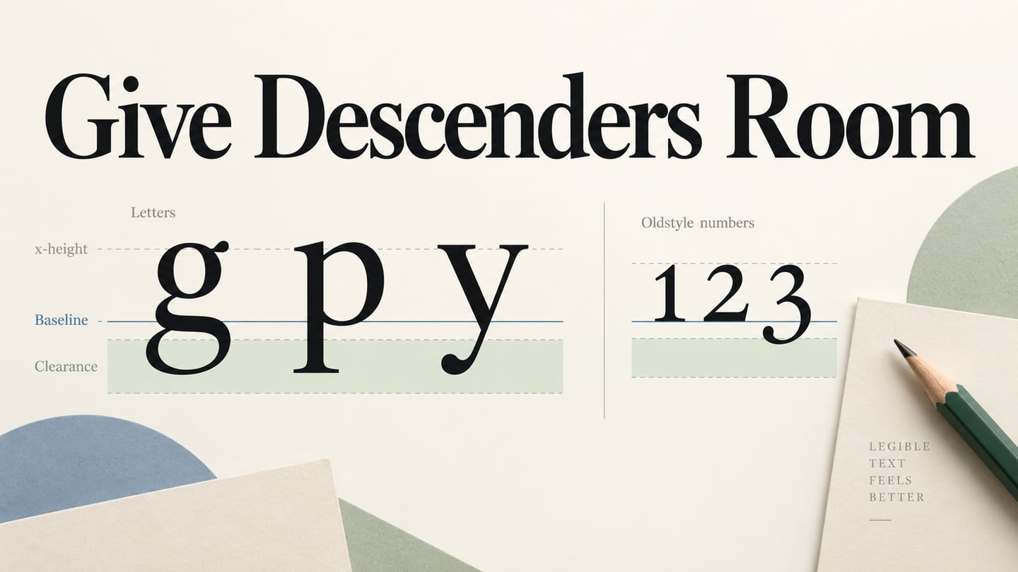
Ruled handwriting paper is a familiar analogy, but a baseline is not the entire grid. It is one reference line within the geometry of a line of type. Letters such as “p” and “g” may extend below it.
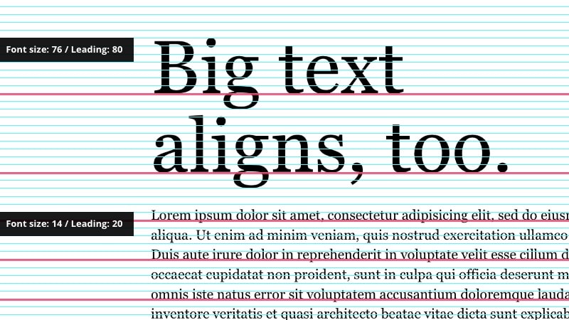
A baseline grid repeats reference lines vertically. Designers can align lines of body text or related columns to those references, while still choosing appropriate font sizes and line heights for the content.
- A baseline is a text-alignment reference; a baseline grid is a repeated set of those references.
- The distance between successive baselines describes the line-to-line rhythm of the text.
- A grid can support consistent alignment, but it does not determine letter spacing or require every element to snap to one rigid system.
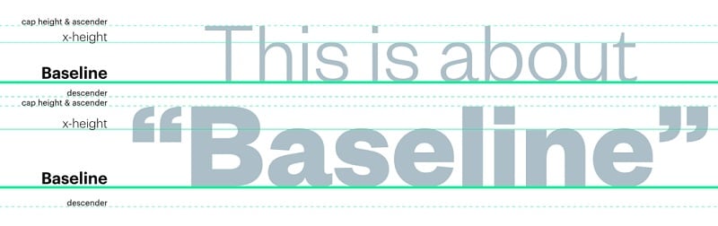
Source: Prolific Interactive
Other Vital Things to Know about Baselines
To use baselines well, distinguish them from nearby font measurements. The retained diagrams introduce x-height, ascenders, descenders and glyph metrics; they are related concepts, not alternate names for a baseline.
The following terms help explain why two equally sized text boxes may still look misaligned. Font size is not the visible height of every letter in that font.
1. Ascender and Descender
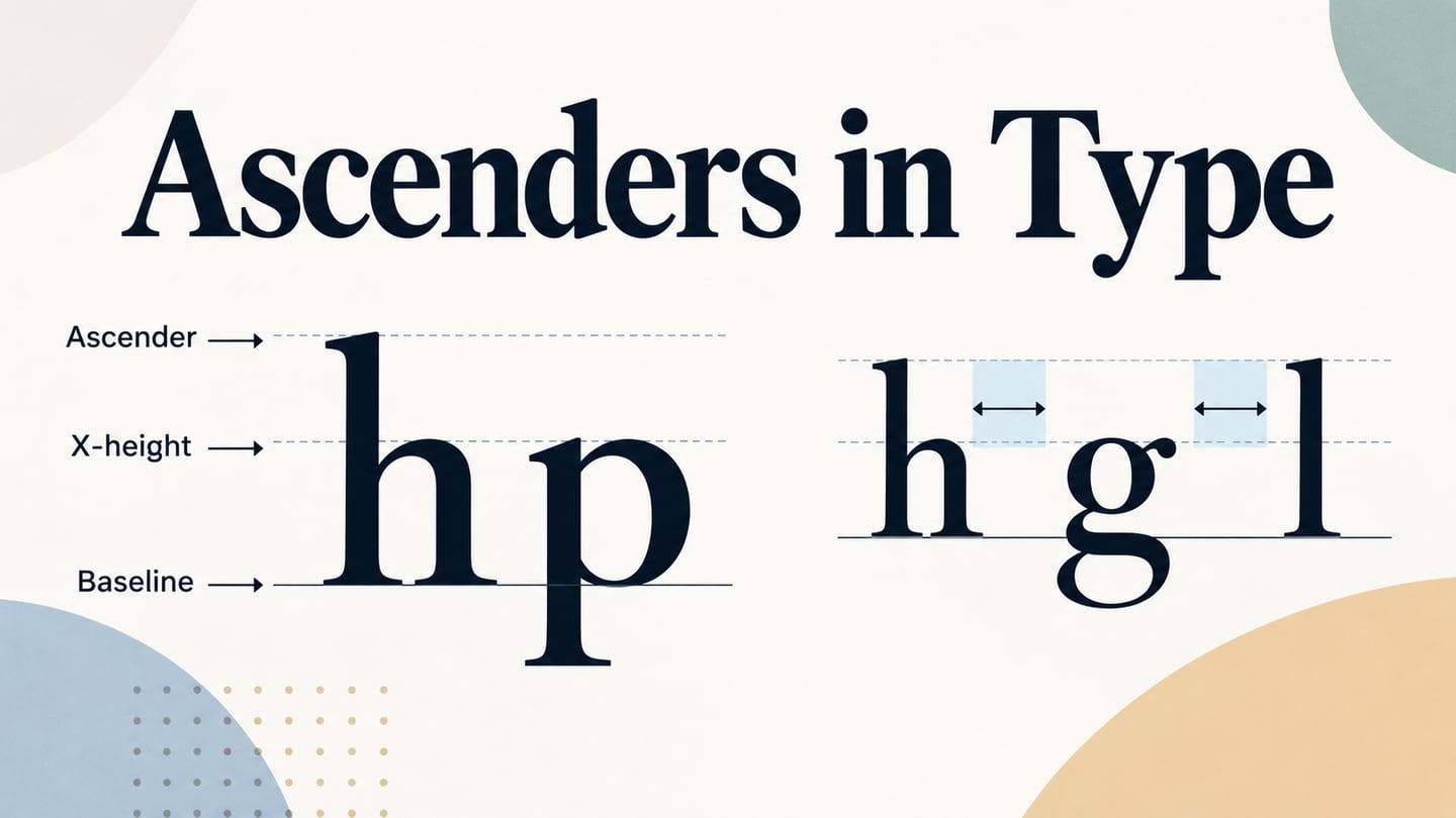
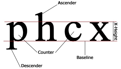
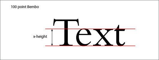
The x-height is approximately the height of a lowercase “x” above the baseline. An ascender is the part of a lowercase letter, such as “h,” that rises above the x-height. A descender, such as the lower stroke of “p,” extends below the baseline.
Source: WordPress
In this example, you can see the small "p" has a downward stroke (descender) and the small "h" has an upward stroke (ascender).
2. Lining Figures
Lining figures are numerals designed with a broadly uniform height, often close to the capitals. They are not lowercase letters such as “x” or “c.” A counter is the enclosed or partly enclosed space inside a letter, as in “p” or “c.” The diagram above labels these different features.
3. Upper and Lower Case Alphabets
Uppercase letters commonly reach the cap height, while lowercase letters vary around the x-height. Both are aligned to a baseline. Some glyphs, including certain forms of “Q,” extend below it; the details depend on the typeface.
Lowercase letters may sit within the x-height, rise above it or descend below the baseline. Do not force their visible tops and bottoms into identical boxes: those differences are part of the letterforms.
Source: Pinterest
4. Glyphs
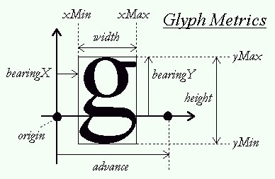
A glyph is a particular visual representation of a character or character sequence. A font can include alternate glyphs for the same character, but glyphs are not limited to rounded letters. The retained “g” diagram shows measurements such as advance width and bearings alongside its visible outline.
Source: StackOverflow
How to Use Baselines in your Design?
Use baselines to compare related text, then check the result in normal reading order. A technically aligned row can still need optical adjustment when icons, unusual fonts or mixed scripts are involved.
Tip 1: Use a Baseline Grid to Attain Uniformity
A baseline grid can help two text columns share a consistent rhythm. Start with the body-text line height and inspect where the lines land. The preserved example shows large and small text related to a grid; it is not a requirement to make every heading occupy the same number of lines.
Source: InVision
Tip 2: It will help you create a Visual Hierarchy
Hierarchy comes from meaning, size, weight, spacing and placement. H1, H2 and H3 describe document structure; their visual sizes should support that structure but are not set automatically by the baseline grid.
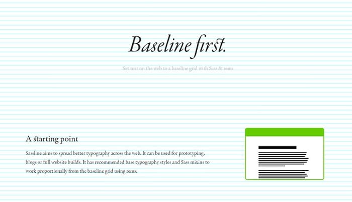
Choose a readable type scale, then use baseline references to coordinate related text. Check a long heading and multiline paragraph, because alignment that looks tidy with a short placeholder can fail with real content.
Source: Hongkiat
Tip 3: Use 4/8/16px baseline grid
A 4px or 8px spacing system is a useful convention in some interface systems, not a universal typographic rule. Choose line heights for the font and reading task; “font size plus 4px” will not suit every size. Baseline spacing, component padding and layout spacing are related decisions but not the same measurement.
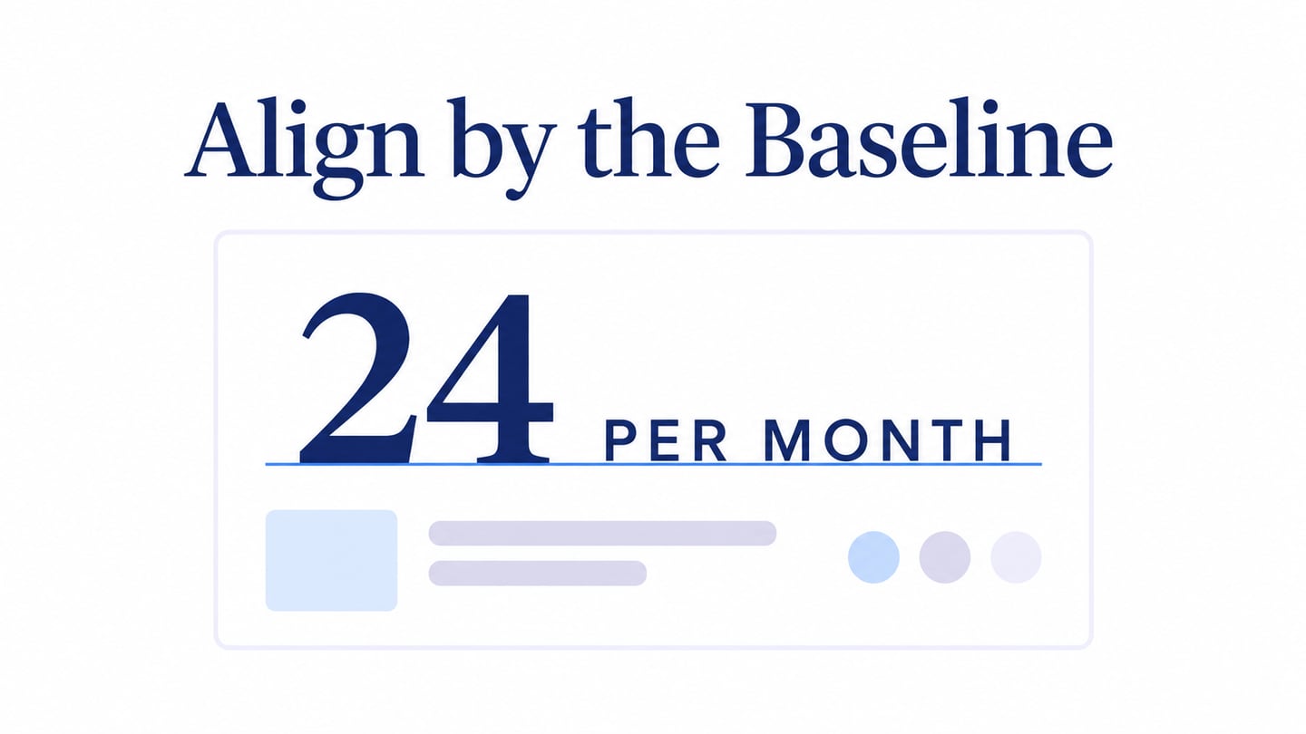
For a pricing row, align the large amount “24” with the smaller phrase “per month” along their text baseline. Centering their bounding boxes instead can leave the small phrase floating too high. Place the currency symbol deliberately, then compare the whole row with the neighboring plan rather than only checking one isolated pair.
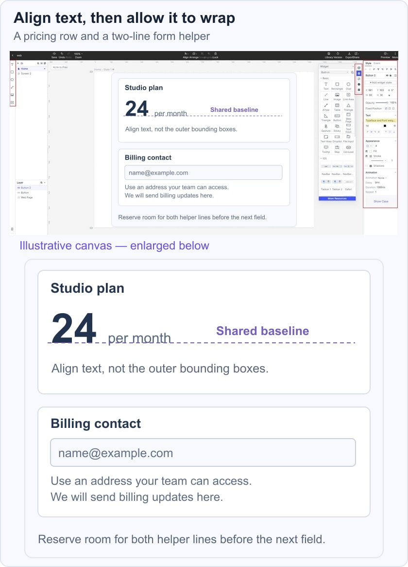
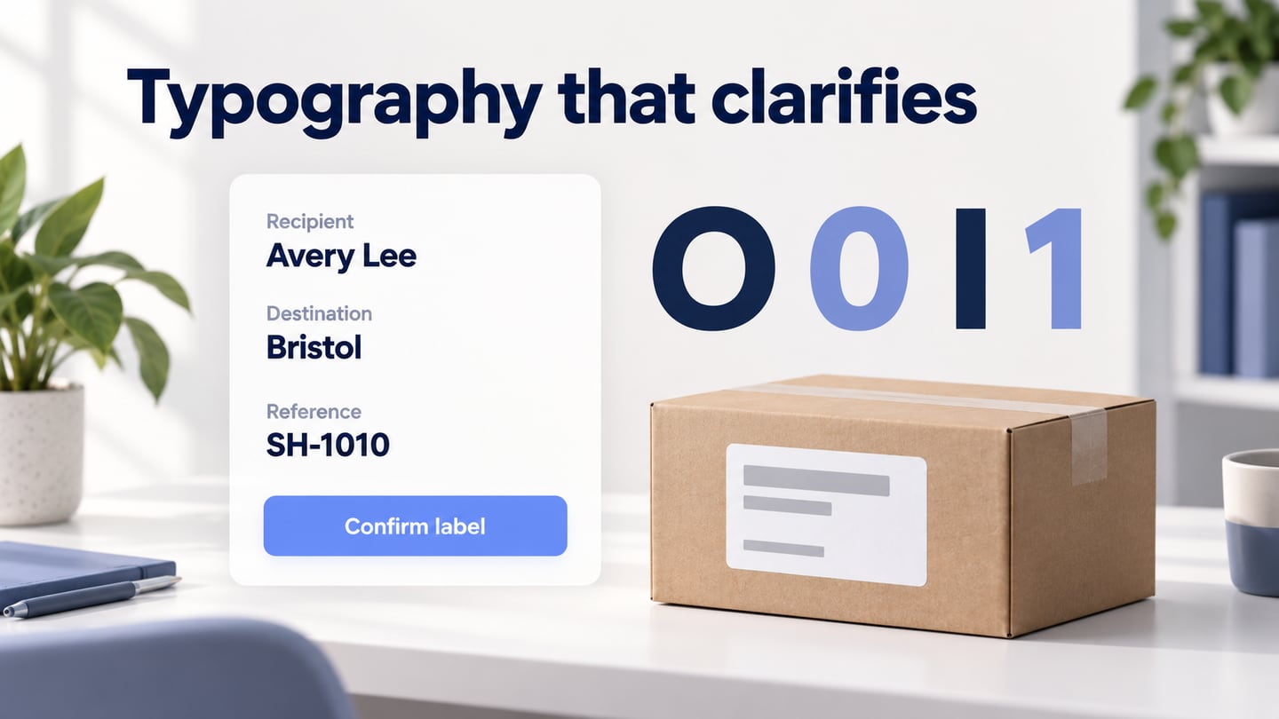
Below that row, test a form label followed by a two-line helper message. Leave room for the second line so it does not collide with the next field. If a fixed spacing grid produces cramped text, revise the component spacing; do not shrink the copy simply to satisfy the grid.
Material’s spacing guidance illustrates baseline references for line height and alignment. Use the reference as a way to communicate the intended result, then inspect the implemented font and layout rather than assuming a prototype’s text metrics will match every browser exactly.
A useful baseline system supports reading and alignment without distorting the type. Review it with real labels, numbers and multiline content. The kerning guide covers horizontal pair spacing, while the serif overview helps distinguish letterform styles.