Typography is more than choosing a font and its color. It organizes text so people can recognize information, read it comfortably and understand what matters in an interface. Typeface, size, weight, spacing and layout all contribute.
The words and their presentation work together. In UI design, typography needs to support the task: a heading establishes context, a field label identifies an input and a status message explains what happened.
A typeface can contribute to a brand’s character, but it cannot guarantee a particular emotional response. Prioritize understandable content and readable presentation before decoration.
Typography has a role to play in UI design, and it goes beyond selecting a good-looking font. The role of typography in UI design is simple. It helps make reading through the digital interface simple, understandable, and memorable.
People should not need to squint or move close to the screen to read essential information. Avoid ornate letterforms or abrupt changes in size that make an ordinary task harder. Check the interface at its actual display size, not only on an enlarged design canvas.
5 Tips on Typography in UI Design
1. Use the Principles of Hierarchy
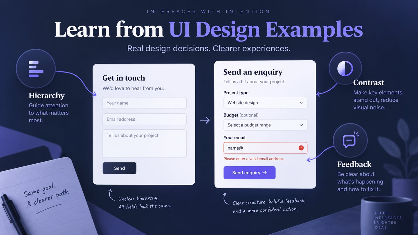
Hierarchy helps distinguish a page title, a section heading, a label and supporting text. Use a small, consistent set of text roles with deliberate differences in size, weight and spacing. Making every label bold removes the distinction.
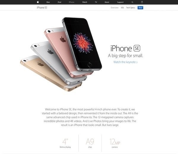
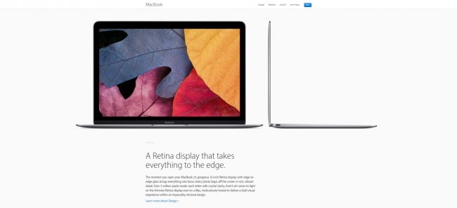
Historical example: an earlier Apple product page separates the product name, supporting statement and detail text.
Organize text according to its role in the task. On a shipment-review screen, the recipient and destination deserve more attention than an internal reference, while delivery instructions must still be readable.
Typography and layout should reinforce the same order. A visually large heading should also be a meaningful heading in the implemented page; appearance alone does not provide semantic structure.
2. Check Readability in Context
When you add content to the design, ask yourself the following questions.
- Can someone read and understand the content at its intended size?
- Are headings, subheadings, and other content forms distinguishable from each other?
- Am I able to make out the difference between the main message and the auxiliary content?
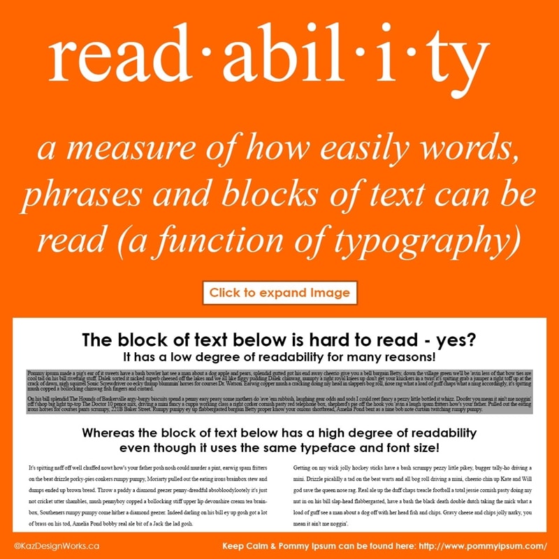
Retained illustration from Kaz Design Works comparing dense and more readable text arrangements.
Consider line length, line height, paragraph spacing and the surrounding layout together. A readable font can still become difficult to read when the column is too wide or lines are packed too closely.
Check contrast on the actual background rather than judge it from color names. WCAG’s contrast guidance sets different minimums for normal and large text and describes exceptions. Do not assume light gray metadata is acceptable because it is secondary.
3. Distinguish Legibility from Readability
Legibility concerns recognizing characters; readability concerns reading the content as a whole. The distinction is useful when diagnosing a problem: a confusing character shape and an overly dense paragraph need different adjustments.
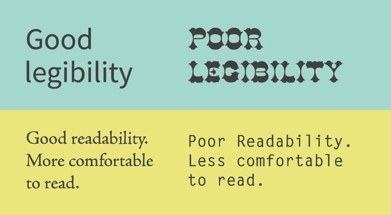
Retained comparison illustrating character legibility and the effect of spacing on reading.
Inspect details such as x-height, counters, weight and the shapes of similar characters. A shipping reference containing O, 0, I and 1 is a useful test string. Check the font at the smallest size it will actually use, including on lower-resolution displays.
Clear copy and legible type support each other. Shortening a label is not helpful if it becomes ambiguous, and increasing font weight cannot repair unclear wording.
4. Make Usability the Primary Concern
Choose typefaces that remain understandable across the roles and sizes the interface needs. Test body text, labels, numbers and controls rather than evaluating the alphabet in isolation.
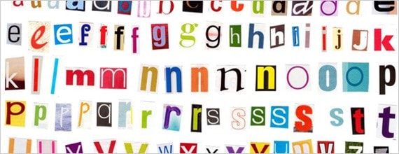
Retained letterform collage illustrating how character shapes vary between typefaces.
If characters are difficult to distinguish, visual decoration will not solve the problem. Review the actual language, numerals and punctuation the product uses, including accented characters where relevant.
Typography must also tolerate changes in viewport and user settings. Text resizing and user-adjusted text spacing can expose clipping in fixed-height fields, cards and buttons. These checks concern the implemented layout as well as the design file.
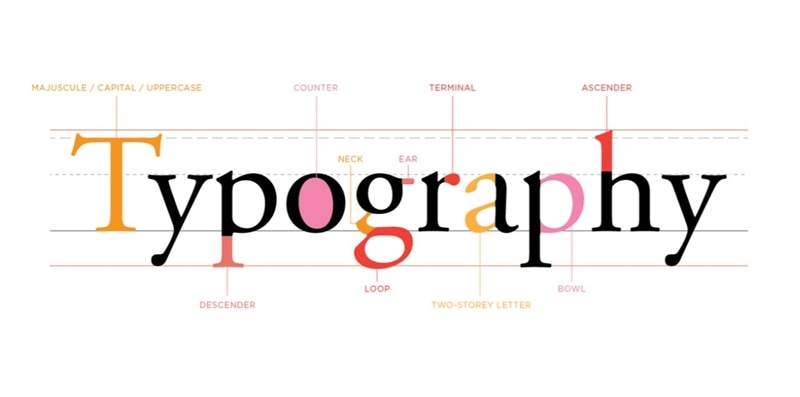
5. Understand the Typography Elements
The following terms help you discuss a typographic problem precisely:
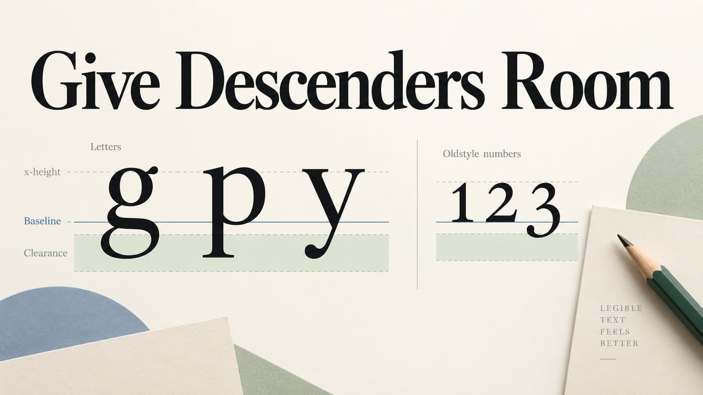
- Baseline and x-height: The alignment line and the height of the main body of lowercase letters.
- Character width: The horizontal space a glyph occupies, affecting line length and compact labels.
- Ascenders and descenders: Parts of letters extending above or below the main lowercase body.
- White space: The space that separates characters, lines and content groups.
- Kerning: Adjustment between particular character pairs.
- Alignment: How lines relate to an edge or axis in the layout.
- Tracking: Spacing applied across a range of characters.
- Leading or line height: The vertical distance used to separate lines of text.
Use these terms to explain a specific issue rather than adjust every property without a reason. Start with a readable default, then check representative content and the interface’s constraints.
Examples of How to Use Typography in UI Design
The original examples below remain useful as historical layout studies. Their screenshots do not represent a current product release or prove that every typographic choice meets accessibility requirements.
Here are some examples of how to use typography in UI design.
- Apple: White Space Around Product Information
In the retained Apple screenshot, generous space separates the product image, headline and supporting copy. That separation helps reveal the intended reading order without giving every element the same visual weight.
Source: Reseller Club
The lesson is to group related text and allow it room to be read. A sparse product page is not a template for every interface; a dense operational tool will need a different balance.
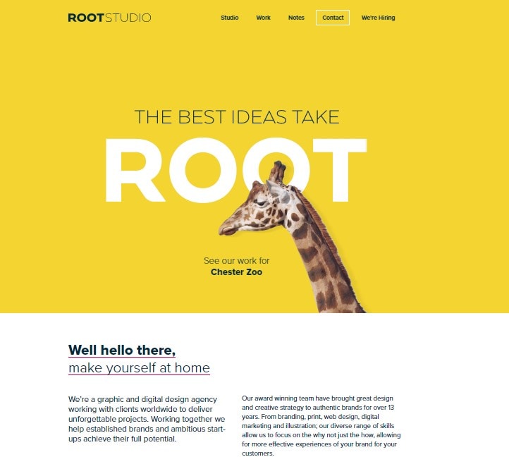
- Root Studio: A Strong Heading and a Quieter Introduction
The retained Root Studio screenshot uses a large display word on a colored background, followed by a smaller introduction. It illustrates two distinct text roles within the same page.
Source: Root Studio UK
Notice the difference between the expressive headline and the longer supporting content. Borrow the idea of deliberate hierarchy, not the exact color or size. Check contrast and text wrapping independently for your own content.
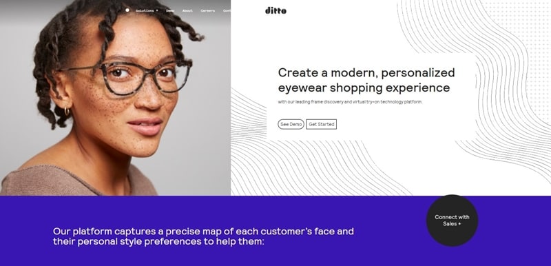
- Ditto: Separating the Main Message from Supporting Detail
The retained Ditto screenshot places a concise main message beside an image and separates another text block with a different background. This is a layout observation, not evidence that every reader finds it easy to use.
Source: Ditto
Inspect the relationship between the headline, actions and supporting copy. Recreate the hierarchy with your own text and test longer content before assuming the same layout will work.
When applying these principles, confirm that the selected typeface is available and licensed for the final product, with suitable fallbacks. A font shown in a design file may not render identically in every browser.
Use a design tool to review the choices, then verify them in the environment where people will read the interface.
Apply the Typography Decisions in Mockitt
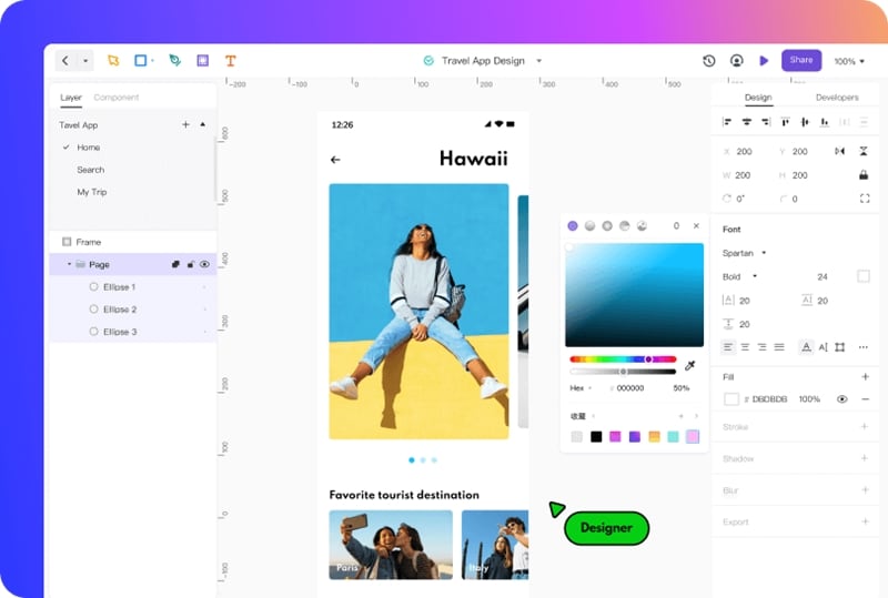
Mockitt lets you arrange text and visual elements for a UI review. Use the design to discuss hierarchy and readability, while keeping final browser rendering and accessibility checks separate.
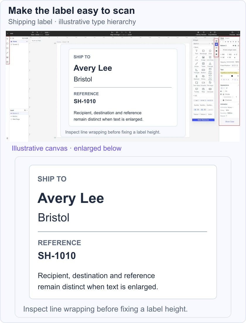
For a shipment-review screen, distinguish the destination and recipient from the reference and secondary instructions. Use synthetic details, such as Avery Lee, Bristol and reference SH-1010. Include a Confirm label action, then create an enlarged-text variant to see whether the address or button is clipped.
- Edit text: Set the text box and wrapping to accommodate representative values, not only the shortest name.
- Choose type and color: Use consistent text roles and sufficient contrast. Confirm that the intended weights and glyphs are available.
- Set alignment and spacing: Keep labels close to their values and separate unrelated groups. Review paragraphs as well as single-line controls.
Keep the same content while comparing variants so that any difference in readability comes from the design choices being discussed. Record the intended typeface, size, weight and fallback behavior for handoff.
The original workspace image is an earlier Mockitt interface example. It illustrates editing controls rather than a current font inventory or a guarantee about browser rendering.
Conclusion
Typography should help people find, read and act on information. Use hierarchy to communicate importance, inspect letterforms for legibility and review whole blocks of text for readability.
Check long content, narrow screens, enlarged text and the actual background before approving a design. A visually attractive screenshot is one useful reference, not a substitute for those checks.
Carry the chosen text roles into implementation, verify font loading and fallbacks, and revisit the design if real content changes the layout. Consistency and clear task information matter more than an elaborate type scale.