Salesforce Lightning Design System (SLDS) supplies design guidance and interface resources for Salesforce experiences. Choosing how to use it depends on the application and component technology. This guide explains those choices and preserves the older ZIP-and-Aura example as a historical workflow. For the general role of shared foundations and components, start with the design-system overview.
What Is Lightning Design System?
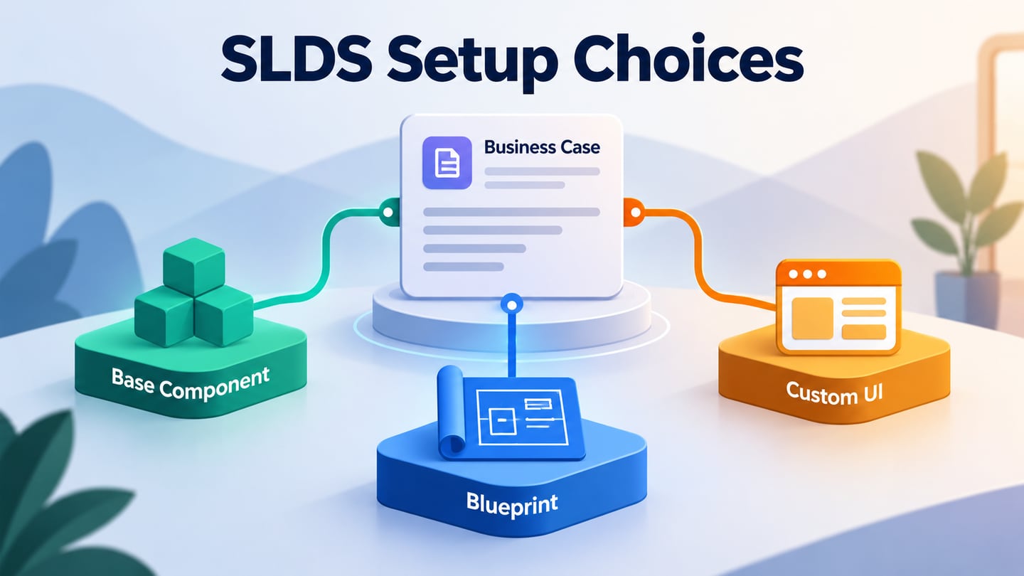
SLDS provides foundations, patterns, component blueprints and styling resources. It supports business interfaces such as record pages, activity timelines and data tables. It is not a no-code application builder: markup, behavior, data access and integration still depend on the implementation. Salesforce’s base components implement many established patterns and are usually a better starting point than recreating their markup and behavior. Blueprints and custom styling serve different needs and require their own checks.
Advantages of the Lightning Design System
The following benefits come from using supported components and guidance appropriately. They are useful starting conditions, not automatic guarantees about a finished application.
1. Flexible
Reusable components make common interface structures available without designing every detail from scratch. You still need to define the task, choose the appropriate component, supply meaningful content and check the states that the user will encounter.
2. Scalable
Shared patterns help multiple screens evolve consistently. That consistency requires compatible versions and deliberate migration work; a growing product does not remain coherent simply because it uses the same stylesheet. Review custom overrides when the underlying system changes.
3. Efficient
Base components can reduce repeated implementation work. They do not eliminate code or product decisions. A record-editing screen still needs field rules, validation, permissions and a clear success or failure path. Reuse lets a team focus its effort on those task-specific requirements.
4. Accessible
Accessibility guidance and component behavior provide useful foundations. The complete page still needs checks for labels, focus order, keyboard interaction, error feedback and custom code. ARIA attributes copied into a page do not by themselves make a control accessible.
5. Living
SLDS continues to evolve. The official development guidance distinguishes base components, blueprints and custom work. Confirm the SLDS generation and feature status supported by your environment. A preview feature should not be described as generally available, and a historical ZIP version such as 2.1.4 is not the same thing as the newer “SLDS 2” generation.
6. Several Implementation Routes
Lightning Web Components styling guidance explains the relationship between SLDS, base components and custom CSS. Aura and other environments have their own integration details. Choose the route for your actual application rather than assuming any setup works unchanged in every technology stack.
Choose the Appropriate Setup Route
For a new Salesforce component, check the supported base component before adding a separate stylesheet. The following five steps document an older manual Aura/static-resource workflow, using the original screenshots. They are useful when interpreting an inherited project, but are not a recommendation to install the pictured 2.1.4 package in a new project.
- 1. Identify the Historical Design-System Package
The screenshot shows an old Design System ZIP download, version 2.1.4, containing styles and related assets. Before working on a legacy application, identify the exact package already in use and its references. For new work or migration, follow the current guidance for the target Salesforce environment instead of copying this archived download step.
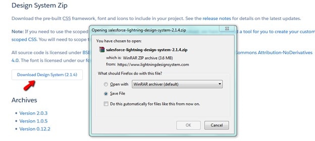 Historical SLDS package 2.1.4 download; this is not the newer SLDS 2 generation.
- 2. Understand the Static Resource
In the historical flow, an administrator opened Setup > Static Resources, created a resource, uploaded the ZIP and supplied a name such as SLDS24. The picture also shows a cache-control choice. A static resource makes packaged files available for references from supported code; it does not configure a complete application. Check access and cache settings against your project’s requirements rather than selecting Public solely because the old screenshot does.
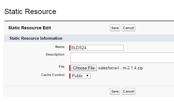 Historical static-resource upload example.
- 3. Read the Aura Stylesheet Reference
The old example uses an Aura ltng:require tag to load a stylesheet from the uploaded static resource. This is an implementation detail of that manual workflow, not the setup required for every Lightning component. In supported Salesforce contexts, base components already provide their intended SLDS styling.
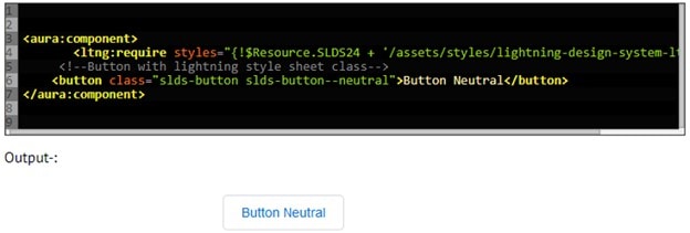 Historical Aura stylesheet reference and styled button output.
In the pictured snippet, SLDS24 is the resource name and $Resource resolves the resource location. The appended stylesheet path must match the contents of the actual ZIP. The resulting “Button Neutral” demonstrates styling only; it does not show validation, data handling or accessible behavior for a complete task. Keep inherited code tied to its documented package before changing paths.
- 4. Review the Historical Component Tab
The older Salesforce interface in the screenshot locates Tabs through Setup. This explains how the example exposed its component, but current navigation and eligibility depend on the component type and environment. Confirm that the component is intended to be available as a tab before reproducing the configuration.
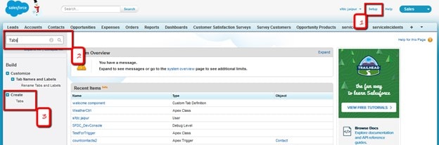 Historical Salesforce Setup navigation.
The historical Lightning Component Tabs section uses New to select a component and configure its label, name, style and description. Give any exposed tab a task-oriented label and verify its availability to the intended users. A saved tab configuration is not evidence that every user has the necessary permissions.
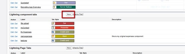 Historical Lightning Component Tab setup.
- 5. Review the Historical Mobile Navigation
The final screenshot shows the older Salesforce1 Navigation setting. It records where that example added a component tab to mobile navigation. Use current Salesforce mobile configuration guidance for a live project and confirm whether the chosen component supports the intended mobile experience.
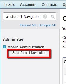 Historical Salesforce1 Navigation control.
After configuration, test the record task as an intended user on the relevant device. Check navigation, field entry, save feedback and permission-dependent states. Seeing a tab in a menu is only the beginning of that verification.
Prototype a Record-Editing Task
In Mockitt, sketch a fictional case record C104 with Status, Owner and a Save action. Show the read view, the editing state and an error when a required owner is missing. This lets reviewers assess the task before implementation without claiming that the prototype is connected to Salesforce.
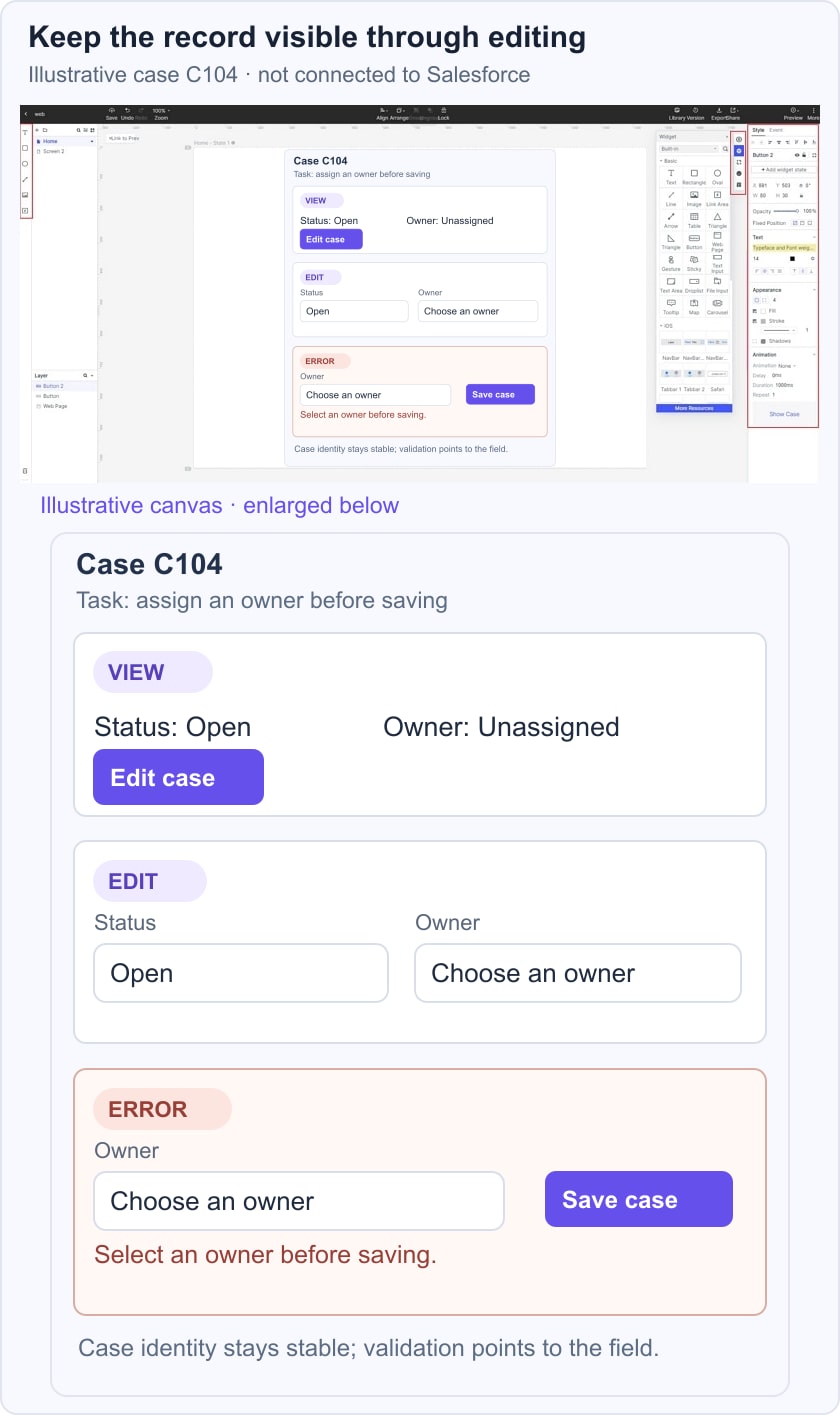
 Historical Mockitt editor capture; interface details may differ from the current product.
Keep the case identifier visible as the state changes, and make the validation message explain what to fix. For a dense business interface, the key question is whether people can distinguish record information from actions and feedback. Review the intended behavior with the developer who will select the supported component and implement the data rules.
What to Review Before Implementation
- The record identity and the field values retained between view and edit states.
- A clear transition into editing and a way to cancel without ambiguity.
- Required-field feedback placed next to the field that needs attention.
- Consistent labels and reusable controls that suit the selected Salesforce component route.
- The save-success and save-failure paths, followed by testing in the implemented application.
- Access to the review prototype and the separate production permission requirements.