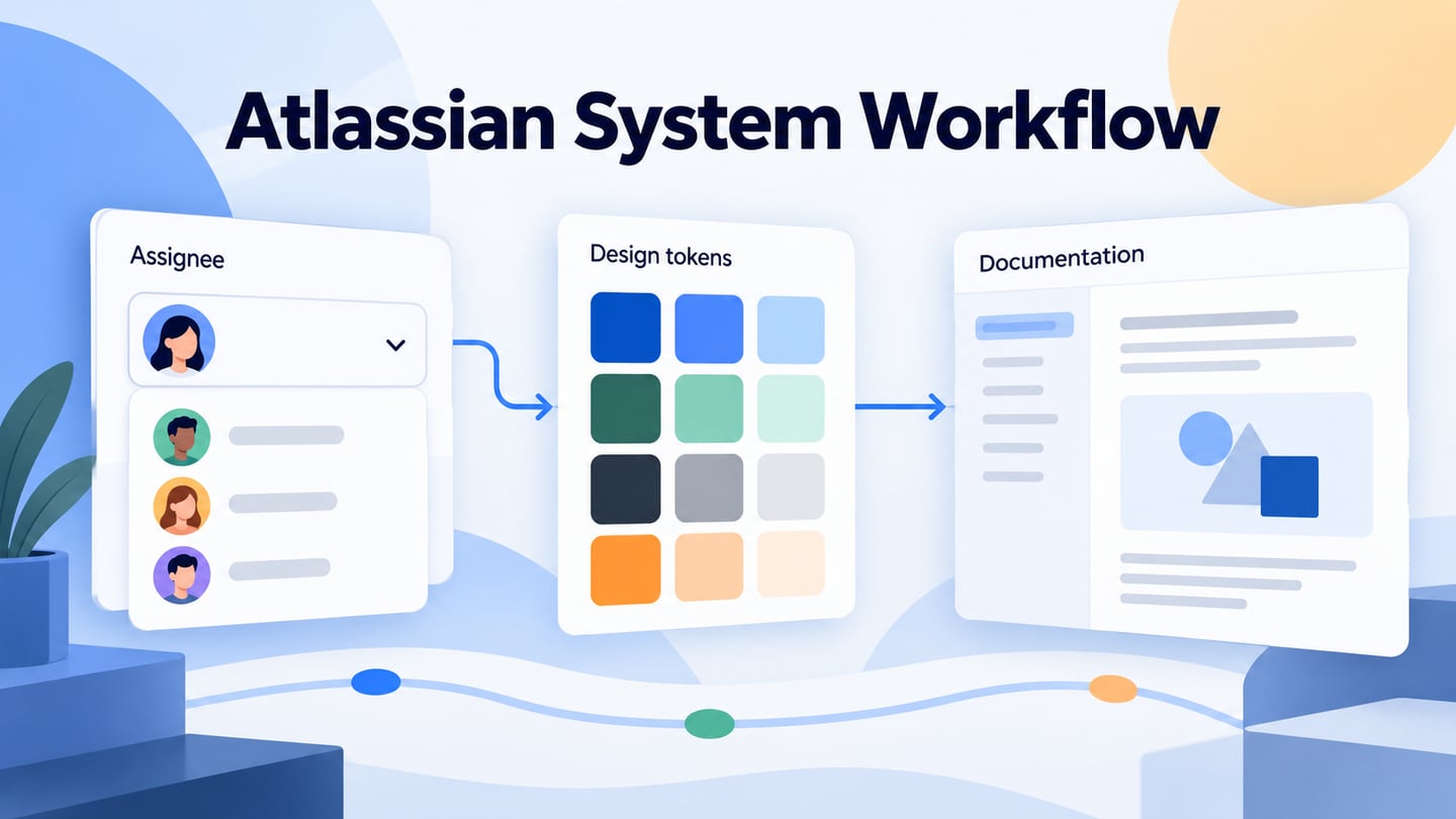
The Atlassian Design System provides foundations, components and guidance for building coherent interfaces. It is different from Confluence, which can document your team’s decisions. This guide connects the two tasks: using a design system and recording how your product applies it. The original Confluence examples below remain useful as a historical documentation workflow, not instructions for drawing an Atlassian component library.
What Does the Atlassian Design System Provide?
The official getting-started guide connects design foundations, Figma resources and development guidance. Components supply repeatable interface patterns, while design tokens name visual decisions such as color or spacing. Choose resources appropriate to your role and confirm their supported use. Atlassian’s products are not proof that every product screen is available as a downloadable design kit.
Practical Benefits and Boundaries
- Shared foundations give teams a common reference for typography, spacing, color and other visual decisions.
- Patterns explain how combinations of components can address recurring user tasks.
- Component documentation helps designers inspect intended uses and states before inventing a local variant.
- Usage guidance makes reviews more concrete, but a documented component still needs testing in your product’s context.
- Tokens separate the meaning of a visual choice from a hard-coded value, supporting consistent theme decisions.
- Design and development resources serve different jobs; a design file does not automatically become production code.
- Reusing appropriate components can reduce accidental inconsistencies between screens.
- A shared reference helps multiple teams discuss the same pattern, provided local ownership and change review remain clear.
- Check current releases and migration guidance when updating dependencies; do not assume every historical example is still current.
For implementation, Atlassian’s token guidance explains how named decisions are used in code. A designer can record the intended semantic role, while a developer selects the supported token and verifies the result in the relevant theme. This is a different task from writing a page about the component.
Document a Component in Confluence
The following five steps use Confluence as a documentation space. The screenshots show an older interface and a meeting-notes example; they do not show the Atlassian Design System editor. For current page behavior, consult Confluence’s page creation and publishing guide. Keep documentation and implementation linked so a reader can tell which version is being described.
Step 1. Create a Documentation Page
Open the appropriate Confluence space and create a page where your team can find the component guidance. Confirm you have permission to add content. The historical Create control below illustrates this first step; current navigation may differ. Use a descriptive title such as “Assignee selector” instead of calling an entire product’s system complete after creating one page.
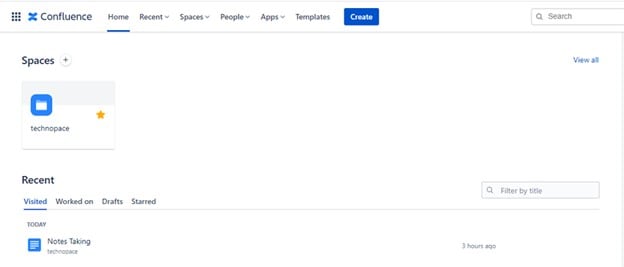 Historical Confluence page-creation interface.
Step 2. Start from a Blank Page or a Template
A blank page gives you control over the structure, while a suitable template supplies a starting outline. In either case, document the component’s purpose, owner, supported states, content rules and implementation reference.
- Start from a Blank Page
Enter a clear page title and use headings to divide the guidance. For an assignee selector, separate “When to use,” “States,” “Content” and “Implementation.” This structure helps a reader find a decision without scanning meeting history. The screenshot below shows an older blank-page title field.
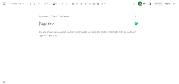 Historical Confluence blank-page editor.
Use the editor’s insert controls or slash menu to add suitable content such as a table or list. A state table can record Default, Empty and Error, with the message, trigger and next action for each. The original screenshot illustrates a slash menu inside a documentation page; adding a table does not create a working UI component.
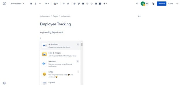 Historical Confluence insert menu.
- Adapt a Template
Choose a template that matches the type of document. The historical example uses a meeting-notes template, which is useful for recording a design discussion. Adapt it to your team’s decisions rather than treating its default fields as a complete component specification.
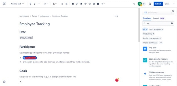 Historical meeting-notes template used for documentation.
Step 3. Record the Decisions
In the meeting-notes example, retain the date, participants, goals, discussion topics, action items and decisions. For a component review, record why a state exists and who will resolve each open issue. Link the agreed result to the component page so a future reader does not need to reconstruct the specification from several meeting records.
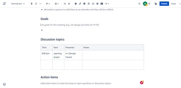 Historical discussion and action-items table.
Step 4. Check Access and Draft Status
Review who can view or edit the page and confirm the appropriate restrictions for your workspace. The historical screenshot highlights restrictions and Close. Current pages and live docs have different editing and publication behavior, so verify the content’s actual status rather than relying on the old control names.
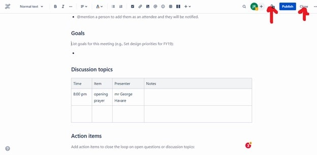 Historical restrictions and Close controls; current page behavior may differ.
Step 5. Publish and Share the Reference
Publish the page when it is ready for its intended readers, then share the stable reference with the team. Check that recipients can open any linked prototype or implementation material. When the component changes, update the guidance and record the relevant version or decision date; retiring a component also needs migration guidance for its existing users.
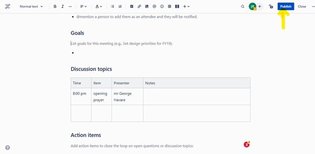 Historical Confluence Publish control.
Prototype the Assignee Selector’s Behavior
Use Mockitt to compare an assignee selector in three states: a named teammate selected, no assignee selected, and a required-field error. Keep the field label consistent and give the error a clear recovery action. The example is an illustrative product component, not a claim that Mockitt includes a native Atlassian library.
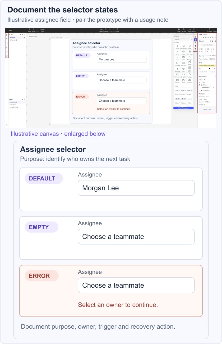
 Historical Mockitt editor capture; interface details may differ from the current product.
Connect the states needed for the review and use realistic content, such as a long teammate name. Ask whether the selected value is clear, whether an empty state is acceptable for the task, and when validation should appear. A browser-based design workspace supports this discussion, but prototype approval does not prove the component’s implemented keyboard behavior.
Put the agreed state rules beside the prototype reference in Confluence. A developer can then compare the intended behavior with the chosen component implementation. Keep the visual decision, content decision and technical dependency distinct so later changes are traceable.
What to Capture in the Prototype Review
- The visible selected value and the field’s stable label.
- The empty-state message and whether selection is required.
- The exact validation message and its placement.
- The transition that triggers validation and the action that clears it.
- Reviewer comments attached to the relevant state or decision.
- A link to the applicable component documentation and implementation version.
- An owner and date for the accepted decision, rather than an assumed product version-history limit.
- Implementation checks for keyboard interaction, focus and screen-reader announcements.