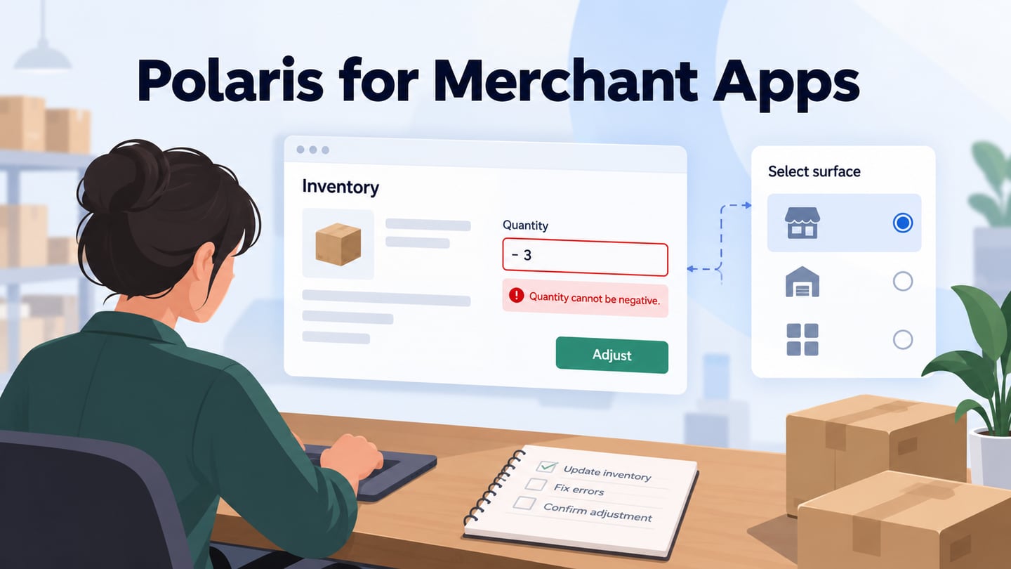
Polaris is Shopify’s design system for building experiences that fit the platform and support merchant tasks. Its guidance and components help teams make consistent choices, but the correct resources depend on the surface being built. This guide focuses on merchant-facing app interfaces. The broader design-system framework explains how shared foundations, components and usage rules work together.
What Is Shopify Polaris?
Shopify’s current Polaris documentation provides resources for platform experiences. Merchant-facing App Home, checkout and other extension surfaces have specific component and API boundaries. A customer-facing storefront theme is another task entirely. Do not assume that a component documented for one surface can be copied into another without checking support.
Six practical benefits are useful when the resources match your target surface:
- Familiar patterns. Established controls can help merchants understand a new app, but designers and developers still need to learn the guidance and the business task. A design system does not remove the learning curve.
- Less repeated work. Reusable components reduce the need to recreate standard interface parts, leaving more effort for task flow, data rules and exceptional cases.
- Clearer decisions. Guidance helps teams choose consistent labels, layouts and feedback. When a component changes, assess the migration and test affected screens rather than assuming that every earlier design updates itself.
- Inspectable resources. Published documentation and packages make supported behavior easier to understand. Their availability is not a guarantee of compatibility with another commerce platform; check the applicable license and technical environment.
- Documented evolution. Versioned resources give teams a route to maintain their application. Read release and migration guidance before changing a dependency, especially when evaluating a preview release.
- Appropriate identity. A merchant app can communicate its purpose while respecting the host surface’s rules. Branding should not obscure standard controls or imply permissions that the platform does not provide.
The aim is a coherent merchant workflow, not visual uniformity at the expense of the task. Test whether the chosen components help people understand the current state and the consequence of an action.
Choose Resources for Your Shopify Surface
These five resource types serve different purposes. Use the current documentation for the intended surface as the source of truth, rather than treating an old list of Sketch and React downloads as a universal setup path.
- Guidance. Start with the task and platform context. Check accessibility, internationalization and navigation expectations for the surface you are extending. A merchant should be able to understand where the app fits within the surrounding Shopify workflow.
- Content. Write labels, help text and errors that explain the merchant’s next action. Use precise quantities, dates and units where they affect an inventory or order decision. A vague “Invalid” message is less useful than one that states the allowed input and preserves the value for correction.
- Design foundations. Use the supported visual language for spacing, type, color and interaction states. Consider how status information remains understandable without relying on color alone, especially in dense tables or forms.
- Components. The current App Home documentation describes Polaris web components. Select components from the documentation for your target surface and version. Historical React or Sketch resources should not be presented as the default starting point for every new Polaris project.
- Patterns. Assemble controls into a complete task: find an item, change a value, validate it and confirm the result. Specify empty, error, loading and saved states when relevant. A component library cannot decide your app’s inventory policy or permission model.
Use these two setup checks before implementing a merchant-app screen:
- Confirm the surface and version. Follow the supported web-component setup for the chosen environment. As checked on October 7, 2026, Shopify’s documentation distinguishes the stable App Home v1.0 resources from the Polaris 2.0 release candidate. Check versioning guidance at implementation time rather than treating a release candidate as the stable default.
- Connect documentation to the task. Record the selected components, their supported properties and the relevant migration notes. Test the resulting screen in its host environment. If the project is a storefront, use the appropriate storefront and theme resources instead of assuming that a merchant-app component controls the shopping experience.
Prototype an Inventory-Editing Task
Use Mockitt to prototype a fictional inventory edit for “Canvas Tote.” Show the current quantity, an invalid negative entry with a clear message, and the saved state after correction. This illustrative example supports review of a merchant task; it does not claim a live Shopify connection or a built-in Polaris library.
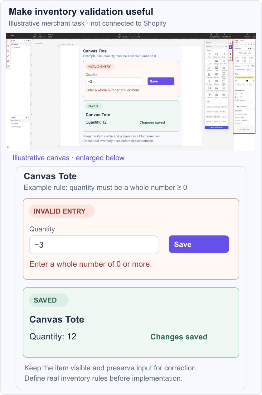
 Historical Mockitt editor capture; interface details may differ from the current product. This is not a Polaris library capture.
Keep the item name visible while the merchant edits the quantity. In this example, the quantity must be a whole number of zero or more; label that as the example’s rule, since a real app’s inventory model may differ. Put the error near the field, retain the entered value and provide a clear way to correct it.
Review the prototype with people who understand the commerce workflow. Ask what happens if saving fails, another user changes the item, or the merchant lacks permission. Document the relevant cases for implementation rather than assuming that a polished screen resolves concurrency or access control.
Share the prototype and record the accepted labels, validation rule and confirmation behavior. Verify the current product plan and collaboration controls when organizing review access; the design exercise does not depend on an assumed free-project allowance or promised completion time.
Use the prototype to settle the interaction, then implement it with the supported Shopify resources for the chosen surface. Validate the real component behavior, data handling and accessibility in that environment.