Carbon is IBM’s open-source design system for digital products and experiences. Its guidance, design resources and code components provide a shared starting point for interface work. This article explains the resources and preserves an older Sketch workflow with clear version context. For the broader principles behind this approach, see the design-system guide.
What Does Carbon Provide?
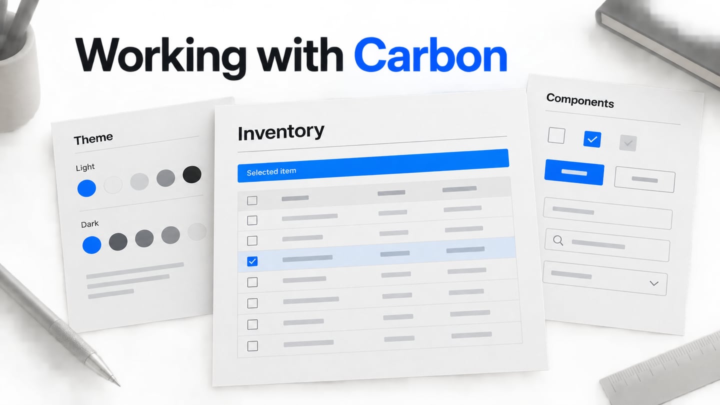
Carbon builds on IBM Design Language and brings together guidelines, reusable components, design assets and implementation resources. Its value is a shared vocabulary for interface decisions, not a guarantee that any assembled screen is usable. Start by distinguishing three connected resources: the documentation site, the coded component library and the design kit.
- The Design Site
The documentation site provides foundations, component usage, patterns and resource guidance. Read the usage and behavior notes for the component you need, not only its visual example. They help you determine whether the pattern fits your task and what conditions still require product-level decisions.
- Component Library
Coded components provide an implementation starting point. Check the supported package, framework, version and component status for your project. A visual example and a code package are related resources, but adopting one does not automatically install or configure the other.
- Design Kit
Current Carbon design resources center on Figma libraries and related assets. The screenshots later in this article show an older Sketch-based workflow. They remain useful for understanding the kinds of resources involved, but should not be followed as the current default installation instructions.
Advantages of Carbon Design System
- The open-source community supports contributions and discussion; use the documented contribution route rather than assuming an individual issue will receive a particular response time.
- Design resources and component libraries help teams share established patterns. Check the current status of a framework package instead of treating every historical Carbon implementation as equally maintained.
- Open-source resources allow teams to inspect and contribute within the applicable licenses and project process.
- Accessibility guidance supports inclusive design, but product content, composition and custom behavior still require accessibility testing.
- Modular components can be combined into task-specific interfaces, with usage rules that help avoid arbitrary variations.
- Shared foundations improve consistency when designers and developers use compatible versions and review the implemented result.
Choose a Kit and Start Designing
Step 1. Choose Resources for the Version You Use
For new work, begin with the current design-resource page and follow its library setup instructions. The archived Carbon v10 guide explains the historical Sketch, Adobe XD and Axure options shown here. Do not assume those archived kits continue to receive current updates. If you inherit a v10 file, establish whether you are maintaining it or migrating before replacing assets.
- Choose a Theme
Carbon’s White and Gray 10 themes are light; Gray 90 and Gray 100 are dark. The historical image below presents separate Sketch downloads. In the v11 design migration guidance, all themes are available in one file, and updated tokens and layering affect migration. Theme selection should be consistent across the interface rather than a collection of manually recolored components.
 Historical Carbon v10-era Sketch theme downloads.
- Use the Appropriate Icons and Foundations
The historical resource cards below show IBM Design Language and icon libraries grouped by size. In a current project, choose the documented icon asset and size for the component, and check its alignment and accessible label. An icon’s visual presence alone does not communicate an interactive control’s name to every user.
 Historical IBM Design Language and icon-library downloads.
- Establish the Grid and Shell
The older Sketch workflow downloaded an IBM Grid template and a UI Shell template, then saved the document for reuse. In current work, use the supported grid and shell resources for your chosen kit. Define the content area, navigation and responsive behavior before filling the page with components.
 Historical Sketch Grid and UI Shell template downloads.
Step 2. Assemble and Review the Interface
Familiarize yourself with the kit’s grid, text styles, layers and components. Build one representative screen with realistic content before spreading a pattern across the product. A dense data table is a useful test because selection, overflow, empty states and actions reveal problems that a decorative sample can hide.
In the historical Sketch flow, File > New File from Template opened the IBM Grid template. The equivalent design task today is still to establish a consistent layout, but use the current editor’s supported resources and avoid mixing incompatible library versions.
The old Insert > Text Styles > Carbon Design System menu shown below applied a library style. In a current file, use the relevant shared text style and check the content hierarchy. Long labels and wrapped cells should remain readable without arbitrary local font reductions.
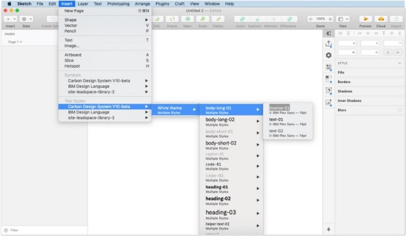 Historical Carbon v10-beta text-style menu in Sketch.
The historical Layout Settings control adjusted the grid. Review the chosen content width and spacing with actual table rows, including a longer item name. Record which columns can wrap, truncate or disappear at narrower widths; the kit cannot decide these product-specific rules for you.
The second historical menu inserts a Carbon symbol such as a button. For a current implementation, choose the documented component and its appropriate variant, then check all states used in the task. Do not treat a placed symbol as evidence that sorting, selection or keyboard behavior has been implemented.
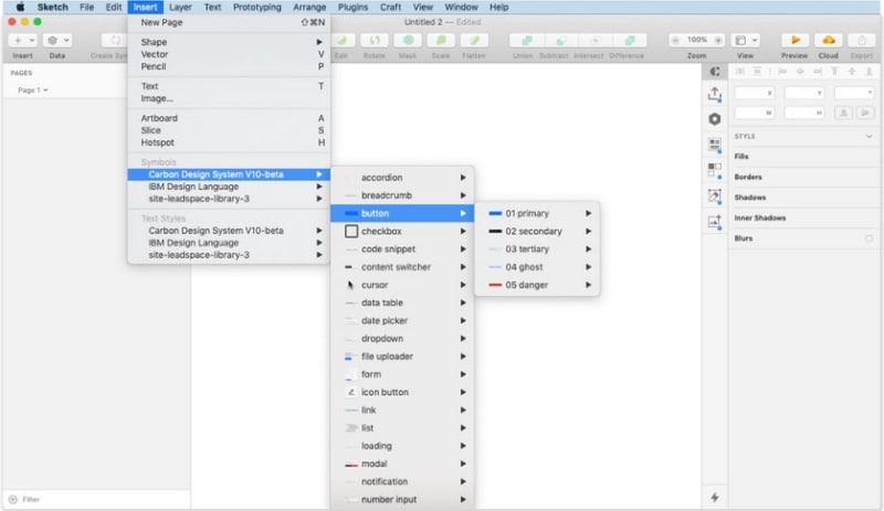 Historical Carbon v10-beta symbol menu in Sketch.
Prototype a Table Selection and Batch Action
In Mockitt, make an illustrative inventory table with one selected row and a clearly related batch action. Show the item name, selection state and action label together, then compare the unselected and selected states. This is a prototype exercise informed by component-based design; it is not a claim that Mockitt imports Carbon’s Figma or code libraries.
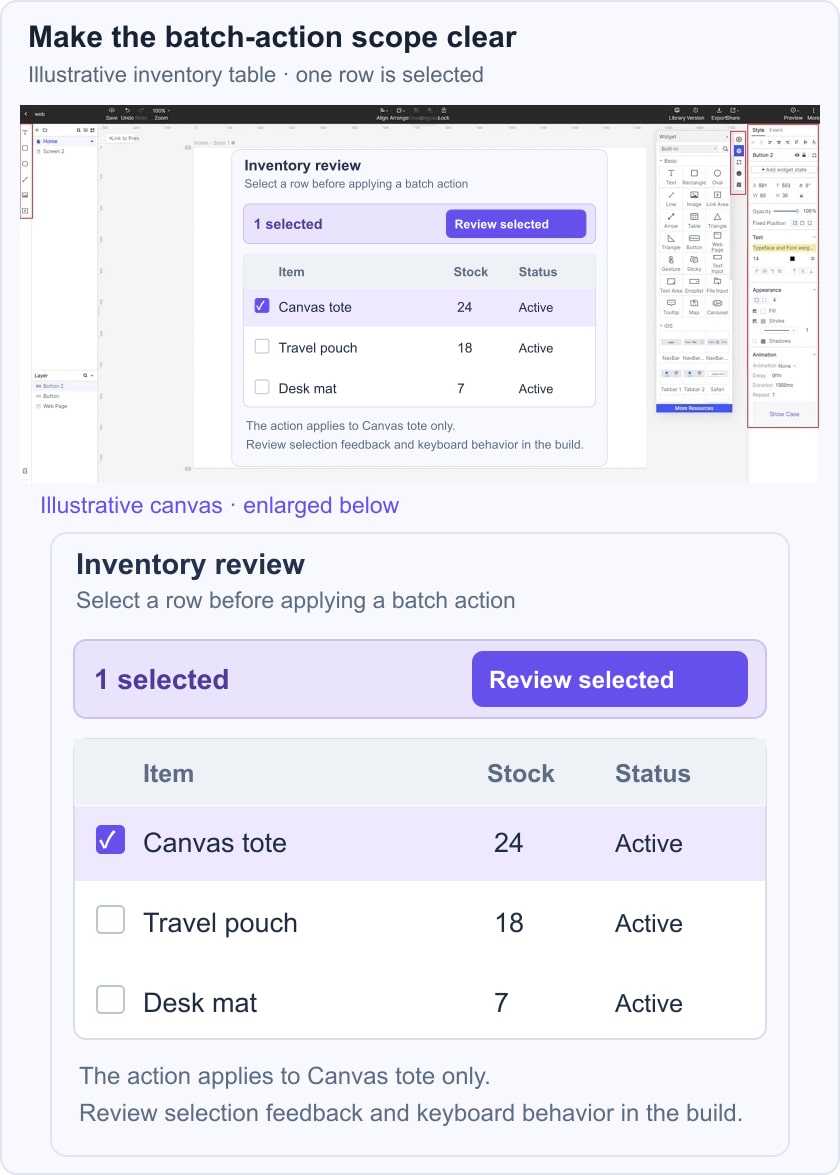
 Historical Mockitt editor capture; interface details may differ from the current product.
Review whether the action’s scope is obvious: does it apply to the selected row or the entire inventory? Add a confirmation state if the task requires one and use realistic item names. Share the prototype with reviewers, then transfer the accepted behavior to the implementation reference. A screen that looks consistent still needs validation with the actual data and interaction model.
What the Review Should Establish
- A consistent relationship between the table, selection control and batch-action area.
- Clear feedback when a row becomes selected or selection is cleared.
- A visible action label that describes what happens to the selected item.
- A usable layout with long content and narrower available space.
- The version of the design kit and coded component that implementation will use.
- The behavior of any transition, rather than animation added only for decoration.
- Ownership of follow-up checks for keyboard operation, focus, labels and data-dependent states.