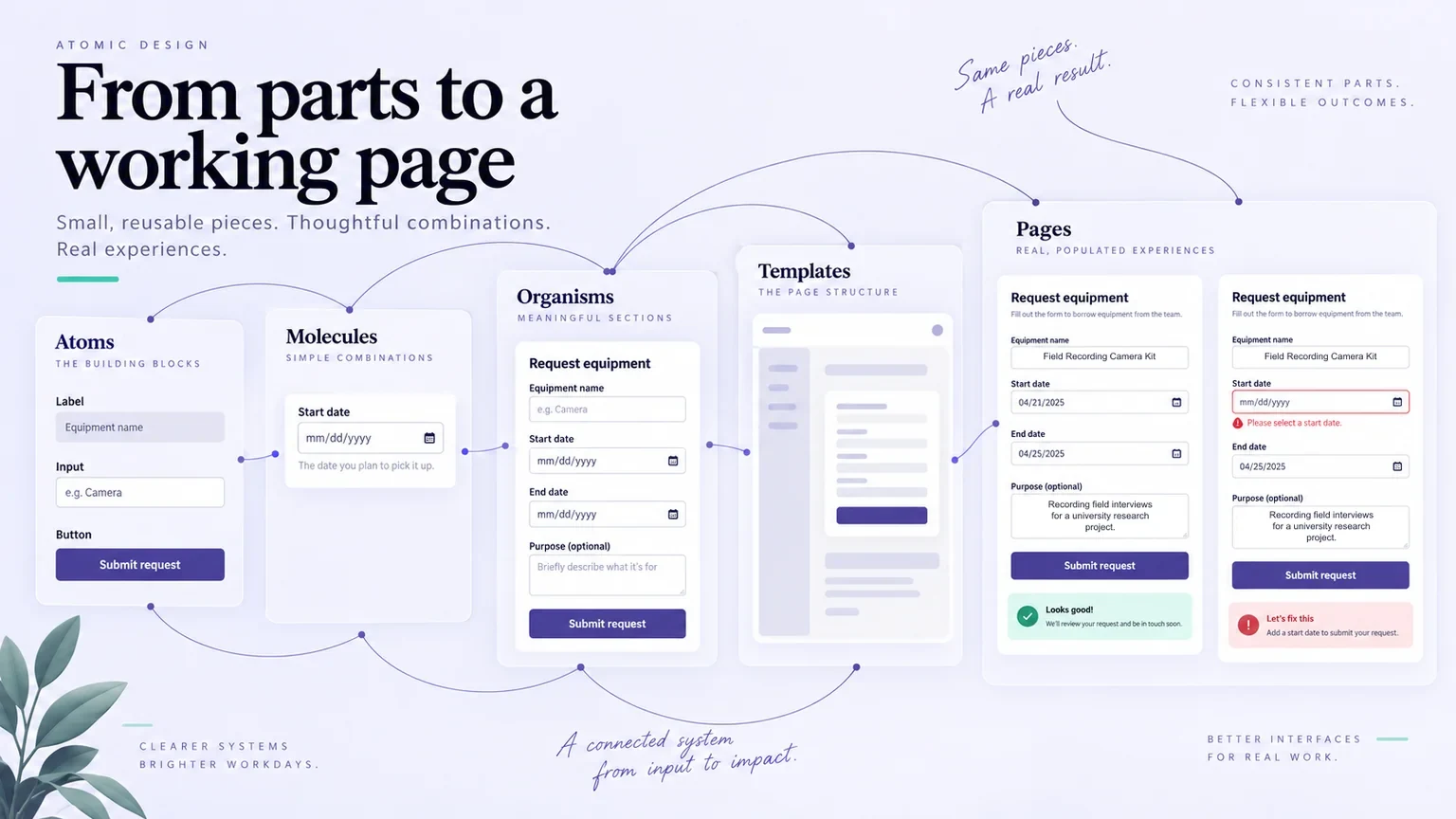
Atomic design gives a team a way to connect small interface elements with the complete screens people use. Its value becomes clear when a change to one field must work in several forms, or when a tidy component breaks under real content. The aim is reusable decisions that survive those situations, rather than a library organized around impressive terminology.
You can explore these relationships in Mockitt Design with reusable components and page layouts. Start with a real task, compare the parts with the whole, and document the behavior that the visual design cannot express by itself. Below, a fictional equipment-loan service illustrates the method, followed by five design-system references and a practical review workflow.
The five levels work together
Brad Frost's atomic design methodology describes atoms, molecules, organisms, templates, and pages. These are concurrent ways to examine an interface, not five production phases that must be finished in order. Atoms are basic elements; molecules combine them into a small functional unit; organisms form larger interface sections. Templates describe page structure, while pages populate that structure with representative content.
Atomic design is one method within a broader design system. It does not, by itself, supply ownership, accessibility rules, release practices, or agreement between design and implementation. A team can use plain names such as “field,” “request panel,” and “page layout” while still making the relationships explicit.
An equipment request, from a field to a complete page
Imagine a small university service called Fieldnote Loans. A researcher needs to borrow a camera kit for fieldwork. The request includes the kit, collection date, return date, and a reason for borrowing it. This is an authored example for examining component decisions, not a report of a tested service.
| Level | Fieldnote example | Decision to examine |
|---|---|---|
| Atom | A date label, input, or submit button | Can someone identify the control and its state? |
| Molecule | A labeled collection-date field with help and an error message | Does its message explain how to correct an invalid date? |
| Organism | The request panel combining dates, purpose, and submission | Can someone understand the complete request before sending it? |
| Template | A loan-request layout with equipment details and form regions | Which information must appear together at narrow widths? |
| Page | A request for the “Field Recording Camera Kit,” with actual dates and availability | Does the layout still work with realistic content and exceptions? |
The date field should not know whether the researcher is borrowing a camera or an audio recorder. That makes it a useful reusable unit. The request panel does need to know that a return date cannot precede collection. Put that relationship in the panel's documented behavior instead of hiding it in one screen's appearance.
Now populate the page with a long equipment name and a missing collection date. If the error pushes the submit button out of view, review the field spacing and panel layout together. If the equipment heading wraps awkwardly, change the content rules or available space. A page-level problem can expose a decision inside a small component; the work does not move only from small to large.
Choose a boundary that supports a real change
Suppose three request forms need the same date format hint. A shared field makes that change manageable. But a collection-location selector and a date input should not become one oversized component merely because they sit next to each other today. Ask whether their behavior, validation, and likely future changes belong together.
Give the component a concise contract: its purpose, accepted content, supported states, and what the surrounding screen must provide. For the date field, include empty, entered, invalid, and unavailable states. Record keyboard and error-announcement expectations for implementation; a drawn focus outline alone does not create accessible behavior.
Fieldnote also uses the date field when someone extends an existing loan. That screen already knows the collection date, so the shared control needs a clear rule about which values it receives from its surroundings. Before changing the field, compare both uses. A correction that improves the new-request form could confuse the extension flow if it suddenly clears a previously selected date. Record the expected result in each context and review those examples with the implementation owner.
Five design-system references to learn from
The following references illustrate different ways to organize reusable interface decisions. They are not five interchangeable products or proof that every organization uses Frost's exact vocabulary. Read a current component reference as implementation guidance for its stated platform; read a historical account as an explanation of decisions made at that time.
1. Material Design: connect foundations with components
Google's Material Design brings together visual and interaction guidance with implementation resources. The Material 3 documentation for Compose provides a concrete platform example. Its usefulness here is the connection between shared design choices and the components that express them, not the assumption that an attractive collection of controls automatically forms a complete product.
For Fieldnote, inspect how the selected implementation handles fields, buttons, and feedback before designing custom variations. Keep the component version and platform visible in the handoff. A web mockup and an Android library can share an intention without sharing identical implementation details.
2. Polaris: design for a specific product environment
Shopify's Polaris web components help app interfaces fit the Shopify admin. The documentation groups resources for actions, feedback, forms, layout, and other interface needs. Polaris is not a promise that a merchant can create any complete storefront without coding in minutes.
The transferable lesson is context. A component should suit the environment in which it is used. Fieldnote's request panel needs equipment availability and borrowing rules; copying an admin component's appearance would not supply those decisions. Review the documented purpose before borrowing a pattern.
3. Buffer: a documented historical use of atomic design
Buffer's 2017 engineering report explicitly describes translating its style guide into React components using atomic design principles. It discusses small elements combining into larger units. This is a historical account of that work, rather than a claim about Buffer's current internal component architecture.
Its practical lesson is to connect design organization with implementation. For Fieldnote, the date-field specification should point to the implemented control and its tests. Keeping two unrelated libraries with similar names would leave the team to reconcile behavior manually every time the component changes.
4. Airbnb Design: a shared visual language
Karri Saarinen's 2016 account of Airbnb's Design Language System explains the creation of a shared visual language and component library. It is a useful organizational case study, not a public inventory of the company's present-day internal system.
Apply the lesson by agreeing what a reusable pattern means before multiplying it. Fieldnote's equipment summary should consistently communicate identity, availability, and collection context. If each team calls a different combination “equipment card,” the shared name provides little help during review.
5. Fluent: match resources to the platform
Microsoft's Fluent 2 provides design resources and component entry points for web, iOS, Android, and Windows. Describing Fluent only through the original Windows 10-era list of light, depth, material, scale, and motion misses the practical resources a team needs to choose today.
Use it as a reminder to identify the target platform and supported library. Fieldnote's desktop request page and a mobile collection screen may need different layouts while retaining consistent labels and behavior. The shared rule matters more than making every screen geometrically identical.
Other references have different histories and scopes. Trello's Nachos is a historical design-system reference; Salesforce's Lightning Design System supplies another established component vocabulary. Neither name, on its own, proves an atomic hierarchy or gives permission to reuse every associated brand asset.
Review components and pages in Mockitt
Mockitt's component, variable, layout, and review features can help a team examine reusable interface decisions. For Fieldnote, place the basic field beside its use in the complete request panel. Then show two populated pages: a valid camera-kit request and one with a missing collection date. Keep the content and error wording readable rather than reducing the example to colored rectangles.
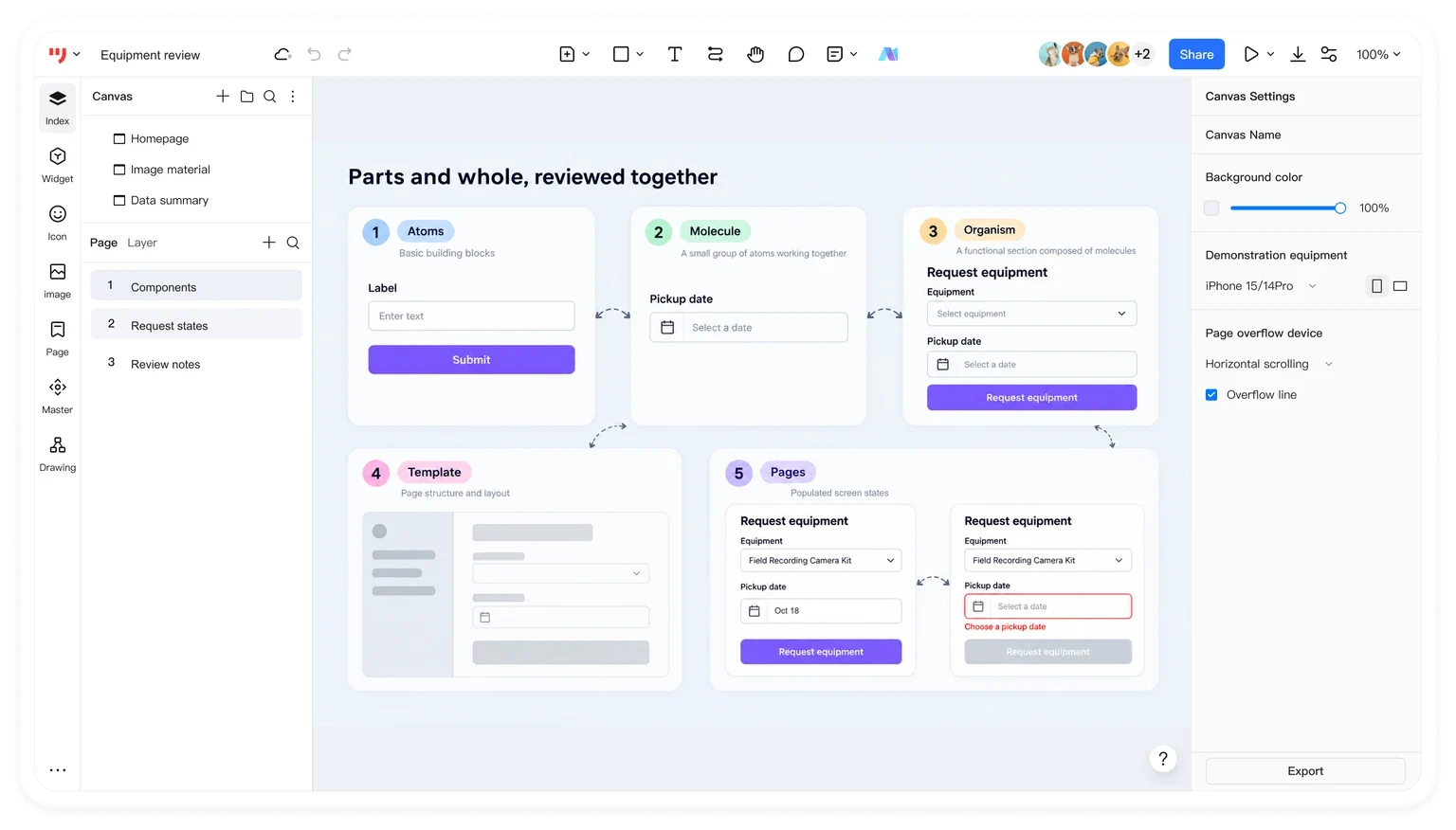
Begin with the reusable elements and adapt their labels and layout to the request. Keep shared style choices consistent, then compare each state in context. If the same field needs different spacing in every screen, investigate the surrounding layout before adding another variant. Use a comment beside the affected screen to explain the decision that needs agreement.
Next, connect the request to a confirmation view and preview the transition. Ask a reviewer to identify the selected equipment, dates, and next action. This checks whether the proposed screens communicate the intended task. It does not establish that availability checks, validation, or persistence work in the eventual application.
For handoff, pair the visual example with a short behavior note and the implementation reference. Specify which element receives focus after an error, how unavailable equipment is explained, and what changes after submission. Exported specifications or code drafts still need engineering review and integration.
Finally, assign an owner to the shared field and record where it is used. Before changing its error behavior, revisit the request pages that depend on it. If a component must be replaced, plan how to retire a design-system component without leaving its consumers stranded. A small library that helps people make and maintain these decisions is more useful than a large catalogue whose components nobody can safely change.