Mockitt - Best Free Wireframe Tool
Helpful Tips About Wireframe
- How To Create A Wireframe
- Wireframe Tools You Should Know
- Wireframe Templates for Your Inspiration
- Free-to-use Wireframe Kit
Design Tokens: Name Visual Decisions for Consistent UI Handoff
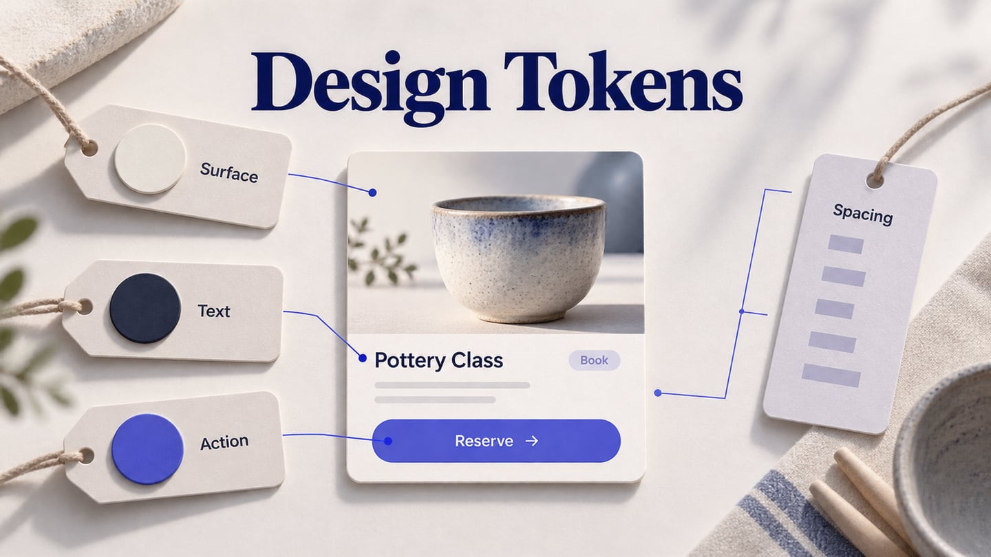
Design tokens give repeated visual decisions a name. Instead of telling a developer that three buttons should use “that purple,” a team can agree on an action-background token, its value and the places where it applies. The useful outcome is a small, understandable vocabulary that survives changes to individual screens.
Start with one real flow in Mockitt's UI design workspace, then record the decisions behind its colors, type and spacing. This guide uses an illustrative booking panel for a fictional pottery studio, Kiln House. The aim is to explain the token model and handoff; a named design value does not automatically create a synchronized code package.
Separate a value from the job it performs
A token is a named design decision with a value and enough context to use it correctly. A value might be a color, a spacing dimension or a typography property. The name provides a stable reference. A documented meaning explains why the reference exists.
Consider two violet rectangles in the booking panel. One is the primary “Reserve a place” button; the other is a decorative lesson-category badge. Their current color may match, but their roles differ. If the primary action needs a darker treatment, changing a shared “violet rectangle” value could unexpectedly alter the badge. Role-based naming makes that dependency visible.
Teams often distinguish raw values from semantic roles. A raw value describes a choice in a palette or scale; a semantic token describes where that choice belongs. Component-specific tokens can add a further layer when a component needs its own maintained contract. These are useful organizational choices, not three mandatory layers for every small project.
The Design Tokens Community Group format specification describes an interchange format with token types, values and references. A naming worksheet is not automatically compliant with that format. If interchange is part of your workflow, agree on the actual format and supported types with the tools and code that will consume it.
Audit one flow before inventing a large token library
Collect the booking panel, its selected-session state, a validation state and the confirmation screen. Record the repeated values and the places where they occur. Keep intentional differences separate from accidental drift: an error message and a lesson description should not necessarily share their text color simply because both are paragraphs.
For Kiln House, the first pass finds a page background, a card surface, primary and secondary text, an action fill, an error color and three recurring gaps. That is a manageable starting set. There is no need to define every possible shade or spacing value before the booking task is coherent.
For each candidate, ask three questions: does the decision recur, does it have a stable meaning, and can someone explain when not to use it? If a value appears only in a decorative illustration, keeping it local may be simpler. If several forms use the same field spacing, a shared token is easier to justify.
Keep an exception note alongside the audit. A compact calendar cell may require a smaller gap than a form field group. Document the reason instead of forcing both into the nearest existing value or adding an unexplained “special2” token.
Name tokens by roles people can recognize
Choose a naming order and use it consistently. In this example, names run from category to purpose and then state: color.action.primary.default. A different team might use a slash-separated design-library name. The important relationship is an unambiguous mapping between the design reference and the implementation reference.
A small proposal for the booking panel could read as follows. These are illustrative names, not built-in Mockitt token names or a prescribed interchange syntax.
color.surface.card: the booking panel background, not the entire page.color.text.primary: the main reading text on its intended surfaces.color.text.secondary: supporting information that must remain readable.color.action.primary.default: the enabled reservation action.color.feedback.error: an error indication paired with an explanation.space.field.gap: the gap between the label and its associated control.space.group.gap: separation between distinct groups of booking choices.
Avoid encoding a temporary screen position in a reusable name. “Bottom-left-purple” stops making sense when the button moves. Conversely, do not give a local decision an overly broad name such as “brand” when only one action state should use it.
State names deserve the same care. Default, hover, pressed and disabled are different interaction conditions. Selected is another meaning: a chosen session remains selected when the pointer leaves it. Review the button roles and states before treating all highlighted controls as variations of one action token.
Connect the names to an actual component
Apply the proposed roles to the booking panel. Its title uses primary text, the session-duration note uses secondary text, and the reservation action uses the primary action fill. Label the mapping in a separate notes area so readers do not mistake developer annotations for customer-facing copy.
The illustrative Kiln House panel connects three visible decisions—card surface, primary action and field spacing—to a compact naming record beside the design.
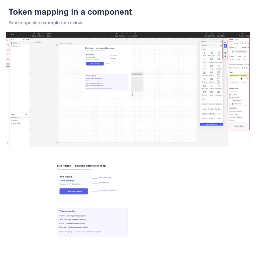
Mockitt Design's public product page describes variables, shared variables and reusable components. Use the available design controls to maintain the visual reference, and keep any external token-file or code mapping explicit. Do not promise an automatic token export or a two-way synchronization that has not been established in your workflow.
The component is still responsible for its anatomy and behavior. A spacing token does not say whether the attendee-count field belongs before or after the session choice. A color token does not define what happens when no place is available. Keep those rules in the component specification and reference the tokens where they apply.
When a local component needs an exception, decide whether the exception is a real reusable role. “Reservation warning surface” could be meaningful across several booking screens; “card-yellow-v3-final” hides the reason for the difference. Name the decision once it is understood, rather than treating every new hex value as a new system concept.
Review themes and color pairs together
A semantic name can retain its purpose while its resolved value changes with the theme. The booking card may use one surface in a light presentation and another in a dark presentation. The foreground text must be considered with that surface, not reviewed as an isolated swatch.
Keep a small matrix of actual uses: primary text on card, secondary text on card, action text on action fill, and error text on its message surface. Include the disabled and selected states that exist in the flow. An attractive palette is not enough to establish readable combinations.
The W3C text-contrast guidance provides the relevant criteria and exceptions. Test the resulting foreground/background pairs under the criteria that apply to your interface. A token named “accessible-purple” cannot guarantee accessibility wherever someone uses it.
Also inspect meaning without color. The unavailable session should say “Full” and offer an appropriate next action; changing only a circle from violet to gray leaves too much to infer. Tokens keep presentation decisions consistent, while content and behavior make the state understandable.
Give developers a mapping they can maintain
For each approved token, record its name, type, current value or reference, purpose, permitted uses, owner and implementation mapping. Add the relevant theme or platform context where a single value would otherwise be ambiguous. Keep units explicit for dimensions; “16” without a unit or interpretation is an incomplete handoff.
For example, a field-gap record can identify a design spacing value of 8 px and the implementation variable selected by engineering. That is a proposed mapping to review, not a promise that an exported file will choose the same unit or name. Typography needs similar care: family, weight, size, line height and letter spacing are separate decisions even when the design tool displays them as one style.
Include one concrete usage and one misuse. The primary action fill belongs to the enabled reservation button; it does not automatically belong to every badge. This small distinction is often more useful than a long list of palette values with no explanation.
Put the approved mapping in the design handoff reference with the component and flow version. A developer should be able to identify whether a mismatch is a wrong token, a wrong resolved value, or an intentional exception.
Change a token by following its uses
Suppose the reservation action becomes darker. First confirm that the intended change concerns the action role, not every use of the raw violet value. List its consumers, update the proposal, and compare the affected states in each supported theme. The lesson-category badge should remain unchanged if it has a separate role.
A rename requires more than changing a label in the design file. Record the old and new names, decide how existing references will migrate, and check both design and implementation consumers. Where a token is retired, point to the replacement and explain the difference; two names that happen to resolve to the same color may still have different meanings.
Keep the first version small enough to review in a real task. For Kiln House, success is a consistent booking panel, a clear record of its visual roles, and a developer who can implement the intended mapping. Expand the vocabulary when another flow supplies a real shared need.