A data table helps people scan, compare and act on records. An Ant Design table needs more than aligned columns: users must understand what each row represents, which records a filter includes and what a row action will change.
Use Mockitt to prototype table interactions before implementing the React component. A small set of realistic records can reveal whether the layout supports the task and whether selection, sorting and actions preserve the right context.
What is Ant Design
Ant Design provides reusable patterns for enterprise interfaces, including tables and forms. Their value comes from consistency, but the application still needs a clear definition of the records and operations it exposes.
A component can supply a familiar control while the product team specifies its meaning. For example, “Pending” must refer to a defined order state; it should not mean different things in a summary card and in the table.
Design Resources
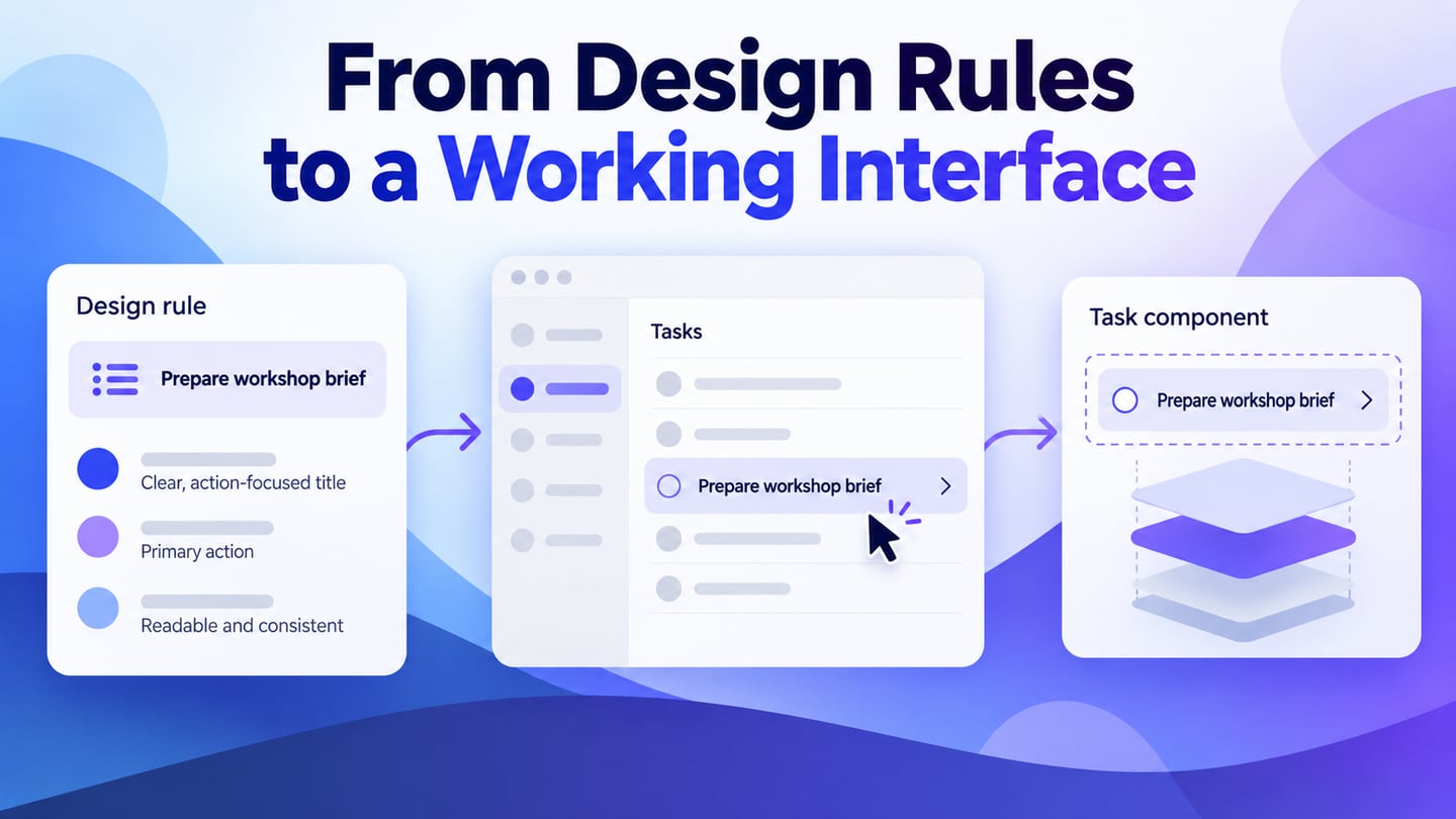
Use official guidelines and design resources as implementation references. Keep the component version and any custom behavior in the handoff so the team can distinguish standard behavior from product-specific rules.
- Design values
- Design Patterns
- Visualization
- illustration
- Design resources
- Current design resources for the implementation version
Design Patterns
Design patterns help related interfaces behave consistently. In a table, the important relationships include filters, sort order, row identity and the consequences of actions. Document those relationships so a design that works for one sample row also works for missing, long or changing data.
Principle
Organize information around the comparison the user needs to make. Put identifying information where it remains available and use units, status labels and dates consistently.
Global Rules
Define the recurring behaviors: how filters apply, how selection is cleared, when loading appears and how users recover from a failed action. Consistency matters across the whole record workflow.
Template Document
A starting layout can help you organize a list or detail page. Treat it as a draft: choose the columns and actions based on the actual task rather than keeping every field that appears in a template.
What is Ant Design Table
Tables display and operate on records; forms collect or edit values. They often meet in the same workflow, but each needs clear states and validation rules.
Antd Tables
The Ant Design Table component is a React implementation, not a no-code table builder. You can prototype the intended appearance and behavior visually, then implement its data source, keys, filters and actions in the application.
Forms Components
Forms can support table filters and record edits. Specify which fields are editable, which are required and how changes are validated before choosing the controls.
- Choose text or numeric inputs according to the data, and make formatting rules explicit.
- Choose date controls according to the task: a single date, range or other supported selection. Verify the current component API rather than relying on an older limitation claim.
- Test the chosen date interaction at narrow widths and with keyboard input.
- Time input should make its format, time zone and any allowed range clear.
- Uploads need accepted-file guidance, progress, validation and recovery states; check the current API for implementation details.
How to Create an Antd Table?
Mockitt can help construct the table and its related detail states. Use reusable rows and realistic labels, then preview the important transitions. The visual prototype does not query a database or enforce authorization.

Review the table with the person who will use it. Ask them to locate a specific record and explain why it needs action. If they cannot distinguish the identifier, status and next step, improve the hierarchy before adding more columns.
Use a small set of deliberately different records: a normal row, a long value, a missing optional value and an exception. These cases expose layout and wording problems more clearly than repeated placeholder rows.
An icon or template can help assemble the visual, but it does not define the record behavior. Keep labels where the action would otherwise be ambiguous.
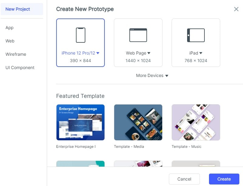
1. Create an order-review screen and define the task: find orders whose shipment needs attention. The retained captures show earlier Mockitt interfaces, not a guarantee that a named template is currently available.
2. Choose or build a table with order ID, shipment status, last update and an action. Keep the identifying column readable when the viewport narrows.
3. Define a “Needs attention” filter with a clear rule. Show the active filter and provide a way to clear it.
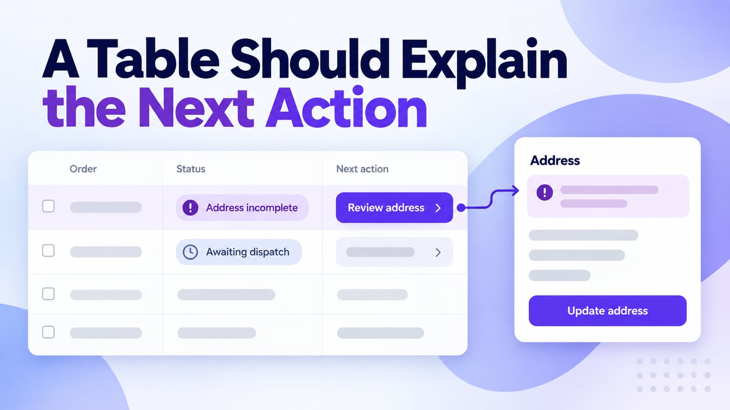
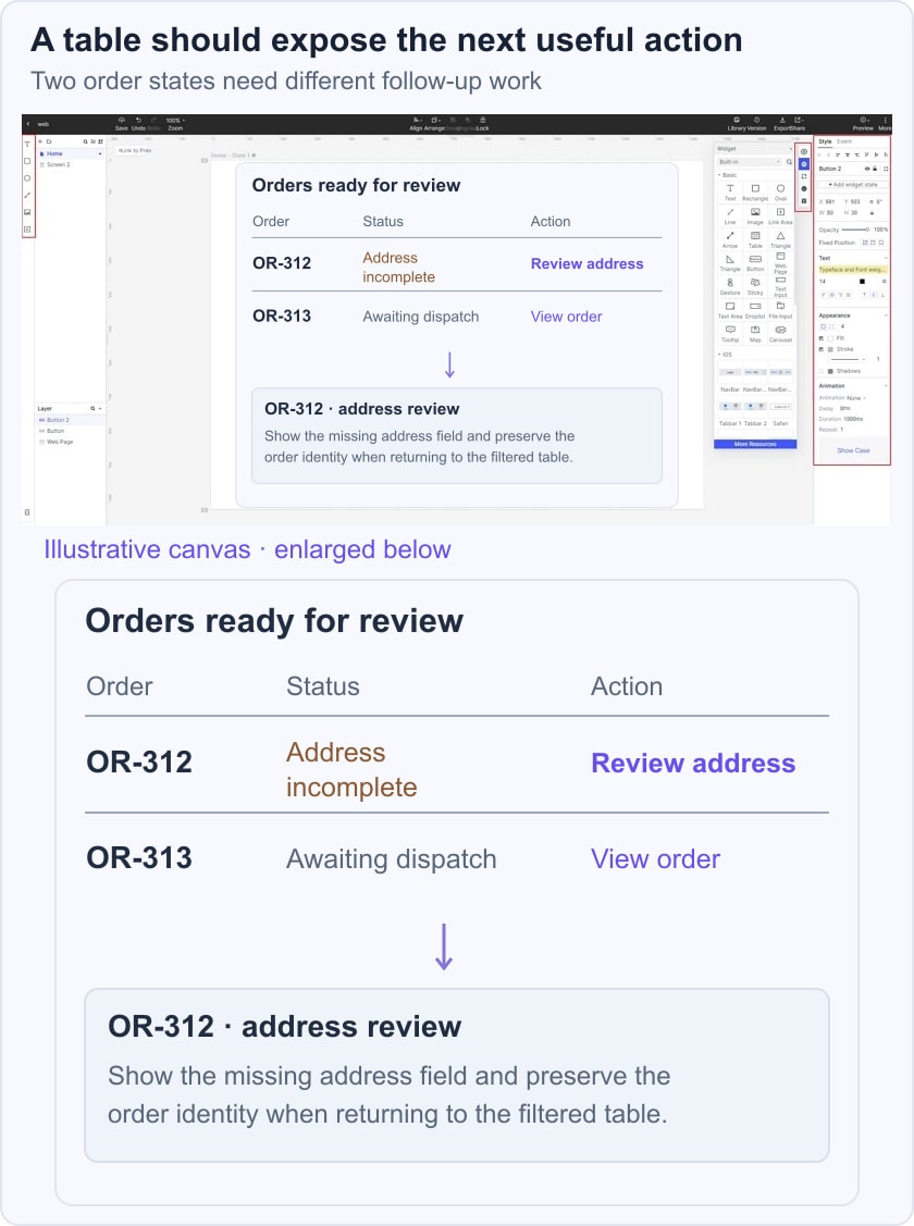
In the order-review example, order OR-312 has “Address incomplete” as its shipment status. Selecting “Review address” opens the record details rather than immediately changing the shipment. A second row is awaiting dispatch and should not look identical to an error. The difference is conveyed by the status text, not only by color.
For coordinated filtering and pagination, see the Ant Design component workflow. The row action should also follow the button hierarchy and state rules used elsewhere in the product.
4. Add loading, no-matching-results and retrieval-error states. Keep “no matching orders” distinct from “orders could not be loaded,” because the recovery action is different.
5. If bulk selection is needed, show its scope and count. Define whether selections survive filter or page changes, and prevent an invisible selection from surprising the user.
6. Preview the path from the filtered list to the record and back. Preserve the intended filter and position so a reviewer can continue their task. Hand off stable record identity, sort and filter rules, action permissions and error behavior for implementation.
The final acceptance check should use the same records in the implemented application. Verify that sorting does not change which record an action targets, that failures do not appear as successes and that keyboard users can reach the required controls. A convincing screenshot alone cannot establish these behaviors.