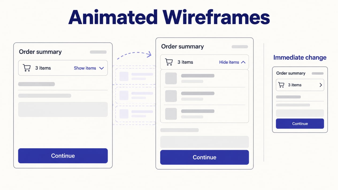
An animated wireframe shows how an interface changes after an action: a panel opens, a selected item moves or a screen gives feedback. It can help a team inspect the relationship between states before implementation. Motion should answer a design question; it is not required to make every wireframe useful.
Compare the tools and follow a six-step workflow using an expandable order summary as the worked example. The goal is to reveal detail without losing the person’s place, then compare that motion with an immediate state change.
What Is an Animated Wireframe?
A wireframe represents interface structure. Adding animation can communicate how one state becomes another, while a prototype connects the states and actions used in a task. A static sketch can still support useful discussion, and paper prototypes can simulate interaction through a facilitator.
Motion may be triggered by a click, tap, other input or a defined system event; it is not necessarily automatic. For example, expanding “Order summary” can reveal line items while retaining the total and current checkout step. The motion explains the relationship between the compact and expanded views rather than automatically completing the task for the user.
Tools for Animated Wireframes: Fit and Limitations
1. Mockitt
Mockitt supports connected screens and interaction states that can demonstrate a proposed UI sequence. It is suitable for the order-summary exercise below. Choose it based on the states and review workflow you need, not a claim that it is universally best.
Use reusable widgets, screen content and relevant transitions to build the sequence. Start from a suitable template only when its structure matches the task. Keep control labels and sample data consistent across states so reviewers can distinguish a deliberate change from a drawing inconsistency.
Review dimensions:
- Construction: compose screens with widgets and text.
- Reuse: retain consistent elements across related states.
- Behavior: connect the control to the intended state change.
- Motion: preview the selected transition and compare it with no movement.
- Review: share a defined version and record state-specific feedback.
- Boundary: a UI preview does not prove implemented performance or accessibility.
2. Figma
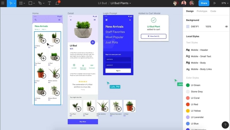
Figma combines design files and interactive prototypes. Its animation options can help teams compare changes between states. Choose on the basis of the required interaction and current plan.
For this task, inspect whether the compact and expanded summary preserve content and alignment. Use the same sample order as in other tools if comparing workflows; familiarity with the editor may matter as much as the animation options.
Review dimensions:
- Construction: design the starting and ending frames or component states.
- Behavior: preview the interaction before interpreting it as a tested user experience.
- Reuse: use consistent components for recurring controls.
- Layout: inspect resizing explicitly; a layout feature does not automatically make every design responsive.
- Boundary: confirm current plan and sharing requirements for the actual reviewers.
3. Adobe XD: Existing-Project Context
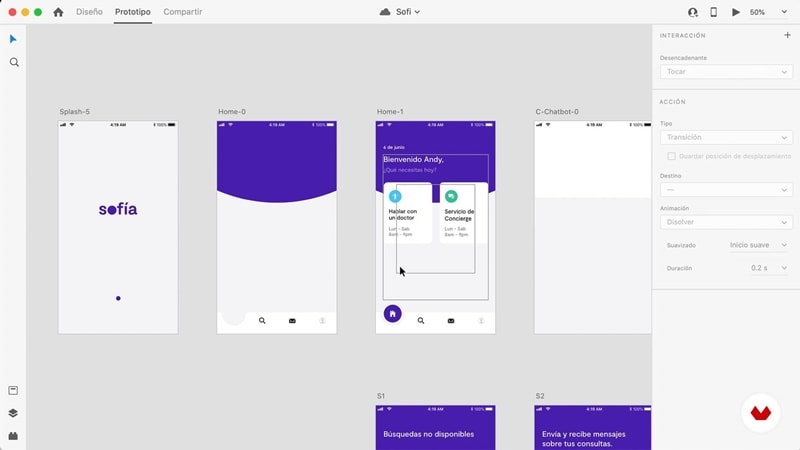
Adobe XD remains in maintenance mode; Adobe says it is not investing in new features. Its retained screenshot can help teams understand an existing XD file, but that is different from recommending it as the default starting point for a new workflow.
If your team already has access and archived XD prototypes, assess whether maintaining or moving them better serves the work. Check whether new users have the same access as existing customers.
Existing-project checks:
- Check whether the original file and its linked assets still open in the supported environment.
- Inspect the state sequence and labels before treating the old prototype as current guidance.
- Preserve useful design decisions during any migration rather than merely copying screenshots.
- Verify the interactions needed for the task after moving a file; a screenshot of the old interface does not demonstrate a successful migration.
4. Sketch
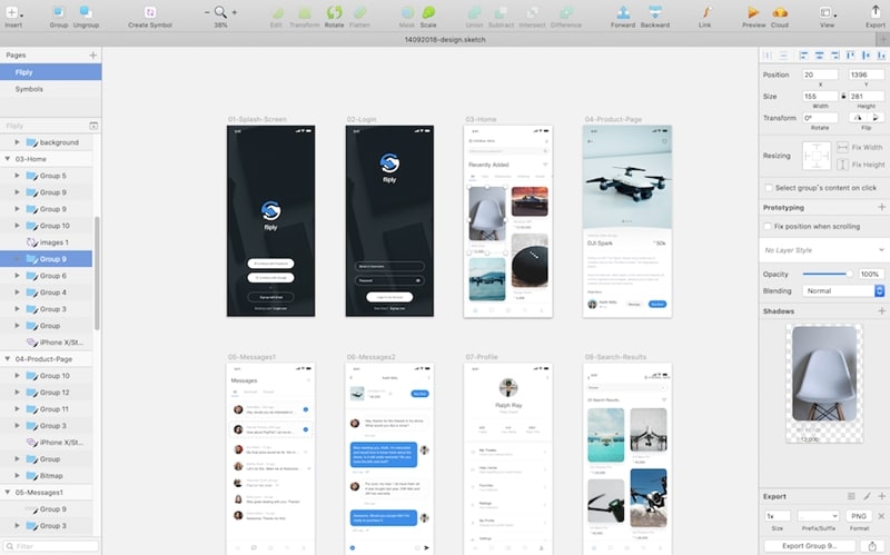
Sketch’s current animation documentation describes instant, slide, dissolve and Smart Animate transitions. These provide different ways to represent changes; choose the one that explains the relationship without distracting from the task.
Sketch’s design editor is associated with macOS, while its collaboration and viewing workflow also includes browser access. Verify the roles and access needed for your team. The old statement that Sketch has no built-in libraries was inaccurate and is not a useful selection criterion.
Review dimensions:
- Motion: compare an instant change with a slide or dissolve where appropriate.
- Review: check that the intended recipient can open the prototype.
- Boundary: confirm how the chosen transition behaves with your actual layers and content.
5. Justinmind
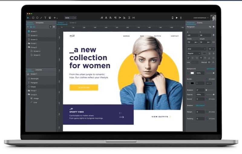
Justinmind is another option for building interactive prototypes. Evaluate its interaction and review workflow against the same order-summary task.
Review dimensions:
- Construction: use the UI elements appropriate to the screen being modeled.
- Behavior: inspect triggers, states and the result in a preview.
- Boundary: verify available exports and plan requirements; a prototype’s HTML demonstration is not automatically production application code.
Steps to Create an Animated Wireframe
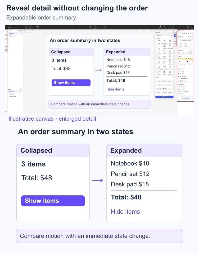
Build an order summary with a collapsed state that shows “3 items” and a total, and an expanded state that exposes the line items. These are fictional screens for reviewing disclosure behavior, not a live checkout.
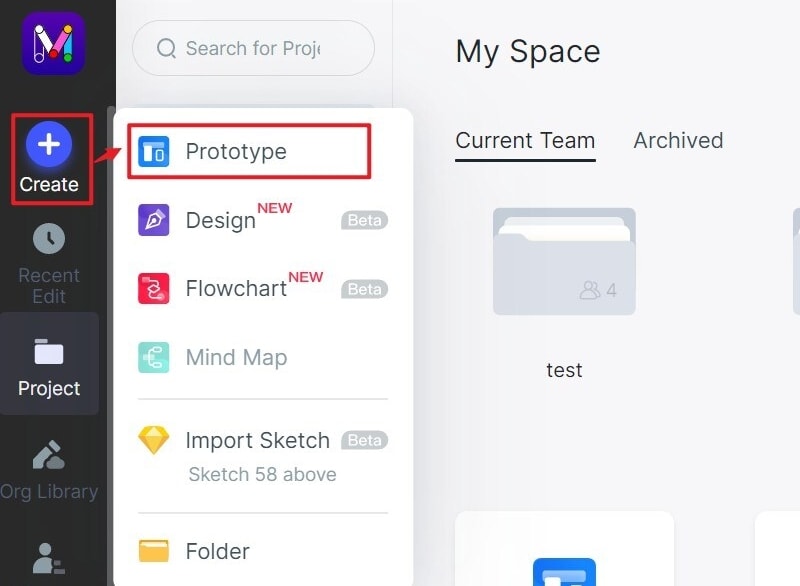
Step 1. Create the Review Project
Create a project named “Expandable order summary.” Keep the sample items and total identical across states. The retained operation screenshots illustrate an earlier Mockitt editor; use the corresponding current controls.
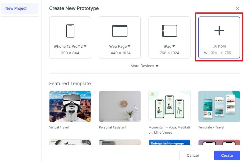
Step 2. Choose the Review Size
Choose a viewport representative of the checkout context. Leave enough space below the summary to observe what moves when the panel expands. Add a narrow version if the transition changes content position there.
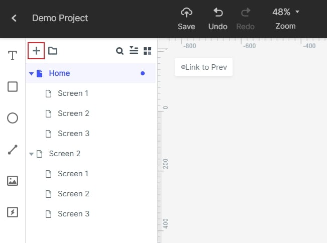
Step 3. Add the States
Create Collapsed and Expanded views or equivalent component states. Include the same summary label and total in both. Add a focused-control treatment as a design requirement, without assuming the prototype supplies implemented keyboard semantics.
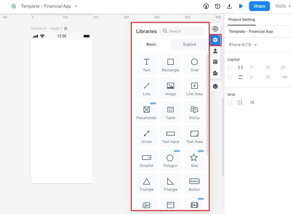
Step 4. Add Consistent Elements
Use repeated rows for the three sample items and a control labeled “Show items” or “Hide items” as appropriate. Keep the line-item content readable in the expanded state. Avoid moving the primary checkout action so far that the person loses its location.
Step 5. Set the Trigger and Transition
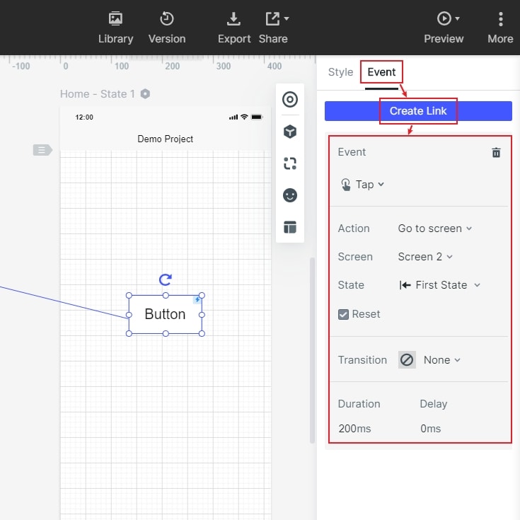
Connect the disclosure action to the expanded state and the closing action back to collapsed. Choose a restrained transition that makes the relationship clear, then prepare an immediate-change alternative. Follow W3C’s animation-from-interactions guidance when defining a reduced-motion experience; verify the actual setting and implementation separately.
Step 6. Preview the Task and Record the Result
Ask a reviewer to find which items are included, close the summary and continue without losing their place. Inspect both motion and immediate-change versions. Record whether the content, current step and next action remain understandable; do not report reduced task time unless you have conducted an appropriate comparison.