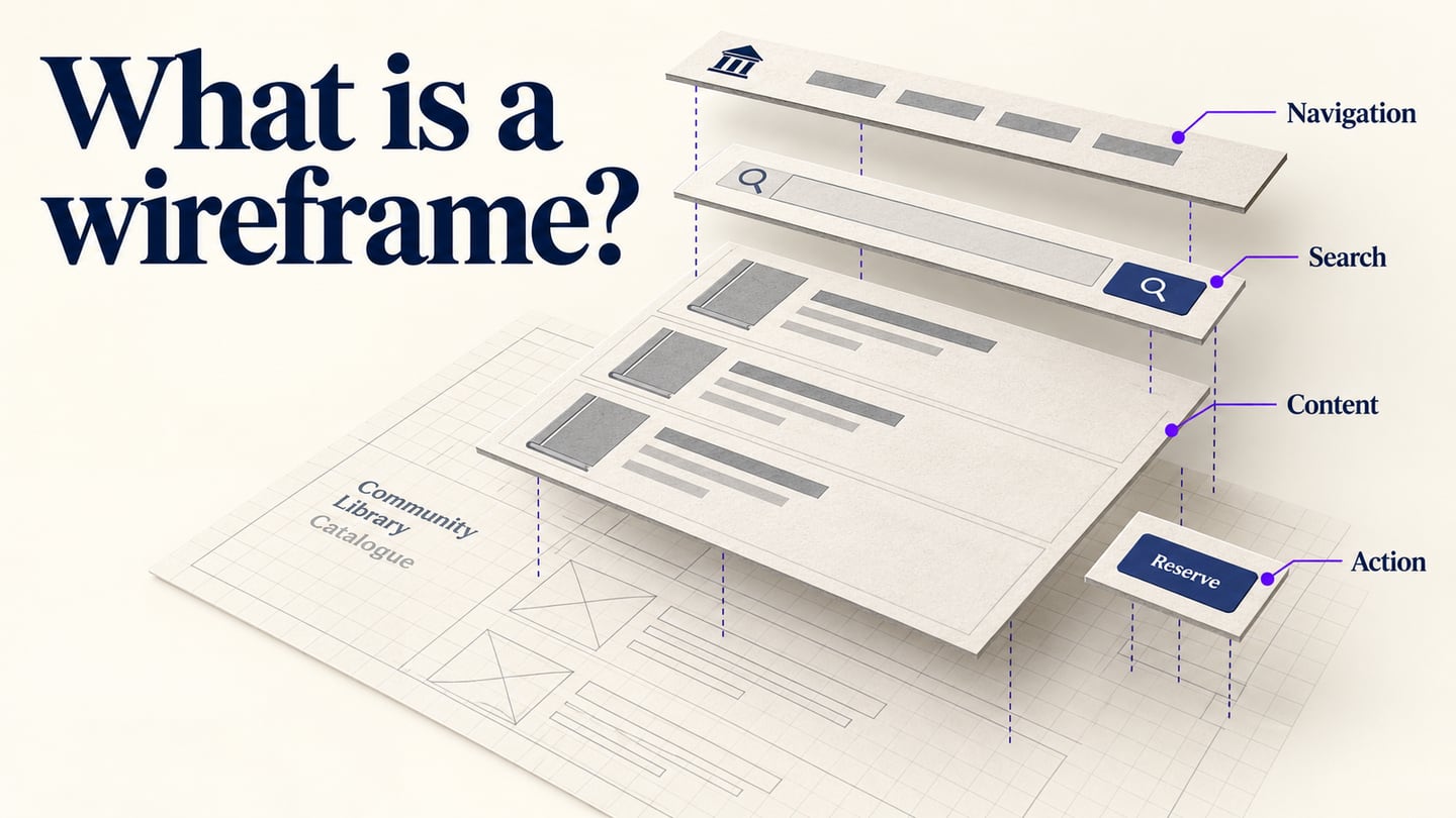
A wireframe is a simplified representation of a screen's structure. It shows the placement and priority of content, controls, and navigation before a team commits to visual design. A wireframe editor helps you arrange and revise those elements, but the useful result is a clear answer to three questions: what is on this screen, what matters most, and what can someone do next?
This guide uses a library catalogue to explain those decisions. The page needs to help a reader search for a title, compare results, and find the reservation entry. You can test that structure with simple boxes and meaningful labels before choosing fonts, colors, or final illustrations.
What is a wireframe?
A wireframe makes a proposed interface concrete enough to discuss: what appears, where it belongs, and how the pieces relate. It can represent a website page, a mobile app screen, or a dashboard. Its purpose is structural communication, so it does not have to resemble a finished product.
A static wireframe does not prove that search, forms, or account features work. A drawn search field communicates that searching belongs on the page; a connected prototype can demonstrate the intended route to results. Working search against real data still requires implementation.
Low-fidelity wireframes
Low-fidelity wireframes use simple shapes and short labels to explore alternatives. “Low” describes detail, not the quality or ambition of the product. In the catalogue example, boxes for search, filters, and results are enough to discuss whether readers can find a book.
Use this level when the arrangement is still open to change. Moving a filter or trying a different result hierarchy is easier when the team is discussing structure instead of defending a polished screen.
Higher-fidelity wireframes
A higher-fidelity wireframe adds precise content, spacing, and component states. It can remain grayscale. If you connect its actions to other screens, you have also added prototype behavior; detail and interactivity are separate choices.
Increase detail when the next decision depends on it. For example, realistic book titles can reveal whether a result card becomes difficult to scan, while an unavailable status can reveal whether the reservation action is misleading.
| Artifact | Question it helps answer | Library example |
|---|---|---|
| Wireframe | What belongs on the screen, and what is its priority? | Search above results; branch filters beside the list. |
| Visual mockup | How should the interface look? | Final typography, colors, cover images, and spacing. |
| Interactive prototype | How should the intended path behave? | Open book details, return to results, and follow a reservation route. |
What belongs in a wireframe layout?
Include elements that support the page's purpose rather than treating this list as mandatory. For a library catalogue, the central task is to find a title and understand how to reserve an available copy.
- Identity: a small library name or logo area establishes where the reader is.
- Search: a labeled query field and search action support title or author lookup.
- Headings: distinguish the page title, result groups, and individual book titles.
- Navigation: provide relevant routes such as catalogue, opening hours, and account access. Location controls belong only where the task requires them.
- Actions: place “View book” or “Reserve” beside the item it affects, with unavailable states explained.
- Main content: show enough information to compare books, such as title, author, and availability.
- Help: offer a relevant support route when a search returns no useful result.
- Orientation: add breadcrumbs when the page sits within a hierarchy readers need to navigate.
- Footer: reserve space for supporting information without making it compete with the catalogue task.
Build the structure in a visual editor
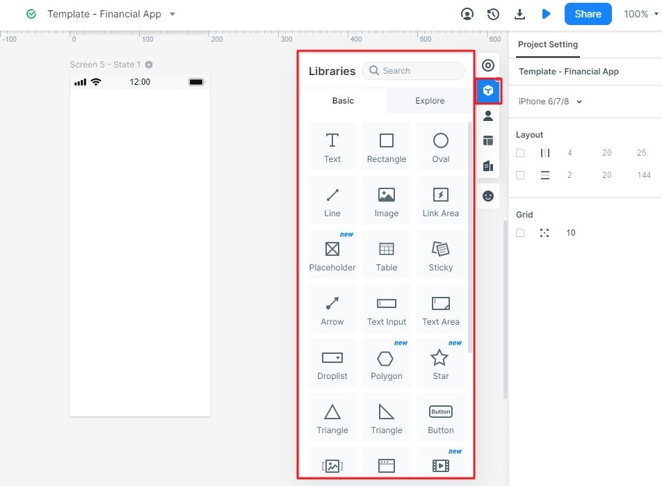
You can sketch the first layout on paper or use Mockitt when the team wants to continue into editable screens and a shared prototype. Its component library includes text, buttons, navigation, and other interface elements that can be placed on a canvas. Choose the detail needed for the discussion rather than polishing everything at once.
Capabilities that support the task
- Arrange content and controls so the main action is easy to identify.
- Reuse a result-card pattern for consistent title, author, and availability placement.
- Add screen connections when the review needs to follow a route from catalogue to book details.
- Use comments or notes to distinguish decisions from unanswered questions.
- Share the intended version and confirm what reviewers can access.
How to create a wireframe: a library catalogue example
Use fictional book data and keep the example focused on one task: find a title and locate the reservation entry. The retained guide screenshots below show archived Mockitt controls; they illustrate the operations without claiming that every current panel has the same appearance.
Step 1: Create a project and name the first screen
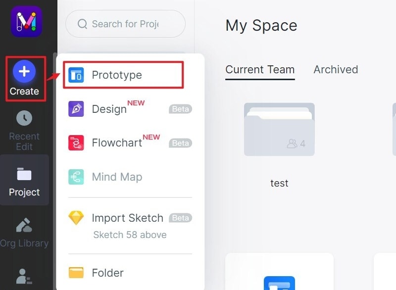
Choose Create, then Prototype, and start a blank project or an appropriate template. Name the first screen “Library catalogue.” Write the task in your working notes so reviewers know what the layout is meant to support.
Choose an initial viewport, then plan a narrow-screen version if mobile use is part of the review. A resized canvas alone does not establish how a production interface responds.
Step 2: Add and reuse the page elements
Place the page heading and search area above the results. Keep filters beside the list on a wide screen or behind a clearly labeled control on a narrow one. Drag text, rectangles, buttons, and other components onto the canvas, then adjust their labels and spacing.
Add one available title, one unavailable title, and a separate no-results state. For the available book, include title, author, availability, and “View book.” For the unavailable book, show a clear status rather than an action that appears to promise immediate reservation.
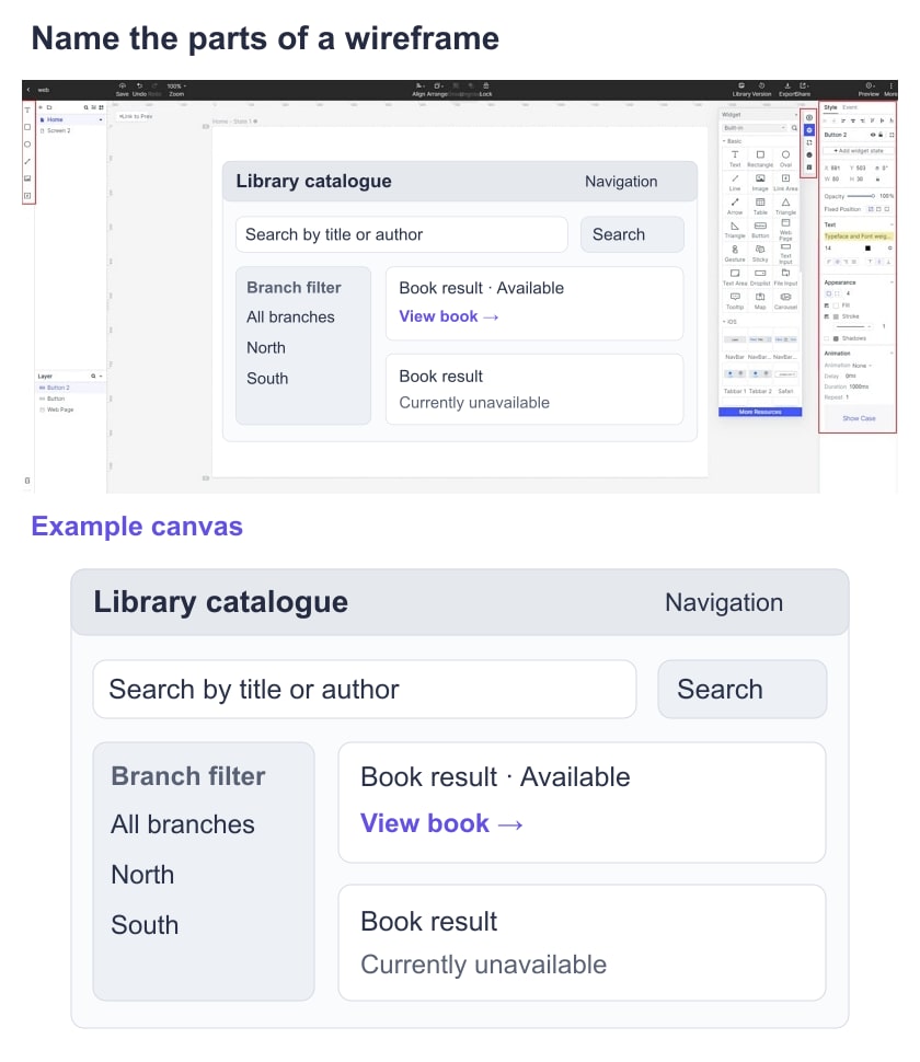
Save or duplicate the repeated result-card pattern instead of rebuilding its structure for each book. Keep the title and availability content distinct while maintaining the same action labels and spacing.
Step 3: Add an action when the review needs interaction
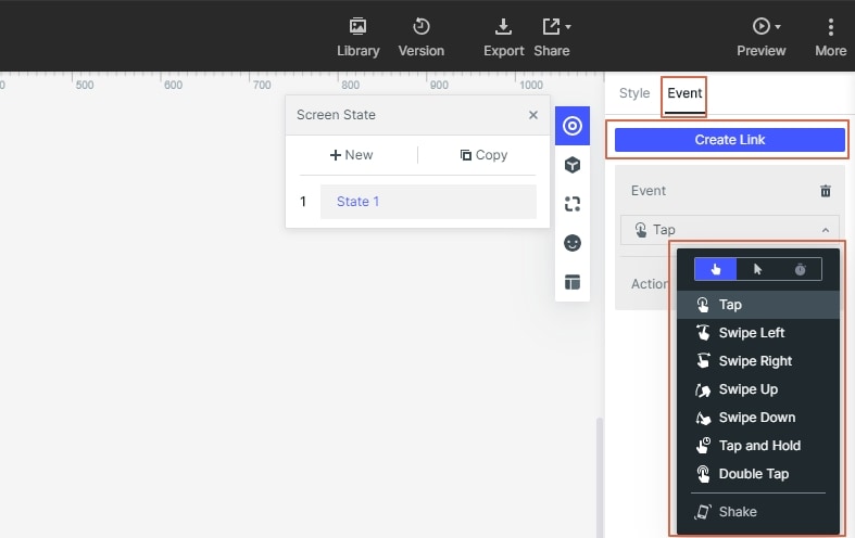
A definition or layout review may need only a static screen. If you need to review the route, select the “View book” control and add a connection to a book-detail screen. Set the trigger and destination, then check that the selected book is recognizable on the next screen.
Do not connect every visible control just to make the page feel interactive. Add the paths necessary for the question being reviewed and note anything intentionally outside the prototype's scope.
Step 4: Connect the destination and return path
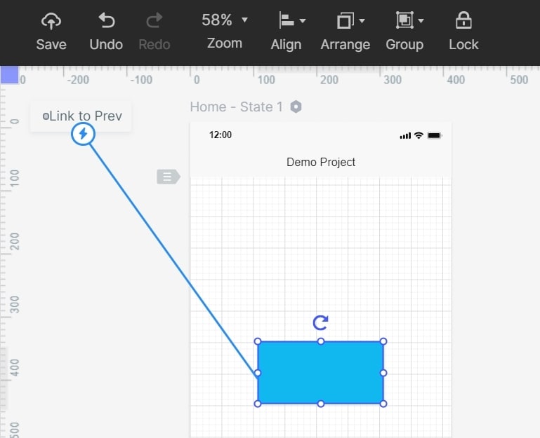
Drag the selected control's connection handle to the intended screen, or select the destination in the interaction settings. Add a return action from book details to results so reviewers can complete the task in both directions.
Keep the navigation and result-card structure consistent across these screens. Include an unavailable-book state when it changes what the reader can do next. The connection arrow below illustrates a screen transition, not component reuse.
Step 5: Add notes beside uncertain decisions
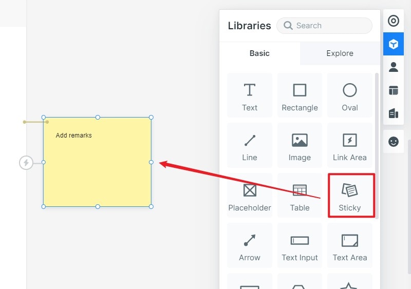
Attach notes beside uncertain decisions, such as whether branch availability belongs in the results or on the detail page. State the question, the proposed placement, and what feedback would resolve it.
For example: “Should changing the branch filter keep the current search term?” is more actionable than “Improve search.” Keep a note distinguishable from interface copy so a reviewer does not mistake it for part of the page.
Step 6: Preview and share the intended version
Preview the layout without editor panels. Ask a reader where they would search, compare results, and open a book's details. If they cannot identify those areas, revise hierarchy and labels before decorating the page.
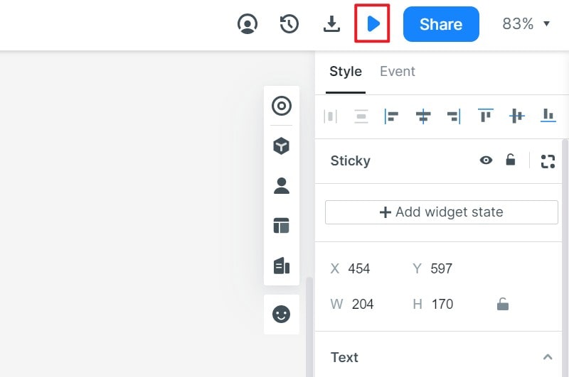
Share the intended screen or project version and check the access settings. Record feedback against the relevant screen, then separate a layout problem from a missing interaction or an implementation question.
When is the wireframe ready for the next stage?
Move forward when the team can explain the content hierarchy, intended actions, and unresolved states. For this catalogue, check that a reader can identify search, understand the branch filter, compare book availability, and locate the next action. Test long titles and no-results content before committing to the card layout.
The wireframe does not need final colors to be useful. It needs enough detail to support the decision in front of the team. Approval of the structure is a reason to proceed to visual design or a focused prototype test, not evidence that the library service has already been implemented.