Travel website design connects the appeal of a place with the information needed to explore it. Some visitors know their destination; others begin with an interest such as food, culture or outdoor activities. In Mockitt’s design workspace, you can make these routes visible and review how a destination page turns inspiration into a useful next step. The ten preserved examples below show earlier site designs, with practical lessons in imagery, navigation and content organization.
Ten Travel Website Design Examples
1. Airbnb
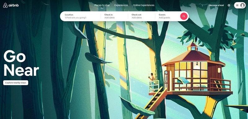
Airbnb’s captured design uses property and place photography to make browsing tangible. Rental interiors answer a different question from landscape photographs: they help a visitor consider where they might stay. Pair the image with the facts needed to understand the listing, then keep a recognizable route to its details. Reviews are another content type, so label them clearly and distinguish them from the host’s description. For a single property, hotel website design has a more focused room-comparison and booking task; a broader destination site should not blur that task with general travel inspiration.
2. Telluride, Colorado
Telluride’s earlier page gives a large landscape photograph room to establish the setting, then pairs it with a seasonal trip-planning action. The useful connection is between what the image introduces and what the action promises. A label such as “Plan your spring trip” implies a destination with relevant seasonal information, not a generic contact page. Keep the season, description and destination content aligned as campaigns change. For a reader arriving through a search result, the place name and planning route should remain clear even if they do not recognize the landscape.
3. Visit Brasil
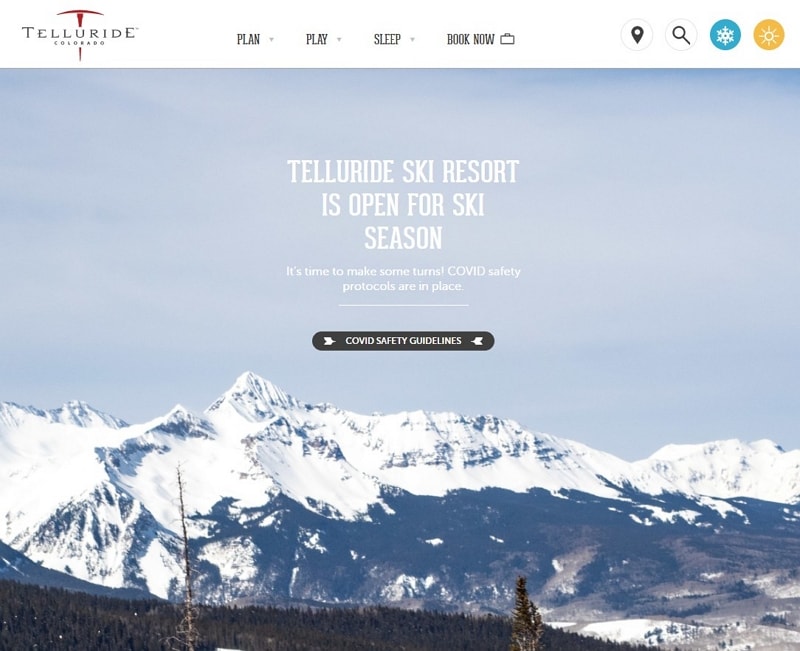
Visit Brasil organizes a large destination through smaller regions and experiences. This helps a reader choose a manageable starting point instead of encountering a single unstructured catalogue. A region answers “Where?”, while an experience answers “What would I like to do?” Explain the relationship between them so a person can switch approaches without losing context. Give each region a meaningful name and description, then expose the activities associated with it. Good grouping makes the variety easier to explore without claiming that every visitor will follow the same route.
4. On the Grid
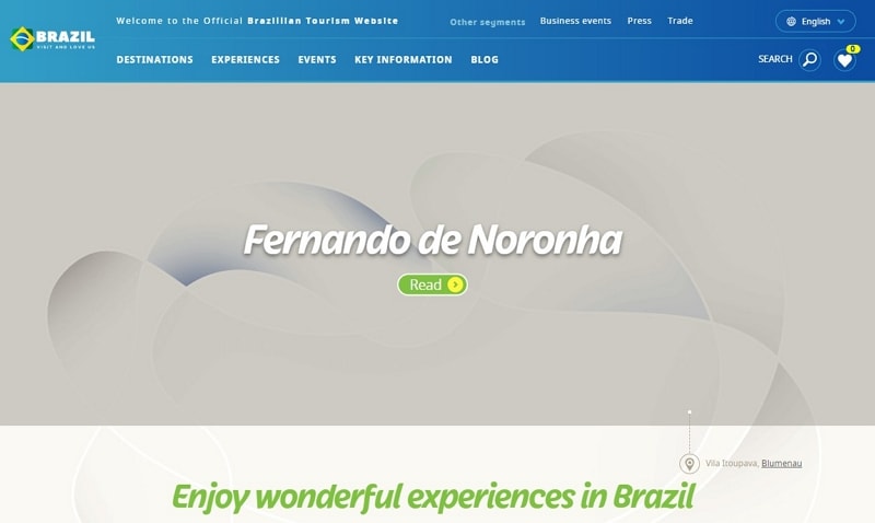
On the Grid uses region navigation and an alphabetical list of city guides, from Aberdeen to Zurich. These serve different browsing behaviors: someone with a city in mind can scan the list, while an undecided reader can explore a region. The preserved page also states that it was no longer being updated from the end of 2019, making it an archived design reference rather than a current source for opening hours or trip logistics.
The reusable pattern is a clear index with predictable labels. If a guide collection becomes an archive, show its status near the content and avoid presenting old venue details as current recommendations. An alphabetical view can coexist with a more visual discovery route, provided both lead to the same clearly named city or neighbourhood guide.
5. Cookiesound
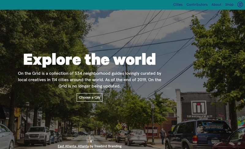
Cookiesound combines travel photography with a mother-and-daughter perspective. That author-led structure differs from a destination authority or accommodation marketplace: the reader is following someone’s account of a place. Give the story a clear title, author context and a readable sequence of images and text. Photography can establish the setting, while the writing explains what the travelers noticed and why it mattered. Keep personal impressions distinguishable from practical travel facts, and date logistical information when its usefulness depends on current conditions. This lets the individual voice remain central without making it carry every planning task.
6. Wheeling, West Virginia
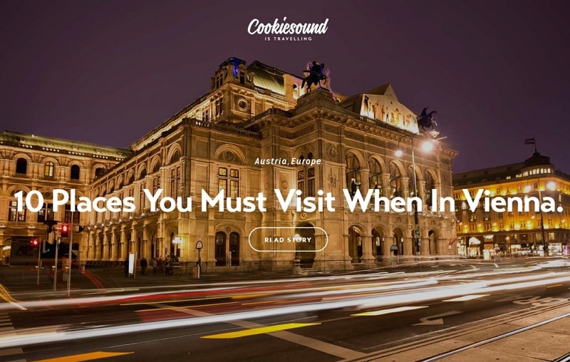
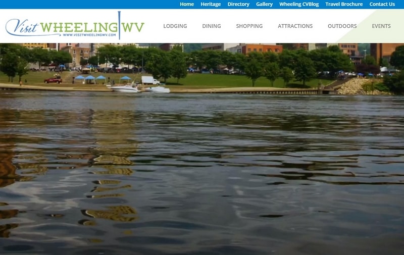
The Wheeling, West Virginia example introduces the city through photographs of places and activities. The images give the visitor possible reasons to explore, rather than presenting one generic travel message. A destination page benefits from making the subject of each photograph identifiable through a caption, title or nearby action.
Its restaurant, hotel and recreation sections turn that introduction into choices. These categories represent useful planning questions: where to eat, where to stay and what to do. Keep the labels consistent between navigation and section headings. A restrained visual style can still support discovery when the content is specific and the next step is evident.
7. Utah, Life Elevated
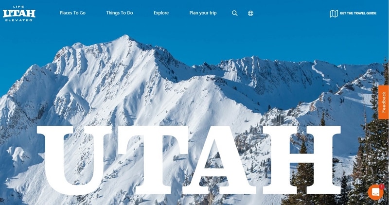
Utah’s Life Elevated design pairs a scenic photograph with an invitation to learn about the featured place. This gives the hero image a purpose beyond decoration. A reader should be able to identify the destination and understand what the action will reveal, such as a place guide or activity description. Keep that destination stable if the homepage image rotates. Image quality matters, but so do useful descriptions and a clear connection to planning information; neither a dramatic landscape nor an emotional headline guarantees that the visitor can plan a trip.
8. Travel Oregon
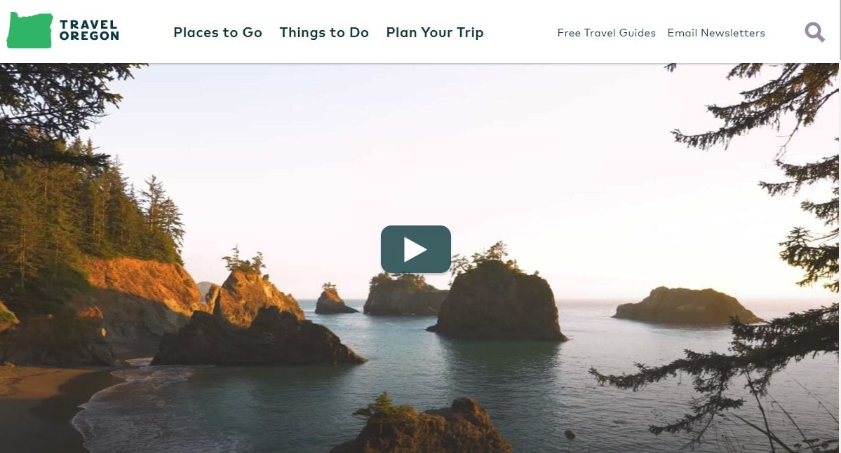
The preserved Travel Oregon design uses an illustrated, game-like visual style and a choose-your-own-adventure approach. Its “Oregon is magic” theme gives different environments a shared identity. The lesson is that a campaign can be distinctive while still directing people toward concrete destination information.
Actions about forests or the coast connect the visual theme with the place a reader wants to explore. The current official Travel Oregon region guide provides another view of that structure by dividing the state into seven regions. A campaign route and a geographical index can support one another, provided the reader can identify the destination and continue to the relevant guide.
9. Visit Australia
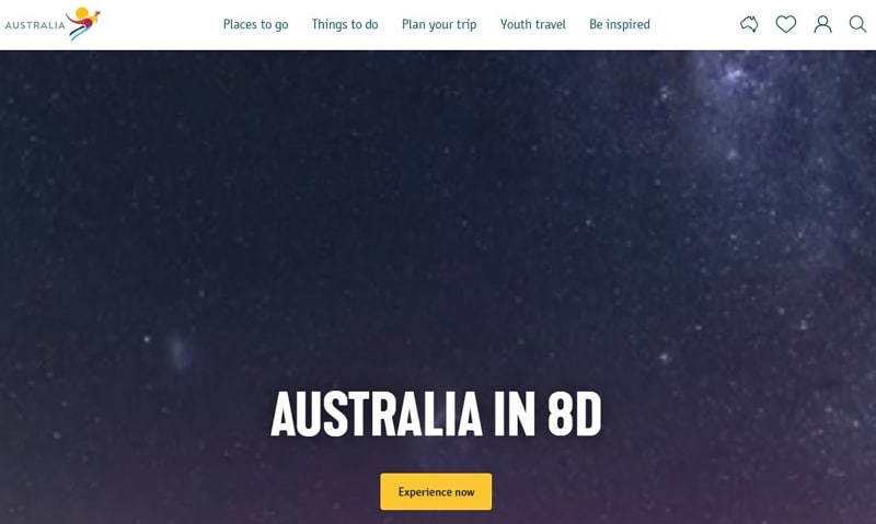
Visit Australia’s example combines photographs, regional descriptions and video to introduce different parts of the country. The design problem is not simply how much media to include, but how to help readers compare those places. Pair a regional name with a concise description of its character and relevant activities, then offer deeper material for people who want it.
An immersive or 360-degree video can offer another perspective on a location when the production supports it. Plan an understandable still image, descriptive text and usable playback controls as well. The reader should be able to compare regions without playing every video, and the practical planning route should remain visible while media loads. This preserves the appeal of richer imagery without making it a prerequisite for discovery.
10. The Hawaiian Islands
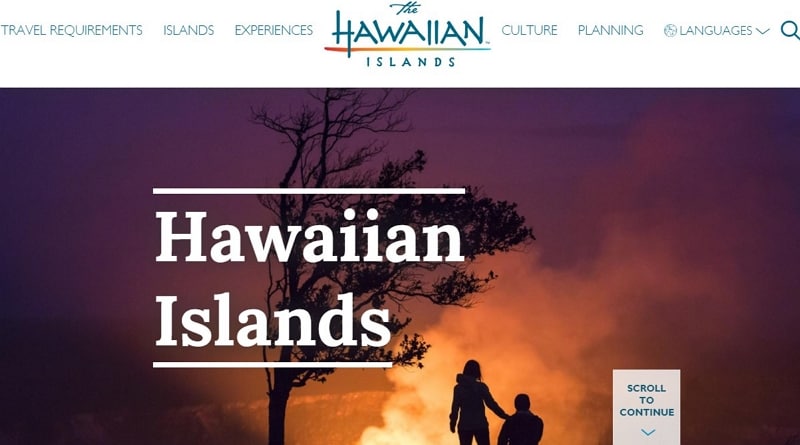
The Hawaiian Islands capture combines scenic imagery with a conventional navigation hierarchy. Its six top-level tabs keep broad choices in a predictable place, while the destination imagery supplies context. The useful lesson is that a familiar structure can support a visually rich site. Give islands, activities and planning information clear labels, and show the selected section when readers move deeper. A simple first screen still needs enough detail to distinguish one island or experience from another; clarity comes from the relationship between the menu and its content, not from the number of tabs alone.
Prototype a Destination Discovery Route
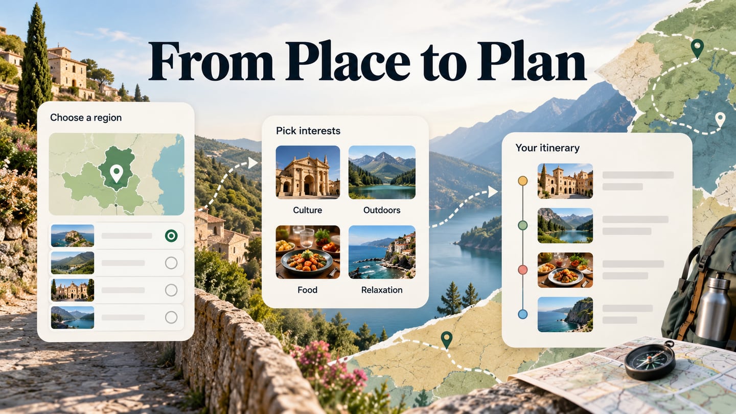
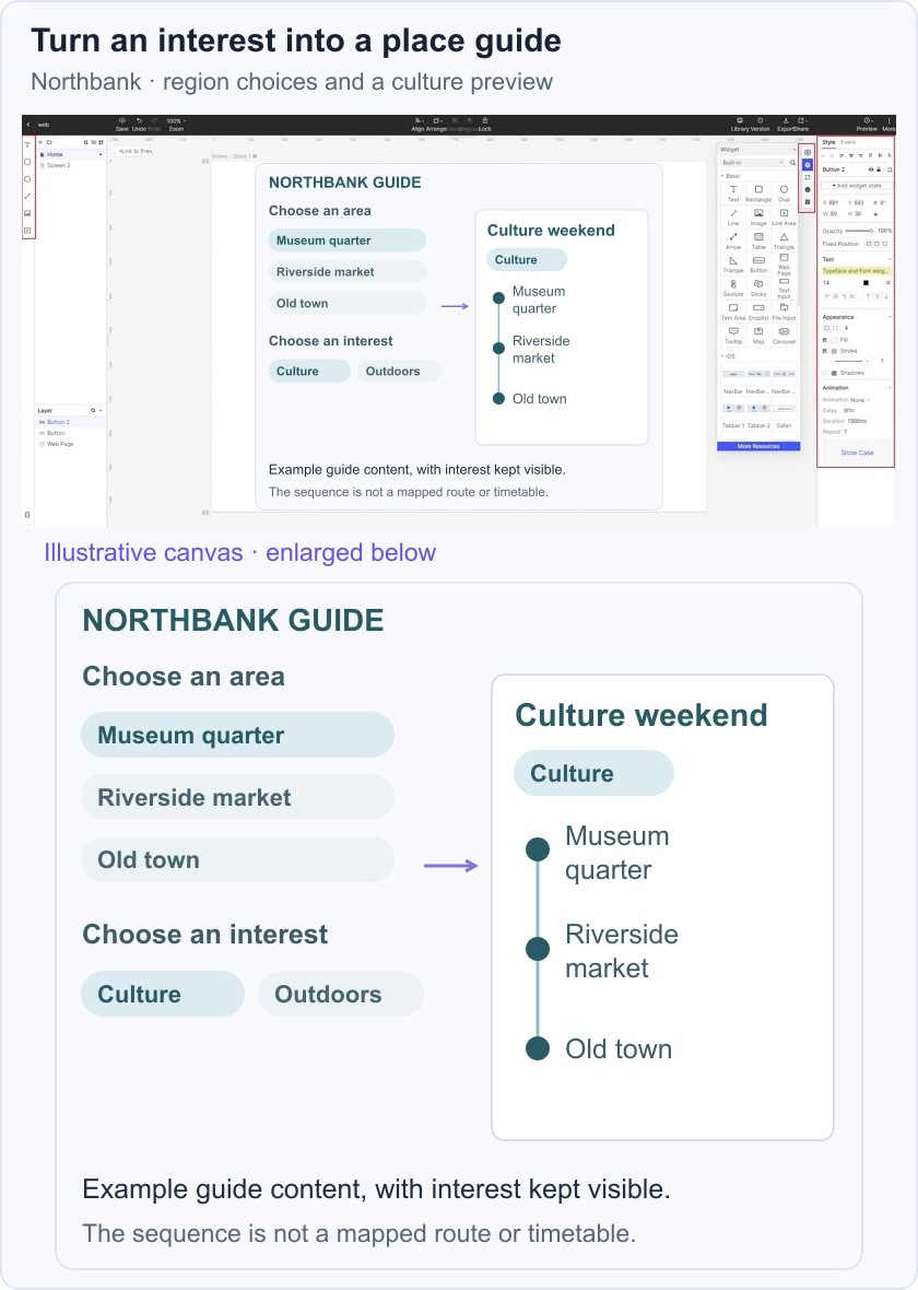
Begin with one reader task: choosing an area and finding an activity that fits an interest. For a fictional Northbank city guide, the prototype connects region choices and a Culture interest to a Culture weekend preview. This is a discovery exercise, so it does not need to imitate live maps, availability or a booking system.

Build and Review the Guide
Define the information architecture before adding decorative media. In the Northbank example, Museum quarter, Riverside market and Old town are clearly named areas. Decide what each area page must contain and how a person returns to the broader guide.
- Create reusable place cards
Use a consistent card structure for the area name, image, short description and action. Add realistic content early so you can see how a longer title or description affects the layout. Reuse the structure while giving each area its own meaningful content; repeated decoration is not a substitute for a distinct description.
- Connect the choices to a useful preview
Arrange the region and interest choices beside the Culture weekend preview. The preview names Museum quarter, Riverside market and Old town as illustrative stops, preserving the selected interest as context. The visible relationship shows how a browsing choice changes the suggested guide content.
- Review the route with another reader
Share the prototype and ask someone to find a culture-focused visit, explain the selected area and open a place detail. Watch for ambiguous category names or actions that lead somewhere unexpected. Review the same route on a phone, where a wide group of choices may become a vertical list and the current selection still needs to remain identifiable.
- Adapt a template to the destination
A template can provide a useful starting structure, but replace its sample categories with the destination’s actual content model. Keep the places, interests and planning information connected consistently. Choose imagery that explains the area, and retain a readable description if the image does not load.
At handoff, record which information needs a content owner and regular review, such as venue details, seasonal activities and transport links. Verify those facts for the implemented guide. A prototype demonstrates the proposed discovery route; it should not imply verified walking times, live transport data or current booking availability.