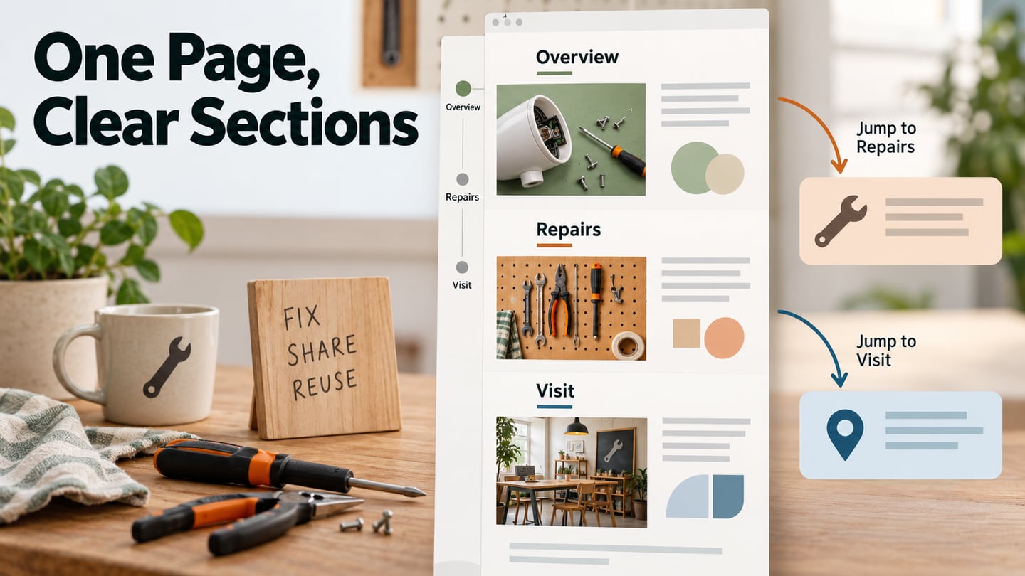
A one-page website places its main content in one continuous document, usually with navigation that jumps to sections. It can suit a compact service, event, product story or portfolio when the information forms a clear sequence. A website prototype in Mockitt lets you review that sequence before implementing the page: what readers see first, how they reach a specific section and where a task continues elsewhere.
One-page describes the structure, not the business goal or underlying technology. A landing page serves a focused campaign goal and may be one page; a single-page application is an application architecture. A small site can still link to a separate booking system, checkout or detailed resource without forcing every task into one long document.
The nine examples below retain earlier designs to illustrate different ways of arranging a compact site. Their screenshots are design references, not a claim that each current website still looks or behaves the same.
Design a One-Page Website Prototype
Start by listing the questions a visitor needs answered. For a repair café, those might be what can be repaired, when the next session takes place and where to bring an item. Arrange those answers into sections rather than treating the whole page as one uninterrupted poster.
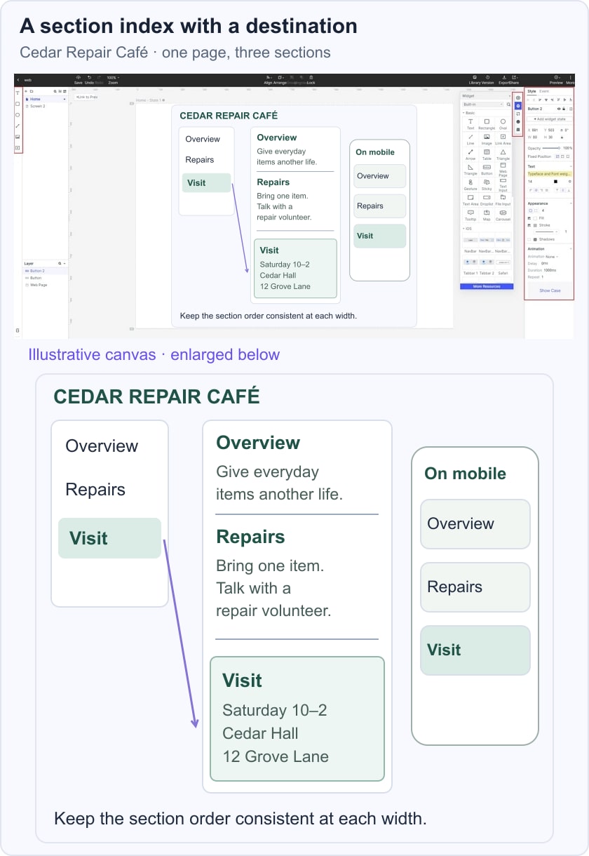
Create a prototype project and choose a web-sized canvas. Add the sections in reading order, using realistic headings and content. The earlier Mockitt capture shows a general prototyping workspace; the one-page structure comes from your design, not a special one-page-maker command.
Give the sections clear labels and plan a small navigation index. “Overview,” “Repairs” and “Visit” are more useful than vague numbered labels when someone needs an address quickly. Keep the target heading identifiable after a jump, especially if the implemented page will have a sticky header.
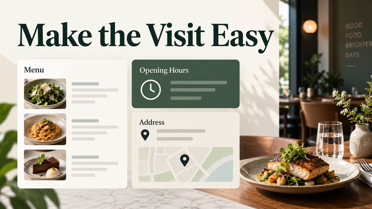
In the illustrative Cedar Repair Café layout, Overview explains the event, Repairs describes suitable items and Visit contains the location and session details. The index highlights Visit beside its destination, making the planned section jump clear without hiding the content behind a hover interaction.
Keep facts next to the decision they support. A product page needs price and product details near its purchase route; an event needs its date and location near attendance information. If a task requires substantial independent content, give it a separate page instead of extending the scroll indefinitely.

Review the same content in a narrow layout. A single document is not automatically easier on mobile: large images, a long menu or an obstructive sticky bar can make it harder to use. Plan mobile web layouts deliberately and verify the final page at the widths and text settings its audience uses.
Use templates and reusable elements where they fit, but keep section navigation available without a mouse. Design the intended jump links, focus behavior and return path. A prototype can communicate those requirements; the implemented HTML, links and scrolling behavior still need browser testing.
Share the prototype and give a reviewer a specific task, such as finding the repair session’s location. Watch which section label they choose and whether the destination answers the question. That feedback is more useful than a general request to decide whether the page looks modern.
9 One-Page Design Examples
These examples show distinct approaches to navigation, product storytelling and visual rhythm. Use the visible design decisions as starting points, then check whether they suit your own content and audience.
#1: Plant22
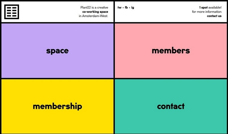
Plant22 is a creative co-working space in Amsterdam-West. Its captured design divides the screen into four colored areas: space, members, membership and contact. That compact index makes the main categories visible together rather than requiring visitors to infer them from a large photograph.
The lesson is to make a small content structure easy to scan. The colored cells reinforce the labels, but the words still carry the meaning. A designer adapting this approach should check reading order and how the four areas stack on a narrow screen; the screenshot does not establish any member-verification or workstation-allocation system.
#2: Sheerlink
The Sheerlink by RTX example presents professional wireless audio with a large “Unleash the music” message, a listening image and a contact action. A vertical set of section markers suggests that the story continues below the opening view.
This approach gives one message room to dominate. Its tradeoff is orientation: dots alone may not tell a reader which section contains technical details or contact information. Use meaningful labels where readers need to skip to a specific answer.
A one-page story can still send a visitor to an external destination. Make that transition clear and keep the important action available without assuming that visual effects will increase visit duration or traffic.

#3: Small Victories
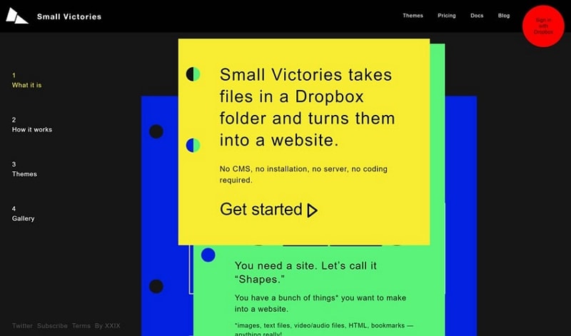
Small Victories explains its Dropbox-to-website proposition through stacked colored cards. The captured page pairs those panels with a numbered section list—What it is, How it works, Themes and Gallery—so the visitor can follow the sequence or jump to an explanation.
The design lesson is progressive explanation: introduce the idea, show how it works and then provide examples. The page’s own wording describes the historical service; it should not be taken as a current promise that every file or account can still be used in that way.
For your own page, avoid making an important instruction available only after an animation. The section index should remain understandable when the decorative card effect is reduced or when a reader is using a different input method.
#4: One Page Pro
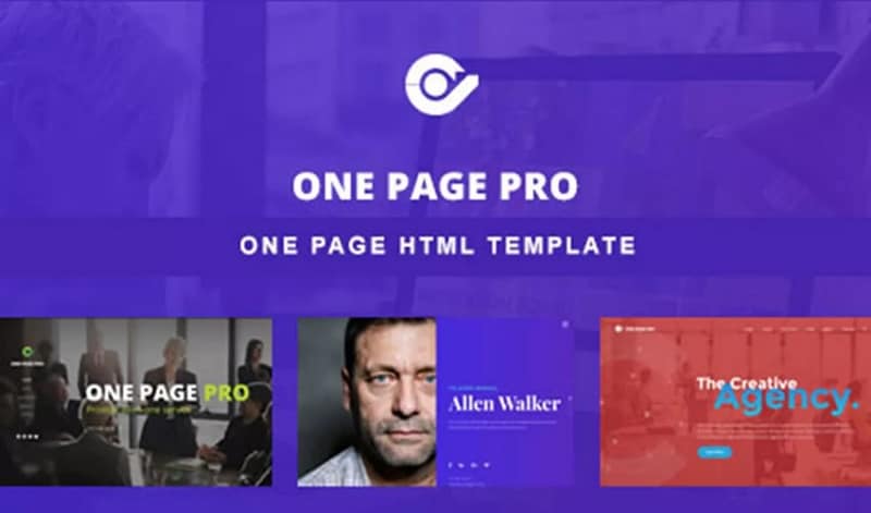
The One Page Pro image advertises a one-page HTML template and shows several visual variants beneath the heading. It is a template presentation rather than evidence that one layout is suitable for every kind of business.
When choosing a template, compare its section structure with your content before its decorative style. Check room for headings, supporting text and navigation. The visible example is labeled HTML template, so it should not be described as a WordPress-only workflow.
#5: 360 Mirror
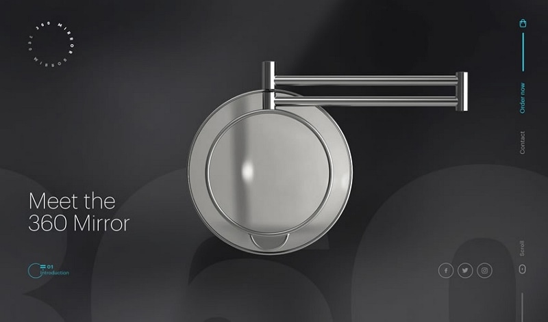
360 Mirror places the product at the center of a dark, restrained composition. The introductory wording is short, while a side rail separates ordering and contact destinations from the product image. The hierarchy suits a story with one main object.
A product-focused page should connect that visual interest to practical information: dimensions, how the product works and the next step. Keep the action legible and available on touch screens instead of requiring a mouse-over to discover it.
The screenshot illustrates a design approach, not a measured sales result. Whether the page works well depends on the completeness of its information and the usability of the implemented purchase path.
#6: Pacific Northwest Travels
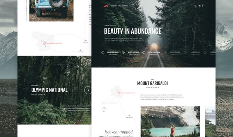
Pacific Northwest Travels uses landscape-led chapters and contrasting text areas to tell a regional story. The retained collage includes destination headings such as Mount Garibaldi. It shows how a long page can move between an atmospheric image and more specific information—a useful pattern in travel website design.
Repeated chapter treatments give the reader a sense of rhythm. That consistency matters when the page includes several places: a new destination should look like a new chapter without making the navigation rules change each time.
If the reader needs to compare places, provide a way to revisit them rather than relying on one uninterrupted scroll. Keep location context and practical details close to each chapter. The image does not demonstrate bookings, personalized itineraries or higher traffic.
#7: Coffee Circle Impact Report
Coffee Circle’s retained 2017/18 report cover combines a strong red title block with a large photograph. Its official impact-report pages describe projects in coffee-growing regions. A report page has a different task from a product page: it needs to guide readers through evidence and explanations.
The date is part of that evidence. Make the reporting period clear and distinguish a historical report from the organization’s current results. A prominent introduction can set the context before the detailed sections begin.
Photography can establish place and people, but captions and source information should explain what is shown. Do not infer someone’s circumstances or the results of a programme from a photograph alone.
For a long report, clear chapter navigation helps readers return to figures or project details. Preserve the relationship between a statement, its time period and its supporting material rather than scattering them across decorative panels.
 Coffee Circle’s 2017/18 report cover, retained as a historical design example.
#8: Outdoor One Page Template
The Outdoor example uses a pale mountain background and large image-filled lettering. Its restrained opening places atmosphere ahead of dense content. This is a template-design idea, not a library displaying thousands of separate templates.
Large lettering can establish identity, but a visitor still needs to know what the page offers. If you adapt this opening, give the next section a clear purpose and make the path to it apparent.
Check the lettering and small controls at mobile size. A dramatic title should not make the main action or section navigation disappear when the available width changes.

#9: Cleverbird Creative
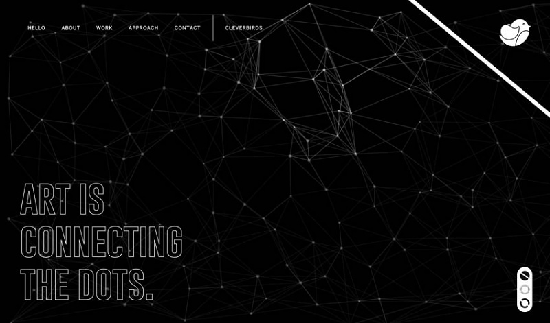
Cleverbird Creative combines a dark background, connecting-line artwork and outlined headline text. Its top navigation names Hello, About, Work, Approach and Contact, giving structure to a visually expressive agency presentation.
The navigation provides an anchor for the visual treatment. A prospective client can look for work or contact information without needing to interpret the background art. Keep those labels readable and the selected destination clear.
If a similar design uses moving linework, consider a quieter presentation and appropriate motion controls. Do not let a decorative layer obscure the content or become the only way to understand a section.
Choose a one-page structure when the main story is coherent and its sections remain easy to revisit. When tasks, content depth or ownership grow, separate pages may be clearer. The right result is a site whose structure helps the reader—not a page count chosen for its own sake.