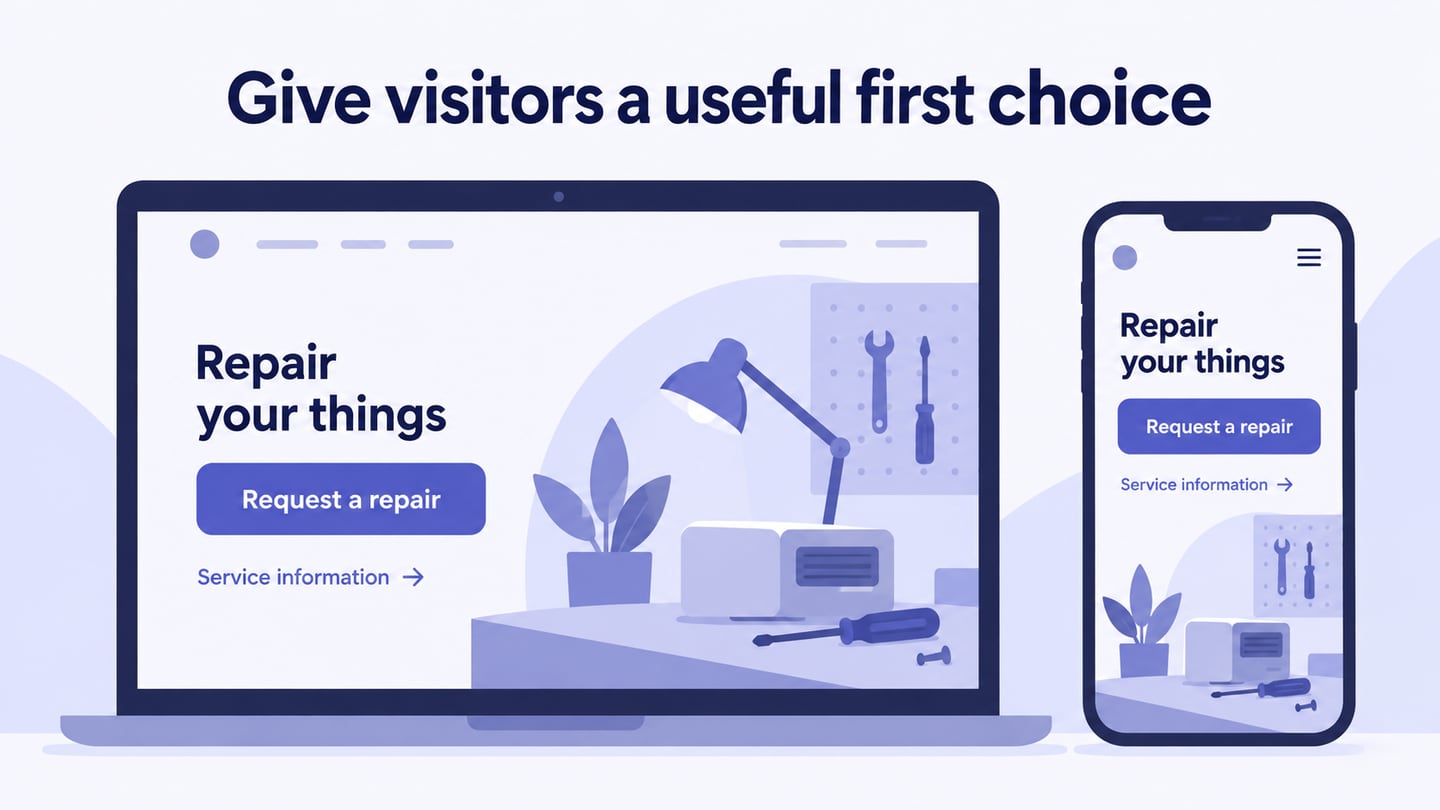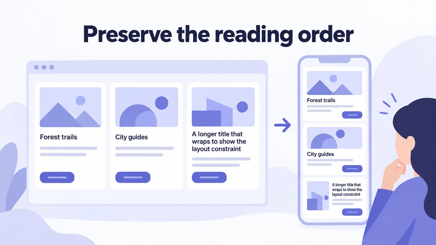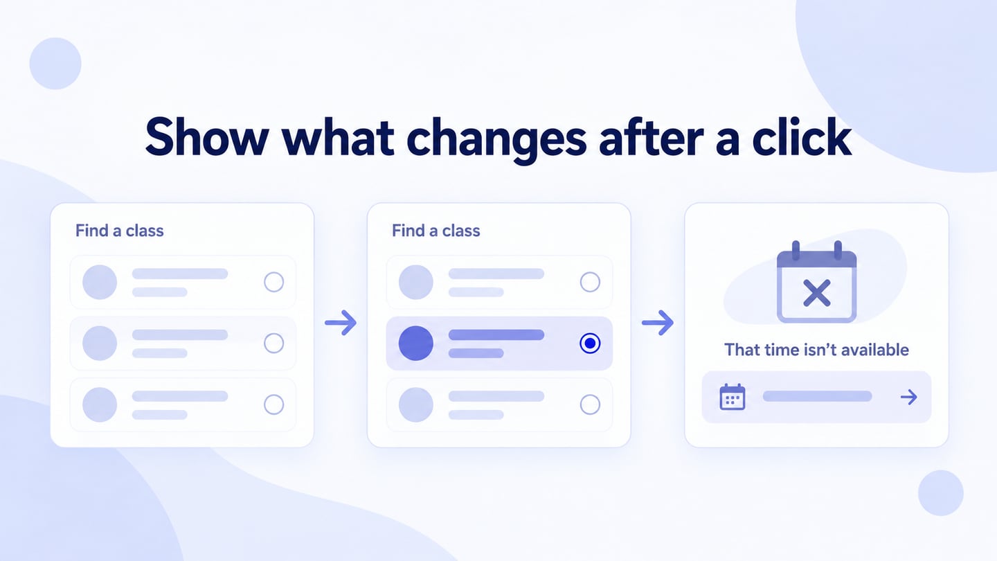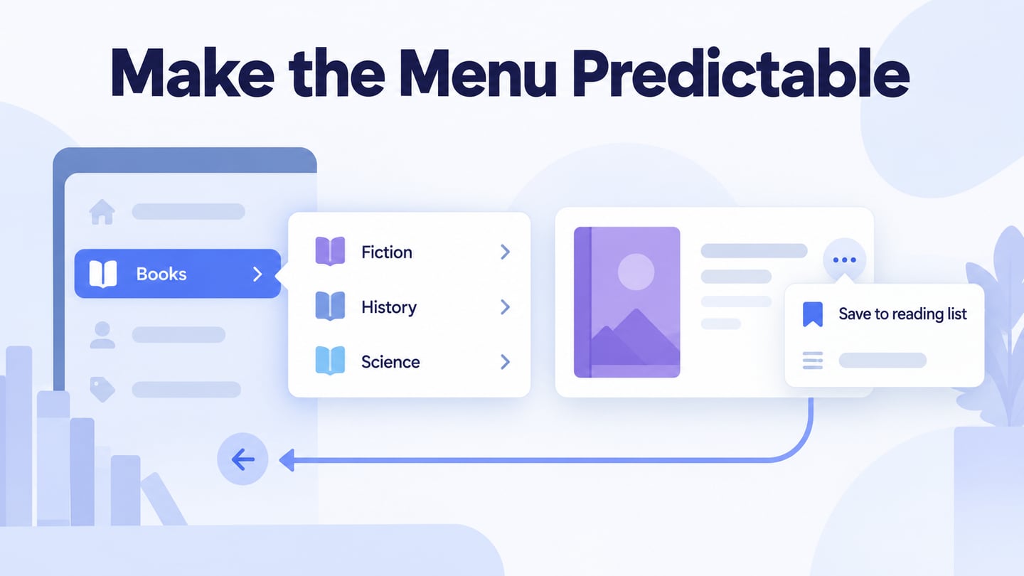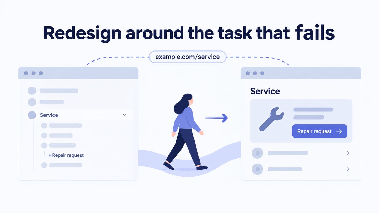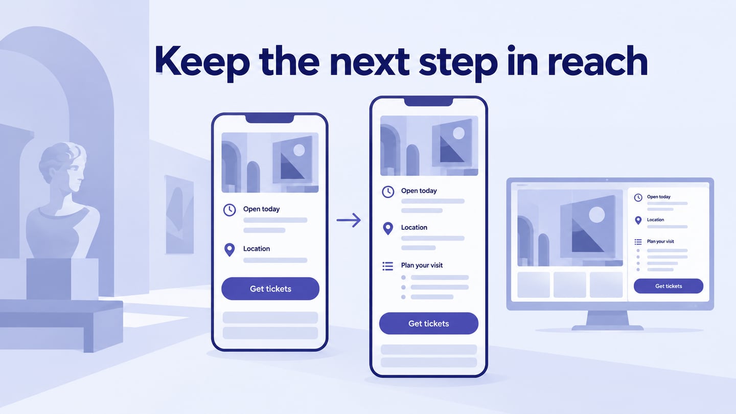
Mobile web design adapts website content and actions to a narrow browser viewport, touch input, and changing viewing conditions. It is distinct from designing a native app. Plan the layout in a mobile website design workspace and review how real content behaves before implementation.
Use the seven examples and Mockitt workflow below to plan a mobile adaptation. The archived screenshots show wide website layouts; they are references for deciding what to adapt on mobile, not evidence of a current narrow-screen audit. Use them to identify a task or layout question, then test your own page.
Good Tool for Mobile Website Design
Mockitt can help arrange mobile web screens and connect the actions required for a review. The tool does not by itself make the implemented website responsive, accessible, or effective at converting visitors.
Define what a visitor needs to know and do on the page. Include realistic content lengths, navigation, and any important unavailable or error state.
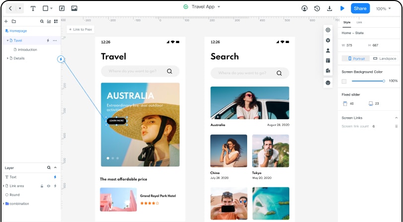
Project Size and Widgets
Choose or enter a relevant narrow viewport, then arrange reusable elements and content. Preview more than one width so a single device preset does not become the whole mobile design.
For example, prototype a museum visit page for a phone browser. Put opening information, location, and the ticket route in a clear order. Let visitors expand practical details without losing their place or covering the main action. Test a longer exhibition name and a closed-day message so the layout does not depend on ideal sample text.
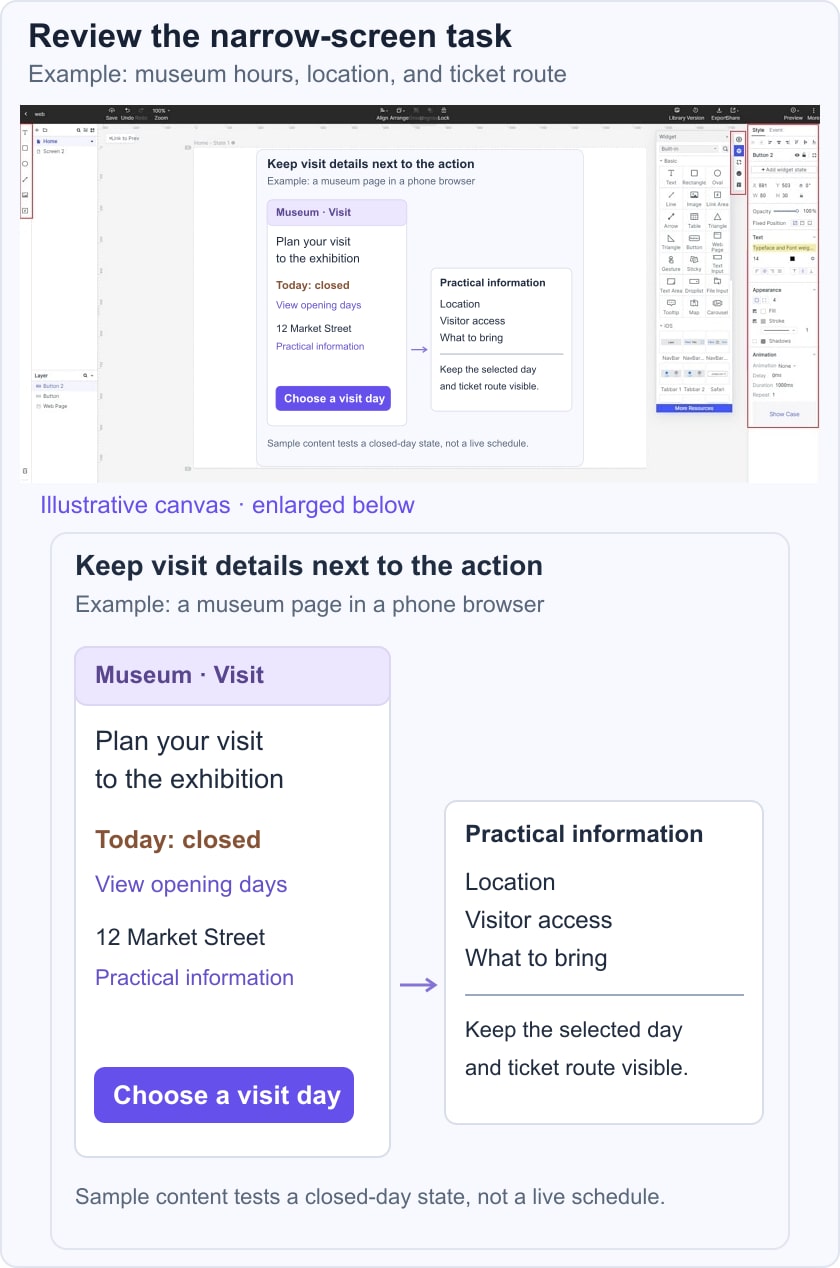
Use Existing Design Assets Carefully
Bring in suitable assets using the formats supported in the current workspace. An imported screenshot can be a reference, but it is not automatically a set of editable components. Check current support before relying on an old Sketch-import workflow.
Preview, Share, and Handoff
Preview the visitor task and share it with the intended reviewers using suitable permissions. Record what the prototype demonstrates and what remains for development, such as real responsive behavior, focus management, and data loading.
Choose Elements for the Web Task
Use controls and typography that remain understandable in the browser. Selecting an iPhone-sized canvas does not mean a website should automatically use native iOS buttons or reproduce a mobile app interface.
Use the original examples below as focused design references, not as proof of current performance or universal usability.
Seven Mobile Website Examples and What to Examine
#1: Shutterfly
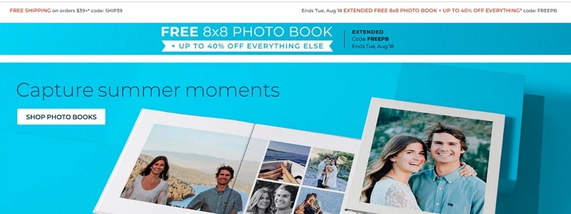
The archived Shutterfly example illustrates a product-heavy shopping page for personalized items. The design question is whether visitors can distinguish product categories and understand where to start customizing.
When adapting this pattern, keep product imagery, prices, and actions from competing for the same attention. Test how a long product name and an unavailable option affect the layout.
#2: Purple
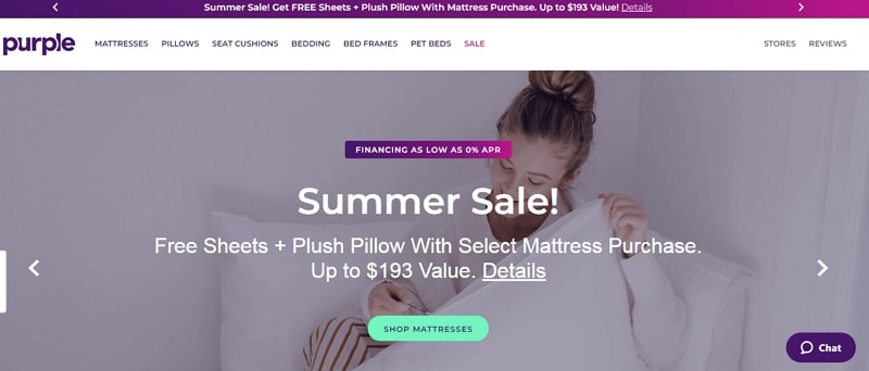
The archived Purple example focuses on explaining a product through headline, image, and supporting detail. Study whether the sequence gives enough context before asking for the next action.
For your own page, check image scaling, paragraph length, and the relationship between the product claim and its supporting information. A strong visual does not validate a product claim.
#3: BuzzFeed
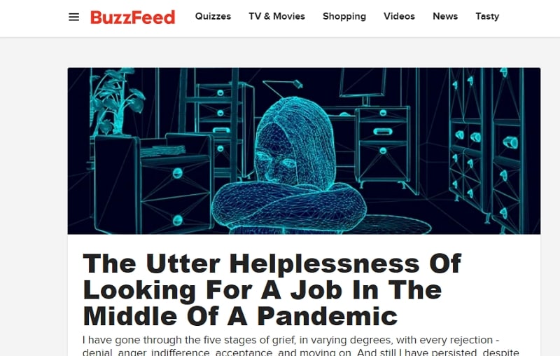
The archived BuzzFeed example illustrates a stream of editorial choices. Test whether headline hierarchy and category navigation help a visitor choose an article. A feed should remain usable with longer headlines and images that have not loaded.
#4: Adobe
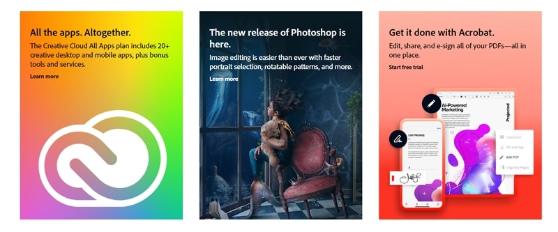
The archived Adobe example shows a product-portfolio navigation problem. The useful question is how users locate a relevant product without opening every category. Avoid forcing the complete desktop menu into a narrow screen.
#5: Nationwide Insurance
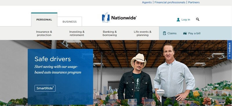
The archived Nationwide example illustrates a service site with multiple audiences and common tasks. Consider how a visitor finds the relevant route without first reading the entire organization structure.
Keep high-priority service actions easy to identify, while explaining which audience or account context each route serves. Do not infer claim or payment behavior from a static screenshot.
#6: Stripe
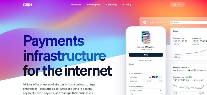
The archived Stripe example illustrates a complex product offering presented in a narrow format. Study the order of the explanation, examples, and next actions rather than copying its visual effects.
Keep the hierarchy intact when columns stack. A decorative background or color treatment should not make product text or controls harder to read.
#7: SAP
The archived SAP example combines enterprise-product content with a prominent media area. If you use a similar approach, make important information available without playing a video and keep the next action accessible. For search indexing, follow Google’s mobile-first guidance so important content and metadata remain available on mobile. A mobile layout alone is not a ranking guarantee.