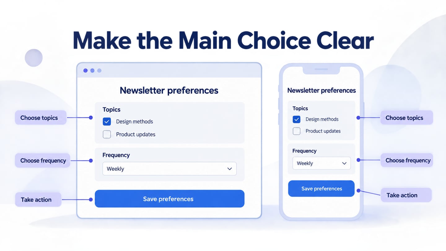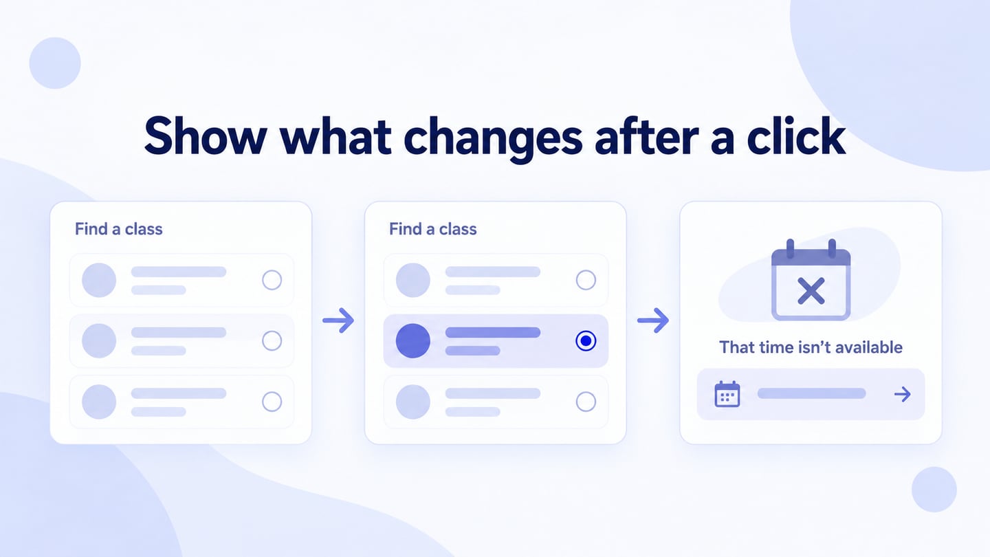
Interactive web design defines what changes when a visitor acts: a menu opens, a form validates, results are filtered, or a submission is confirmed. Use an interactive website prototype to review those responses before implementation. The goal is to help someone complete a task, not to add motion to every element.
Keep important content understandable and navigation accessible while adding interaction. Search visibility, usability, and visual design should be planned together; an animated page is not automatically better for either visitors or search engines.
Evaluate the design with observable questions rather than unverified industry percentages:
- Can visitors recognize which elements are interactive?
- Does the page explain what changed after an action?
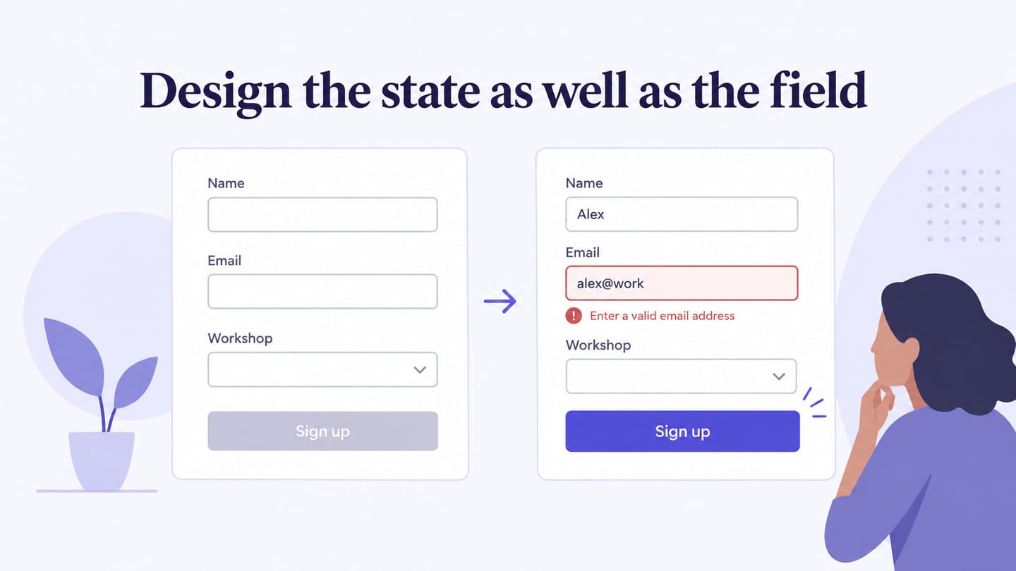
- Can users recover from an invalid entry or unavailable result?
- Does keyboard navigation reach the controls in a sensible order?
- Does the task remain understandable at a narrow viewport and with reduced motion?
Create and Review an Interactive Web Prototype
Mockitt can be used to connect interface screens and represent selected interaction states. Start from the task and the feedback required, then build only the level of detail needed to review it.
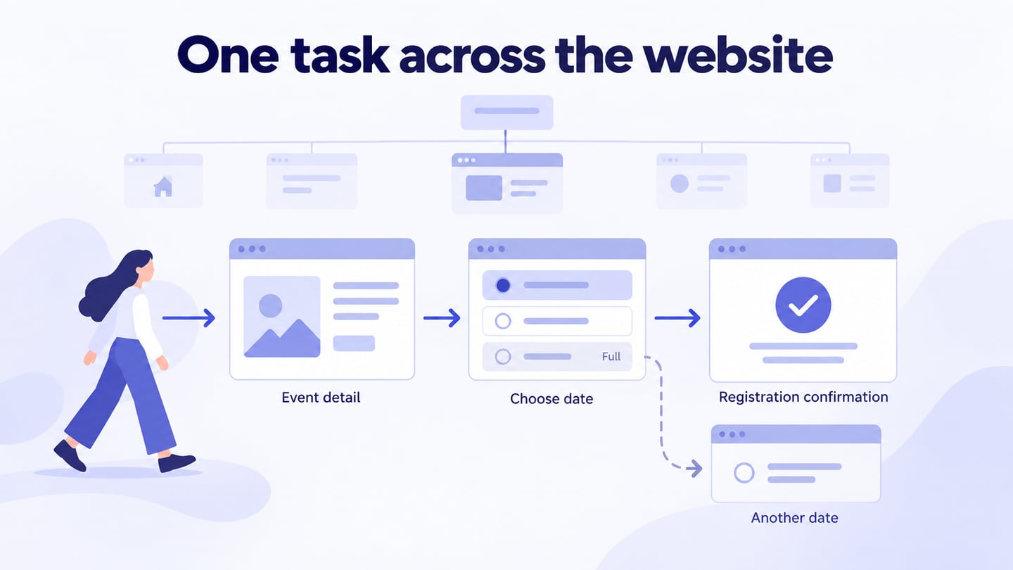
For example, prototype a class-finder interaction. A visitor selects a class and date, sees whether places are available, and opens the registration step. If the session is full, show an explanation and a way to choose another date. Include a visible selected state and a return path so reviewers can tell which choice the response refers to.
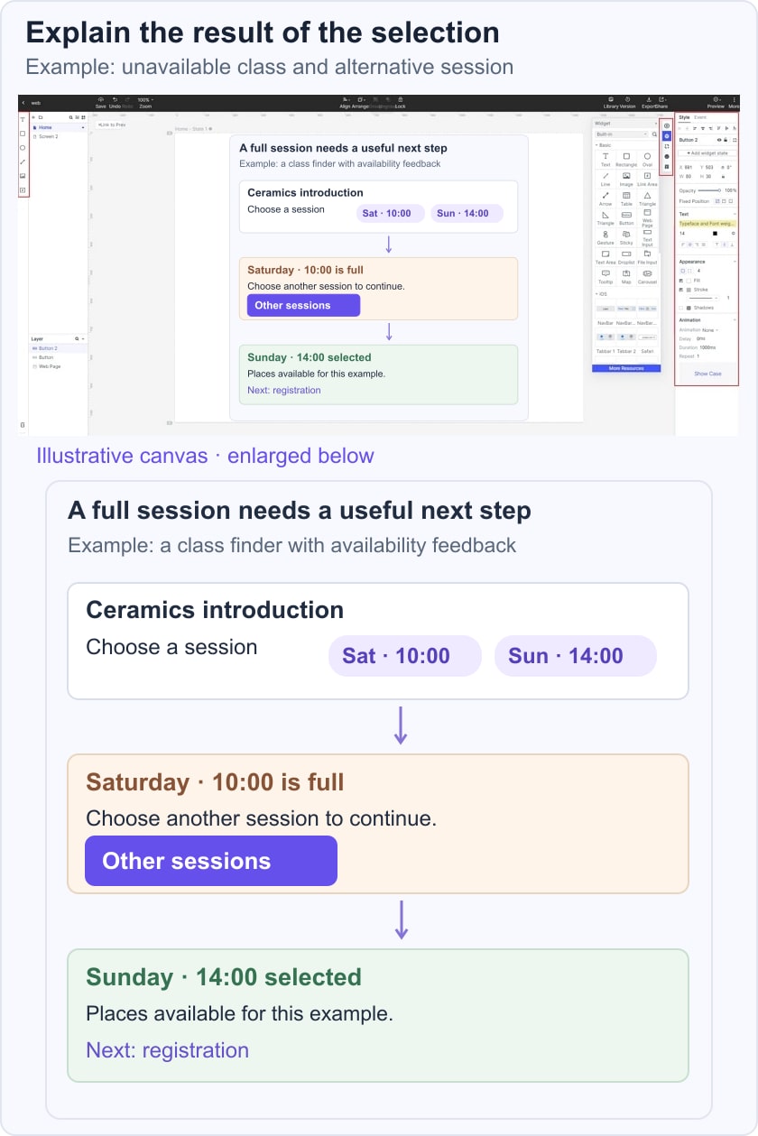

Use widgets, labels, and connections to represent that sequence. The original editor image illustrates an earlier screen-building workflow; it is not evidence that an implemented website’s behavior or accessibility has been tested.
- Customize labels and controls so their purpose is evident without a tooltip or animation.
- Give form inputs persistent labels and specify the expected response to incomplete information.
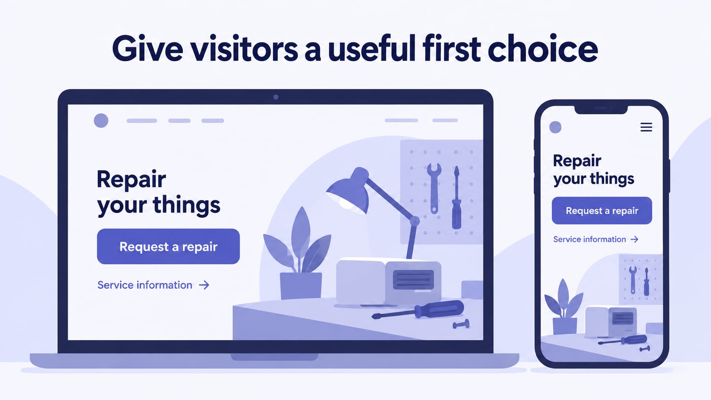
- Make the primary action distinguishable, and show focus, selected, or unavailable states where relevant.
- Choose navigation according to the website’s structure. A mobile bottom-tab pattern is not a requirement for every web page.
- Connect the relevant screens or states, including the alternative path. Use transitions only where they clarify what changed.
- If an image gallery serves the task, provide usable controls and a clear current position. Avoid automatic movement that prevents reading.
- Reuse consistent elements so the same action is recognizable across the flow.
- Preview and share the prototype. Check current export options separately; a prototype export should not be described as a production iOS, Android, or web application.
Five Website Examples to Study for Different Interaction Tasks
1. Lemonade
Lemonade provides insurance quote routes. Study how a visitor chooses the relevant offering and is guided into the information-gathering process. The transferable lesson is to break a complex task into understandable steps, not to assume that a conversational interface proves credibility or guarantees a conversion.
2. Slavery Footprint
Slavery Footprint’s survey presents an interactive awareness exercise. Study how questions, progress, and answer refinement work together. Treat the site’s results as outputs of its stated methodology, not as facts established by the interface design. An engaging survey also needs clear controls and a way to revise answers.
3. Frans Hals Museum
The Frans Hals Museum website combines exhibition content with practical visit information. Review how imagery supports exploration while visitors still need routes to tickets and planning. Use two different review tasks: exploring an exhibition and planning a visit. The first needs room for discovery; the second needs a clear route to practical information and booking.
4. SPINX Digital
SPINX Digital presents services and project work. Study how a visitor moves from an overview to relevant evidence and an inquiry. Do not infer loading speed or search performance from a visually polished portfolio without measuring the current page.
5. POLYGON
Use Polygon as an editorial-content reference: review how a reader moves from a story preview into a longer article, then finds a related topic. Inspect the current page before borrowing any specific control or layout. The transferable lesson is to organize long-form material with readable headings and supporting imagery, while keeping navigation from interrupting the reading task.
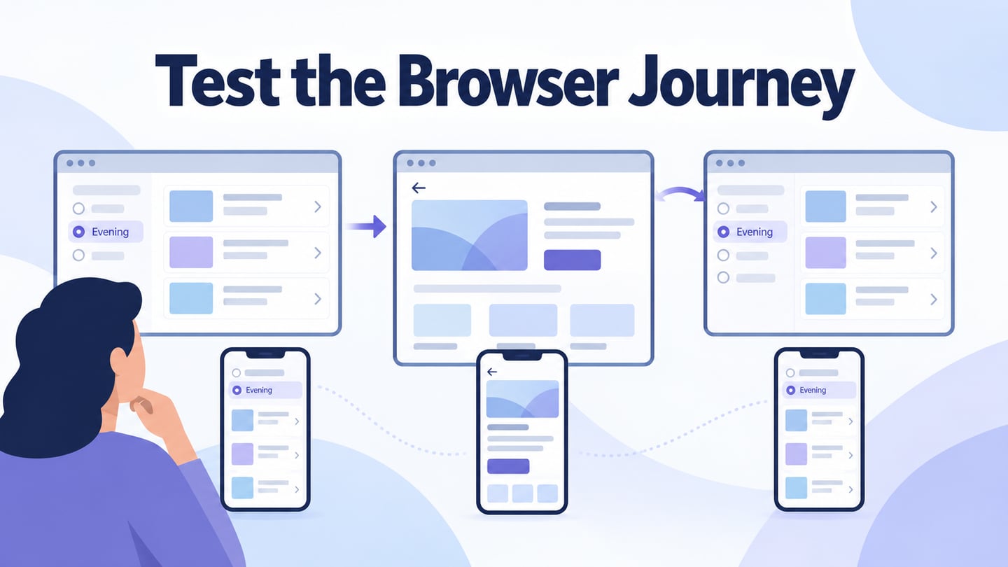
Apply the examples to the class finder with a short interaction record. Note the starting state, the visitor’s action, the visible response, and the recovery path. Selecting an available class should lead toward registration. Selecting a full session should explain the constraint and keep the date choice editable. Returning from registration should preserve the selected class, unless the interface clearly explains why that selection changed.
During a review, ask someone to find a class on a given day without naming the control they should use. Record where they hesitate or choose an unintended route. Separate a missing prototype connection from a confusing design decision. After development, verify keyboard behavior, focus movement, validation, and current availability in the actual website; the clickable model documents the intended responses.