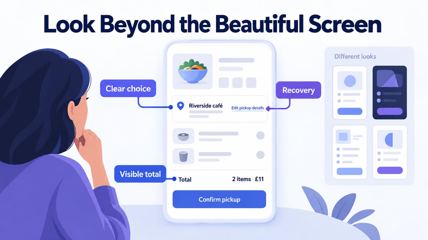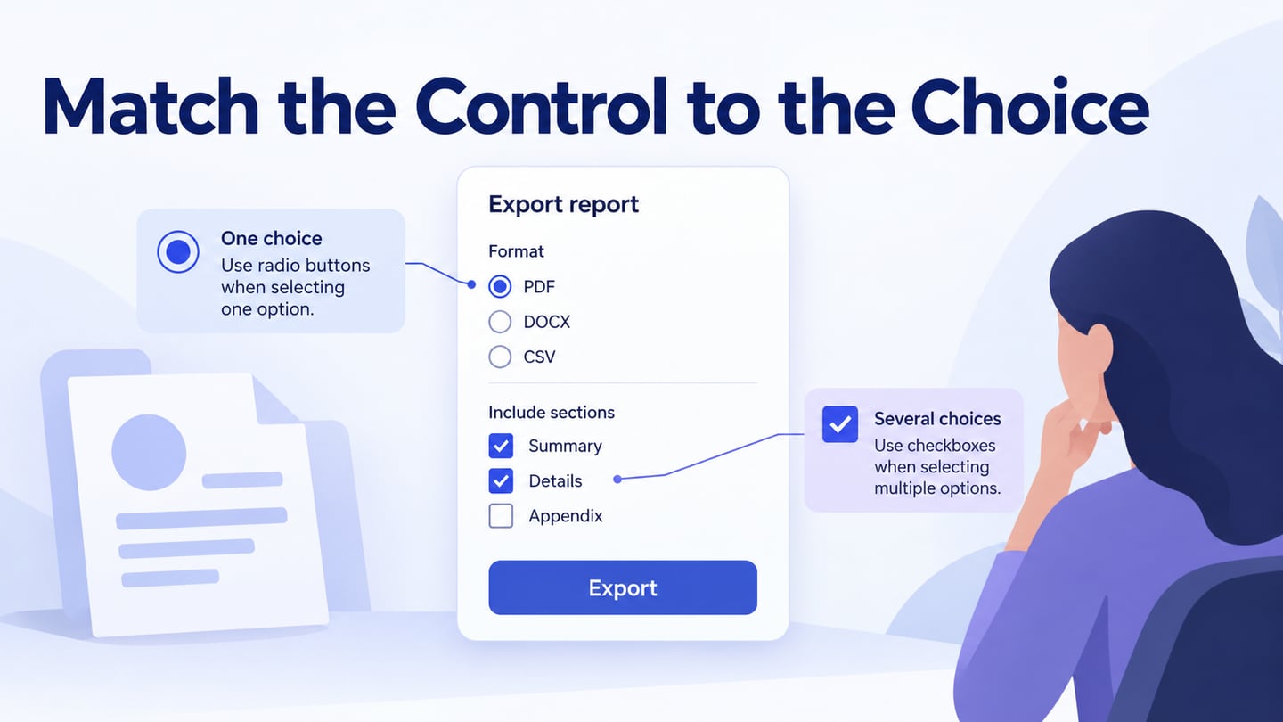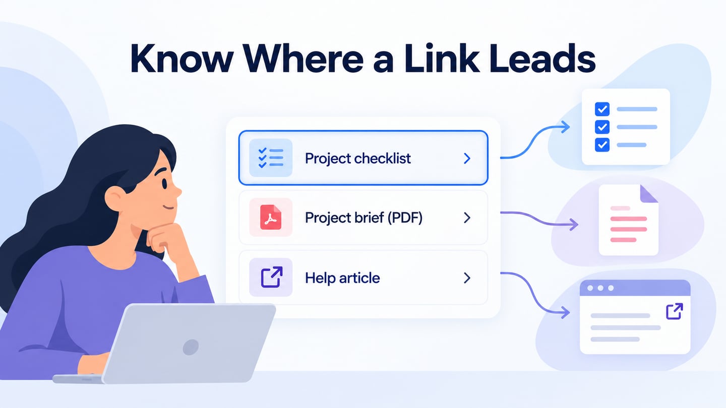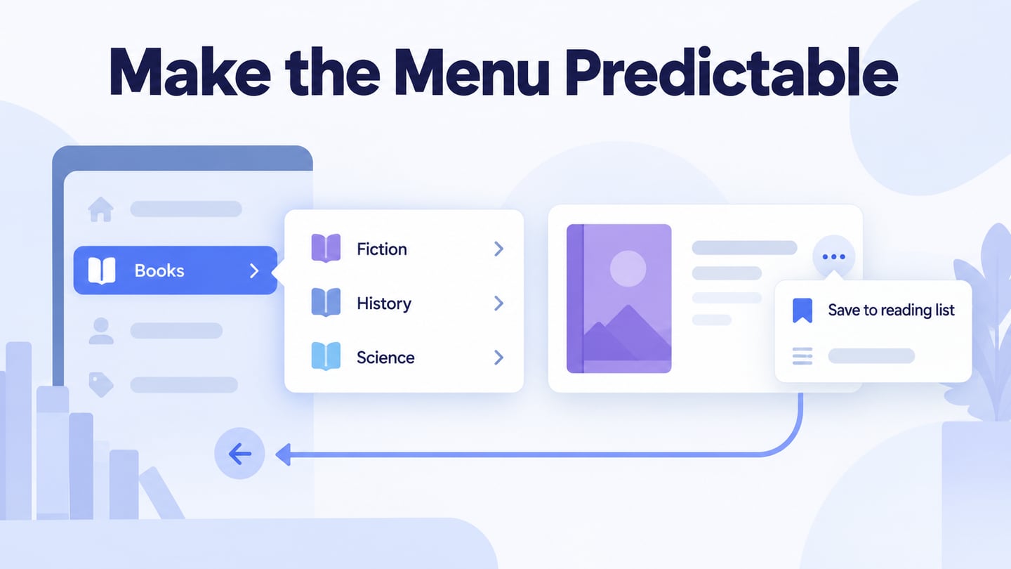
A useful menu helps people find a destination or perform an action without guessing. Start with the task and the information structure, then use an interactive menu prototype to check the labels and states. A menu does not become usable merely because it is prominent or contains every possible item. Use the dropdown workflow and five pattern examples to choose a suitable menu and review its behavior.
Use Mockitt to Prototype Menu States
Mockitt can help you arrange a menu, connect its open and closed states, and preview a route through the interface. Use components and icons where appropriate, but give each item a meaningful label. The retained guide image shows an earlier editor with linked screens; exact controls may differ in the current workspace.

Share the prototype with the intended reviewers and ask them to complete a specific navigation task. Record confusing labels, unexpected destinations, and unclear closing behaviour. The prototype communicates design intent; keyboard semantics, focus management, and assistive-technology support must also be implemented and tested in the real interface.
How to Create Dropdown Menu UI Design
Before drawing a dropdown, decide whether it contains page links, commands, or a value for a form field. Those behaviours require different controls. The following workflow creates a navigation example and its review states; it does not assume one menu pattern is correct for every task.
Step 1: Create a new project
- Create a project for the intended screen size and name the task. Include the page before the menu opens, the expanded navigation, and a destination state.
Step 2: Create Menu UI Design
- Add the trigger, labels, and destination items. Use realistic wording and enough space for long labels. Show the current destination in a way that does not depend only on color.
- Connect the trigger to the expanded state and each destination to the corresponding screen. Document what happens when the trigger is used again, a destination is selected, or the person dismisses the list.
- Add notes for behaviour that the visual prototype does not implement, including focus return, keyboard operation, and the accessible name of the trigger.
- Use animation only when it explains the change. The menu should remain understandable when motion is reduced or absent.
Step 3: Preview the menu UI
- Preview the prototype at the intended size and try both short and long labels. Check that opening the menu does not hide the action needed to close it.
- Ask someone to find a named destination without first telling them where it lives. Record their interpretation of the labels and whether they can recover from choosing the wrong section.
Step 4: Share the menu UI
- Share the relevant prototype and access settings with reviewers. Include the test task and the states they should inspect, rather than sending an unexplained collection of screens.
Review a library navigation menu
For an illustrative library website, make Books a disclosure control that reveals Fiction, History, and Science links. Keep a separate Save to reading list action on each book card. A reader looking for history books should not have to decide whether a control changes the page or modifies a saved item.
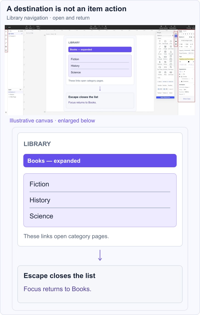
Review the closed, expanded, and destination states. For the disclosure behaviour, specify that Escape closes the list and returns focus to Books. The WAI disclosure-navigation example explains this kind of interaction and why ordinary site navigation should not automatically receive an application-menu role. Treat its example as implementation guidance to test, not production code to copy without review.
Five Menu UI Patterns and Their Tradeoffs
1. Dropdown UI design
Dropdown navigation groups related destinations under a visible trigger. It saves space, but hides options until opened. Keep labels distinct and make opening and closing predictable. A form selection list and a command menu may look similar while behaving differently; choose the control according to the task, not its outline.
2. Fixed Position UI Menu design
A fixed-position menu remains available while the page scrolls. It may help on long pages, but must leave room for content and avoid covering focused controls or anchored headings. Review the small-screen and zoomed layout. Keeping a header fixed does not by itself improve page speed.
3. Custom mega menu UI design
A mega menu exposes several groups of destinations in a larger panel. It can help people scan a broad catalog when group names are meaningful. It also creates a larger reading and interaction surface. Check heading structure, focus order, screen space, and dismissal rather than assuming the pattern is inherently accessible.
4. Slide UI menu
A slide-out menu can hold secondary navigation on a small screen. Its trigger should be recognizable and labeled where the icon alone is unclear. Keep common tasks easy to reach and define what happens to background content while the panel is open. Use interaction states to document dismissal and return to the original context.
5. Card grid menu UI design
A card-grid menu presents destinations as visual groups. It can suit browsing where images help identify a category, but the labels and destination still need to be clear. Do not assume every card should expand: a category link, a disclosure, and a selection have different outcomes.
Before handoff, check the menu using the WAI menus tutorial: meaningful structure and labels, recognizable current and expanded states, and operation with the input methods the interface supports. Include these checks in UI testing of the implementation. A successful visual walkthrough is useful evidence about the design, but it is not a complete accessibility test.