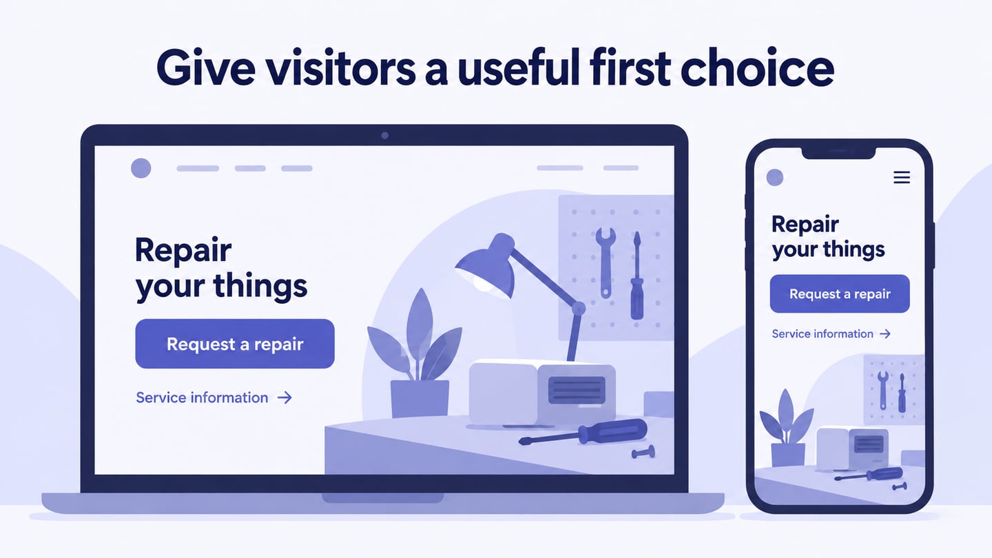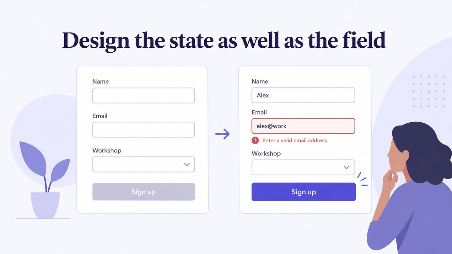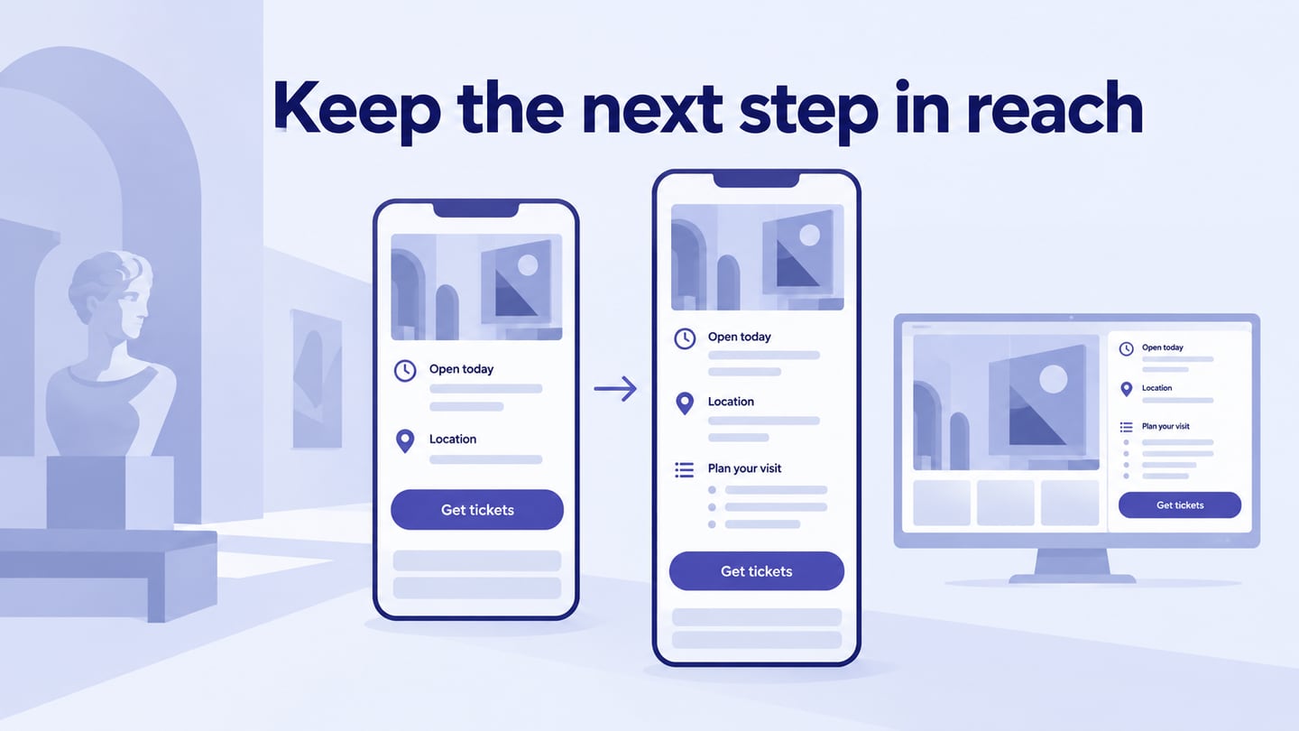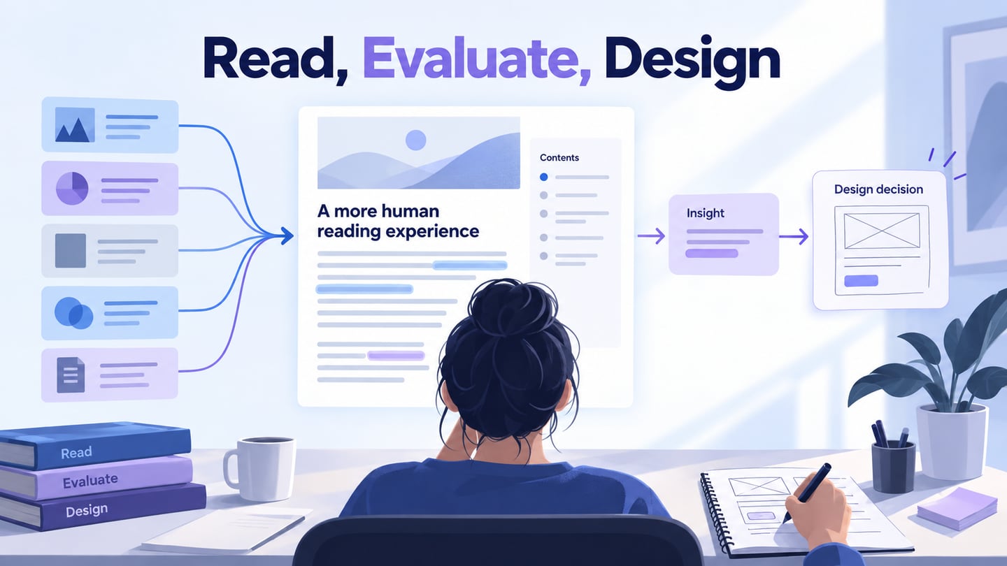
Website layout organizes content and actions into a readable structure. Start in a website layout design workspace with the information the visitor needs and the order in which they need it. Simplicity means removing unnecessary complexity, not automatically removing useful detail.
Give important information a clear place and make the next action understandable. The amount of content should follow the task. A short page can still be confusing, while a longer page can work well when its hierarchy and navigation are clear.
Use consistent typography, spacing, and image treatment across related pages. The hierarchy should remain recognizable when the layout adapts to a narrower viewport.
How to Create a Website Layout
Mockitt can be used to arrange a page and connect the relevant actions for review. A prototype helps evaluate grouping and flow before the responsive website is implemented.
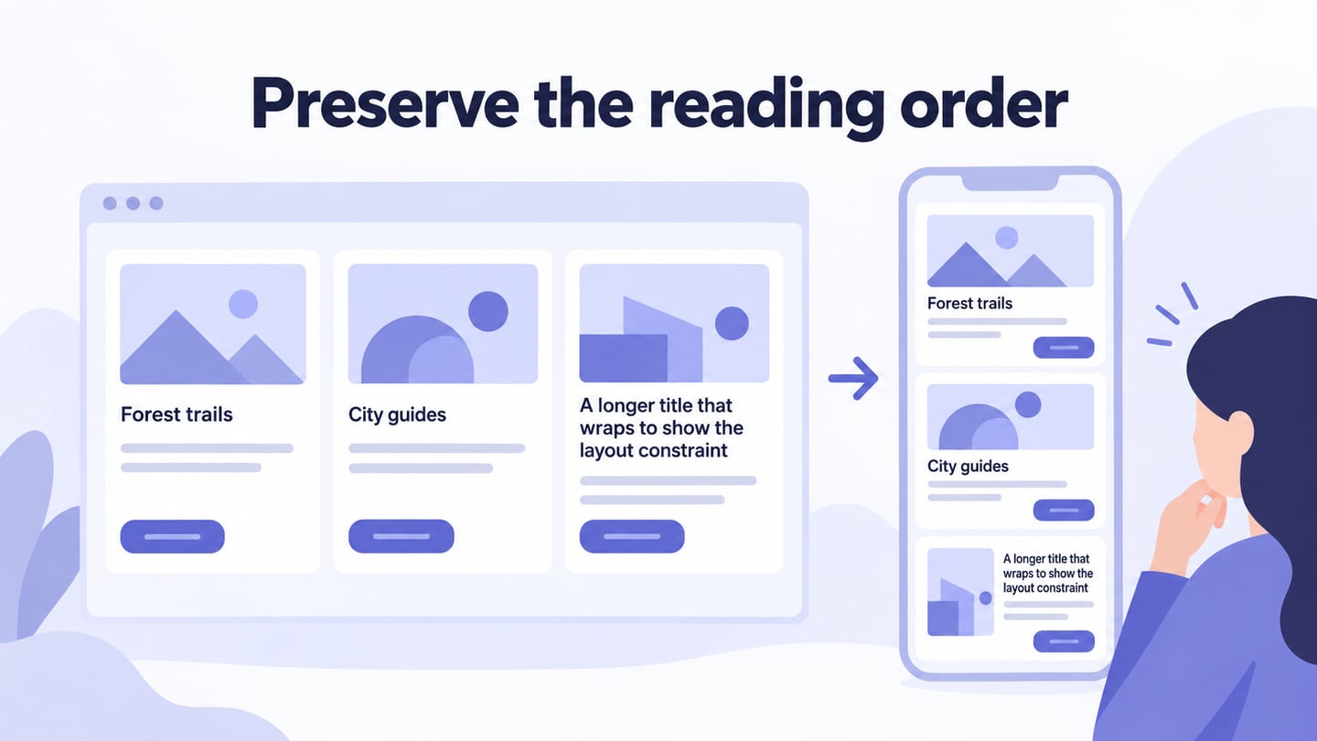
For example, lay out a resource library with three article cards. Each card has a title, a short summary, and an action. Test a title that is twice as long as the others. On a narrow screen, stack the cards in a deliberate reading order and keep each action with its own title and summary rather than separating all buttons into another row.
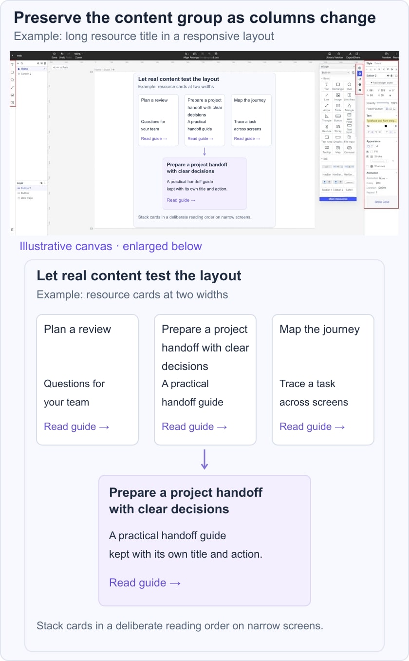

Choose a blank canvas or a suitable template, then use realistic content. The original editor image shows an earlier screen-building interface; apply the same layout task through the current controls.
A mobile app preset is not required for a website. Choose the web viewport and the additional widths needed for the review.
- Open the current workspace and create a prototype project.
- Set up the page or screens needed to demonstrate the resource-library task.
- Name the screens and distinguish the desktop and narrow arrangements.
- Start from a suitable template only if its grouping matches the content.
- Use a descriptive project name. Add a logo or other imagery only where the page needs it; a website does not normally require an app splash screen.
- Arrange the main content regions and the navigation.
- Add the necessary states or connected pages, such as opening a resource and returning to the library.
- Customize the elements and preview the page using realistic titles, summaries, and images. Check the content order as well as the appearance.
Five Layout and Presentation Approaches
1. Parallax Scrolling
Parallax changes the relative movement of layers during scrolling or pointer movement. It is a presentation technique that can support a visual story, not a required layout for a modern website.
Use it only when it helps the content and preserves usability. Avoid depending on device tilt or motion to reveal essential information, and provide a suitable reduced-motion experience.
2. Brick/Grid Layout
A grid aligns repeated content such as resource or product cards. A masonry-style arrangement packs differently sized items into columns, which may produce a different visual reading order. Choose the structure according to the content and how users compare items.
Define how card titles, images, summaries, and actions respond to unequal content lengths. Do not rely on a third-party layout library to decide the information hierarchy.
Review the result at different widths and with keyboard navigation.
3. Long-Form Vertical Layout
A vertically scrolling page can organize a longer explanation into sections with useful headings. Scroll-triggered animation is different from lazy loading, which defers loading noncritical resources. Neither requires hiding meaningful text until a decorative effect finishes.
4. Full Page Layout
Full-page or screen-sized sections can suit a focused presentation. Make sure content can grow without clipping, particularly on a smaller screen or at increased text size.
Avoid trapping readers in nested scrolling areas or forcing every section to fit one screen. If a section is long, normal document scrolling may be clearer than a visually rigid presentation. The W3C explanation of reflow describes how ordinary reading content should remain available when the viewport narrows or text is enlarged. A data table may need its own horizontal view; that does not justify making the surrounding paragraphs scroll sideways.
For the resource library, review a complete card rather than an empty rectangle. Keep its image, title, summary, and action together; let a longer title increase the card height. When the cards stack, preserve their intended reading order. Use a deliberate placeholder or an image-free card for a missing image so the title remains the entry point. Check the implemented page with keyboard focus and enlarged text as well as the static design.
5. Restrained or Monochromatic Color
A monochromatic palette is a visual style, not a layout structure. It can reduce visual variation, but it does not automatically make a site more professional or readable.
Keep sufficient contrast and distinguish interaction states using more than color alone. Review the resource-library example with a long title, a missing image, and a narrow viewport: the grouping and reading order should still explain which action belongs to which resource.