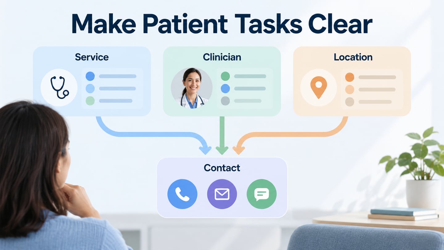
Medical website design should help people find the right service, location and contact route. A visitor may arrive with an unfamiliar department name, a referral or a practical question about a visit. In Mockitt’s UI design workspace, you can arrange those routes and review their labels before a development team implements the site.
The ten preserved examples below show earlier versions of hospital, health-system and support-service websites. Use their concrete navigation and content patterns as design references. A clear interface can help people find information; the appearance of a page does not establish the quality of care or the accessibility of its implementation.
Ten Medical Website Design Examples
#1: The Royal Women's Hospital
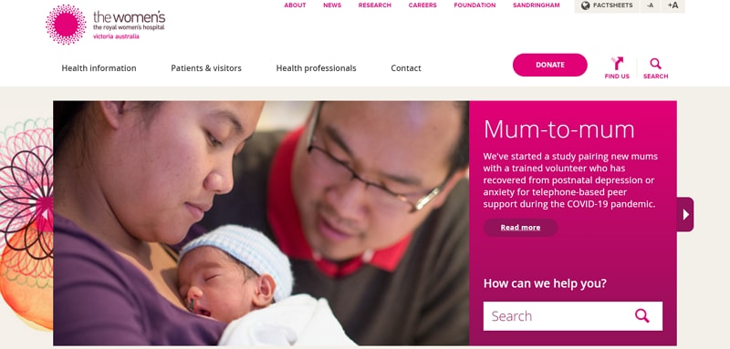
The Royal Women’s Hospital separates patient and visitor information from health information and professional resources. In the historical capture, audience navigation, Search and Find us frame a large feature area. The practical lesson is to organize around the reader’s purpose, without assuming that a particular color or photograph appeals to everyone in an audience.
The official site currently distinguishes appointments and bookings, clinics and services, and health information, including resources about violence against women. Keep these tasks clearly named and give sensitive information a direct route. A campaign banner can introduce a topic, but it should not become the only way to find an essential service or support resource.
#2: Centura Health
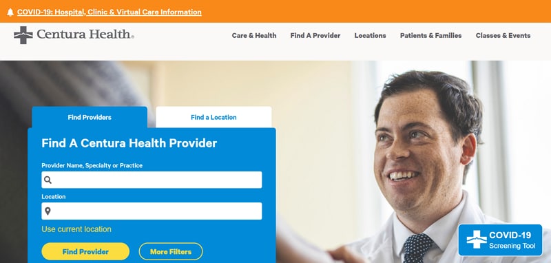
The Centura Health capture is a historical example: CommonSpirit announced direct management of its facilities in Colorado, Kansas and Utah in 2023. The older layout groups a small set of primary navigation choices and puts provider and location search near the center. The useful decision is that these searches have a defined place, rather than competing with a large undifferentiated link list.
When planning a navigation menu, separate broad sections from the controls needed for an immediate task. A prominent search area still needs meaningful labels, useful results and a recovery path when nothing matches. Check text size and foreground/background contrast in the implementation, rather than assuming that a visually bold search field is accessible.
#3: Mercy Health
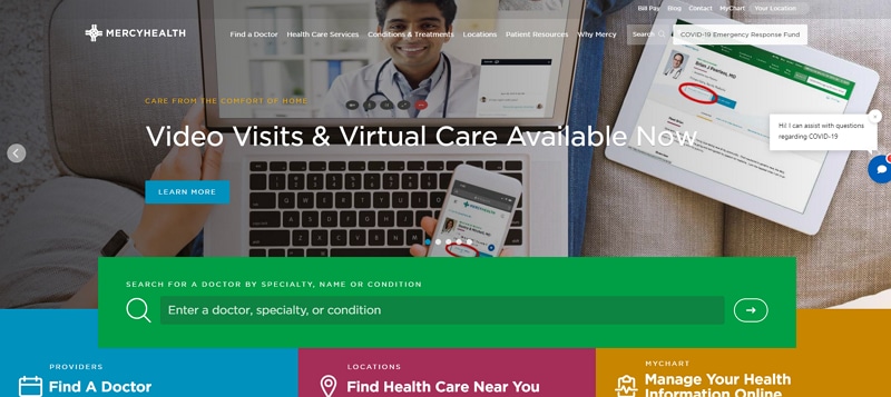
The Mercy Health image presents a virtual-care feature above routes for finding a doctor, locations and the patient portal. These are distinct intentions: learning about a service, choosing a professional, finding a place and accessing an existing account. Keeping them separate helps the visitor understand which route to take.
The green search area acts as a visual anchor in the captured composition. Color is useful here because it distinguishes a task area, not because green guarantees reassurance or recovery. Preserve readable text and clear control labels if the brand palette changes. Give the portal a recognizable label so it is not mistaken for general site search.
#4: Alfred Health
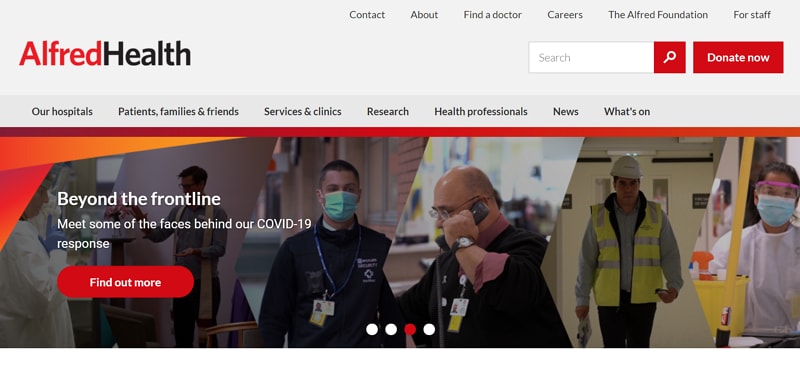
Alfred Health combines a staff photograph with audience and service navigation, search and a featured-content carousel. The image introduces the people behind the organization while the navigation carries the practical work. This is a useful division of responsibility: photography provides context, and explicit labels help readers find a service.
Use consistent type, spacing and controls across the site so a person can recognize familiar actions on a new page. In a carousel, visible position indicators and deliberate controls are more useful than motion alone. Keep the service and contact routes available while the featured story changes, and check that long headings remain readable on a narrow screen.
#5: Northern Health
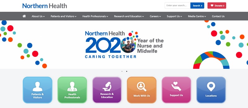
Northern Health’s preserved 2020 homepage uses whitespace and a set of audience shortcuts beneath the primary navigation. The location icon is a concrete cue for a practical task. These details are more useful design references than attributing a universal emotional response to the logo or color palette.
Group shortcuts according to the tasks people actually bring to the site: finding a location, a service or information for an upcoming visit. Use words as well as icons. A location route should lead to an address and relevant visit information, while a service route should explain what the service is and how to contact it. Test the labels with likely readers instead of assuming that every internal department name will be familiar.
#6: Indiana University Health
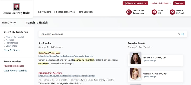
Indiana University Health’s captured search page separates site results from provider results and offers categories such as services, news and events, locations and providers. This distinction can help people understand what kind of information a result contains. Its header also gives providers, services and locations their own entry points. For a similar design, make the selected filter visible, show how to clear it and keep the search term available for editing. If recent searches are offered, consider their behavior on a shared device and explain how they can be cleared. A useful search design supports refinement as well as the first query.
#7: Rest Assured
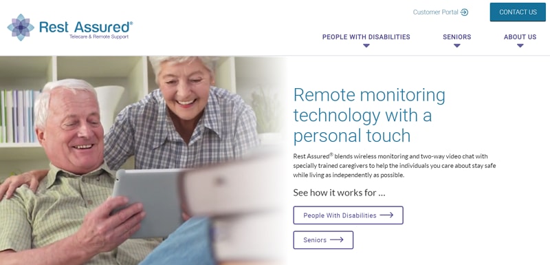
Rest Assured is a remote-support service example, rather than a hospital appointment website. Its retained page addresses people with disabilities and seniors and presents routes into its services. The design lesson is to explain the service and next step in direct language, with a clear relationship between the audience description and the contact route.
Accessibility needs to be checked beyond the screenshot. Evaluate keyboard operation and visible focus, meaningful image alternatives, readable labels and text contrast. A prominent heading does not verify that every control can be used, and an image cannot establish a site-wide WCAG conformance claim. Build these checks into implementation review rather than presenting visual appearance as certification.
#8: Regional One Health
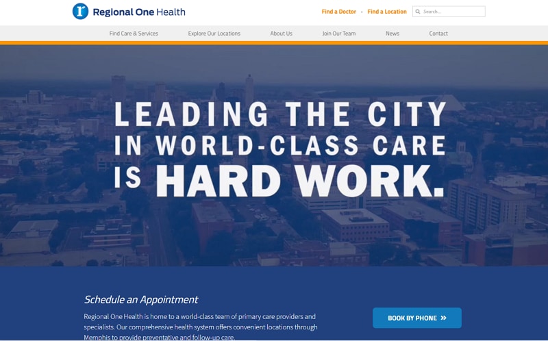
Regional One Health’s capture combines a primary-care message with navigation and a Book by phone entry. Video can introduce a facility or a professional, but its role should be clear: it provides context alongside the information needed to act. A person looking for a phone number should not have to watch a film first.
If a page includes a tour or interview, provide a descriptive title, appropriate captions and controls, and keep essential information available as text. Plan how the section behaves when the media is not played. The service and contact information should remain understandable without implying that an engaging presentation guarantees a treatment result.
#9: Arkansas Surgical Hospital
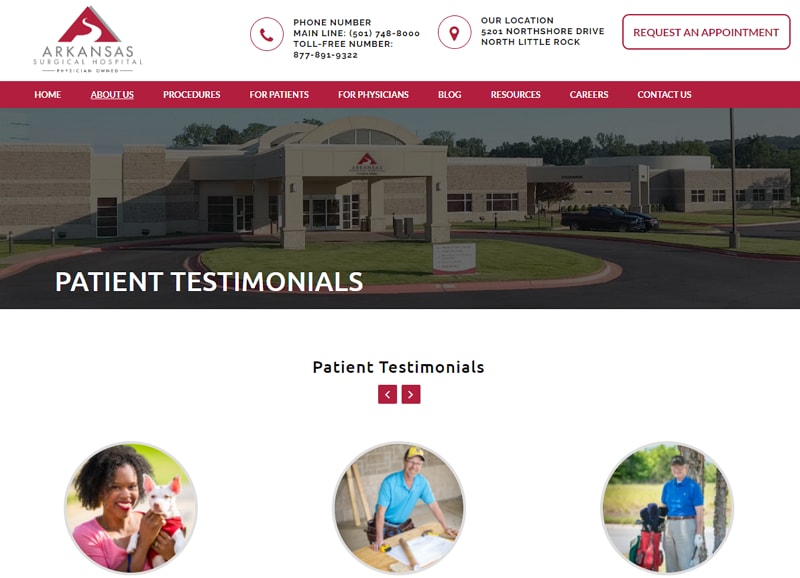
Arkansas Surgical Hospital’s retained layout shows testimonial portraits alongside practical phone, address and appointment information. A user-controlled testimonial carousel can present individual experiences, but it should remain distinguishable from factual service information. Keep the controls accessible and avoid letting automatic rotation interrupt reading. Do not treat a testimonial as evidence that another person will have the same outcome. For the visitor’s task, the stable location and contact details remain valuable even when the featured story changes.
#10: Mayo Clinic
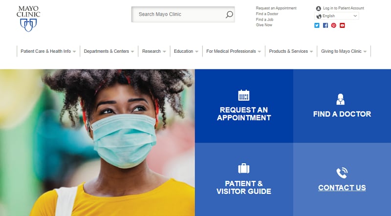
The Mayo Clinic capture gives four tasks prominent space: requesting an appointment, finding a doctor, planning a visit and making contact. These routes serve different needs from browsing condition information. The current official appointment page also distinguishes new patients, returning patients and referring physicians, then offers phone options by location. The useful pattern is to explain which route applies before asking the reader to proceed. Keep educational information and appointment requests clearly separated, and make the next step specific.
Plan a Clear Service-to-Contact Route
For a fictional Riverton Clinic website, start with a simple task: find a service, identify its location and locate the contact information. Write down the facts required at each stage before arranging the screen. Keep synthetic content in the prototype so reviewers can focus on the structure without including personal health information.

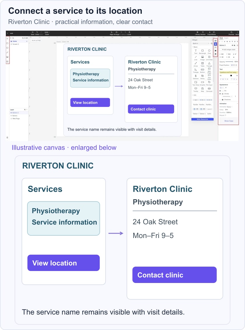
Create a service overview and a location detail. Use consistent names so a reader can see that the service selected on the first screen matches the information on the next. In the illustrative canvas, the service card leads to a location panel containing an address, opening hours and Contact clinic.
Use reusable components for service cards and location details, then review realistic text lengths. The location name stays visible above the address and opening hours, with Contact clinic as the next step. This makes the relationship between service, place and action explicit rather than scattering the three across unrelated panels.
Check the same route in a mobile web layout. Read the address and hours at the intended display size, follow the route with a keyboard and check that the contact action describes what happens next. A prototype review can reveal missing content or unclear labels before implementation.
Share the prototype with the people responsible for service information and visitor enquiries. Ask them to find the location for a named service and explain the next step. Record uncertain hours, contact details or ownership as open questions, then resolve them with the organization before publication.
Carry the reviewed structure into development with clear responsibilities for maintaining it. The implementation team must check actual forms, integrations and accessibility behavior. Keep this design exercise focused on finding information and contacting the clinic; it does not provide diagnosis, triage or clinical validation.