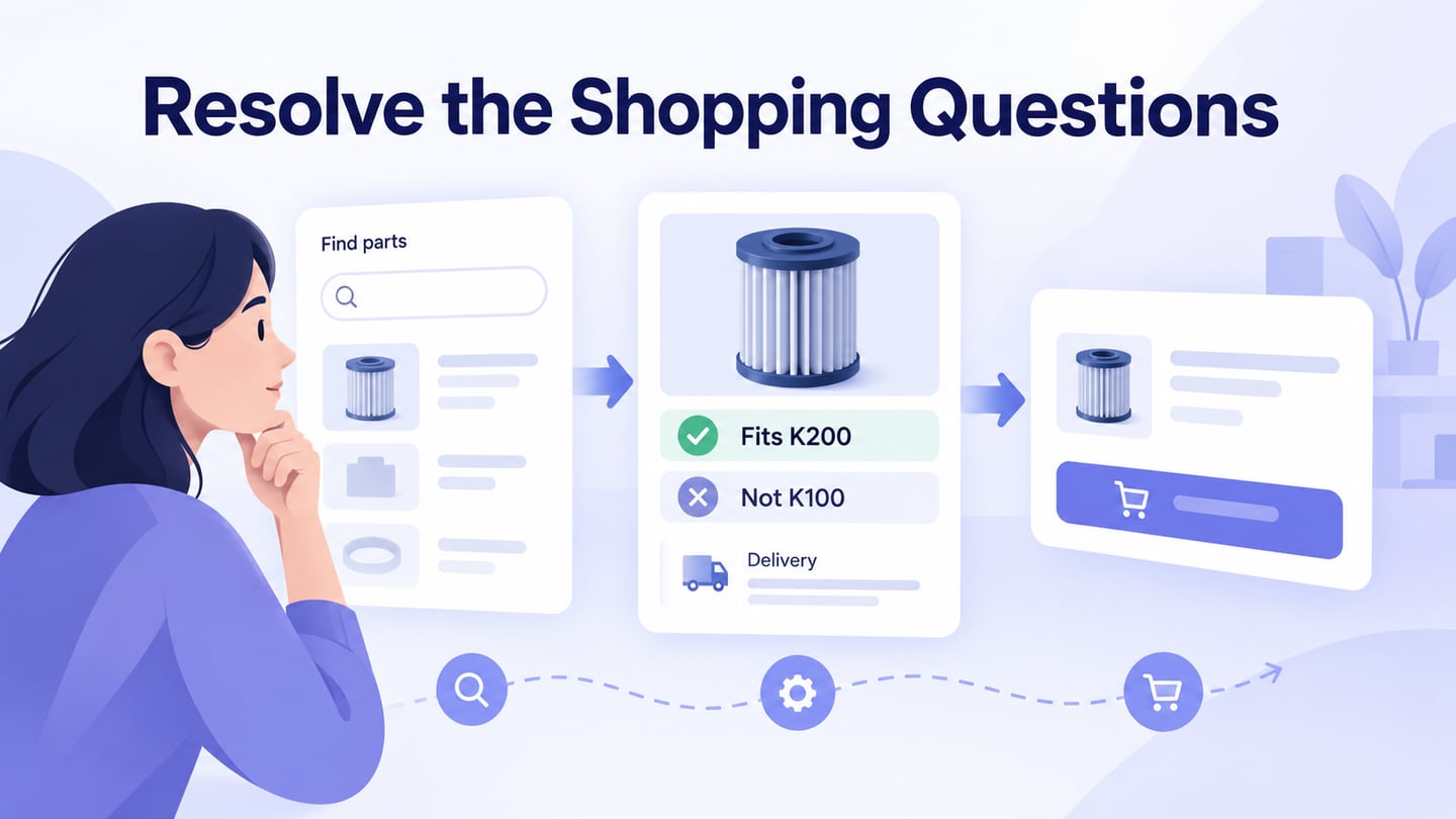
Ecommerce UX concerns the whole shopping task: finding a suitable product, understanding the offer, choosing the right option, and completing the next step with confidence. A polished product page can still fail when compatibility, delivery, or availability is unclear. Use a prototype of the shopping journey to inspect those decisions before implementation. The five practices below focus on responsiveness, simplicity, navigation, product media, and detail pages. Design observations do not establish promises about sales.
Top 5 Ecommerce UX Practices
Start with the shopper’s situation and the information needed to make a decision. Different products create different uncertainty: clothing may need sizing details, while a replacement part needs compatibility. Review the following practices against an actual task rather than applying every pattern to every store.
1. A Responsive, Dependable Journey
Design for the devices and conditions that matter to the audience. A responsive page adapts to available space, but compatibility also includes input methods, browser behaviour, readable content, and usable controls. Check the journey from results to detail and cart, not just the homepage. Avoid claiming support for every device based on a single layout.
Keep the experience responsive during loading and interaction. Show understandable feedback when results are updating or an item is being added. In implementation, measure performance under representative conditions and address the actual delays. There is no universal point at which every shopper leaves, and a prototype does not establish the live store’s loading speed.
2. Simplicity Without Missing Information
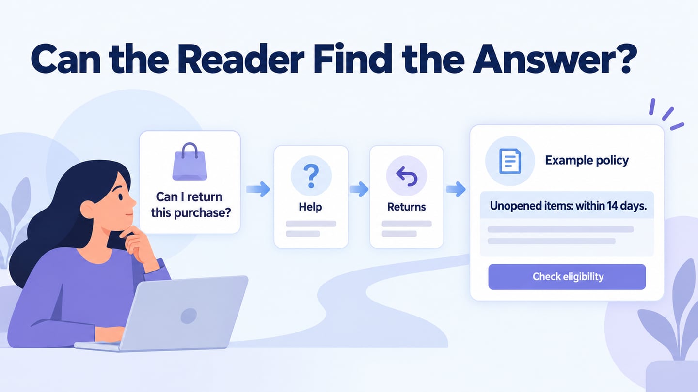
A simple layout directs attention to the decision at hand. Remove unnecessary decoration or repeated promotions, but retain information needed to choose correctly. Product size, compatibility, availability, delivery conditions, and return terms may be essential even when they make the page longer. Prioritize and group them rather than hiding them to create an empty-looking screen.
Use headings, spacing, and meaningful labels to make the information scannable. A short page is not automatically easier to use. Test whether someone can answer the product-specific questions without searching several unrelated areas or guessing what an icon means.
3. Clear Navigation and Search
Navigation helps shoppers move between categories, results, product details, and the cart while maintaining context. Show where they are and provide an understandable way back. If a person returns to results, consider whether their filters and position should remain available. Validate these behaviours in the implemented store.
Organize categories and filters around attributes people use to find the product. A sidebar is one presentation option, not an automatic search-ranking improvement. Search should handle the names and identifiers relevant to the catalog. Review these behaviours with actual examples:
- Offer useful suggestions where appropriate, with enough context to distinguish similar products.
- Support relevant product names and model numbers, including the format customers see on their existing item.
- Handle common alternative terms or formatting differences when they are supported by the catalog; provide a helpful no-results state rather than inventing a match.
4. Product Media That Answers Questions
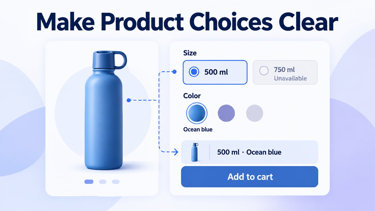
Product images and video help people inspect something they cannot hold, but they should work with accurate descriptions and specifications. Choose media that answers a question about form, dimensions, material, fit, or use. Keep the selected variant and its images consistent.
Use clear source images and deliver appropriate sizes for the device. The web.dev responsive-image guidance explains why image delivery should match display conditions. Preserve the aspect ratio and provide useful alternatives for informative images. Depending on the product, useful media can include:
- Views from different angles that reveal relevant features.
- Images of the selected variant, with labels that identify its color or size.
- Close-up views of details such as connectors or material texture.
- A rotatable view when it helps answer a real inspection question.
- A short demonstration with accessible alternatives where necessary.
5. Product Details and the Next Action
The detail page should help the shopper decide whether this product and variant meet their needs. Keep the name, options, availability, and action understandable, with supporting information nearby. Shopify’s product-page guidance likewise emphasizes product information and clear choices. Review these areas:
- Cart action: make the action clear and confirm which item and variant were added. If a required option is missing, explain it beside the relevant control.
- Trust information: show accurate policies, contact details, and only legitimate certifications or payment marks. Adding unverified badges does not establish security or product quality.
- Reviews: present genuine reviews and relevant context without inventing ratings or implying that every customer has the same experience.
Use Mockitt to Review the Journey
Choose a prototyping tool according to the decisions you need to evaluate and the way your team reviews work. For this task, linked screens and clear annotations are more useful than an unsupported claim that one tool is best for every store.
Mockitt

Mockitt can represent the product search, detail, option selection, and cart states in a shared prototype. The retained guide screenshots illustrate an earlier editor workflow; current panel names and positions may differ. They remain useful for understanding how screens, interactions, notes, and preview fit together.
Features to Use for This Review
Check the current plan and workspace permissions for the features your team needs. Avoid assuming that every capability is available without limits on every plan.
- Reuse relevant components and icons, while adapting labels and states to the actual shopping task.
- Arrange the screens and controls to communicate hierarchy and the next decision.
- Link screens and states to show valid choices, errors, and recovery paths.
- Use shared access and comments to coordinate review; maintain appropriate backups and permissions rather than treating cloud storage as a guarantee against data loss.
- Invite the people responsible for product content, design, and implementation so they can resolve different kinds of uncertainty.
How to Prototype an Ecommerce UX Review
Keep one realistic shopping task consistent across the project, design, preview, and sharing steps. Include an exception as well as the expected path.
Walk through a compatibility-sensitive purchase
For an illustrative replacement-filter store, ask a shopper with a K200 appliance to find a suitable replacement. The product F-20 should state “Fits model K200” and “Not compatible with K100,” with guidance to check the model label. Keep delivery information accessible before the cart action.
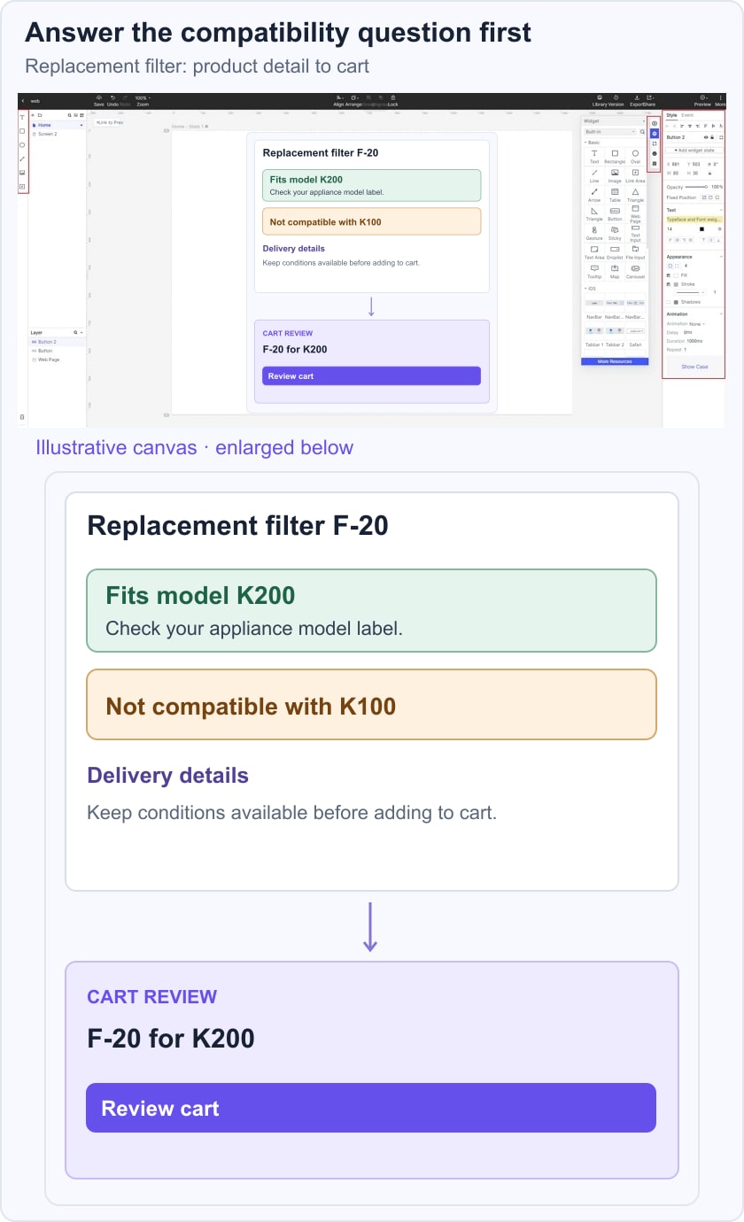
Follow the same item into the cart: its name and compatibility should agree with the product page. Ask the reviewer to explain why the filter fits and what they expect to receive. If they choose the wrong model or cannot find the delivery details, record where the information or navigation failed. This example is fictional design material, not a claim about an actual product or a measured conversion result.
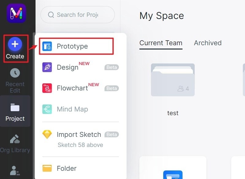
Step 1: Create a new project
- Create a project named for the shopping task, such as a compatibility check for a replacement part.
- Prepare the relevant screen sizes and add the result, product-detail, and cart states, including a mismatch or unavailable case.
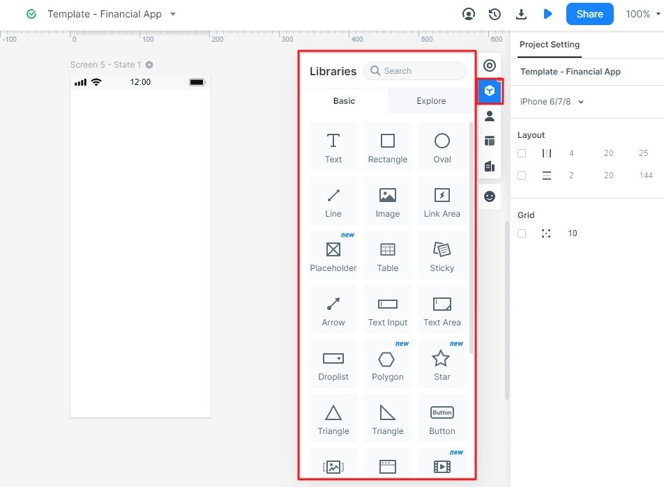
Step 2: Design the Shopping States
Add components and icons that make the product decision understandable.
- Use the available component libraries and editing panels; the retained screenshots show earlier panel arrangements.
- Place the relevant elements on the canvas and fill them with realistic product names and constraints.
- Reuse repeated controls so a label or state change can be checked consistently across screens.
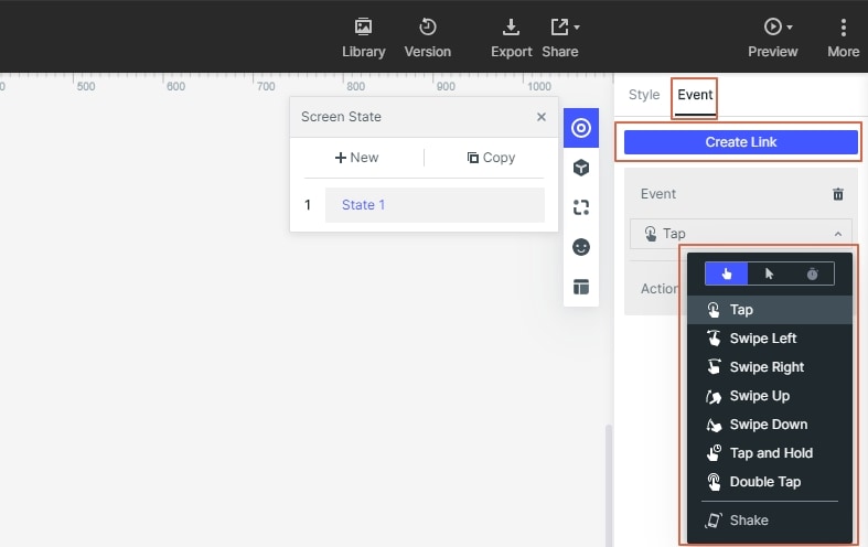
Connect the screens and meaningful states.
- Assign the appropriate interaction to a result, option, or cart action, and link it to the matching destination or state.
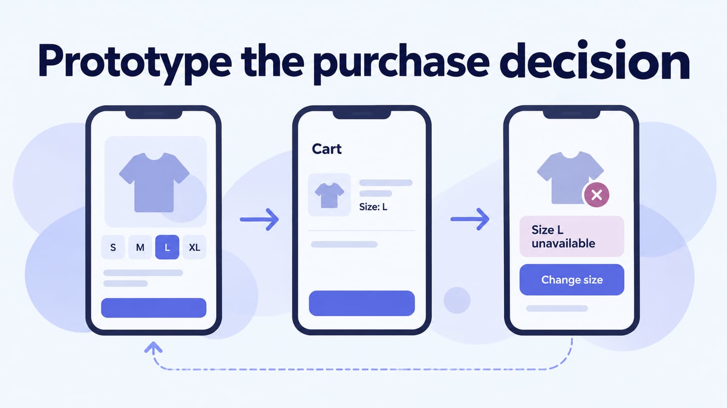
- Include the recovery path when the model is incompatible or the selected variant is unavailable. Do not route every choice to the same success screen.
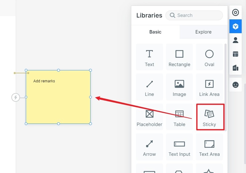
Add Review Notes
- Record questions about inventory, delivery rules, and product data separately from the customer-facing content. Assign each unresolved point to the relevant owner.
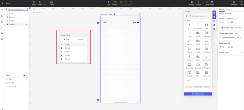
Show the Important State Changes
- Represent the selected item, changed option, pending operation, and confirmation where they affect understanding.
- Use transitions only where they explain the relationship between states. The prototype should communicate intent without pretending to execute payments or validate real inventory.
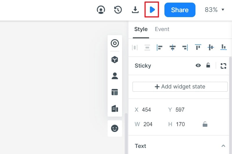
Step 3: Preview the Journey
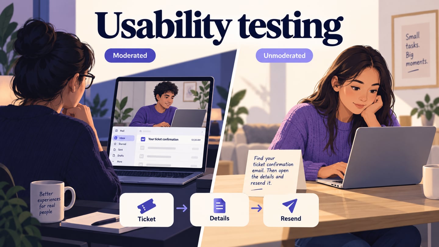
- Ask a reviewer to complete the task on a representative device. Observe the choices and explanations, including the incompatible case. Check readability and navigation in the prototype, then verify performance, accessibility, and transaction behaviour in the working store.
Step 4: Share and Resolve the Findings
- Share the design and its unresolved questions with developers, including the required states and the product-data assumptions. A visual handoff does not replace a specification for inventory or payment behaviour.
- Review feedback with the relevant team members, record the change made, and repeat the affected task. Keep observations about this journey separate from business outcomes that require live evidence.
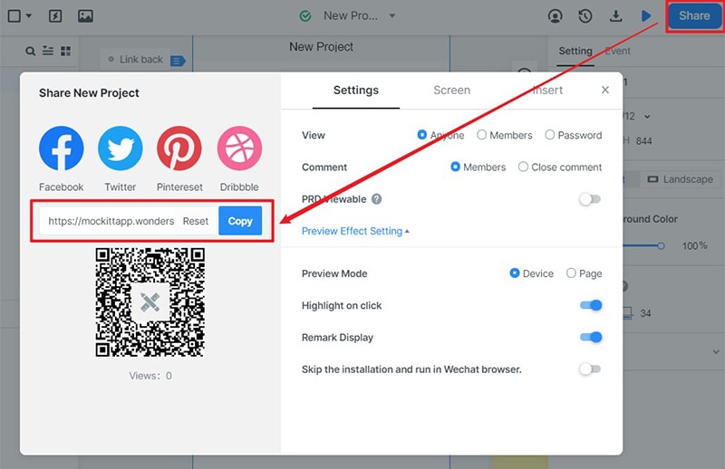 Historical guide capture; use the sharing link generated by your current workspace.