Learn navigation design through task paths, labels, breadcrumbs, menus, and mobile patterns. Review orientation, recovery, and accessibility before handoff.
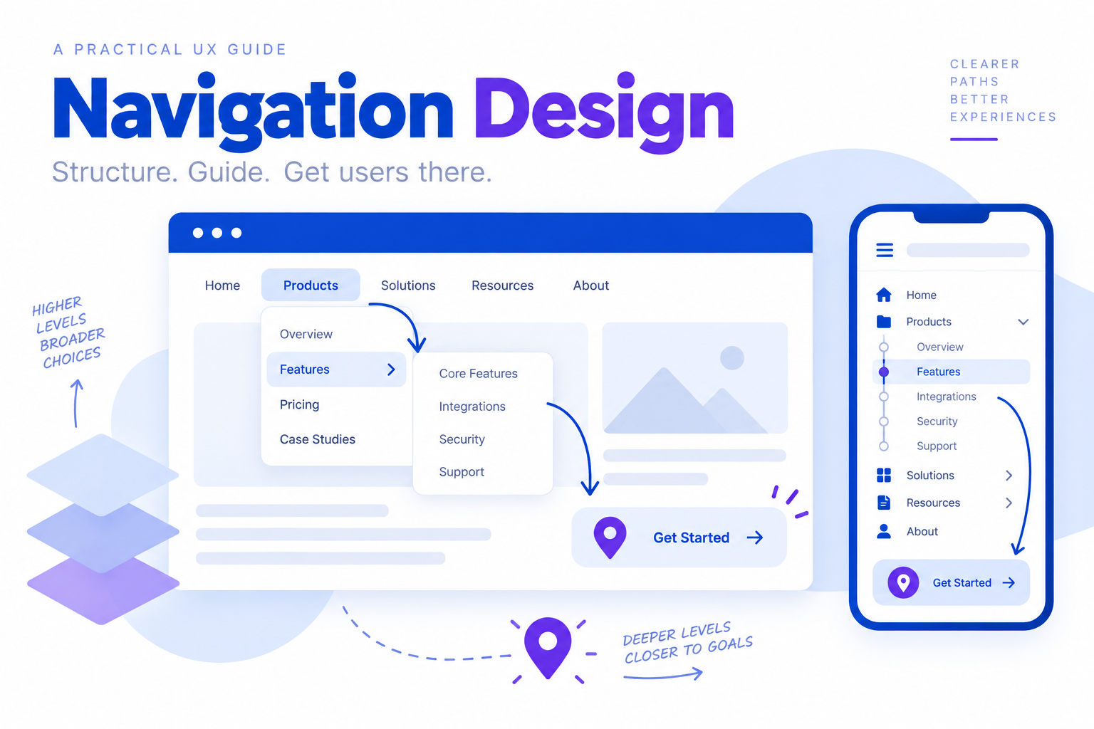
Navigation design is the system that helps people understand where they are, what they can do next, and how to return to a previous step. It includes menus, links, tabs, breadcrumbs, labels, and the visual cues around them. A navigation pattern is useful only when it supports a real task: finding a product, comparing options, completing a form, or returning to saved work.
When the first structure is ready, teams can review the screens and states in Mockitt’s UI design workspace before handing the flow to development. The goal is not to add more links. It is to make the next useful action easy to recognise.
What is navigation design?
Navigation design is the planning and implementation of paths through a website or app. It connects the information architecture to the interface a person sees. A good navigation system answers three questions at every important step:
- Where am I now?
- What can I do here?
- Where can I go next, and how do I go back?
The homepage or product entry point should be reachable without forcing someone to restart. Related destinations should be grouped in one predictable area, while low-value links should be removed or moved behind a suitable menu. Limiting links is a way to preserve hierarchy, not an invitation to hide useful information.
The familiar “three-click rule” is best treated as a warning signal rather than a universal law. A longer path can be appropriate for a complex task if each step is labelled, expected, and reversible. Measure whether people complete the task instead of counting clicks alone.
Consistency matters just as much. Keep the main navigation in the same location, use the same label for the same destination, and keep focus, hover, selected, and disabled states understandable. Consistency reduces the amount of interpretation required on every page.
Three decisions that shape a navigation system
Content
Start with the content and actions people actually need. Group pages by a meaningful relationship, create a clear hierarchy, and avoid putting unrelated features into the same menu. A short label such as “Billing” is easier to scan than a sentence that tries to describe every option beneath it.
On a course website, for example, keep “Courses,” “Fees,” “Faculty,” and “Reviews” together within the relevant course area. People can then compare the information they need without returning to the homepage between questions.
Audience
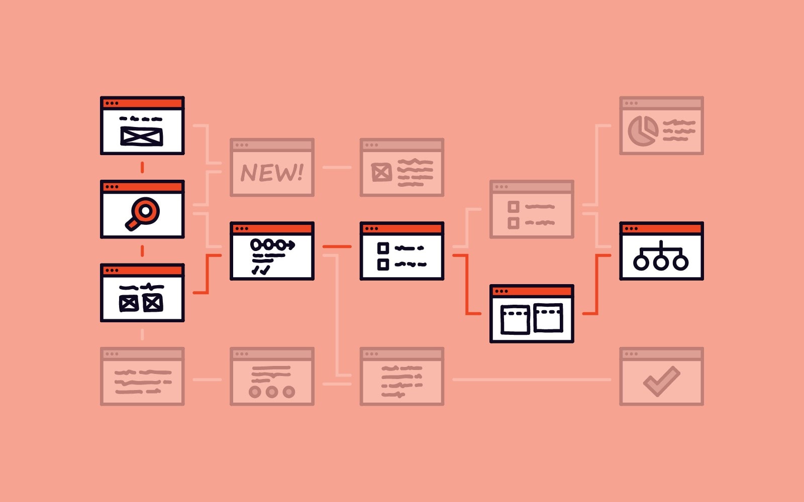
Different audiences may enter through different pages and use different terms. A new visitor may need an overview, while a returning customer may want a direct link to projects or account settings. Use interviews, search data, support questions, and observed task paths to choose labels. Do not assume that internal team language is familiar to users.
Orientation
Orientation is the combination of location, context, and recovery. A horizontal header can work well for a small set of top-level destinations; a vertical sidebar may be clearer for a deep workspace; tabs can separate sibling views. The right orientation follows the content, screen size, and task. On smaller screens, a menu should still expose its scope and current location, and it should be easy to close without losing the user’s place.
A practical task-path example
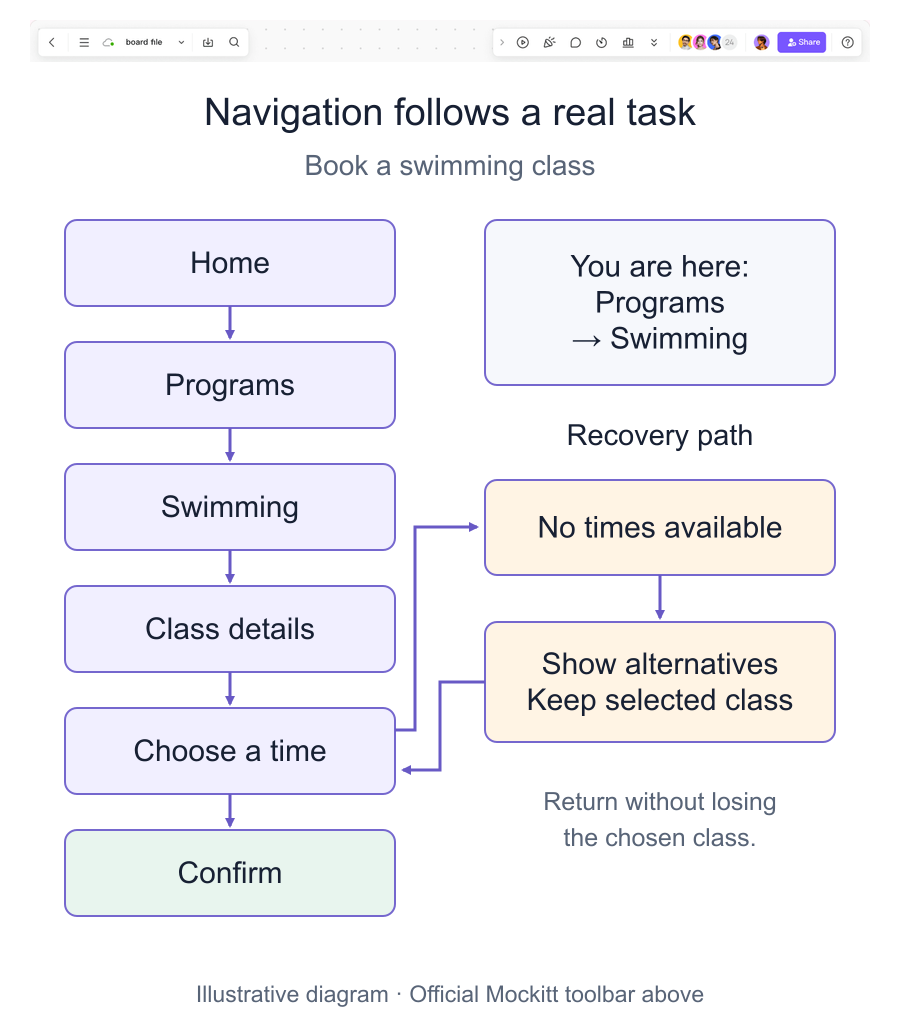
Imagine a community centre website with a visitor who wants to book a swimming class. The path could be Home → Programs → Swimming → Class details → Choose a time → Confirm. The “Programs” label tells the visitor what is inside it, a breadcrumb shows the current location, and the confirmation screen explains what happened after submission.
The path also needs alternate states. If no time is available, show the nearest alternatives and preserve the visitor’s selected class. If required contact information is missing, identify the field and let the visitor correct it without returning to an empty form. These recovery points are part of navigation design, even though they may not appear in the primary happy path.
Navigation patterns and when to use them
- Hamburger menu: useful when a compact screen cannot show the full set of destinations. Give it an accessible label and make the open state obvious.
- Tabs: appropriate for a small group of peer views, such as “Overview,” “Activity,” and “Settings.” Keep labels short and show the active tab.
- Vertical navigation: useful for a workspace or documentation area with several levels. It is different from the browser or page scrollbar.
- Call-to-action: reserves visual emphasis for a meaningful next action such as “Save changes” or “Start a project.” It should not be used for every link.
- Breadcrumbs: show the hierarchy behind the current page and provide a quick way to move upward.
Across education, retail, blogs, restaurants, and booking services, the same principle applies: make categories recognisable, keep menu placement predictable, and use contrast and spacing to separate navigation from promotional content. A link should look interactive, but colour should not be the only cue; focus and hover states need to remain visible.
Navigation, UX, and accessibility
Navigation affects UX because every unclear label creates extra cognitive work. Use words that match the destination, keep the current location visible, and ensure keyboard users can move through the same structure. Touch targets need enough space on mobile, and focus indicators should not disappear against the background. Test a path with a first-time user and with someone who has used the product before; their questions often reveal different structural problems.
Before handoff, check the main path, an empty state, an error or unavailable state, and the return path. Confirm that the header, sidebar, breadcrumbs, and in-content links do not contradict each other. A simple and consistent system usually supports more confidence than a visually complex menu.
Conclusion
Effective navigation design connects content, audience, and orientation around real tasks. Start with the paths people need, choose patterns that fit the screen and information depth, and make location and recovery visible. Review the structure in context, remove unsupported assumptions, and iterate after observing where people pause or lose their place. The result should feel predictable without feeling restrictive.