A UI prototype is a proposed interface that shows how people see, operate, and recover through a task. It is more detailed than a structural wireframe, but it is still an experiment: it cannot prove production data, latency, accessibility semantics, or final visual quality by itself. Build the smallest set of polished screens that answers the next product question, then test the flow in Mockitt with realistic content and states.
What a UI prototype should answer
Choose the question before styling the screens. A product team might need to know whether a new customer can compare plans, whether an operator can recover from a failed import, or whether a dashboard makes an urgent exception visible. Each question implies different screens and states. A gallery of attractive screens without a task gives reviewers no way to judge the interface.
Write the user, starting condition, action, and evidence you need. For a plan comparison, the evidence might be which details people look for before choosing, where they hesitate, and whether the selected plan remains visible at checkout. Keep those measures separate from visual preference.
Choose detail by risk
| Risk to test | Prototype detail | Useful evidence |
|---|---|---|
| Information hierarchy | Real headings, labels, values, and a complete reading order. | Can people find the decision and explain it? |
| Interaction and state | Clickable controls, selected/disabled states, confirmation, and recovery. | Can people complete and correct the task? |
| Content and responsive fit | Long names, error text, narrow layouts, and realistic media. | Does the interface remain readable and usable? |
| Visual direction | Type scale, spacing, color, and representative components. | Does the visual system support the task and brand? |
Do not spend high-fidelity effort on a risk that is not part of the decision. Conversely, a polished happy path is not enough when the product depends on permissions, empty data, or a failed action.
Build a complete UI flow
- Set the entry state. Show the context the user needs before acting, including account, location, or selected project when relevant.
- Make the primary action obvious. Use a clear label and a visible result. Avoid relying on color alone or on hover to explain what happens.
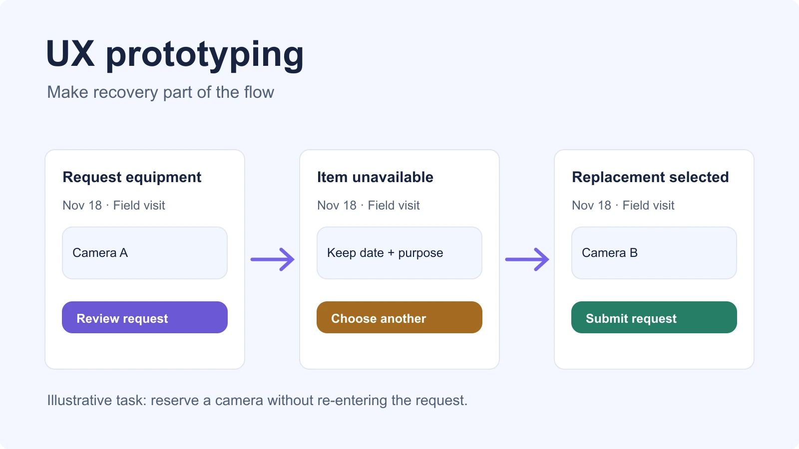
- Model state changes. Include loading, selected, disabled, success, empty, and error states when they affect the task.
- Connect editing and recovery. Let people change a choice, cancel safely, and return to the point where they can continue.
- Check the end state. Show what was saved, sent, or confirmed and where the user can go next.
Use the same content across the route so reviewers can notice what changes. If a prototype simulates a server response, label that boundary in a note. The interaction can demonstrate the proposed behavior without implying that the underlying request has been implemented.
Test with tasks, not compliments
Give a reviewer a task and ask them to think aloud only when that will not change the route. Watch where they pause, what they expect to happen, and whether they recover after an error. Record the screen, action, observation, and consequence. “The card feels busy” is a starting reaction; “two reviewers missed the secondary status because it looked like helper text” is an actionable finding.
Test at least one long-content case and one narrow viewport. A UI prototype can show alternate mobile screens, or it can represent intended responsive rules with notes. It does not establish real browser reflow unless the prototype supports that behavior; verify the implementation separately with keyboard, zoom, touch, and screen-reader checks.
Prepare an honest handoff
Attach a short behavior specification: the purpose of each screen, available actions, state transitions, content rules, and unresolved implementation questions. Identify which values are sample data and which are product requirements. Link each important decision to the screen or note where it was reviewed.
A good UI prototype is therefore a focused test object. It makes the intended interaction visible, gives the team realistic states to discuss, and records what still needs engineering or accessibility validation before release.