When the route needs editable screens and a shareable preview, Mockitt's online workspace lets the team inspect the same task before implementation.
A website prototyping tool lets you and your team review page structure and interactions before development. Start with Mockitt for connected website screens and feedback, Balsamiq for wireframes and AI-generated prototypes, or Sketch and Figma for detailed UI design. Flinto is a specialist option for motion studies on a Mac. The right choice depends on what visitors need to do and how reviewers will open the result.
If you need editable pages, navigation links, and a shared preview, Mockitt's online prototype editor is one option to evaluate. This comparison explains five tools, separates free access from trials, and retains a six-step Mockitt walkthrough.
5 Website Prototyping Tools Compared
A static mockup helps you judge appearance; an interactive prototype also lets a reviewer follow a route through the site. You do not need finished visual design to test that route. The options below serve different parts of the process, so this is a task-based comparison rather than a universal ranking.
| Tool | Useful starting point | Review format | Free access or trial |
|---|---|---|---|
| Mockitt | Connected pages, reusable UI, and team feedback | Shareable prototype preview | Free plan with file and workspace limits |
| Balsamiq | Wireframes and AI-generated interactive prototypes | Shared prototype link; static wireframe exports are a separate format | 14-day Cloud trial with limited AI credits, followed by a paid plan |
| Sketch | Detailed UI and interactions on a Mac | Web preview with a Workspace subscription | 30-day subscription trial; a separate Mac-only license has different sharing terms |
| Figma Design | UI layouts, components, and connected flows | Shared interactive prototypes | Free Starter plan; advanced capabilities depend on the plan |
| Flinto | Transition and micro-interaction studies | Mac/iOS viewing, or exported video/GIF | 14-day trial, followed by a paid license |
Access terms below were checked against the providers' official pages on October 10, 2026. A free trial ends after a set period; a free plan continues with limits. Neither means every feature or team workflow is free.
The Balsamiq capability and Cloud-plan details were rechecked on October 15, 2026. The comparison below uses documented capabilities and a common evaluation brief; it does not report a timed or account-based test of all five products.
1. Mockitt
Mockitt is a collaborative prototyping tool for UI/UX work. You can arrange wireframes and website screens, adjust canvas dimensions, connect interactions, and share a preview for discussion. It is a relevant starting point when the deliverable is a reviewable visitor journey rather than a published website.

For a website project, the useful capabilities include:
- Wireframes and website screens with adjustable layouts.
- Links, transitions, and reusable interactive components.
- Inspection and handoff information to discuss with developers.
- Templates and UI components to start a design.
- Cloud-based editing and shared feedback.
The six steps below show the original guide workflow: create a project, size screens, add content, connect pages, inspect, and preview. The retained screenshots show an earlier Mockitt interface; use the Mockitt user guide for the current help topics. For a website comparison, build the same small visitor journey in each tool instead of judging only a polished sample.
Step 1: Create a Website Prototype Project
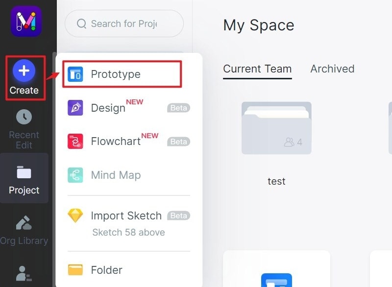
Sign in and create a prototype project. In the guide screenshot, the route is Create → Prototype. Choose a web-sized canvas for the first screen. For an example studio website, start with a Projects page, a Project Details page, an Enquiry form, and a Request Received page. These are design screens, not a live enquiry service.
Use this sample brief in every shortlisted tool: a visitor wants to enquire about “Museum Archive and Reading Room Redesign.” The studio is Northline; the sample visitor is Alex Morgan. Keep the same project title, gallery order and form labels in every version so visual differences do not change the task.
Step 2: Set the Screen Dimensions
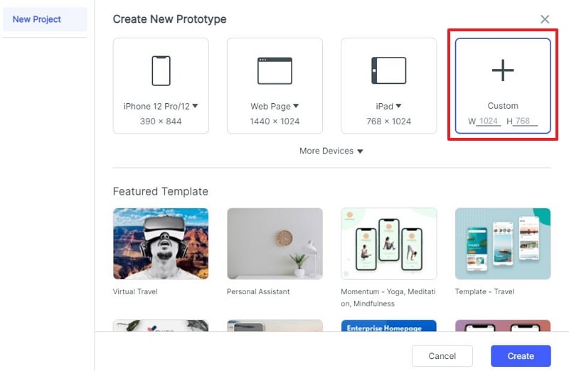
Set the dimensions before filling the page with content. The retained project dialog shows Web Page and Custom size choices. Prepare a wide layout and a narrow layout so you can compare the full navigation with a compact menu. A smaller canvas still needs a deliberate layout; shrinking the wide screen does not demonstrate responsive behavior.
For the exercise, prepare 1440-pixel-wide and 390-pixel-wide layouts. On the narrow version, include both Menu closed and Menu open states; Projects, About and Enquire should remain legible, and Close must return to the same page. These chosen widths are review samples, not a complete responsive-device test.
Step 3: Design Your Website Prototype
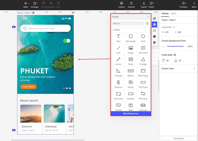
Open the widget library and drag the elements you need onto the canvas. Add the studio name, navigation, project cards, and enquiry fields. Reuse the header across your screens, but include one long project title and a multi-line description so you can spot wrapping problems before visual polish.
Step 4: Add Interactive Links
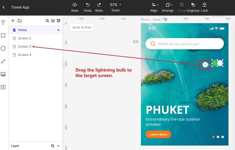
Connect each action to its intended screen or state. The earlier interface shown below uses a lightning-shaped connector dragged to the target screen. Link a project card to its details, the enquiry button to the form, and a completed form to Request Received. Include a missing-email state and a route back to correct details; an incomplete form should not lead directly to a success screen.
Make two explicit enquiry states: “Email missing,” with “Enter an email address” beside the field, and “Email supplied,” with alex@example.com as sample text. Keep Alex Morgan and the project title visible in both. Link the missing-email submission back to the error state; let the corrected example continue to Request Received. If you use duplicated screens, tell reviewers that typing and validation are simulated rather than computed.
Step 5: Inspect the Web Prototype
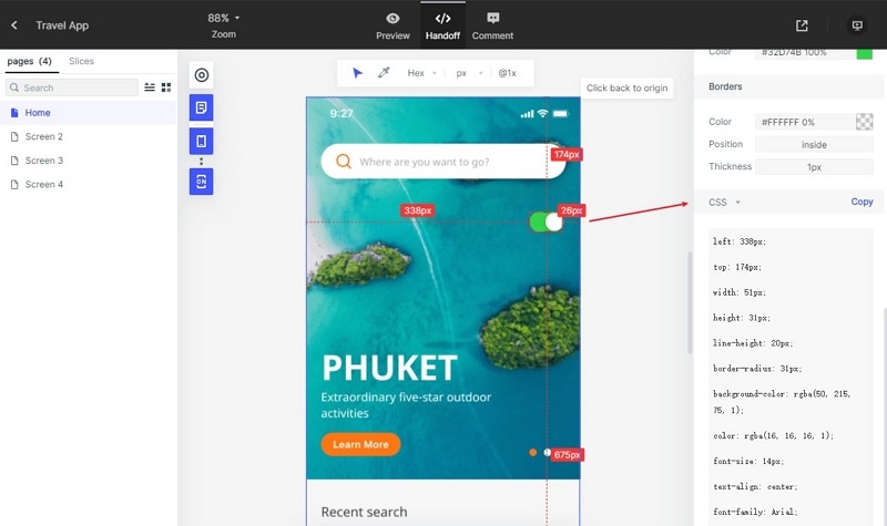
Use the inspection or handoff view to review dimensions, spacing, and available style information. The screenshot shows a Handoff control and CSS-style values; it does not establish that the prototype contains a complete production website. Document which enquiry fields are required and what should happen after submission so developers can implement the behavior.
Step 6: Preview Your Web Prototype
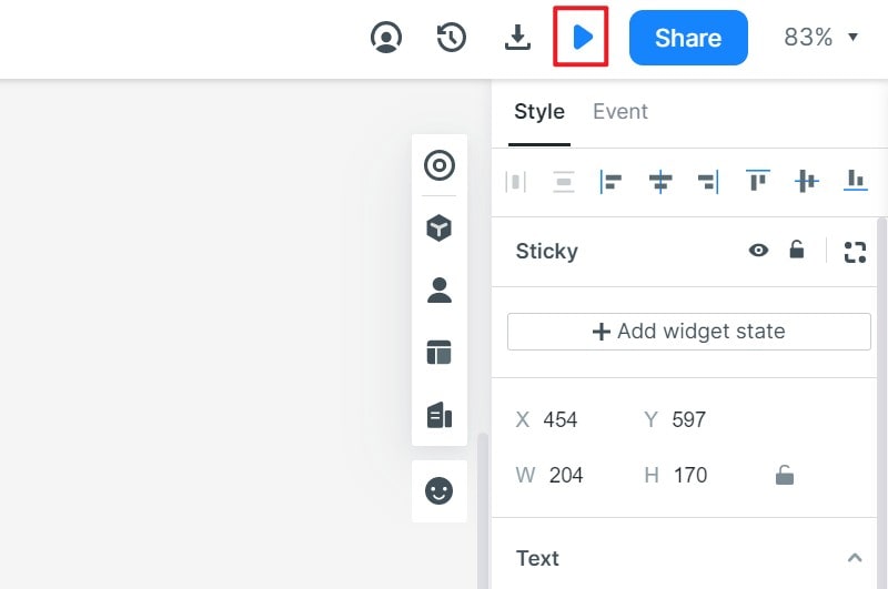
Open Preview and follow the visitor journey from Projects to Request Received, then use Share to invite a reviewer. Ask them to find a project, open its details, and correct a missing email address before submitting the example form. Check the narrow menu and the long project title separately. Record what they can and cannot complete rather than treating an animation or a screenshot as proof that the website works.
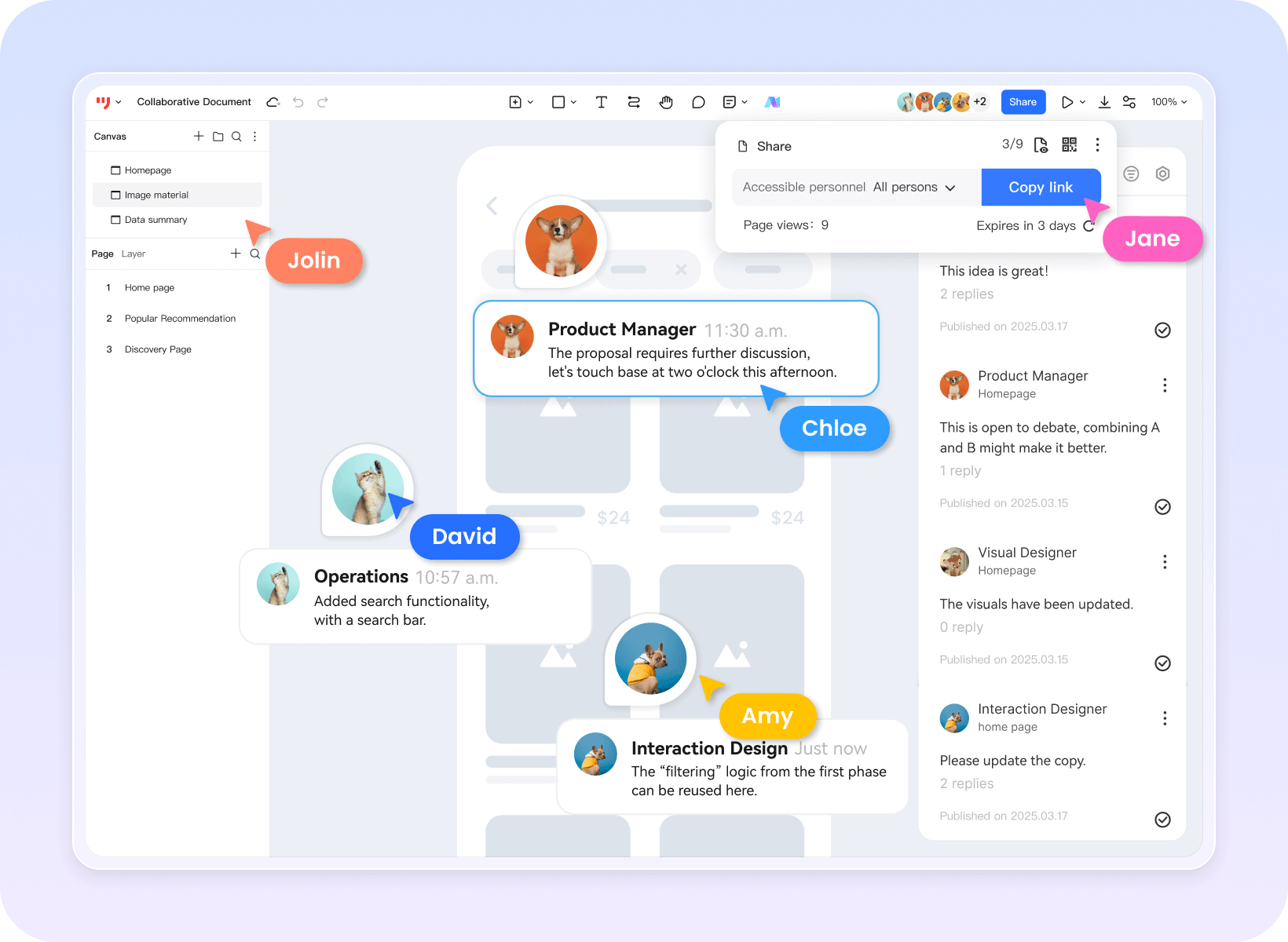
Before inviting a client, open the review link using the access conditions intended for that client. Note whether it needs sign-in and whether feedback can be attached to the relevant screen. The Share label in a product illustration does not establish the permissions or limits of your particular workspace.
2. Balsamiq: Wireframes and AI Prototypes
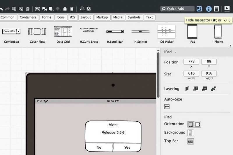
Balsamiq combines wireframes with AI-generated interactive prototypes. You can generate from selected screens, refine the result and share a prototype link. Its Cloud plans use AI credits, and the 14-day trial has a limited allowance.
For the studio brief, start with the gallery and enquiry wireframes, then inspect the generated navigation and missing-email recovery. A generated button is useful only if its action matches the brief. PDF or image exports remain suitable for reviewing structure; use the interactive prototype when the visitor must click through the task.
Pros:
- Reusable UI components help compare page arrangements.
- Reviewers can view and comment without an editing seat.
- PDF or image export suits an asynchronous discussion about structure.
Cons:
- A trial is not an ongoing free editing plan.
- AI generation uses credits; review the generated behavior and remaining allowance before planning repeated iterations.
3. Sketch: Detailed Website UI on a Mac
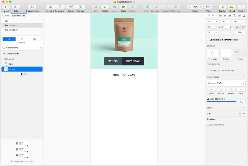
Sketch combines vector-based interface design with prototyping in its Mac app. Its prototyping tools include links, hotspots, overlays, scrolling areas, and fixed elements. That makes it relevant when a website review needs both visual detail and behavior such as a menu opening over the page.
Pros:
- Design screens and connect interactions in the same Mac document.
- Model overlays, scrolling content, and fixed navigation.
- Preview prototypes in the Mac app, web app, or iOS app.
Cons:
- Designing and editing require a Mac; browser review is a different role.
- The subscription and Mac-only license do not include the same collaboration and online-sharing features. The subscription offers a 30-day trial.
4. Figma Design: Shared UI and Prototype Work
Figma Design is a relevant option when the team already maintains its website layouts and components there. Its prototype workflow connects designs into interactive flows and supports overlays and animated component states. Keep the review tied to the visitor task: opening the navigation, finding a project, and returning from its details.
Strengths:
- Move between editing a layout and previewing its interactions.
- Use shared components to keep repeated website UI consistent.
- Share interactive prototypes with reviewers.
Consider before choosing:
- The free Starter plan has limits; advanced prototyping and team capabilities depend on the plan.
- A Figma Design prototype is a review artifact. Publishing a website is a separate workflow, not the result of connecting prototype screens.
5. Flinto: Motion Studies on a Mac
Flinto is a Mac prototyping app focused on animated transitions and micro-interactions. For a website team, it can help specify how a menu, card, or scroll effect should move. Its official workflow includes importing Sketch or Figma designs, previewing on Mac or iOS, and exporting video or GIF. It offers a 14-day trial, followed by a paid license.
Pros:
- Adjust transitions and micro-interactions in a dedicated animation workflow.
- Import existing Sketch or Figma designs.
- Export video or GIF to communicate motion.
Cons:
- Authoring requires a Mac.
- Its documented interactive sharing uses a Flinto file and Mac/iOS viewer; a video or GIF does not let a client click through the website.
Where Photoshop Fits
Photoshop remains useful for preparing photographs, graphics, and static website compositions. Adobe describes Photoshop as an image-editing and design tool. Treat those assets as inputs to an interactive prototype, not as proof of a working navigation or form flow. If you already have a Photoshop composition, preserve it as a visual reference while connecting the visitor journey in a prototyping tool.
How to Choose the Best Website Prototyping Tool
Choose against a small website brief rather than a list of feature names. For the example studio site, the important output is a reviewer journey from a project gallery to an enquiry, with a usable narrow-screen menu and a recoverable form error.
The documented routes differ: Mockitt links editable UI screens; Balsamiq can generate an interactive prototype from wireframes; Sketch and Figma Design connect designed layouts and interaction states; Flinto concentrates on transitions and micro-interactions. Use the same required outcomes below to judge the artifact produced, including when a route needs a separate simulated state.
Use the following factors to compare the result, not just the editor.
Decide What the Website Review Must Answer
If the open question is whether visitors can find the right project, start with page hierarchy and clear labels. If it is whether a menu covers important content on a phone, include the open and closed menu states. A motion specialist such as Flinto is useful only when the motion itself is the question; it does not replace a complete visitor-flow review.
Check the Interactions Your Pages Actually Need
Try the same narrow brief in each shortlisted tool: open Projects, choose a long-titled project, return to the gallery, and send an enquiry. Deliberately leave the email field empty, then correct it. Separately inspect the narrow layout with the menu open. These tasks expose different requirements: navigation, preserved context, validation feedback, and layered content.
| Task to give a reviewer | Expected evidence | What to record |
|---|---|---|
| Open the Museum Archive project, then return to Projects | The long title is readable; the return action reaches the gallery with the expected context. | Wrong destination, lost context or help needed |
| Submit an enquiry with no email, then correct it | The missing-email message appears; name and project remain visible; only the corrected example reaches Request Received. | Simulated screen links versus working input logic; any lost field values |
| At 390px, open and close the menu | Links and Close remain reachable; the menu does not trap the reviewer on an unrelated screen. | Overflow, obscured content or unreachable controls |
| Open the agreed review deliverable outside the editor | The reviewer can follow the required route and provide feedback using the agreed access. | File/link format, sign-in, device and plan restrictions |
Mark each requirement “met,” “partly met” or “not demonstrated,” and attach the relevant screen or link. Keep “not demonstrated” when the output is only a video, static export or unsupported assertion. Record editing time and revision effort only when you actually perform the exercise; no scores are supplied here.
Make the Reviewer's Access Part of the Choice
Send a candidate prototype to someone outside the editing session. Confirm whether they can open it, follow the route, and leave the feedback you need without acquiring the wrong account or seat. A browser preview, an editable design file, and an exported video are different deliverables. Agree which one the client or developer will receive.
Compare the Cost of the Whole Review Workflow
Count editors, reviewers, project limits, and required sharing or export features. Mockitt has a free plan, while Balsamiq, Sketch, and Flinto provide time-limited trials for the offerings described above. Check Mockitt's current plan limits before choosing a team workflow; do not assume the free plan includes every collaboration feature.
For an early content discussion, a wireframe may be enough. For a design review, include the navigation, menu, form, and return paths that a visitor will use. For a motion discussion, make the timing and transition explicit. Choosing the smallest toolset that produces the required review artifact is more useful than paying for capabilities the project will not use.
Before committing, make sure you can reopen the work, share the agreed format, and revise it after feedback. A successful prototype review should leave the team with specific design decisions to implement; it does not publish the site or connect a live form service.
Make each prototype step produce review evidence
For a checkout example, define the starting assumption, create only the screens needed to test it, connect the primary path, and add the error or recovery state that could change the decision. Ask a reviewer to complete the task from the beginning, then record the expected result, observed confusion, and next revision.
| Step | Input | Evidence to keep |
|---|---|---|
| Scope | One uncertain product decision | Decision statement and success condition |
| Build | Minimum screens and states | Connected route and visible labels |
| Review | Known task and starting state | Observed issue and assigned change |