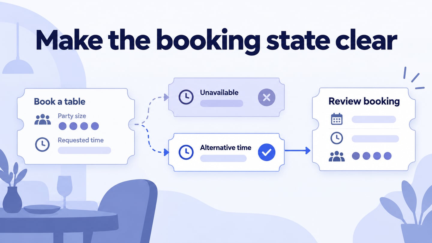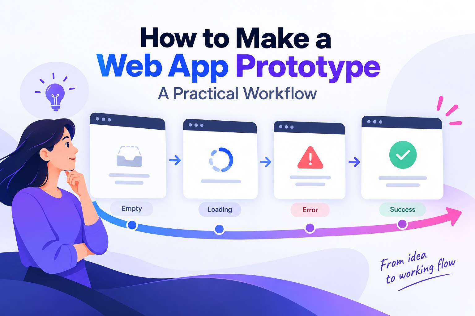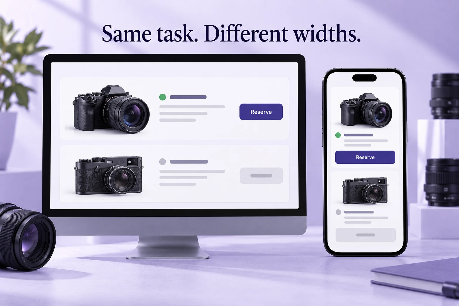
A responsive web app adapts its layout to the available screen space while keeping its essential tasks usable. Flexible grids, images, and CSS rules can turn a wide desktop layout into a narrower mobile layout. Responsive design does not automatically make an application installable or usable offline; those are separate capabilities often associated with progressive web apps, or PWAs.
To plan the experience before development, use Mockitt's prototyping tools to create and connect representative wide and narrow screens. This guide uses an inventory app: a person finds an item, checks availability, and submits a reservation. The task stays the same even when the presentation changes from a desktop table to mobile cards.
What Is a Responsive Web App?
A responsive web application responds to available viewport space and relevant device characteristics. Instead of designing a separate fixed layout for every phone, tablet, and laptop, the team defines rules for how content grows, wraps, reorders, or changes presentation. Flexible layouts, grids, and images are part of that approach.
For example, an inventory table may show item name, category, location, availability, and an action in one row on a wide screen. On a narrow screen, a card can put the name and availability first, followed by the location and reservation action. The information remains available, but the layout gives the task enough room instead of compressing five columns into unreadable text.
MDN's responsive design guide explains the role of flexible layouts, media queries, and responsive media. A breakpoint should respond to a real layout problem, such as navigation no longer fitting or a form becoming too cramped. It does not need to match every device model.
Responsive work also involves content and interaction decisions. Decide what happens to navigation, long labels, filters, dialogs, and error messages. A layout that fits the screen can still be difficult to use if an important action disappears or keyboard focus becomes unclear. Responsive design supports usability; it does not by itself guarantee better retention, sales, or performance.
Responsive Web App vs. Progressive Web App
Responsive and progressive describe different aspects of a web application. Responsive describes how the interface adapts to its display. A progressive web app can offer app-like capabilities, such as installation and offline behavior, using web technologies. An application can be both responsive and a PWA; the team does not have to choose one instead of the other.
For the inventory app, adapting the item list to a phone is a responsive-design task. Allowing someone to reopen previously loaded item details without a connection is an offline-capability task. Reserving stock may still require a server connection, so the interface must explain what can and cannot happen while offline.
Push notifications
Being a PWA does not automatically grant permission to send notifications. A site must request the relevant permission, and support depends on the browser and platform. MDN's Notifications API guide describes the permission requirement. Do not design an unexplained prompt on arrival as if every visitor has already agreed.
In the inventory example, a useful notification might tell someone that a reserved item is ready. First explain that benefit at a relevant point in the task, then account for both allowed and denied states. The reservation should still have a visible status inside the application when notifications are unavailable.
Devices and installation
Both a responsive website and a PWA can be accessed through a URL. Installation is a separate capability, and its availability and presentation vary across browsers and operating systems. A PWA still needs a usable layout on the screens it supports; installation does not automatically fix overflowing tables or small controls.
Plan around the users' actual environment. Someone reserving equipment at a desk may need a dense comparison view, while someone collecting it on a phone may need a clear item identifier and pickup details. Keep both experiences consistent without assuming they must show every element in the same arrangement.
Loading speed and offline behavior
Caching can reduce repeat network work, but a PWA is not automatically faster than another website. Asset size, JavaScript, server response, cache policy, and device performance still matter. Measure the implemented application rather than treating a prototype or a PWA label as performance evidence.
Offline support also needs deliberate implementation. MDN's offline and background operation guide explains how service workers support these capabilities. Define which data is available, how old it may be, and what happens to an action that cannot reach the server. If the application knows a reservation was never sent, show “Not submitted—reconnect to try again.” If the connection drops after sending it, check the reservation's status before inviting a repeat request; neither success nor failure is established by a missing response.
How to Design a Responsive Web Application
Start by researching the people, devices, and tasks the application must support. Identify the main action on each screen and the content required to complete it. For the inventory example, those essentials are finding an item, understanding its availability, and knowing whether the reservation succeeded. Secondary columns can move, but those essentials should remain easy to find.
Mockitt provides editable screens, components, interactions, preview, and sharing for reviewing that experience. The prototype helps you communicate layout and behavior; it is not the deployed responsive application. Developers still need to implement the layout rules, accessibility, data operations, and any PWA capabilities in the working product.
Step 1: Create a Project for the Responsive Web App
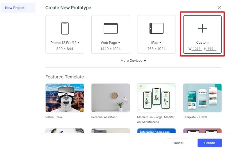
Create a prototype project and prepare one wide screen and one narrow screen. Give them names that identify both the task and the size, such as “Inventory—wide” and “Inventory—narrow.” Choose representative dimensions for the users you identified, then add intermediate states when the content exposes a layout problem.
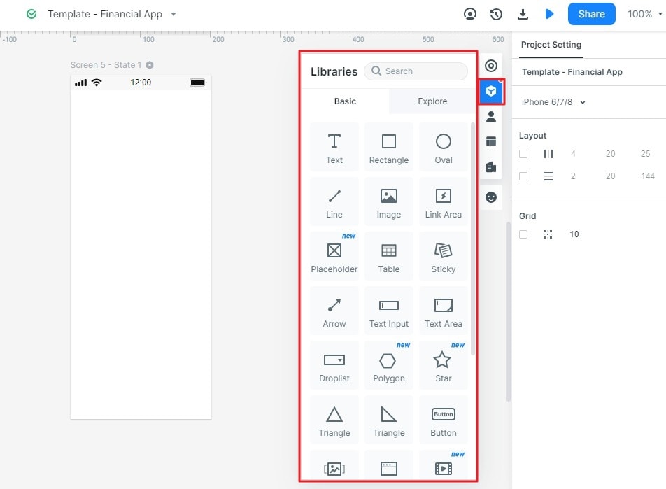
The guide captures below show an earlier Mockitt editor. They illustrate choosing a custom size, placing widgets, connecting screens, and previewing a flow; the layout examples should be adapted to the controls available in your editor.
Step 2: Design the Responsive Web Application
Drag or add components to the screen, then edit their text, size, and position. Build the wide inventory view with a search field, a category filter, and item rows. Use realistic content, including a long item name and an unavailable item, so the design does not depend on every label being short.
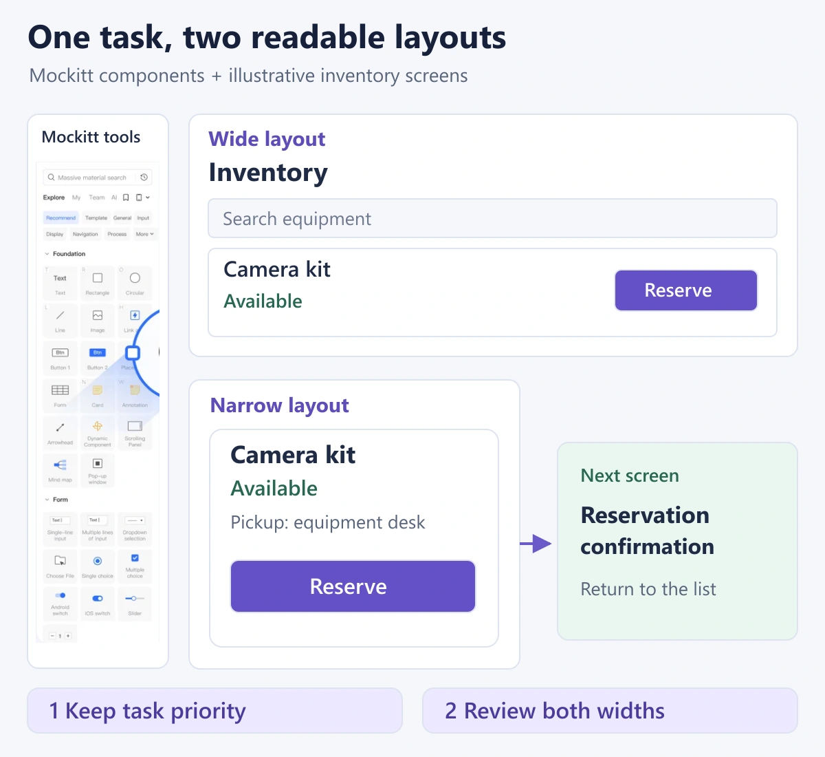
For the narrow view, convert each row into a card. Keep the item name and availability together, move supporting details underneath, and give the reservation action a clear place. If filters move into a panel, show the active filter state when that panel closes. A person should not lose track of why only three items are visible.
Step 3: Prototype the Responsive Web App Design
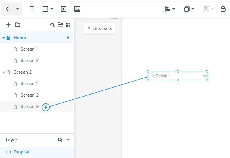
Connect the item action to its details screen, then connect the reservation action to a confirmation or an error state. In the earlier editor shown below, a link handle connects a component to a target screen. Configure the trigger and destination to match the intended action rather than adding transitions only for decoration.
Build the same meaningful states for both widths: available item, unavailable item, reservation confirmation, and a failed submission with a recovery action. Preserve the selected item and filter context when the person returns to the list. Two differently sized frames do not demonstrate automatic responsive behavior; they communicate the intended layouts and transitions for implementation.
Step 4: Preview and Review Both Widths
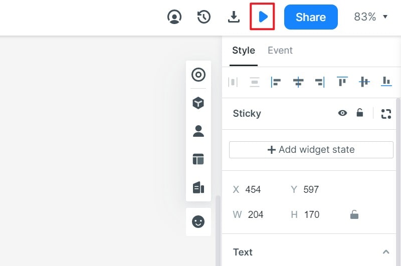
Open Preview and complete the reservation flow from the list at each width. Share the prototype for feedback and record which screen and state a comment concerns. Ask reviewers to find an available item, inspect its details, reserve it, and return to the list. Then repeat with an unavailable item or failed submission to check that the next action remains understandable.
Hand off the rules behind the screens as well as the screens themselves: which elements wrap, when a table becomes cards, how filters retain their state, and where a dialog or error message appears. After development, test the actual application at intermediate widths, with keyboard input, enlarged text, and slow or unavailable networks. That final check establishes whether the responsive behavior works beyond the prototype.