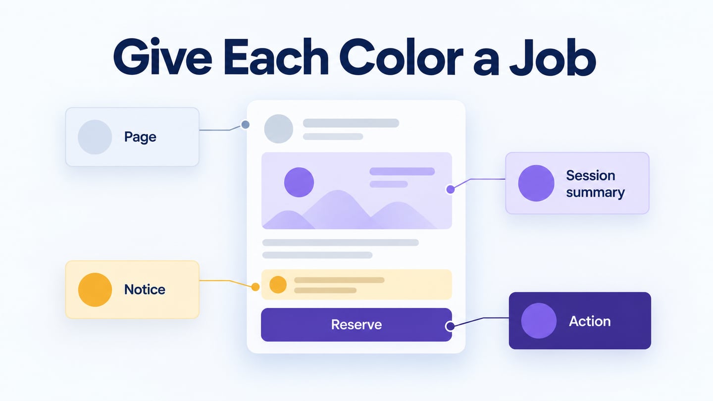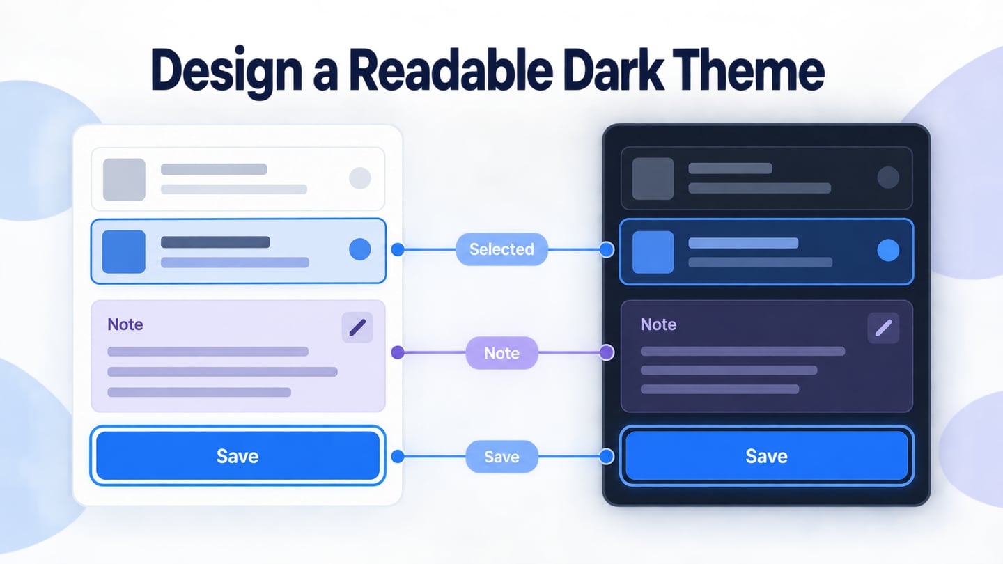
Contrasting colours help distinguish text, controls, and meaningful visual information from their backgrounds. The exact foreground/background pair matters more than a color’s name or brightness in isolation. When building a palette in a UI design tool with reusable color variables, review the important component states as well as the default screen. A visually striking palette is not automatically an accessible one.
Color contrast is one part of accessibility. The ten considerations below retain the wider UX context while separating measurable contrast checks from assumptions about particular palettes.
What does it mean to design for accessibility?
Accessibility concerns whether people with disabilities can perceive, understand, navigate, and operate a product or service. It can also benefit people in varied situations, but those wider benefits should not erase disability-related needs. A design should be reviewed with relevant standards, implementation checks, and people’s actual tasks.
Do not infer a person’s access needs from appearance or demographic labels. Consider low vision, color-vision differences, hearing, motor, cognitive, and other requirements. A single color change cannot address all of them. The purpose is to remove barriers to the task, not to promise that one interface will work identically for everyone.
Areas to consider include:
- Visual
- Auditory
- Mobility
- Cognitive
There is no one palette or shortcut that establishes accessibility. Start with the barriers relevant to the task and inspect how the design and implementation address them.
Use the following considerations during design and again in the implemented interface.
10 Tips to Create Accessible UX Design
These checks are useful for beginners, but they are a starting point rather than a complete accessibility audit.
1.Define Your Audience
Identify who needs to use the interface and in what context. Include people with relevant access needs in research and testing. Age or a persona label is not enough to predict how someone reads a chart, operates a control, or uses assistive technology.
Keep the actual task in view. A person may need to distinguish a warning quickly, enlarge text, or navigate without a pointer. Record those requirements before deciding that a particular visual style is suitable.
2.Learn to make accessibility part of your everyday designs
Build accessible choices into components and review routines. A shared text style, focus treatment, or error pattern can prevent the same problem from recurring across screens. Check changes to those shared elements rather than assuming a design system automatically guarantees compliance.
Include contrast, keyboard use, meaningful labels, and understandable feedback in regular reviews. Automated checks can detect some issues, but they do not replace task-based inspection or testing of the actual interface.
3.Add Adequate Color Contrast
Measure the contrast between the actual text and the background on which it appears. Under WCAG 2.2 minimum text contrast, normal text generally needs at least 4.5:1 and large text 3:1, with specified exceptions. Check the intended size and weight rather than assuming any large-looking heading qualifies.
Light text on a light surface can be difficult to read in many conditions, including glare or low vision. Hue difference alone is not a substitute for luminance contrast. Test text in its real state, including placeholder text, selected items, and messages over images.
Measure each important foreground/background pair. There is no universally safe “color-blind palette” that makes all text and controls accessible. Charts and controls also have requirements beyond the text-contrast criterion, so do not treat a passing text pair as a full-screen pass.
4.Never Use only Colors to Define Something Informative
If a state or instruction is meaningful, provide a cue beyond hue. An error can have a text explanation and an icon; a selected item can have a visible label or mark. WCAG’s use-of-color guidance explains this requirement.
Use descriptive labels, shapes, patterns, or underlines where appropriate. Links do not have to be blue, but they must be recognizable and operable in context. An unexplained red border is not enough to tell someone which value needs correction.
A grayscale preview can reveal some problems with color-only distinctions, but it is only a heuristic. It does not simulate every color-vision difference or establish contrast and accessibility compliance.
Review color in a real task context
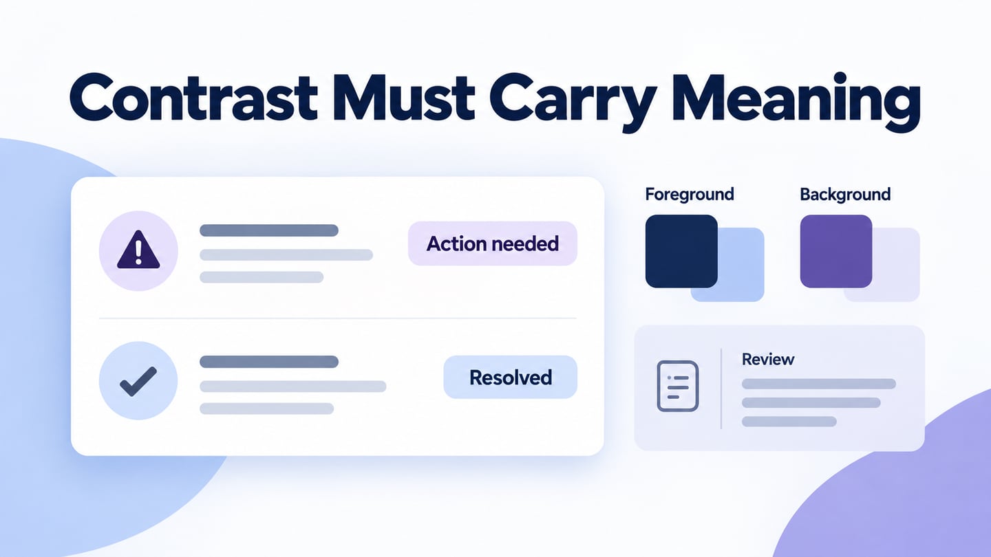
In an illustrative support-ticket list, a red dot and a green dot are not enough to explain which ticket needs attention. Add “Action needed” with a distinct warning icon and the instruction “Provide order reference.” Use “Resolved” with a different mark for the other ticket. Now the state has a name and a next step as well as a color.
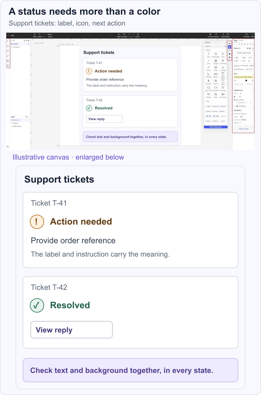
Check the label against its background, then inspect the list without relying on hue. Ask someone to identify the ticket that needs a reply and explain the action. If the text or icon is unclear, revise it before relying on the color treatment. Keep the contrast values in the design record using the actual chosen colors; do not invent a pass result from an illustrative image.
5.Font Weight, Color & Size
Font size, weight, spacing, and contrast work together. Choose text styles that remain readable at the intended size, and test what happens when the user enlarges the text.
Thin strokes and small labels can be difficult to read even when a nominal contrast value passes. Review real content rather than a short sample word, and avoid fixed containers that clip longer text.
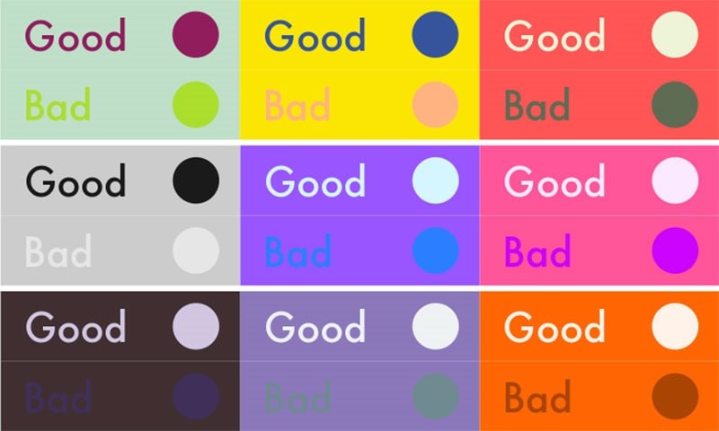
There is no universal 12-point minimum that alone establishes WCAG compliance, and named pairs such as orange/blue are not guaranteed to pass. Check the actual colors, text size, and background. Use consistent action styles without making color the only indication that something is interactive.
6.Use Alternative Text to Define Information
Images need an equivalent way to communicate their purpose when people cannot see them. The right alternative depends on why the image appears in the page.
For informative images, describe the relevant information. For a chart, provide its important data or explanation in accessible text as needed. The W3C alt decision tree helps distinguish informative, functional, and decorative cases; purely decorative images can use an empty alt value.
Do not add a generic description to every decorative element or keyword-stuff the alt text. Warm colors have no special role in making an image accessible. The goal is an equivalent understanding of the information or action.
7. Keep the Important Information Clear
Reduce visual clutter when it competes with the task. Group related information and make important messages easy to find. Simplicity should not mean deleting necessary labels, explanations, or recovery options.
Check whether people can distinguish the primary action, the current state, and any required correction without inspecting every decoration.
Monochromatic and analogous palettes can still contain low-contrast combinations. Judge the actual pair and the meaning of the component rather than treating a palette category as an accessibility guarantee.
8. Evaluate Saturation in Context
Saturation describes a color characteristic; it is not an accessibility score. Both vivid and muted palettes can contain readable and unreadable combinations.
Choose the palette for the task and brand, then inspect the important text, controls, and states. A bright accent should not make surrounding information harder to read or turn every element into a competing call to action.
Avoid assuming that all saturated colors are harmful or all muted ones are safe. Evaluate the foreground/background relationship and how much emphasis each element needs.
9.Add Precise Markup to the Content
Use real heading structure in the implementation, not only larger text. A visual hierarchy and a semantic hierarchy should describe the same organization of the content.
Use appropriate HTML elements and accessible names for controls. Screen readers depend on the programmatically exposed structure and state, which a static mockup cannot supply. Review the implemented accessibility tree and interaction behaviour with developers rather than inferring them from a screenshot.
10. Provide Appropriate Media Alternatives
Accessibility is not an 80/20 split between visual and other needs. Consider what each medium communicates and how someone can obtain the same important information through an appropriate alternative.
Audio can be useful, but adding narration is not a substitute for accessible text, and it should not play unexpectedly. Provide captions or transcripts for relevant media and controls that people can operate.
A person may prefer reading, listening, enlarging text, or using assistive technology. Keep the essential information available and the route to it understandable, rather than assuming one format suits everyone.
Conclusion
Begin with readable content and understandable states, then check the implemented experience.
The retained color-pair illustration is a visual comparison, not a WCAG pass/fail table. Its “Good” and “Bad” labels should not replace measurement. Record the actual colors and component states you test, and revisit them when the palette or typography changes.
Contrast is one important part of accessibility. Meaningful text alternatives, semantic structure, keyboard operation, and usable feedback need their own review. Use the ten considerations to identify gaps, not to declare a complete audit finished.