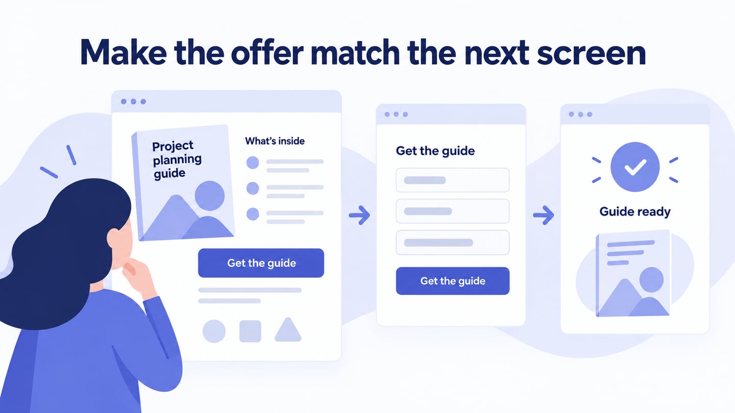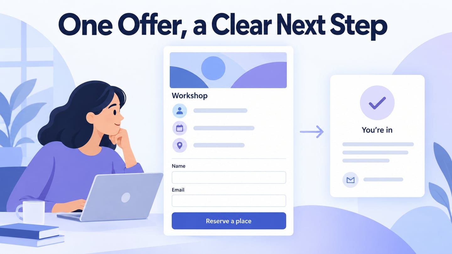
A landing page is designed around a particular visitor context and next action, such as registering for a workshop or requesting a demonstration. It is not necessarily the homepage or every first page someone visits. Use UI layouts and components for the landing page to make the offer, relevant information, and action understandable. The interface can support a decision, but it does not guarantee traffic or conversions.
Use Mockitt to Plan the Landing Page Interface
Choose the design tool according to the collaboration and review work you need. For a landing page, the useful output is a clear arrangement of content and controls, including mobile and error states. A visually polished hero section alone is not enough if the form or next step remains confusing.
Mockitt can help develop those layouts and share the intended interactions for review. The original capability areas below remain useful when tied to a concrete page task rather than unsupported speed or security claims.
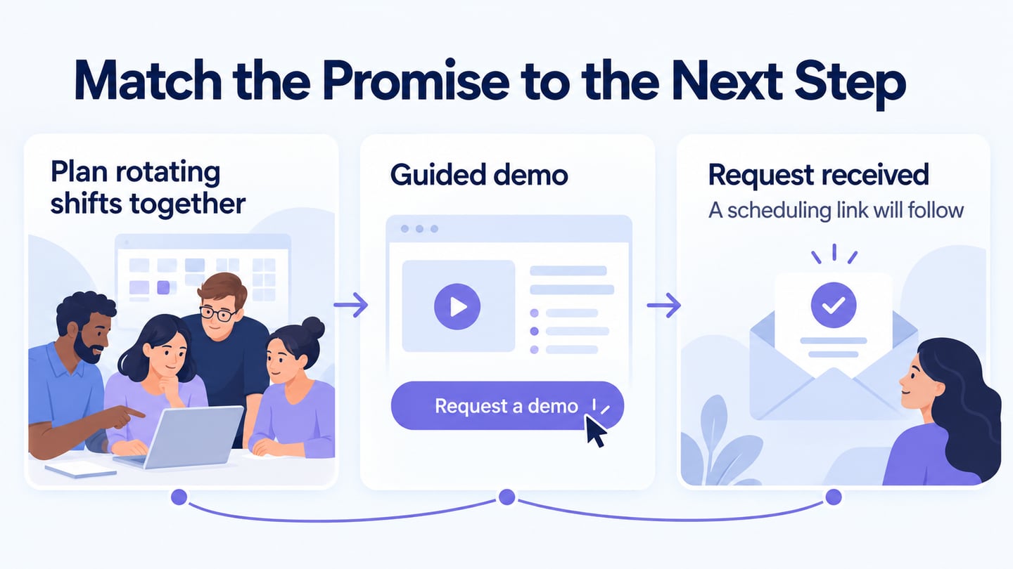
 Earlier Mockitt workspace capture; the workshop scene illustrates this article’s landing-page task.
- Asset library: use relevant components and icons, adapting them to the offer. Keep repeated fields, buttons, and spacing consistent through shared components where appropriate.
- Design: arrange the content and states before implementation. Use realistic labels and text lengths so the design exposes wrapping and hierarchy problems.
- Presentation: preview the intended sequence and ask reviewers specific questions about the offer and action. A demonstration is not a substitute for testing the implemented page.
- Handoff: communicate layouts, states, content requirements, and unresolved questions. Verify current import and export support for your workflow; do not assume a visual file provides complete production code.
- Cloud workspace: use supported browser access and suitable permissions. Maintain appropriate backups rather than assuming online storage guarantees recovery or security.
- Collaboration: assign feedback to the relevant content, design, or implementation owner and record how the issue was resolved.
How to Create Landing Page UI Design
The original workflow—project, design, preview, and sharing—works best when the offer and action are defined before arranging the screen.
Create a project for the landing page and prepare the important wide and narrow layouts. Name the intended action and include the form, validation, pending, and confirmation states needed to review it.
Design a workshop-registration landing page
For an illustrative research-interview workshop, place the offer “Plan a useful research interview” above the details that affect registration: who it is for, how it is delivered, and what the participant should bring. Use one form with visible Name and Email labels and a “Reserve a place” action that matches the offer.
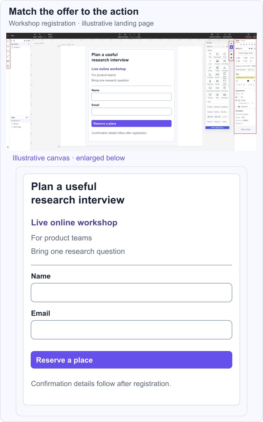
The confirmation should explain the next step rather than repeating the same promotional claim. If a required field is missing, identify that field and preserve the information already entered. This example describes a proposed interface, not a real scheduled event or a measured conversion result.
Design the page around its information hierarchy: offer, decision details, relevant supporting evidence, and action. Arrange these according to the task rather than forcing every page into the same number of sections.
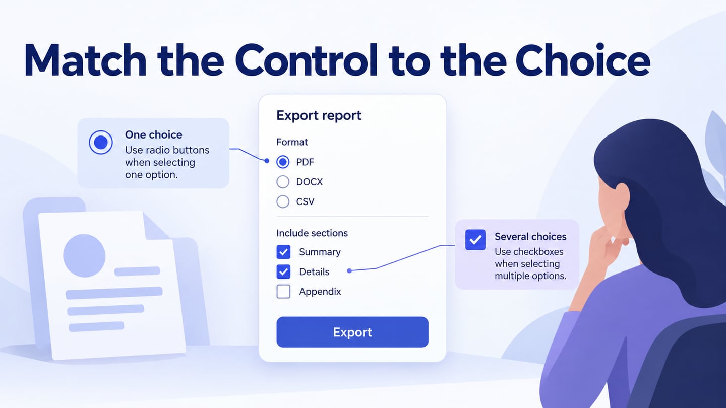
- Add components for headings, media, form fields, and actions. Use persistent labels, distinguish required information, and avoid relying on placeholder text alone. W3C’s form-instruction guidance explains why people need the relevant information while completing and reviewing the form.
- Connect the form and confirmation in an interactive landing-page prototype. Include validation and a recoverable failure state. Keep the action label and destination consistent; a registration action should not unexpectedly send the person to an unrelated generic page.
- Add internal notes about required data, submission rules, and content ownership. Keep those notes separate from public instructions. Record any dependency on a real booking, email, or payment service so a simulated success is not mistaken for a working integration.
- Use transitions only where they explain a state change. Do not delay access to the offer or form for decorative animation. Review reduced motion and loading behaviour in implementation.
Preview the important layouts with realistic text. Check that headings wrap cleanly, the primary action remains readable, and the keyboard does not hide the field or error being addressed. Ask a reviewer to explain the offer and expected result before activating the action.
Share the design with the relevant team and collect feedback on those concrete questions. Resolve unclear labels, missing details, and inconsistent states before publishing. In the implemented page, verify submission behaviour, accessibility, performance, and server-side validation separately.
Useful Tips for Landing Page UI Design
Use the following five original design themes as review questions. Their value comes from how well they support the offer and task, not from a promise that one visual formula will improve every page.
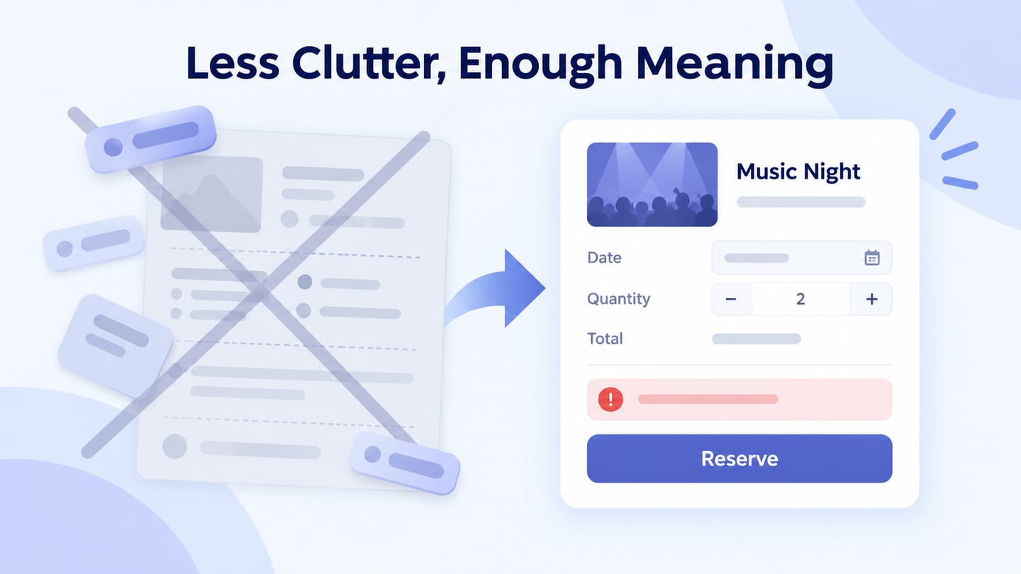
- Clear hierarchy: group related content and make the main offer recognizable. A clean page can contain substantial information when that information answers the visitor’s questions. Remove visual noise and repeated promotions, but do not hide conditions or important details just to make the page shorter.
- Specific headline: explain the offer in language the audience understands. There is no universal ten-word limit. Prefer an accurate title that wraps well over an attention-grabbing phrase that leaves the subject unclear. The supporting description should add useful detail rather than repeat the headline in different words.
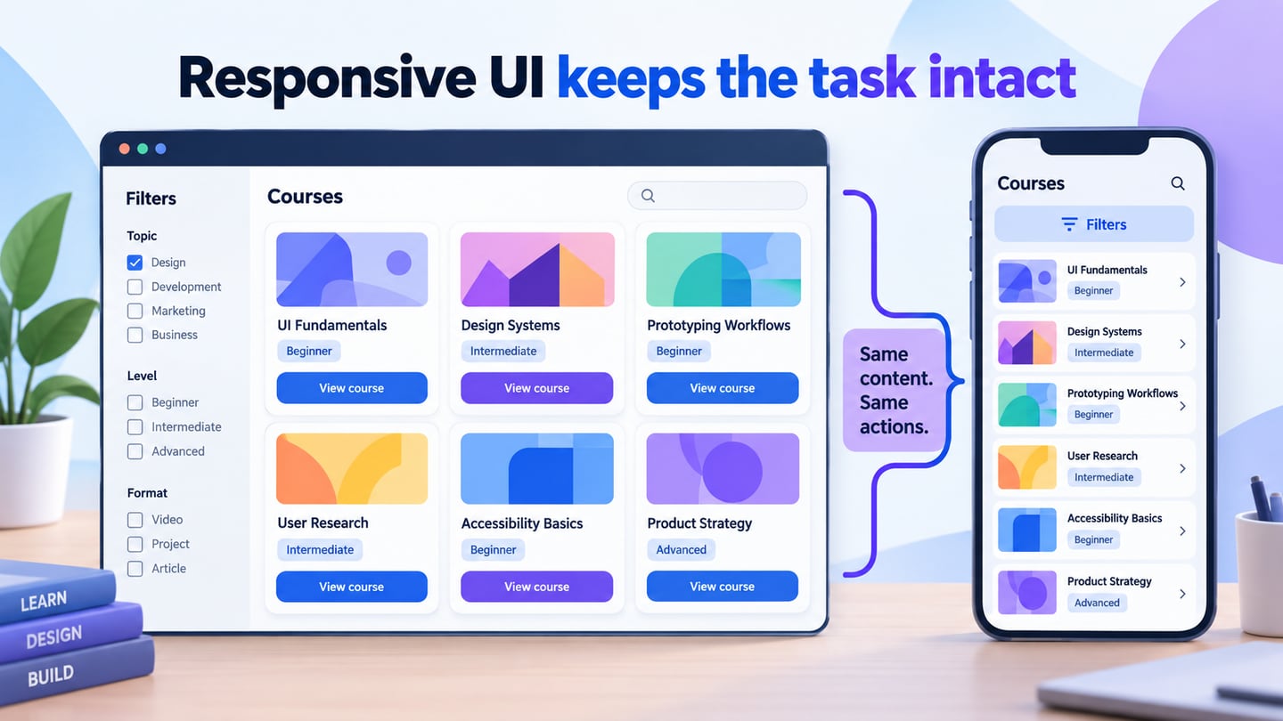
- Responsive layout: check the complete task on narrow screens, including the form, errors, and confirmation. Stack columns intentionally and preserve reading order. The live page also needs appropriate image delivery and reliable interactions; a mobile-shaped mockup is not evidence of live performance.
- Purposeful imagery: use an image that explains the offer or shows relevant context. Preserve its aspect ratio and provide an appropriate alternative for informative content. Decorative color does not establish that an offer is credible, and stock imagery should not be presented as proof of a real customer result.
- Necessary content and restrained actions: give the visitor enough information to decide, then make the next step clear. Repeating a suitable action after a long section may help, but a cluster of competing buttons can obscure the purpose. Keep labels consistent when the action is the same.
Check the page beyond its first screen
For the workshop example, review the offer, required fields, error, pending submission, and confirmation together. Check that the page does not claim a place has been reserved before the service confirms it. The W3C validation guidance also distinguishes client-side assistance from the server-side validation needed by the implementation.
After release, evaluate the actual task and page behaviour with appropriate evidence. Use observations to locate confusion and verified analytics to understand outcomes. Do not attribute a change in registrations to a new button color without a suitable comparison.