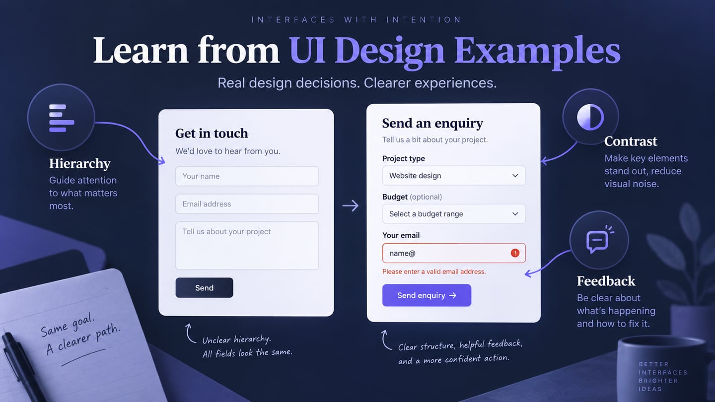
UI design shapes the controls, content and visual feedback people use in an app or website. These ten examples examine five useful approaches and five pitfalls, from visual hierarchy to button states. The retained screenshots are historical references: they support observations about what is visible, not claims about current websites or measured conversion rates.
What Makes a UI Design Example Useful?
An interface can feel welcoming through its layout and visual style, but its job also includes helping someone understand an action and its result. A striking homepage and a clear error message solve different problems. Judge each example against the task it is meant to support.
Look beyond appearance to labels, component states and content priority. Ask what the person needs to notice first, what they can do next and how they will recognize the outcome. A screenshot can reveal hierarchy and alignment; keyboard behavior and task completion need separate checks.
For each example below, separate the visible design choice from the conclusion you would need to test. Then transfer the principle to your own content rather than copying another website’s artwork or assuming its style fits your audience.
Five UI Approaches Worth Studying
1. Give the Main Message a Clear Visual Focus
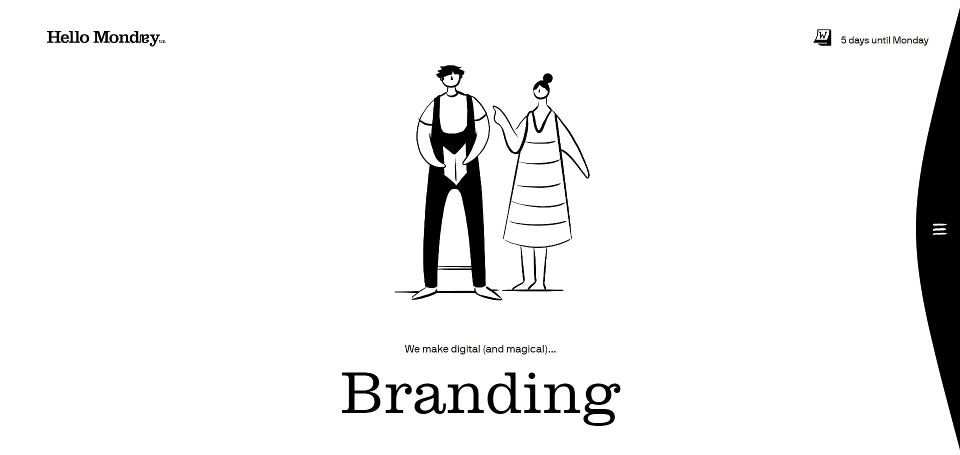
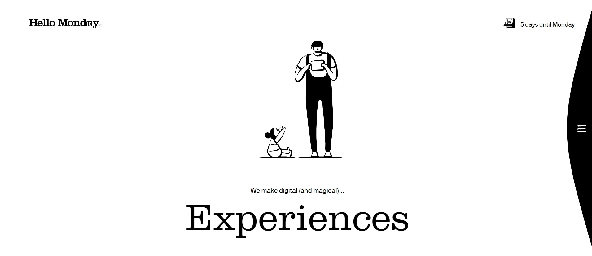
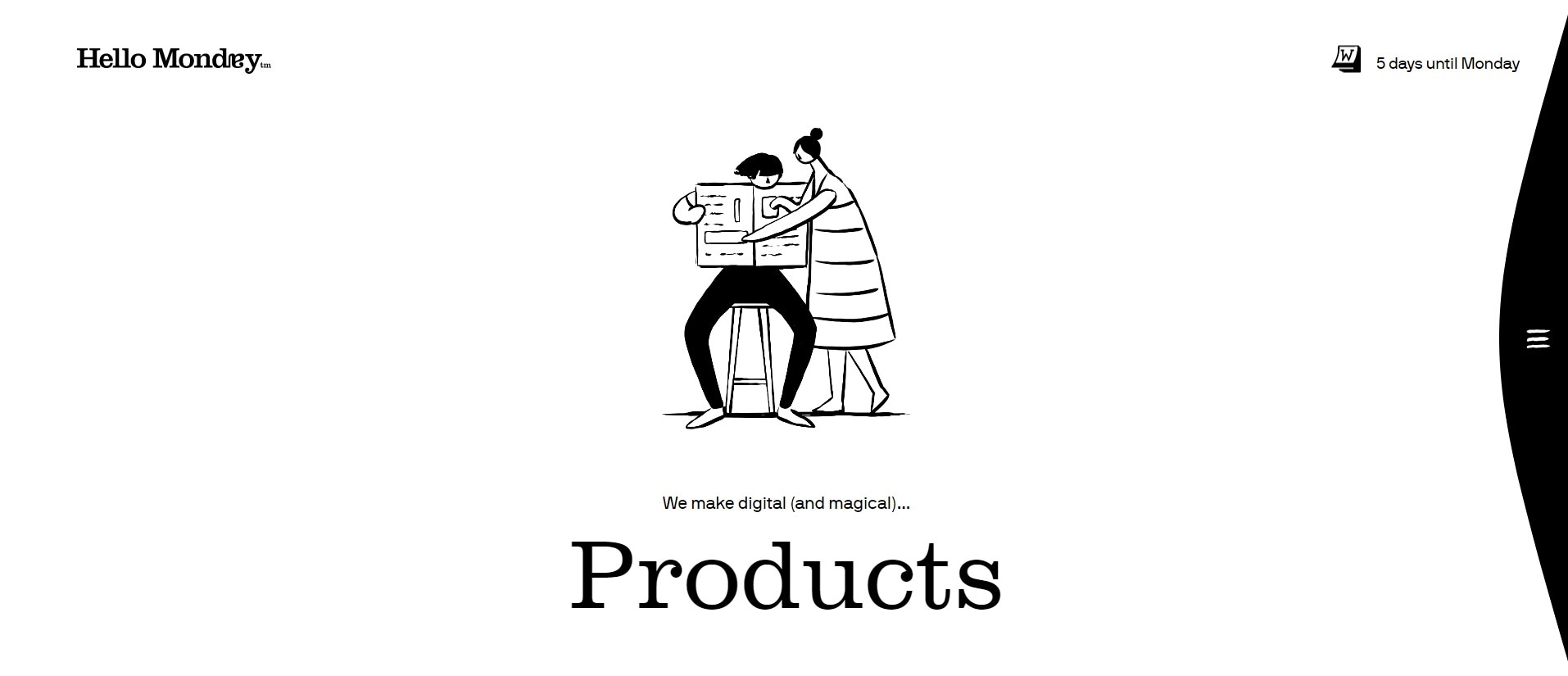
The three archived Hello Monday screenshots show Branding, Experiences and Products. A white background and a small number of central elements give each message room. The relationship between the words and the illustration is the useful design detail to study.
This approach can establish a strong focal point, but empty space alone does not establish that visitors understand the service or know where to go next. In your own design, check whether the main message, navigation and next action remain recognizable at different screen sizes.
2. Use Color to Differentiate Content Without Losing Consistency
The archived Dropbox examples use different background colors across a homepage and feature pages. They illustrate how a site can distinguish sections while retaining familiar navigation and typography.
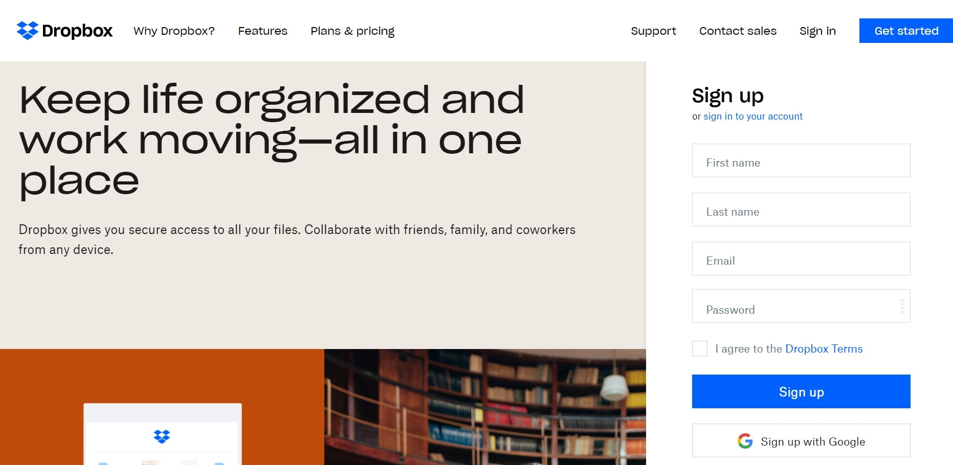
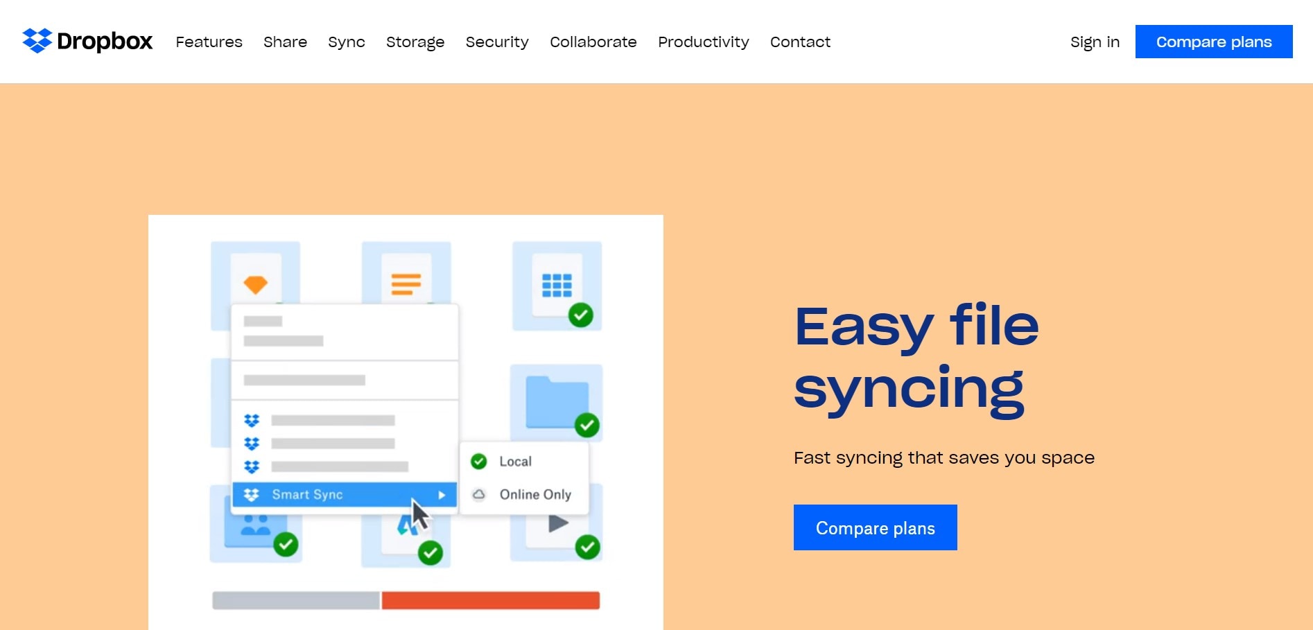
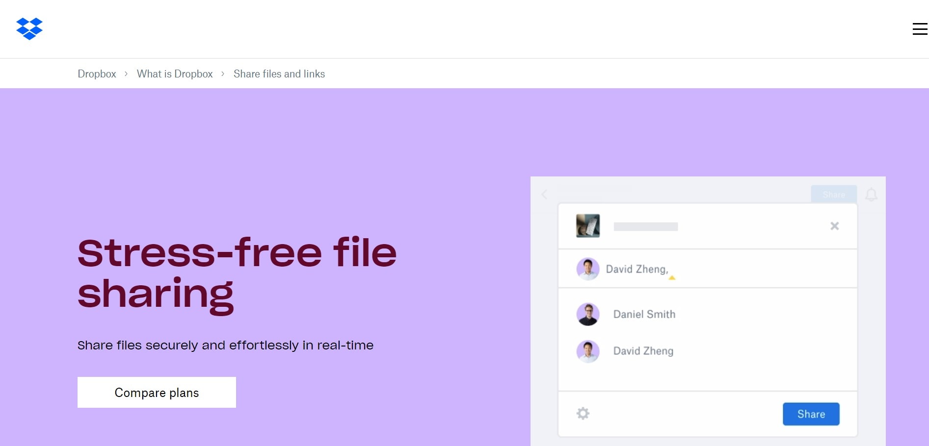
Notice the role of color alongside headings, illustrations and signup controls. When adapting this approach, keep recurring actions and status meanings consistent; a new background should not make an important label difficult to read.
Use the page topic to justify a color change. Do not rely on color alone to tell readers which feature they are viewing, and do not assume that a more unusual palette improves engagement.
3. Use Space to Connect Explanation and Evidence
Available space varies with device, viewport and zoom. A useful layout prioritizes the explanation and supporting visual without making either dependent on a fixed desktop width.
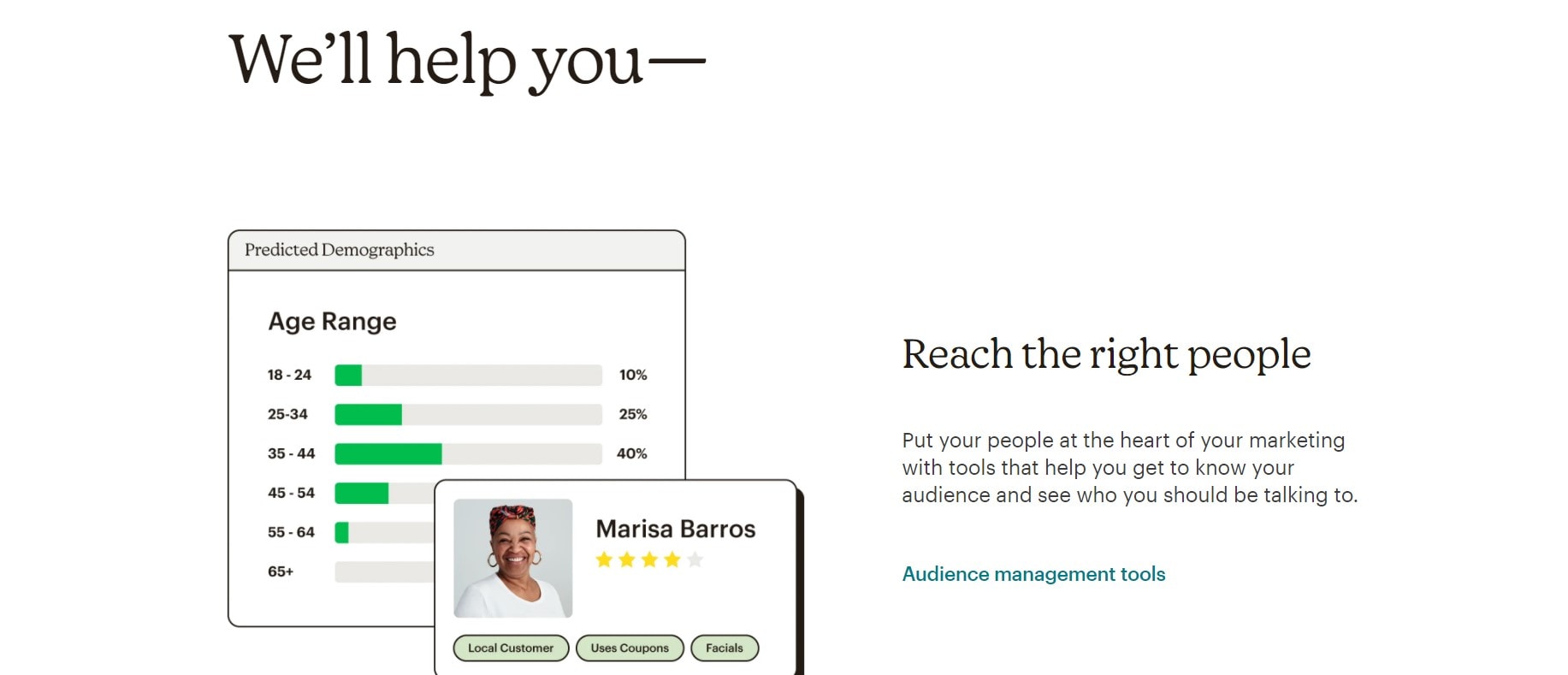
The archived Mailchimp screenshot pairs text with a product illustration about audience organization. The visible lesson is the relationship between explanation, example and action. A static illustration is not a real-time demonstration or proof that a particular workflow succeeds.
4. Make Buttons Communicate Their Purpose
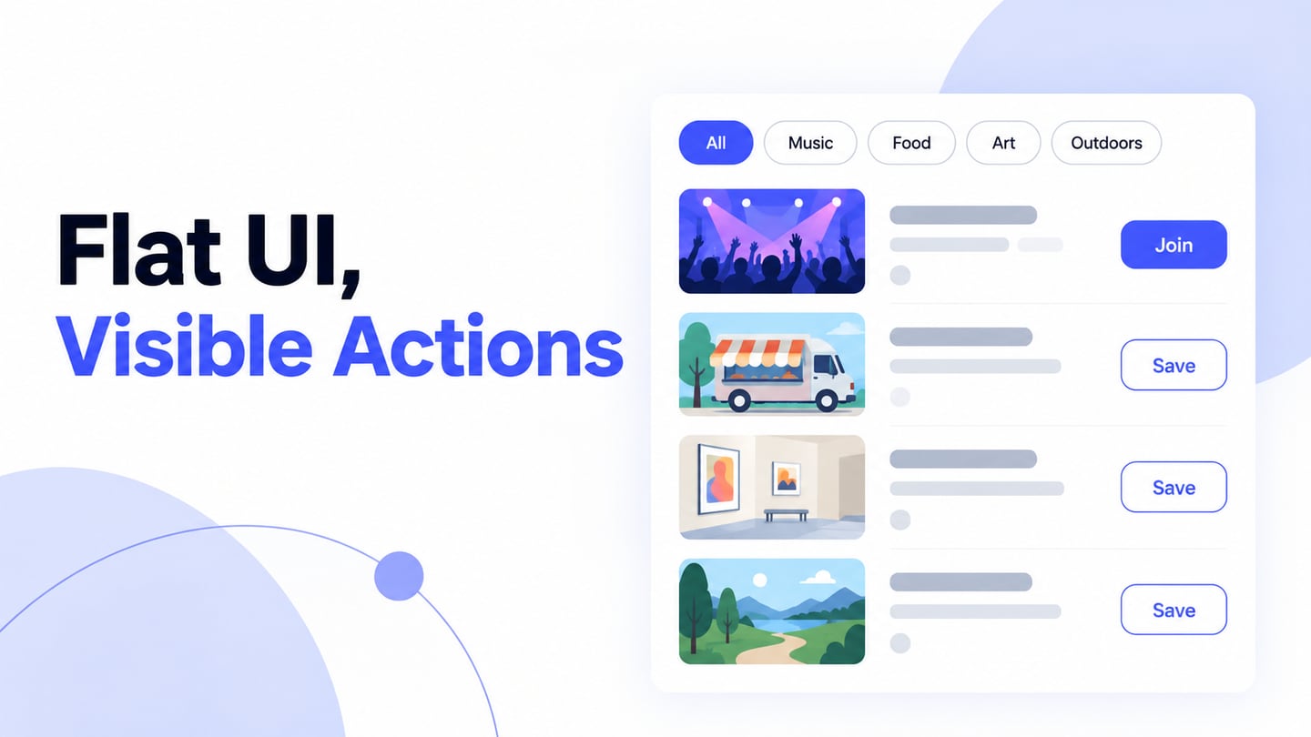
A button needs a recognizable shape, a meaningful label and a position that fits the task. The historical button collections below show a range of visual treatments. They are style references, not a recommendation to use every effect or to recreate obsolete platform controls.
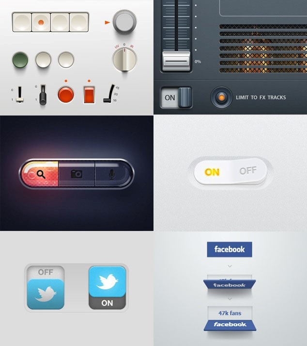
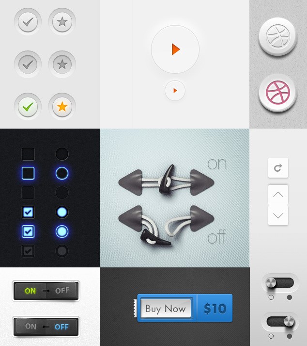
Compare the labels and visual hierarchy before the decoration. “Send enquiry” explains more than “Go”; a secondary “Save draft” should remain visible without competing equally with submission. Evaluate focus, loading and disabled states as well as the default button.
5. Give Illustration and Motion a Clear Role
The archived Cognito page pairs an illustration with a short explanation of its service. The composition is worth studying for how imagery relates to the message, rather than treating animation as a requirement for good UI.
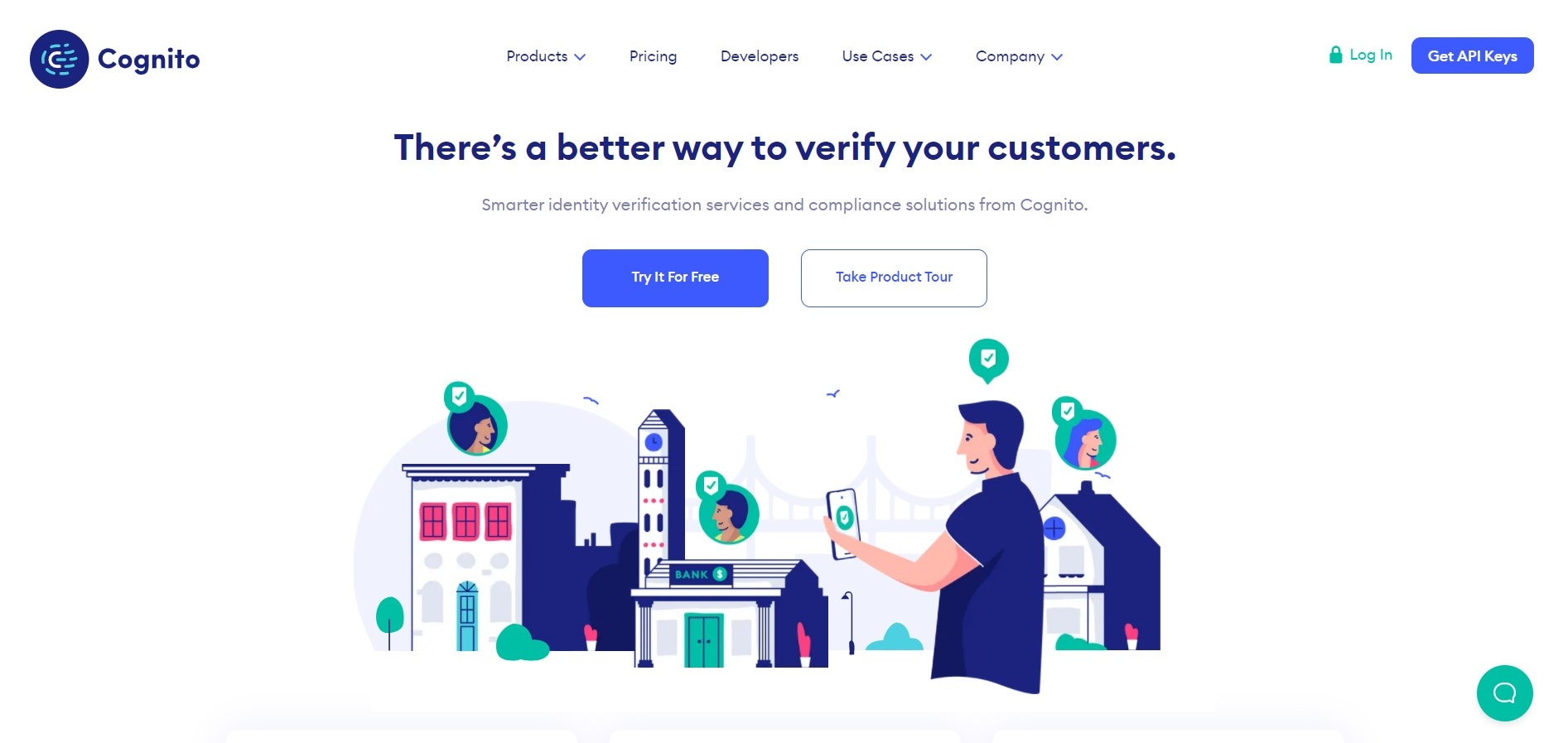
This still image does not show how motion behaves. If you add animation to a similar design, decide what it explains, check whether it delays the main task and provide an appropriate reduced-motion experience. Essential information should remain understandable without the animation.
The common lesson is to give each visual choice a purpose. A design tool helps you build and compare alternatives, but the usefulness of a choice depends on the content, audience and task.
Five UI Pitfalls to Check
1. Insufficient Contrast
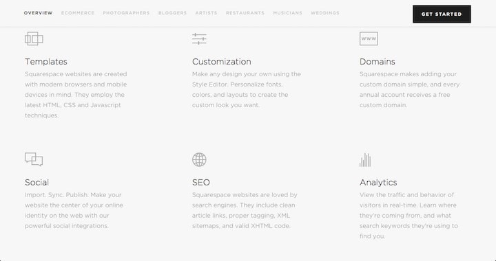
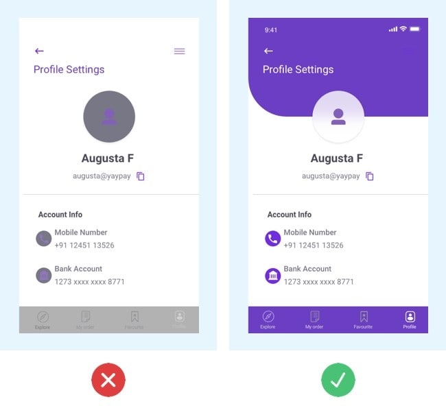
The pale text and backgrounds in these historical examples invite a contrast check. A compressed screenshot is not enough to declare a live page compliant or noncompliant. Inspect the actual foreground and background colors, text size and component states in the design or implementation.
For ordinary text, WCAG’s minimum contrast guidance specifies 4.5:1; qualifying large text uses 3:1. Review applicable exceptions and other accessibility requirements separately. In a form, check labels and error text as well as the main heading.
2. A Layout That Does Not Reflow
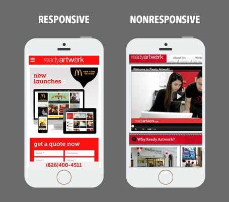
The phone comparison contrasts content fitted to a narrow viewport with a layout that remains too wide. Check whether people can read the page and reach its controls without repeatedly moving sideways through ordinary text.
Vertical scrolling is normal and does not by itself make a page unusable. The issue is whether the layout adapts without losing information or function. WCAG’s reflow guidance also recognizes content, such as certain tables, that needs a two-dimensional layout.
3. Inconsistent Alignment and Grouping
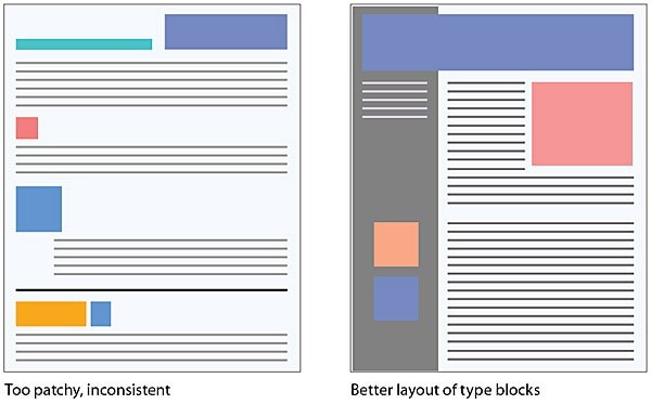
Repeated content benefits from a consistent spacing and typography system. Use alignment to show which label belongs to which value, and use spacing to distinguish separate groups rather than treating every gap as decoration.
The schematic layouts compare scattered elements with a clearer grid. A grid supports order, but alignment alone does not establish usability. Check the reading order, heading hierarchy and relationships between controls, especially when the layout stacks on a small screen.
4. Missing or Ambiguous Component-State Feedback
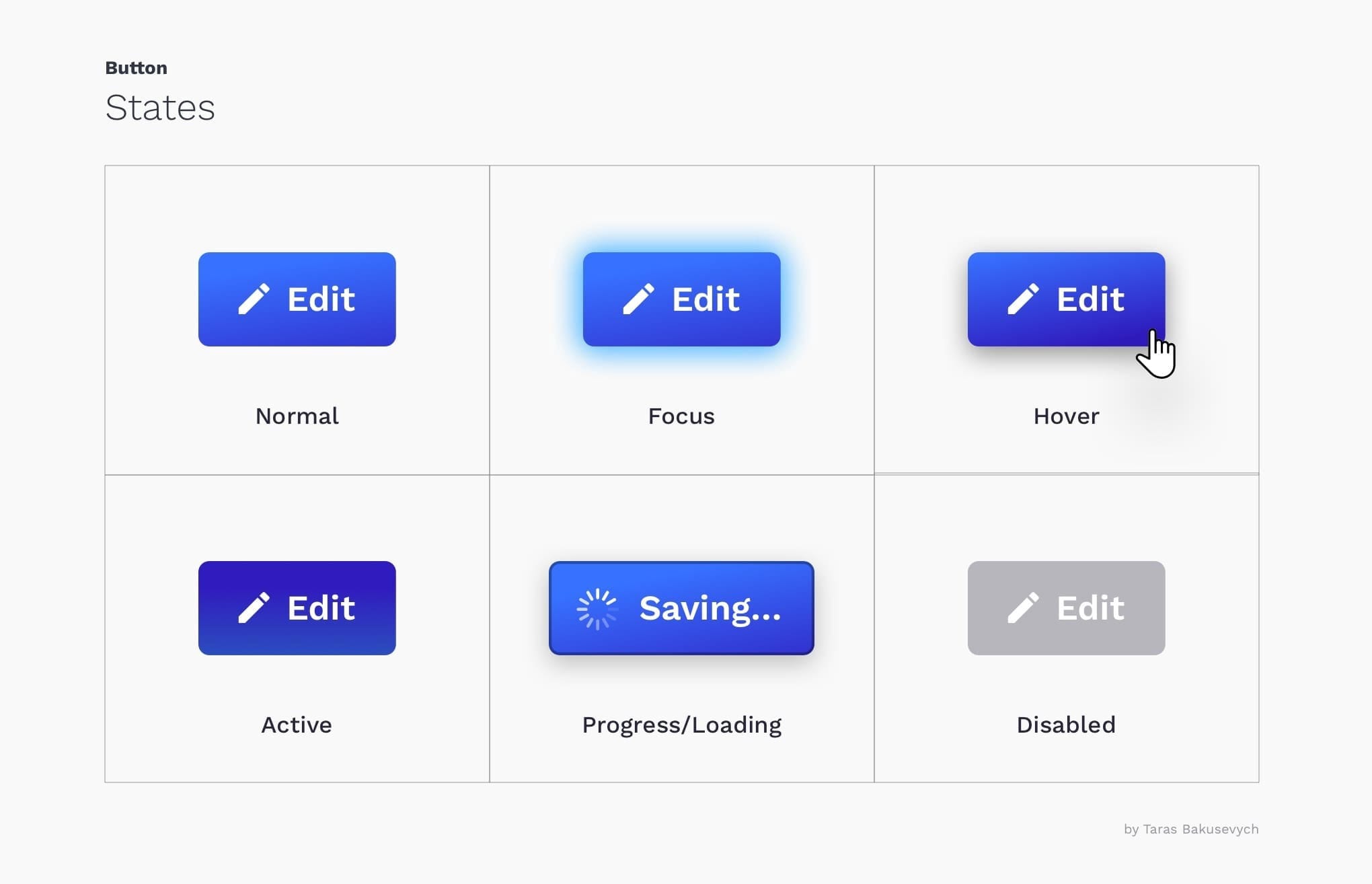
A control needs to communicate more than its default appearance. Keyboard focus, activation, loading and unavailability are different states, and a person should be able to understand the state relevant to their action.
The illustration shows states of the same “Edit” action—normal, focus, hover, active, loading and disabled—not six unrelated actions. A visible focus indicator helps keyboard users locate the control. Loading feedback should explain that work is in progress; do not use a color change alone to convey every state.
5. Dense Content Without a Clear Reading Structure
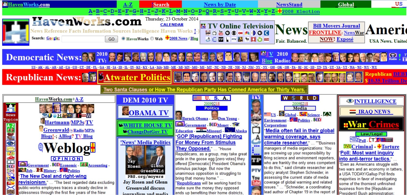
A page can contain substantial information and still be useful. The problem is density without hierarchy: competing headings, unexplained groups or too many equally prominent actions make it harder to identify what matters for a task.
The archived HavenWorks homepage is a historical example of a dense composition, not a claim about a current site. Study how many elements compete for attention. For a content-heavy page, introduce meaningful sections and labels before deciding to remove information that readers may need.
These pitfalls are prompts for inspection, not a substitute for observing users. Apply them to a small, realistic interface so the result can be reviewed against an actual task.
Apply the Examples to a Studio Enquiry Form
In the Mockitt design workspace, create a proposed enquiry form for a small design studio. Use “Project type,” “Budget” and “Email,” followed by “Send enquiry.” Keep the same sample content in each variation so reviewers compare the hierarchy and feedback rather than different wording.
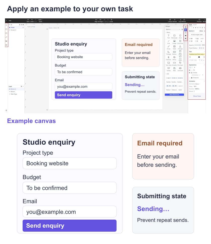
Start with two visual alternatives: one in which labels, help text and buttons all have similar emphasis, and one with a clearer heading, grouped fields and a distinct primary action. Ask a teammate to explain what information is required and what submission will do before giving them hints.
Use reusable field and button elements to keep spacing and typography consistent. Add an empty-email error and a submitting state. Label the error near the field and preserve the information already entered; do not communicate the error only with a red border.
Connect the form to a proposed confirmation in the prototype workflow when you need to review the sequence. The visible result can say “Enquiry received” as a simulated state. It does not prove that a message was delivered or that a live backend validated the address.
Compare the same form at a wide and narrow size. Check whether the labels remain readable, the error stays beside its field and the primary action remains reachable. Reusing components reduces accidental variation, but inspect each instance rather than assuming reuse guarantees correctness.
Keep the reviewed version and record concrete observations: which field the reviewer skipped, whether they noticed the error and what they expected after submission. Verify color contrast from the actual colors, and test keyboard and assistive-technology behavior in the implemented form. A visual prototype cannot certify those implementation details.
Choose the Principle, Then Verify the Result
The examples are useful when they lead to a specific decision: a clearer grouping, a meaningful action label or an understandable state. Avoid classifying an entire website as good or bad from one image; explain which task and design detail you are evaluating.
For the studio form, retain the variant that makes the required information and next action clearer in review. Document unresolved behavior for implementation, including validation and message delivery. That is a more useful outcome than copying a fashionable button or background.