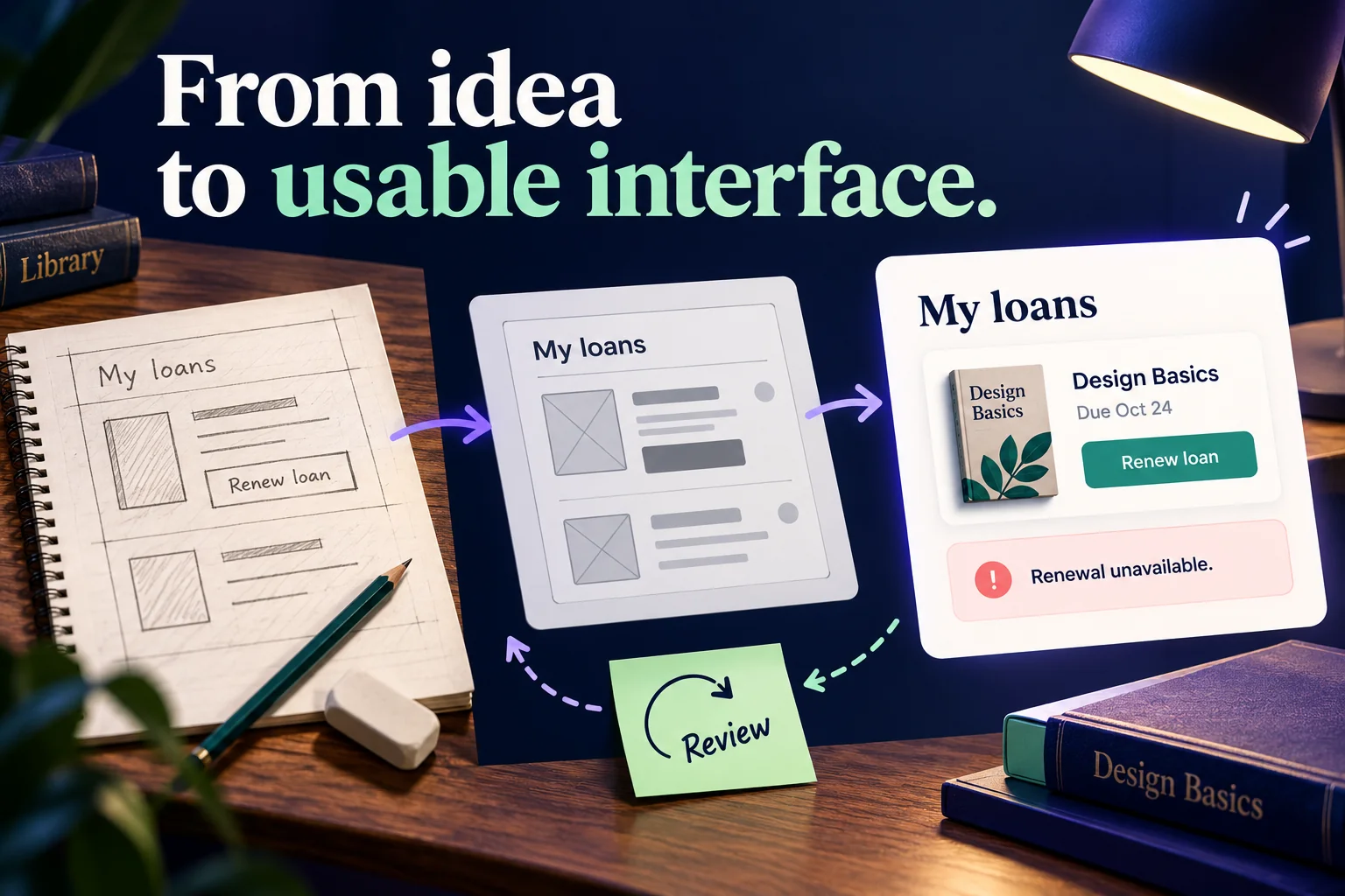
A user interface design process turns research about a task into screens people can understand and use. Start with the users and their goal, organize the information, choose appropriate controls, develop the visual design, build a prototype, test it, and specify the behavior for implementation. Research and testing can send you back to an earlier step; the process is not a one-way production line.
Use the evidence you have rather than assuming that an attractive screen will solve the problem. In a UI design workspace such as Mockitt, components and shared styles help turn those decisions into a consistent interface. The tool supports the design work; the task, content, and behavior still need to be defined.
Selecting User Interface Elements
UI elements give people ways to enter information, move through a service, understand its state, and work with related content. Four useful groups are input controls, navigation controls, informational components, and containers. Some elements serve more than one role, so choose them for their behavior rather than forcing them into a rigid category.
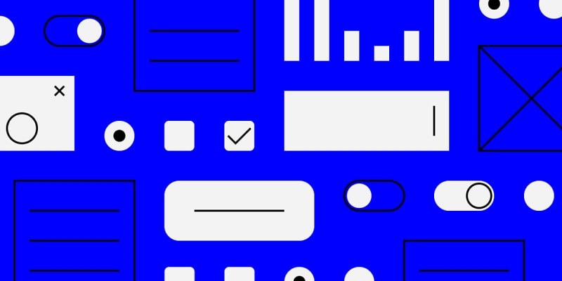
Input controls: Text fields, checkboxes, radio buttons, selects, and toggles let people provide or change information. Match the control to the decision: radio buttons usually represent one choice from a set, while checkboxes can represent independent selections. A button initiates an action; its label should describe that action.
Navigation controls: Links, menus, breadcrumbs, and pagination help people move through content. Make the current location clear and preserve a predictable route back. A slider that sets a value is an input control, not a navigation control merely because it moves. Search also combines input with a route to relevant results.
Informational components: Progress indicators, notifications, status messages, and helpful instructions explain what is happening. A tooltip can supplement a label, but essential information should not depend on hovering. Decide which message belongs beside a field, which describes the whole page, and which needs attention immediately.
Containers: Cards, sections, tabs, and accordions organize related content. An accordion reveals or hides a section; it is different from a dropdown used to select a value. Do not hide the information people need to decide what to do next simply to make the page shorter.
These elements do more than improve appearance. Their wording, arrangement, and states shape how people complete the task. For forms, the W3C accessibility tutorial explains labels, instructions, related control groups, and feedback. Include these requirements in the design rather than leaving them until the final visual review.
7 Steps in the UI Design Process
Before opening a design tool, clarify what the interface must help someone accomplish. The seven steps below use a library loan-renewal example to show the output of each step. Its borrowing rules are design assumptions, not the policies of a real library.
1. Context and user recognition
Identify the users, their goal, and the circumstances in which they use the service. Consider the business or service requirements alongside the user's needs. Existing support questions, interviews, observations, and service data can help you distinguish a real problem from an internal assumption.
For the library example, the task is to renew a borrowed book before it is due. Find out whether readers usually check loans on a phone, how they learn that renewal is unavailable, and whether they need a receipt. Agree with the service team which conditions affect renewal, such as another reader's request, rather than inventing those rules in the interface.
Output: A concise task statement, the audience, important constraints, and questions that still need evidence. “Make a modern dashboard” is not a substitute for this brief.
2. Navigational and systemic interface design
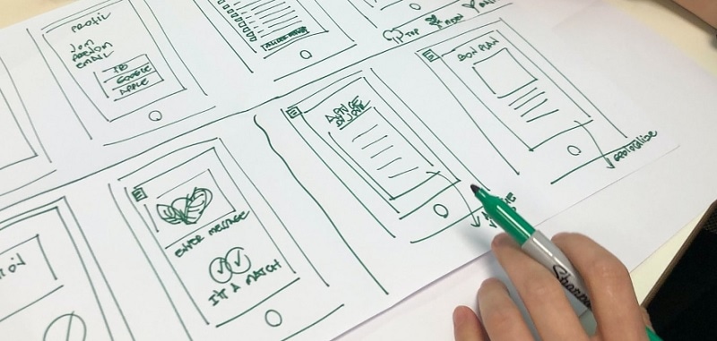
Sketch a structure that connects the user's goal to the relevant information and actions. Refine it around the frequency and importance of tasks, not the organization's department names. Decide what belongs in the navigation and what belongs inside the flow.
A reader might start at My loans, open a book, choose Renew loan, and see the resulting due date. Keep the route back to the loan list clear. If renewal is unavailable, the person should be able to understand the reason and return without losing their place.
Output: A small screen map with the starting point, main route, alternative states, and exit. If the structure is uncertain, work through it as a wireframe before polishing the interface.
3. Distributional design of an interface
Arrange the essential content and controls so the next action is easy to find. This is the layout stage: group related information, establish a reading order, and decide which details need to be visible together. It is not necessary to settle every color or icon yet.
On a loan card, put the book title, due date, and renewal action together. Display a reason beside an unavailable action rather than leaving a disabled button unexplained. Try long book titles and several loans. On a small screen, ensure that the due date remains associated with the correct title when the content wraps.
Output: A wireframe using realistic content, plus the controls needed for the successful and unavailable states. Do not rely on repeated placeholder text to test the layout.
4. Visual interface design
Apply typography, color, spacing, and icons in a way that supports the task and the product's identity. Use a clear hierarchy and reusable styles. A visual distinction should communicate a difference in meaning, not just make the screen more decorative.
For the loan list, use the same date format on every card and a consistent primary action. An overdue or unavailable state needs text as well as any color treatment. Make sure selected, focus, disabled, error, and success states can be distinguished. Review the design with long content and enlarged text before treating the layout as finished.
Output: The main screen and relevant states, with documented style and component choices. A small set of reusable rules is easier to maintain than individually styled controls on every screen.
5. Product prototype design
Build a prototype to explore the flow before development. Connect the screens and states needed for the task: choosing a loan, requesting renewal, seeing the result, and returning to the list. An interactive prototype lets reviewers experience the sequence instead of inferring it from static images.
For one sample book, show the successful renewal route. For another, show Renewal unavailable with Requested by another reader. Keep those examples separate so the person running the review knows which route is being demonstrated. A prototype can simulate these outcomes without checking a live library system.
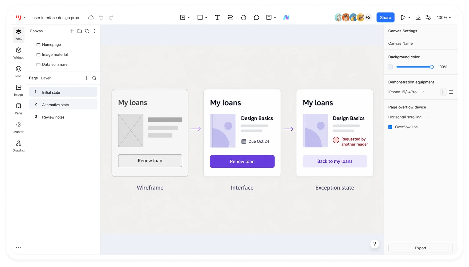
Output: A reviewable task flow and a short note about simulated data and unimplemented behavior. The illustration shows a designed example, not an actual loan transaction.
6. Testing the usability
Observe representative users attempting the task with the prototype. Use a neutral prompt such as “You need more time with Design Basics. Find out whether you can keep it longer.” Avoid naming the control you want them to choose. Notice where they hesitate, misinterpret a message, or cannot determine the outcome.
Include the unavailable case. Can the person explain why the book cannot be renewed and what to do next? A successful click is not enough if the resulting message is misunderstood. Record observations and separate them from proposed fixes. Use the usability testing guide to choose a suitable study approach.
Output: A prioritized set of observed issues, supporting evidence, and revisions to make. Revisit the structure or wording if that is where the problem lies; not every issue is a visual-design issue.
7. Specification of the UI
Document the design decisions and behavior that implementation needs. Include content, component states, responsive behavior, accessibility requirements, and the service rules supplied by the responsible team. A screenshot alone cannot explain when renewal is allowed or what happens if the request fails.
For this example, specify the authoritative source of the due date, the unavailable reason, the behavior while a request is in progress, and how the page updates after success. Agree how to handle a network error without implying that renewal succeeded. Record which parts still need technical or service confirmation.
Output: An implementation-ready design specification and a route for resolving open questions. The design handoff checklist helps organize the materials developers and reviewers need. Recheck the implemented interface as well as the design file.
Using Mockitt in the UI Design Process
Mockitt provides a shared place to develop interface layouts and design materials. Use it to make the chosen structure visible, reuse components, and discuss revisions. It does not remove the need for research, content decisions, usability work, or engineering implementation.
Interactive layouts and transitions
Assemble the screens with reusable elements and develop the interactions needed to review the task. Keep a button's action and resulting state clear. An animation should explain a transition rather than conceal missing content or make the flow harder to follow.
Templates, components, and styles
Built-in resources can provide a starting point. Adapt them to the actual content and task rather than forcing the library scenario into an unrelated template. Reused components and shared styles help maintain consistency as the screens change.
Collaboration and handoff
Share the design with teammates and keep feedback tied to specific screens or decisions. Use the available inspection and handoff materials to explain the chosen design. A comment such as “This state needs the reason returned by the service” is more actionable than “Make it clearer.”
Design, preview, and project continuity
Use design controls to refine the interface and preview the task sequence before review. Keep the current design, its example content, and unresolved questions together so the next person can continue the work. If importing an existing file is part of the project, first check the supported format and inspect the imported result; an import is not proof that every font, component, or interaction transferred correctly.
Conclusion
A useful UI design process connects evidence to decisions and decisions to a reviewable interface. Use the seven stages as a guide, returning to earlier work when testing reveals a problem. Aim for a task people can complete, understandable states when they cannot, and clear information for the team that will build it.