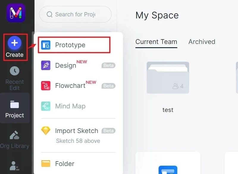
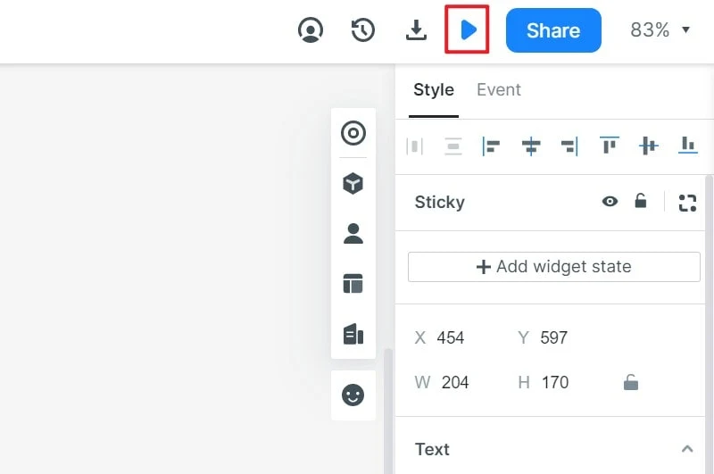
A useful wireframe is a testable layout for one user task. Start with the content and action the task requires, place those elements in a clear reading order, connect the next screen, and test the flow with realistic labels. You can use Mockitt to assemble screens, link the main path, and share the wireframe before visual styling hides structural problems.
1. Define the task and the screen boundary
Write the task as an outcome: “Find a replacement item and request it for Tuesday pickup.” Avoid starting with “design a dashboard” or “make a home screen.” The outcome tells you which information, controls, states, and next step the wireframe must contain.
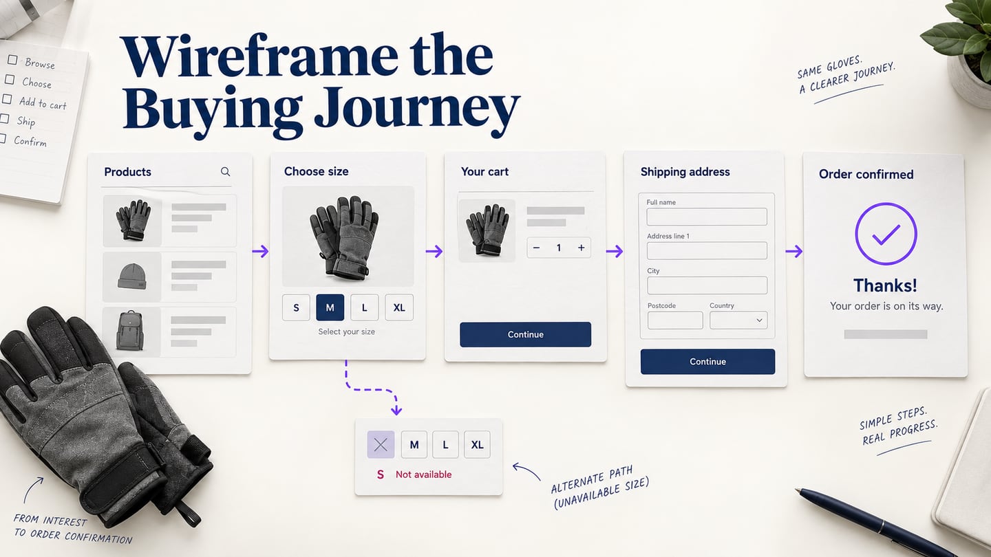
List the entry condition, the decision the user makes, and the success state. Add one recovery case, such as no matching results or an unavailable item. This small boundary prevents a wireframe from becoming a collection of disconnected boxes.
2. Map content before choosing components
Turn the task into a short content inventory: page title, supporting explanation, primary action, secondary action, required inputs, status or error message, and navigation back to the previous step. Group related information and give each group a clear label. If a value is important to the decision, do not replace it with an unlabeled gray bar.
Use real or deliberately challenging text. A long location name, an empty result list, and a two-sentence error message reveal constraints that placeholder “Lorem ipsum” conceals. Mark content that is still unknown rather than inventing product claims.
3. Choose fidelity for the question
| Question | Useful wireframe treatment | Avoid |
|---|---|---|
| Is the information architecture understandable? | Boxes, labels, hierarchy, and a connected low-fidelity route. | Spending time on colors and decorative images. |
| Can people complete the task? | Clickable controls, realistic states, and a recovery path. | Showing only the happy path. |
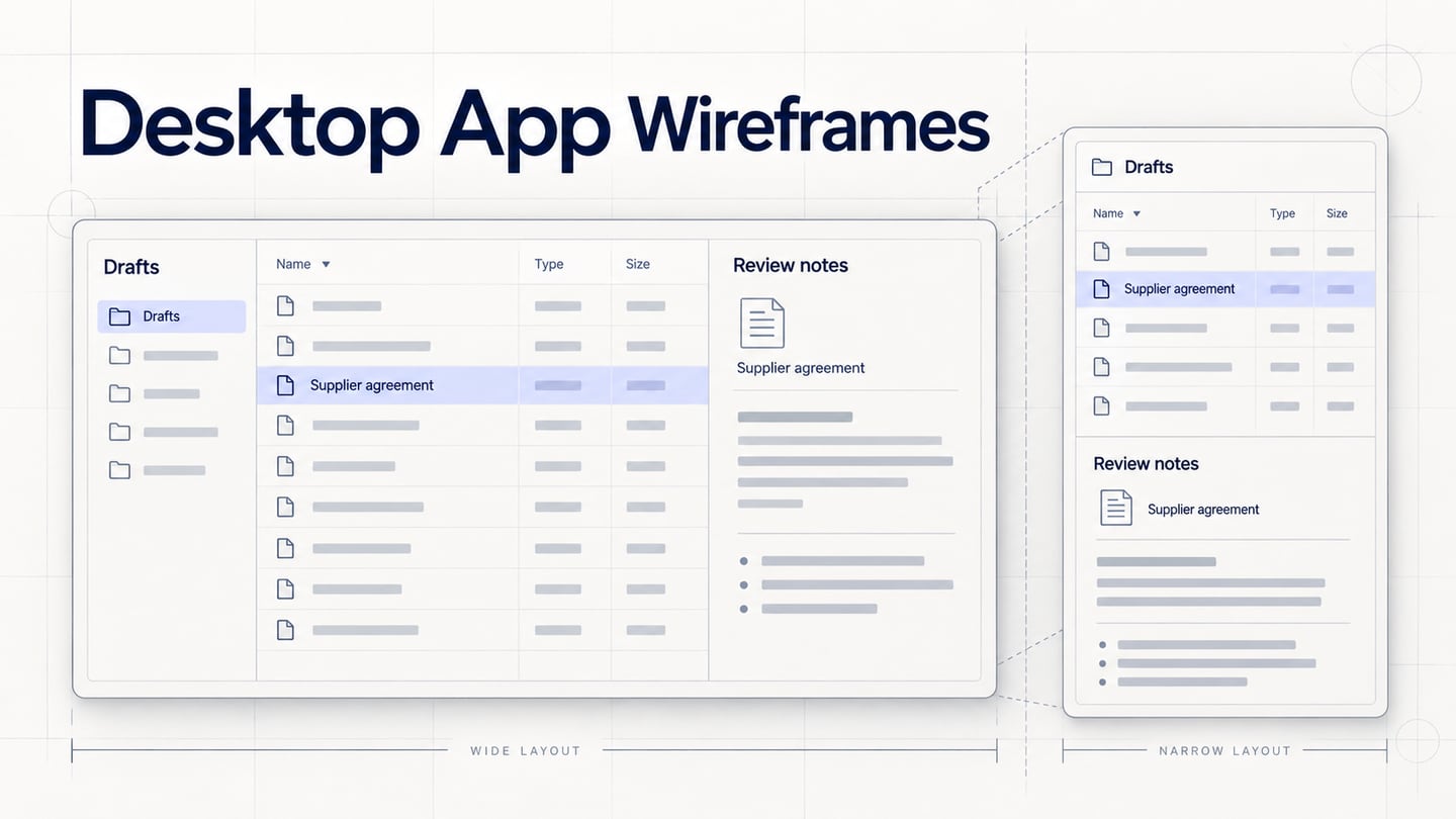
| Will a component fit long content? | Representative text, wrapping rules, and narrow-width checks. | Assuming every label is one short line. |
Low fidelity is not a quality level; it is a deliberate choice to keep the review focused. Increase detail only when the next decision depends on interaction, content, or visual hierarchy. A wireframe that looks finished can make reviewers comment on polish instead of structure.
4. Build the primary route and one recovery route
Connect the entry screen to the success state with the fewest steps needed to test the task. Then add one recovery route. In the equipment example, selecting an unavailable camera should return to a useful list with the chosen date preserved. Label the transition so reviewers understand whether it is a real interaction, a placeholder, or an implementation requirement.
Keep back, cancel, and edit actions visible where the task needs them. A route that only moves forward cannot reveal whether people can correct a choice or understand what will be lost. Test the same task from a fresh start and after returning from the recovery state.
5. Review structure before visual design
- Ask a reviewer to name the task and the next action from the entry screen.
- Run the primary route without explaining which control to choose.
- Introduce the recovery case and check that the user keeps useful context.
- Repeat with long labels, missing media, and a narrow viewport.
- Record each issue with the screen, observed behavior, expected behavior, and owner.
Separate “the task failed” from “the layout needs polish.” The first changes the structure or flow; the second can wait until the task is clear. Keep the review notes next to the wireframe so a developer or content designer can see the reason for each change.
6. Hand off what the wireframe proves
Include the intended reading order, interaction states, content rules, and known limitations. State whether the wireframe represents a responsive layout, separate mobile screens, or a fixed canvas. Do not describe a static preview as evidence of browser reflow, keyboard behavior, performance, or data validation. Those requirements need an implementation test.
Finish when another person can open the link, complete the task, find the recovery route, and explain the unresolved questions. A compact, connected wireframe gives the team something concrete to test and change before visual detail makes the wrong structure expensive.