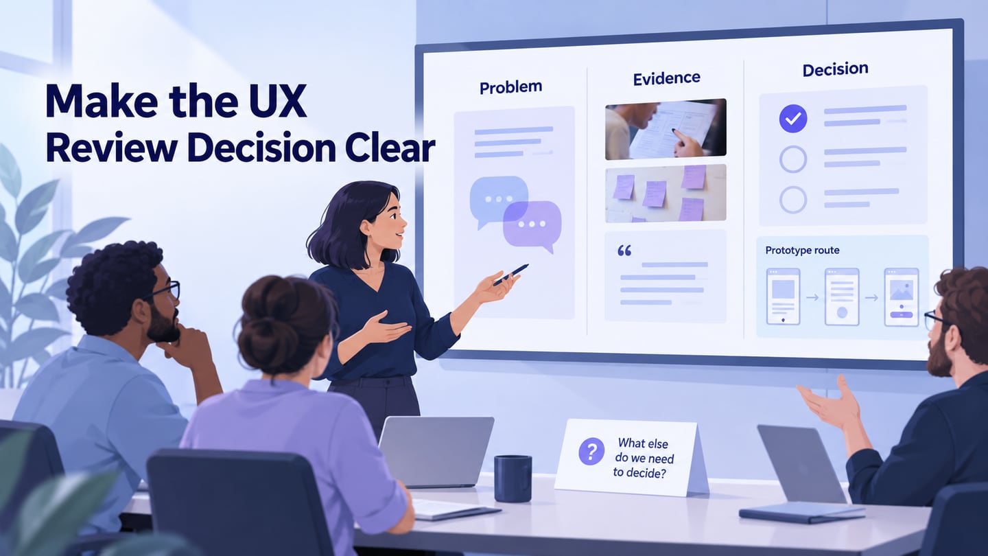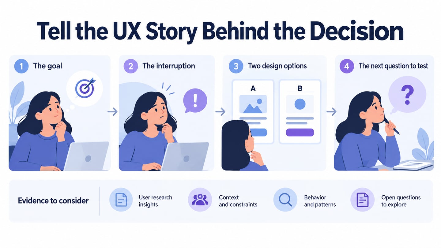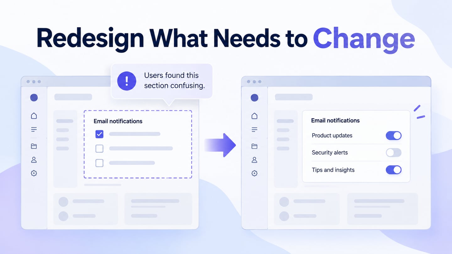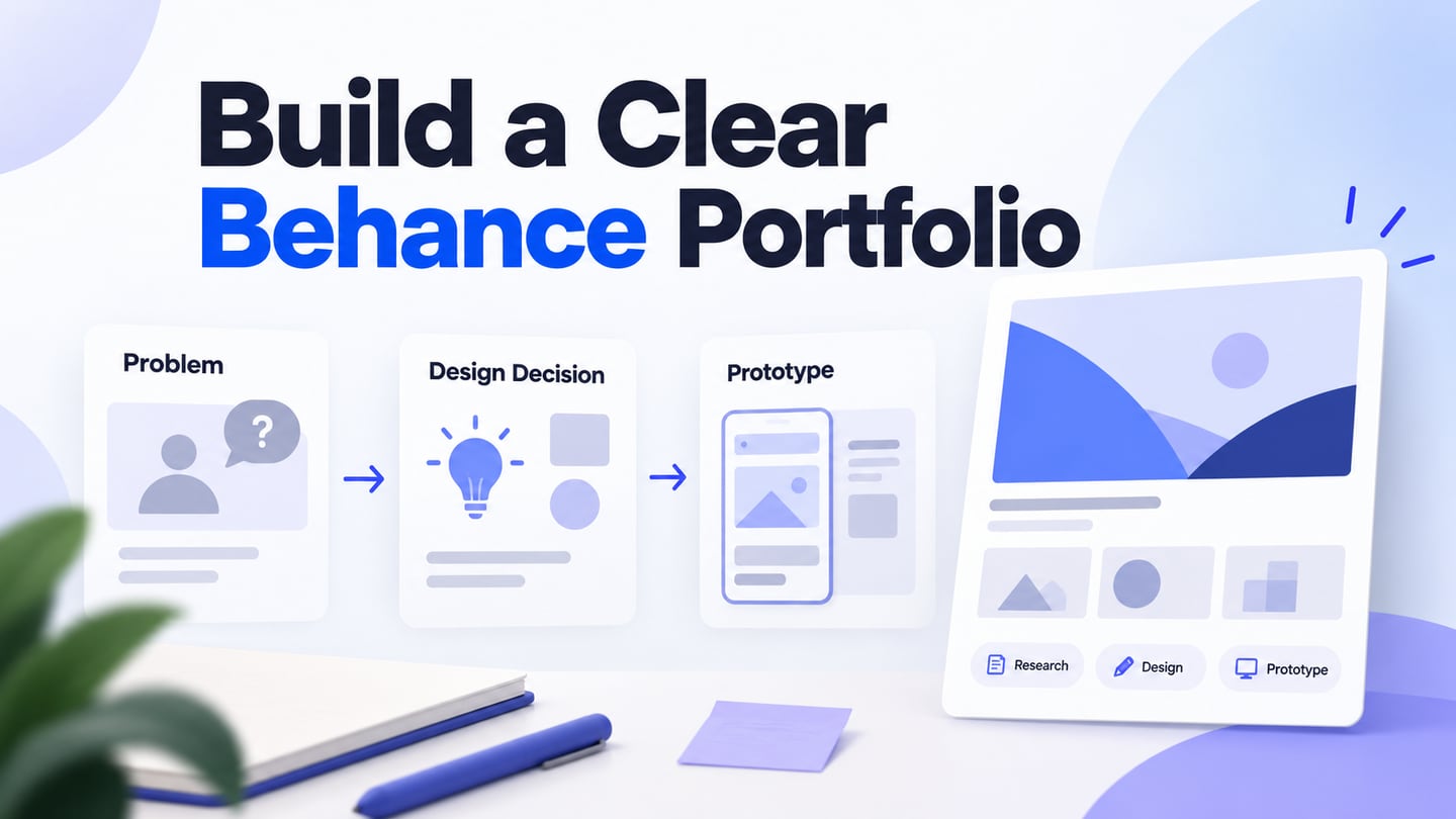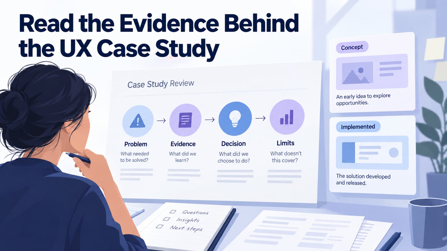
A UX case study explains how a designer moved from a problem to a decision, what evidence informed the work, and what the result can actually support. In a UX design portfolio, it helps readers understand your role and reasoning rather than judging only the finished screens.
The original collection brought together ten varied projects. This refreshed guide keeps those examples while distinguishing documented work, independent concepts, and historical entries whose original write-ups are no longer available for verification. Read them for methods and questions, not as a ranking or proof that a visual style will work for your product. Published case studies are selective accounts; look for limitations as well as outcomes.
Ten case-study examples and the lessons to examine
For each case, ask: who owned the work, what was the actual problem, which evidence changed the design, and what remains unproven? A prototype, a client deliverable, and an implemented product are different outcomes.
1. Zillow: make the decision feedback understandable
Frances Tung’s Zillow home-valuation case study describes a redesign of a comparable-market-analysis tool. The account explains how selectable homes and immediate feedback made the relationship between choices and an estimate more visible. It also notes that missing photographs and data could reduce trust. That tension is more useful than a simple claim that a redesign increased confidence.
Read how the problem, interaction choice, and reported testing relate to one another. Notice the difference between evidence about participants’ understanding and a claim about the accuracy of a property valuation. For your own case study, pair an annotated screen with the reason for the change and explain what the evaluation did—and did not—measure.
2. Timely: identify concept work clearly
Johny Vino’s Timely case study explicitly identifies the New York Times-related work as an independent concept developed by a student team, not work produced by the official New York Times team. The original roundup blurred that distinction. Keep it visible when learning from or presenting the project.
The concept explores short reading opportunities linked to a person’s schedule and habits. Study how a contextual problem leads to a proposed experience. Do not describe the proposal as a launched feature or claim that it improved retention without evidence. A concept can demonstrate thoughtful reasoning while remaining clear about its implementation status.
3. Yelp Activity Map: choose the right kind of evaluation
Gabi Dumaguin’s Yelp Activity Map account describes an exploration of how people could revisit their contributions and places. The author distinguishes concept testing from usability testing because the team needed to understand the value of the idea, not only whether people could operate a finished interface.
Look for the connection between the project goal, alternative explorations, and constraints. A useful lesson is that testing whether someone can use a feature does not necessarily establish whether they need it. In your own account, explain why the chosen method matched the uncertainty at that stage.
4. Fitbit: separate personal frustration from research evidence
The linked Fitbit usability case study starts from an author’s experience with the app and explores possible improvements. Treat it as an independent design investigation of a historical interface, not a current guide to Fitbit or evidence of an official product launch.
The transferable question is how a personal concern becomes a research question. Look for evidence from other users, the scope of the study, and the connection between findings and proposed changes. Remove a long introductory quote from your own case study if a short summary and a clear source communicate the context better.
5. Managing Synced Accounts: an archived account-state lesson
The original collection included a Siftery Track project about managing connected accounts. Its original portfolio page could not be verified during this refresh, so this entry is retained as historical context rather than a current reading recommendation. The useful design question remains: can someone distinguish connected, syncing, disconnected, and failed states, and understand the next action? For your own project, show the state model and the evidence behind the labels instead of claiming success from a final screenshot.
6. Tito Taglish: an archived audience-specific learning example
The original Tito Taglish entry focused on a language-learning concept for a particular audience. The original write-up could not be verified during this refresh; old claims about competitors’ language coverage and the size of a market gap have therefore been removed. Keep the lesson focused on audience specificity: explain whose learning task you investigated, what evidence informed the content and interactions, and which parts were designed, prototyped, or implemented. Do not turn an old project rationale into a statement about today’s market.
7. Zignaly: trace discovery into prototype decisions
UX studio’s historical Zignaly case study describes investigating first-use difficulties and account-connection problems, then iterating on prototypes. The original roundup incorrectly titled this entry “Signal.” Read the project for its discovery and iteration process, not as a recommendation of a financial product or a promise about investment results. Ask which findings changed the team’s initial understanding and how those findings appeared in later screens.
8. IncQueryLabs: distinguish an expert review from user research
The IncQueryLabs website review explains how UX studio organized an expert evaluation and communicated findings. It distinguishes visual issues from problems with understanding and navigation, and describes separate work on the value proposition. This is useful for learning how to structure an audit. An expert’s judgment identifies issues to investigate; it is not automatically the same evidence as observing representative users or measuring a post-launch conversion change.
9. Perfect Recipe: an archived personalization example
The original Perfect Recipe entry connected cooking, recipe discovery, and shopping in one experience. The earlier detailed case-study page could not be verified during this refresh, so its project outcomes are not repeated as established facts. As a design exercise, examine how preferences should affect results, how someone can change a preference, and what happens when no result fits. A useful case study would make those decisions and their evidence explicit rather than relying on attractive food photography or animated transitions.
10. GNO Wellbeing: separate brand work from outcome claims
Tubik’s GNO Wellbeing project presentation identifies the branding and website work for a weighted-blanket business. It is useful for studying how identity, illustration, and interface presentation relate. Do not infer improved sleep, health benefits, or increased sales from a design portfolio. Learn from the organization of the work and the explanation of decisions, while respecting the original assets rather than copying them into a project.
Apply the lessons to your own case study
Start with the problem, your role, the team’s constraints, and the status of the work. Show the evidence that influenced a decision, an alternative you considered, and how the proposal was evaluated. State whether the outcome is a tested prototype, an implemented change, or a result still awaiting measurement. Include limitations rather than filling an empty outcome section with an invented metric.
For an illustrative community tool-library project, the problem might be that borrowers cannot tell when a reserved item is ready to collect. The proposal separates “Reserved” from “Ready for pickup.” Show that distinction in a Mockitt prototype, record the question you will test, and keep the evidence field marked “To collect” until research is completed.
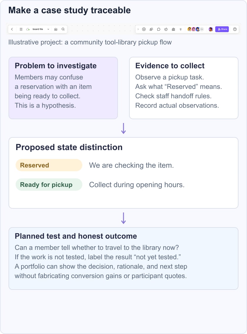
After the study, connect the actual observation to the design decision and cite the relevant session or evidence record. If the result is inconclusive, explain what you would investigate next. This is more informative than presenting polished screens beside a fictional success percentage. The wider UX design process provides context, but the case study should explain the specific work you actually did.
Use case studies to improve your judgment: notice how problems are framed, how evidence is used, and where claims outrun the available information. A strong portfolio makes your reasoning inspectable, including how you present an interactive prototype, and gives proper credit to collaborators. It does not need to imitate another designer’s narrative or manufacture a dramatic result.