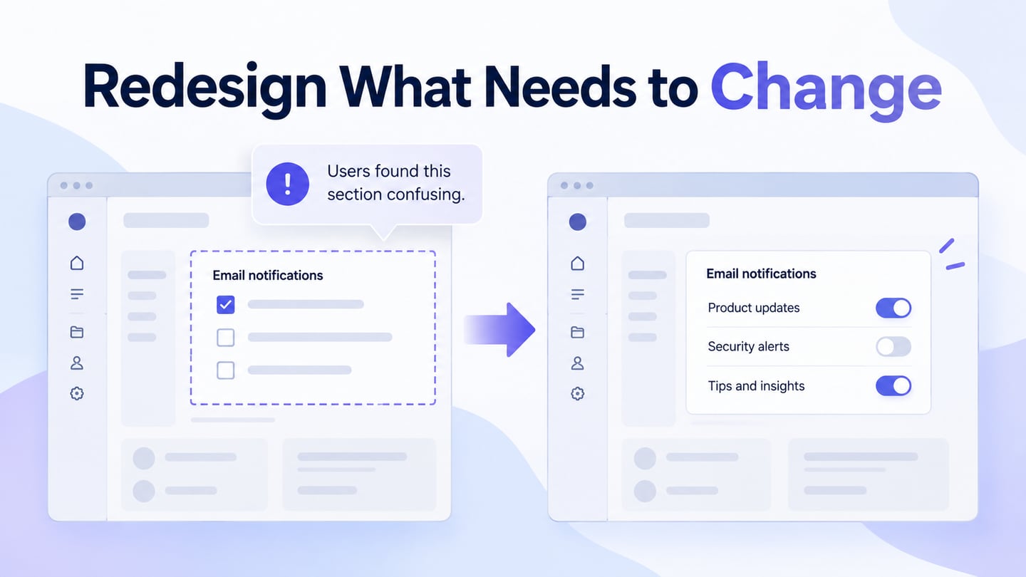
A product redesign changes an existing experience to address a defined problem. It may adjust a label or workflow, reorganize a section, or replace a structure that no longer serves the task. Before opening a UI design workspace, decide what needs to improve and what already works. A newer visual style is not, by itself, evidence that users need a different product.
What is Redesign?
Redesign means revising an existing product’s structure, behavior, content, or visual presentation. The trigger might be a new audience, recurring task failures, changed service rules, or a technical constraint. The useful question is specific: which people are struggling with which task, and what evidence suggests that design is part of the cause?
A redesign should preserve useful behavior as carefully as it changes weak areas. A visual refresh changes presentation; a workflow redesign changes how a task is completed; a service change may also affect policies and operations. Name the scope so that a new screen is not expected to solve an issue outside the interface. NN/g’s guidance on evaluating an existing design before redesigning stresses learning from both its strengths and weaknesses.
Why You Need Redesign
The original guide identified audience growth, customer satisfaction, and security as common triggers. Each is a reason to investigate; none automatically justifies replacing every screen.
1. Support a new audience or context
If a product expands to a new audience, investigate the tasks, language, access needs, and conditions that differ. A desktop workflow used by office staff may need changes for field workers on phones. Start with the affected tasks and preserve conventions that existing users rely on. Adding more features without clarifying the task can make the product harder for both groups.
2. Declining Customer Satisfaction
Repeated support questions, abandoned tasks, and observed confusion can signal a problem, but they do not identify its cause on their own. A drop in satisfaction may reflect price, service availability, performance, or a confusing interface. Combine behavior and feedback to locate the issue, then define how a design change could address it. Do not assume that copying a competitor’s screen will resolve a different service problem.
3. Make security-related tasks understandable
Security changes may introduce account recovery, session management, or additional verification steps. Design can help people understand what is happening and recover from mistakes. It cannot substitute for secure implementation, appropriate access controls, or an engineering review. Treat these as shared design and technical responsibilities; a reassuring badge or a redesigned login screen does not make a service secure.
Other triggers include poor responsiveness, inaccessible controls, growing content, or changes in the underlying service. Prefer the smallest scope that can solve the demonstrated problem. A full rebuild may be justified when the structure itself prevents necessary work, but it also creates more opportunities to disrupt familiar tasks.
Example: clarify an inventory decision before rebuilding the screen
Consider an inventory screen where staff confuse incoming stock with stock available now. In this illustrative example, an item has 12 units available, 20 incoming, and a reorder point of 15. If the interface displays only “Stock: 32,” a user may postpone a needed reorder. The first proposal is to separate the labels and explain when incoming units become available, while keeping the familiar table and search behavior.
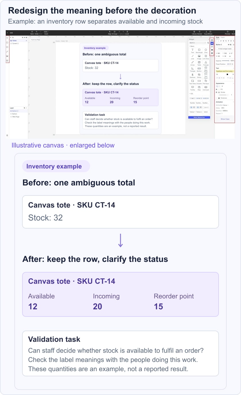
Record the baseline question: can a staff member identify the amount available today and decide whether to review a reorder? Compare that task in the current screen and a revised prototype. Include a row with no incoming stock and one with missing arrival information so the new pattern is not designed around only the easiest example. These are example values, not reported findings.
A focused redesign process
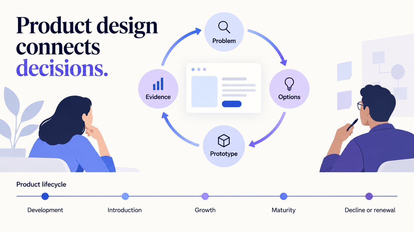
Document the current task and evidence, identify what must remain stable, and sketch more than one response to the problem. Review the options with design, engineering, and service owners before choosing what to prototype. Define the expected outcome and a guardrail, such as keeping experienced users able to locate the same item without relearning the whole table.
After testing, decide which changes to keep, revise, or reject. Plan how the implemented change will be released and monitored. If labels or navigation move, explain the transition where necessary and watch for regression in previously successful tasks. Do not interpret a preference for a fresh visual as proof of better task performance.
Plan and review the redesign in Mockitt
Mockitt provides a workspace for developing screen layouts, reusable elements, and a shared design proposal. Keep a reference to the current design alongside the proposed version so reviewers can understand exactly what changed. Name the task under review rather than presenting a gallery of disconnected screens.
 Earlier Mockitt interface, retained to illustrate a shared screen-design workspace.
For the inventory example, create the revised row labels and the relevant detail state, then connect them in an interactive prototype. Ask teammates to review the stock interpretation and edge cases. Keep feedback tied to the affected screen, and record which comments represent a user problem, a technical dependency, or a stylistic preference. Agreement among stakeholders is useful, but it does not replace evidence from the intended users.
- Templates can provide a starting structure, but keep the product’s actual task and data needs in control of the design.
- Reusable widgets and components help you apply the revised label or state consistently rather than fixing one screen in isolation.
- Interaction previews let reviewers walk through the proposed change and notice missing transitions or recovery routes.
- Shared review helps designers and developers discuss the same version and resolve specific comments.
- Preview and share the relevant task route before the research session; check participant access and repair broken prototype links.
- Handoff should include the states, content rules, and unresolved dependencies. Inspectable design details are not a substitute for production code, testing, or security work.
A useful redesign has a reason, a bounded scope, and evidence that the proposed change helps. Preserve the parts people already use successfully, test the task that motivated the change, and check the implemented experience afterward. Use usability testing to investigate the interaction rather than promising that a new appearance will automatically improve satisfaction or growth.