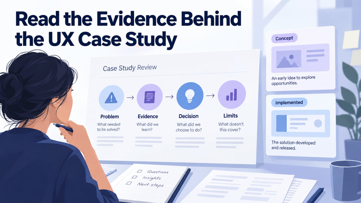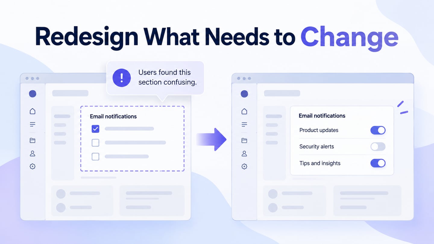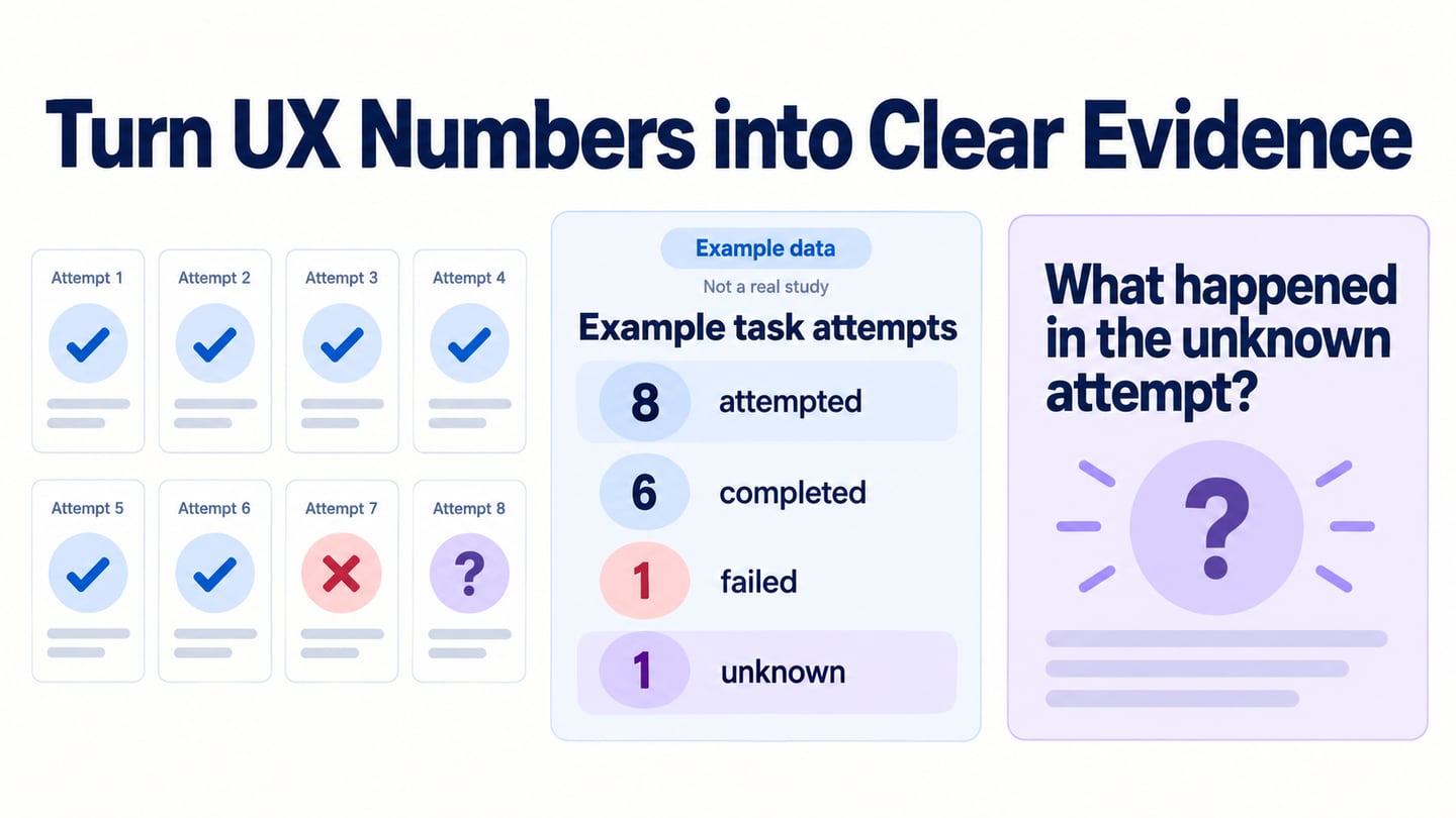
A UX presentation should help an audience understand a problem and make a useful decision. Speaking confidently helps, but the content still needs a clear purpose, evidence, and a request for feedback. A focused UX story can connect those parts without turning the meeting into a tour of every screen you have designed.
A prototype demo script keeps the walkthrough focused on one task, the state changes that matter, and the decision the audience must make.
A UX presentation should make the route and the unresolved question easy to inspect.
The ten practices below build on the original guide’s advice about message, length, stories, slides, participation, rehearsal, tools, visuals, delivery, and engagement. Use them for a design review, research readout, or project proposal, adapting the depth to the people in the room.
Ten ways to make a UX presentation more useful
Before opening the slide deck, write the decision or response you need by the end of the meeting. That gives you a reason to include—or leave out—each piece of information.
1. Have a clear message to convey
State the main message near the beginning. “We need feedback on whether the new request status is understandable” is more useful than “Here is our latest design.” Explain the problem, the affected task, and the evidence you have. Distinguish an observation from a hypothesis so the audience knows what is open for discussion.
Source: Pexels
For a navigation proposal, show what people are trying to find and where the current structure causes difficulty. Then explain the proposed change and the question it needs to answer. This keeps visual preferences from becoming the only topic. If the evidence is incomplete, say what is missing rather than using a confident headline to hide the gap.
2. Try to keep the UX presentation short
Choose a duration that fits the meeting’s purpose and leaves time for discussion. There is no reliable universal rule that all adults stop paying attention after a fixed number of minutes. A short decision review and a detailed research workshop need different formats.
Agree on the available time beforehand. Keep essential evidence in the main sequence and detailed tables, secondary screens, or methodology notes in an appendix. If the discussion needs more depth, the supporting material remains available without slowing the initial explanation.

Source: Pexels
Cut repetition before cutting evidence. A concise presentation still needs enough context for someone outside the project to assess the recommendation. Avoid rushing through a dense deck simply to meet an arbitrary slide count.
3. The power of storytelling
Use a person’s goal and the obstacle they face to organize the design explanation. A short sequence can show why one state matters more than a collection of attractive mockups. Keep the story connected to the task instead of adding emotional detail only to make it memorable.

Source: Pexels
When the story comes from research, identify the source and protect participant privacy. When it is a proposed or composite scenario, label it. Show the point where the design changes the experience and what still needs to be checked. Do not present an imagined successful outcome as something a participant actually achieved.
4. Keep the slides simple and less in number
Give each slide one clear job: establish a problem, show evidence, compare alternatives, or request a decision. Use a descriptive title and readable text. The audience should not need to read a paragraph while listening to a different paragraph from you.
Source: Pexels
Keep visual conventions consistent across slides. A complex concept may need several slides; that is better than shrinking a diagram until nobody can read it. Highlight the relevant part of a screen and explain its relationship to the task. Put long quotations, full tables, and detailed specifications in material people can inspect afterward.
5. Rope in the audience
Invite the type of feedback you need. Ask “Which status would you expect after saving this draft?” or “What dependency could prevent this recovery path?” rather than “Do you like it?” Separate questions about the evidence from preferences about visual style. Repeat or summarize a question so remote participants can follow the discussion.
Source: Pexels
Use a short activity only when it serves the decision. For example, let reviewers inspect a screen silently before discussing it, or ask each role to identify one unresolved dependency. Rewards or quizzes are unnecessary if they distract from the review. Keep a place to record off-topic issues without losing them.
6. Get an estimate of the presentation time
Rehearse the actual sequence, including transitions to a prototype, videos, and questions. Time the explanation rather than estimating from the number of slides. Notice where you need extra context and where the audience would be waiting for you to locate a screen.

Source: Pexels
Reserve a specific discussion window and a closing minute to record the outcome. If the demo runs long, know which secondary example can be omitted. A rehearsal with a teammate can reveal unclear vocabulary and missing context that practicing alone does not expose.
7. Make use of features and tools
Use presentation features to reduce friction, then test them in the real meeting setup. The tool should make your explanation easier to follow, not add another thing the audience must learn.
- PowerPoint Presenter View can show the current slide, the next slide, and speaker notes to the presenter. Microsoft’s Presenter View guidance explains the feature. Check which screen or window is being shared so private notes do not appear in the audience view.
Source: Pexels
- If you use a clicker or keyboard shortcuts, rehearse with them. For a remote meeting, open the intended tabs beforehand and disable unnecessary notifications. Keep a static backup of the key screens in case the live prototype or network connection fails.
8. Make use of visual elements
Choose visuals that carry evidence or explain a relationship: a task route, a screen comparison, a short interaction clip, or a carefully labeled observation. General video-viewing statistics do not establish that a UX presentation needs more video. Every visual should earn its place by helping the audience understand the decision.
Source: Pexels
For a prototype demo, show one relevant route and the state that raises the question. Use Mockitt’s interactive prototype preview to make the proposed sequence inspectable, then return to the decision. State which behavior is simulated. Keep clips short enough to discuss and provide captions or a verbal explanation where needed.
9. Analyze how you look while presenting
Record a rehearsal if it helps you assess pace, audibility, and whether you explain the visuals. Focus on habits that affect understanding, such as speaking while changing screens or using “this” without identifying the element.

Source: Pexels
The goal is understandable delivery, not a particular appearance or performance style. Ask a colleague to summarize the recommendation afterward. If they cannot, improve the message or sequence before concentrating on gestures.
10. Keep the audience engaged with useful decisions
Engagement comes from relevance and participation as much as entertainment. Show why the task matters, give people enough evidence to question the proposal, and make space for disagreement. A light example can help, but it should not trivialize a real user problem.

Source: Pexels
End by recording what was agreed, what remains uncertain, who will act, and when the team will revisit the decision. Share the relevant screens and notes afterward so absent colleagues can understand the reasoning without relying on a secondhand summary.
Example: a focused status-design review
Suppose the meeting must decide whether a revised leave-request status is ready to test with employees. The original screen uses one vague “Submitted” label; the proposal distinguishes Pending approval, Approved, and Needs revision. This is an illustrative review scenario, not a claim about a measured improvement.
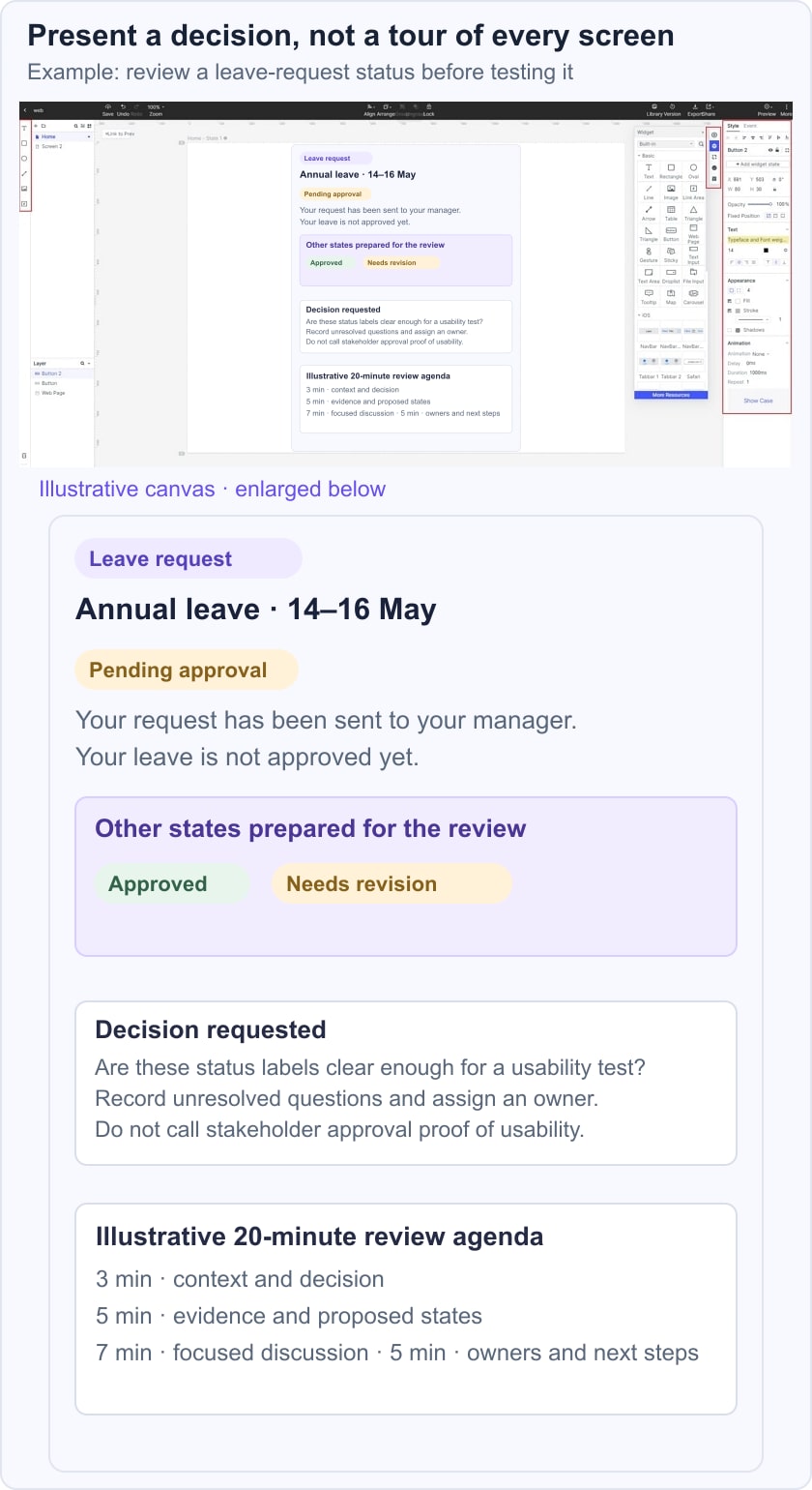
In a 20-minute review, you might spend three minutes on the task and evidence, five on the proposed screens and one recovery path, seven on questions, and five on the decision and next steps. That is a planning example, not a universal attention-span rule. Ask whether each status communicates the next action and whether the proposed wording matches the actual approval process.
The useful output is a testable proposal with known dependencies, not a room full of votes for the most attractive screen. If the approver workflow remains unclear, record that issue and resolve it before presenting the prototype as ready for implementation.
Make the next action clear
A strong UX presentation makes the task, evidence, proposal, and decision understandable. Rehearse the handoff between slides and prototype, leave time for useful questions, and record what the meeting changes. The audience should leave knowing what happens next and why.