Mockitt - Best Free Wireframe Tool
Helpful Tips About Wireframe
- How To Create A Wireframe
- Wireframe Tools You Should Know
- Wireframe Templates for Your Inspiration
- Free-to-use Wireframe Kit
How to Present an Interactive Prototype in a UX Portfolio
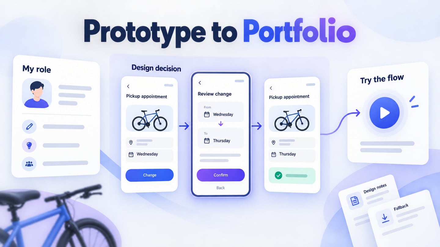
To present an interactive prototype in a UX portfolio, explain your contribution, identify the decision the prototype demonstrates, and give the reviewer a short path through it. Place the link beside that explanation, show what the reviewer can try, and provide a readable alternative if the interaction cannot load. The prototype should help someone understand your judgment without needing you to narrate every click.
You can build and share an interactive prototype in Mockitt, then connect that work to the story on your portfolio page. This guide follows an illustrative project for Maple Quay, a fictional bicycle-repair shop: helping a customer change a collection appointment while keeping the existing slot until the replacement is confirmed.
Choose the question your prototype will answer
Decide what someone should learn by opening the prototype. “Here is the app I designed” gives a reviewer little direction. “See how a customer changes a pickup time without losing the original booking” names a task and a meaningful design problem.
For Maple Quay, the portfolio demonstration covers one journey: view a repair ready for collection, inspect the current appointment, choose another available time, review the change, and confirm it. It does not need a working catalog, payment flow, or staff dashboard. Leaving those areas out makes the review more focused and reduces the number of unfinished routes a visitor can encounter.
Choose a flow that supports the skill you want to show. For interaction design, that might be a difficult state transition. For research-led work, it might be the change prompted by an observation. For a visual-design role, explain how the presentation supports the task. The same attractive screen is not evidence of every skill.
Make your contribution visible before the link
Give the reviewer a compact project introduction: the problem, your role, collaborators, relevant constraint, and project status. A sentence about what you owned is more useful than a row of software logos. In a team project, distinguish your decisions from work completed by researchers, engineers, other designers, or a client.
For a self-directed Maple Quay project, an introduction could read: “I designed the collection-rescheduling flow and built the interactive prototype. This is an independent concept using fictional repair data. The design question is how to make a changed appointment clear while preserving the customer's current booking until confirmation.” A real project should use its actual responsibilities and evidence instead.
Nielsen Norman Group's portfolio guidance emphasizes making the process, role, constraints, and reasoning visible. Apply that principle selectively: include the information a reviewer needs to understand this decision, rather than documenting every workshop or file created during the project.
Credit any template, component library, or shared design system that materially shaped the work. If you adapted an existing flow, explain the adaptation. This makes the original contribution easier to identify.
Put the design decision next to the interaction
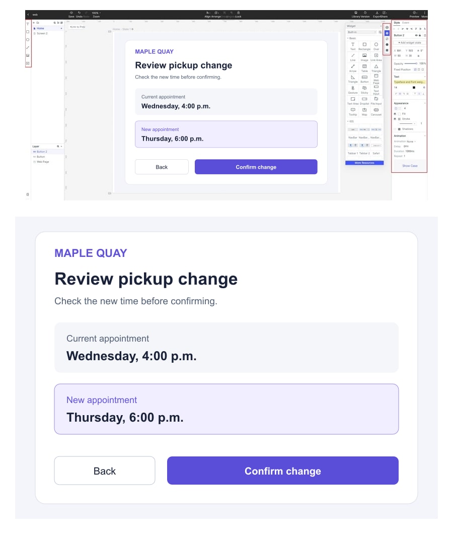
Introduce the key decision before asking someone to click. In Maple Quay, selecting a new time opens a review screen showing both the existing appointment and the proposed replacement. The original appointment remains visible until the person confirms the change. A Back action returns to time selection without presenting the booking as already changed.
Explain why you chose that behavior. An immediate change might be quicker, but a review step lets the customer check the new day and time. The portfolio can show the tradeoff without claiming that the chosen version improved completion rates. In this teaching example, that benefit is a design hypothesis, not a measured result.
If you evaluated a real version, connect the observation to the revision: what participants did, which design detail changed, and what the next evaluation established. Keep an unresolved issue visible when it matters. A screenshot of a confirmation screen cannot demonstrate that people understood it or that an operational booking system behaved correctly.
A small before-and-after comparison can help, provided both states have a clear purpose. Caption the difference: “The revised review screen separates the current slot from the proposed slot.” For broader guidance on describing the evidence, see these UX case-study lessons.
Give the reviewer a complete path through the prototype
Place a short task beside the link, using the perspective of the customer rather than the designer: “Your bicycle is ready, but you cannot collect it on Wednesday. Move the pickup to Thursday evening.” Then let the screens explain the interaction. A portfolio review can include guidance; it does not need to imitate an unmoderated usability test.
The Maple Quay review screen places the current Wednesday appointment beside the proposed Thursday appointment, with separate Back and Confirm change actions. That single state lets a reviewer inspect the central decision without exploring the whole project.
| Part of the demonstration | What the reviewer should encounter | What it explains |
|---|---|---|
| Starting screen | Repair ready; collection booked for Wednesday at 4:00 p.m. | The customer's existing commitment. |
| Choose a replacement | An available Thursday appointment at 6:00 p.m. | The proposed change, before it takes effect. |
| Review the change | Current and proposed appointments, plus Back and Confirm change. | The decision point and a route to reconsider. |
| Finished state | Pickup moved to Thursday at 6:00 p.m. | A visible outcome consistent with the selection. |
Make the end of the demonstration recognizable and provide a way to start again. Check what happens if a reviewer goes back, clicks twice, or refreshes midway. If the prototype supports only the highlighted journey, state that near the link. Avoid controls that appear fully functional but lead nowhere without explanation.
Do not require the visitor to search an editor canvas for the correct first screen. Link to the intended viewing experience and verify where it opens. If a particular viewport is important to the design, explain that briefly and include an alternative for someone viewing the portfolio on a phone.
Prepare the flow and viewing link in Mockitt
Mockitt supports connecting screens and actions, previewing interactions, and sharing a prototype link. For this example, prepare the current-appointment, time-selection, review, and finished states. Connect the primary actions, then preview the route in the order a reviewer will encounter it.
Use the same appointment details across every state. A Wednesday appointment should not become Friday simply because one screen still contains placeholder copy. Likewise, the final confirmation should show the Thursday time selected earlier. These small inconsistencies can obscure an otherwise thoughtful interaction.
Follow the Mockitt prototype-sharing guide when preparing the viewing link, and inspect the access options shown in your workspace. Test the final link as the intended recipient. Your own signed-in editor session cannot tell you whether an outside reviewer can open it.
Use a descriptive portfolio link such as “Try the pickup-rescheduling flow.” Keep the explanation on your portfolio page so the reviewer knows what the destination contains. A direct link is sufficient; the presentation does not depend on embedding the prototype in another website.
Check access and remove private project material
Decide what you are permitted to show before publishing the link. For client or employer work, obtain the appropriate permission and follow the agreed restrictions. A publicly reachable prototype should not become an accidental route to internal screens, customer records, or comments intended only for the project team.
Replace real names, contact details, repair notes, and internal identifiers with coherent sample content. For Maple Quay, a fictional repair reference and appointment are enough to explain the journey. The guide to prototype test data covers how to keep examples consistent without using sensitive records.
Review every reachable branch, not just the screen pictured in the case study. Look at linked pages, background details, uploaded images, and information revealed by alternative actions. If the approved scope is narrow, prepare a presentation version containing only the material you are allowed to share, using the controls actually available to you.
Open the link outside your authoring session. Check whether it asks for access, whether the expected content appears, and whether the recipient can do anything beyond the intended review. If protected access is necessary, explain how an authorized reviewer obtains it. Do not put a supposedly private password beside a public link and assume the project remains restricted.
Keep the case study useful when the prototype cannot open
An interactive link should add detail without carrying the entire explanation. Include a small sequence of relevant screens with captions describing the action and resulting state. For Maple Quay, the current appointment, change review, and final confirmation convey the main decision even when the visitor cannot run the flow.
You can also record a short walkthrough using a screen-recording tool. Show the actual interaction at a readable pace, explain the decision, and include captions or a text equivalent. Avoid a fast montage that hides the transition you are trying to demonstrate. Keep the fallback next to the link so a reviewer does not have to search for it.
Separate a static explanation from an interactive experience in the labels. “View the screen sequence” and “Try the pickup flow” describe two different destinations. If you replace the linked prototype later, update the screenshots and recording when the demonstrated behavior changes. Otherwise, the portfolio tells two conflicting stories.
Review the portfolio as someone who has never seen the project
Ask a person unfamiliar with the work to open the case study and explain what you contributed, which decision they are about to inspect, and where the demonstration starts. Let them follow the link without giving extra instructions. Their questions reveal gaps between what is obvious to you and what the page actually communicates.
Rehearse the live presentation separately. Begin with the task, demonstrate the key decision, then return to the evidence and what you learned. Keep the screen sequence available if access or connectivity interrupts the walkthrough. You should be able to discuss the design without spending the interview repairing a link.
Before sending the portfolio, check the viewing link, sample data, permissions, and the match between the interactive and static versions. Revisit those items when the project changes. A useful prototype presentation leaves the reviewer able to describe both the interaction and your reasoning, with enough context to ask a more informed next question.